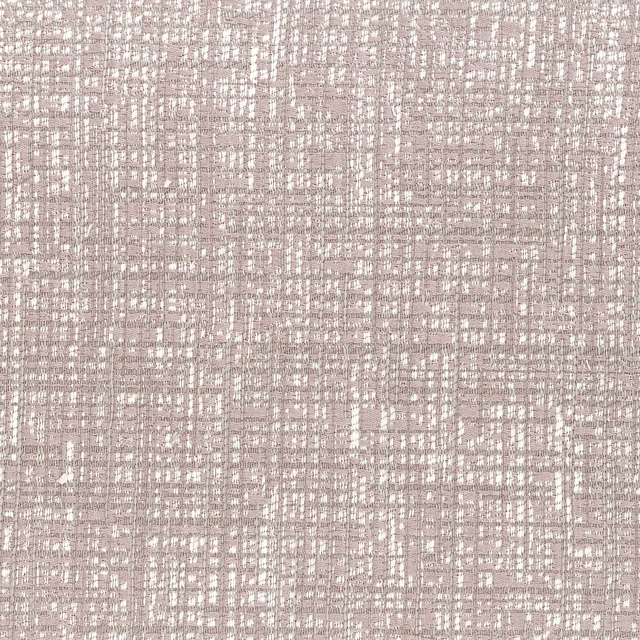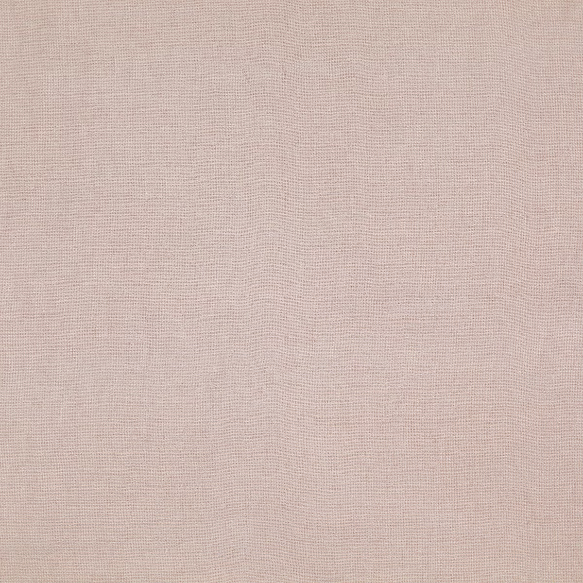

Tap the swatch to see it full screen. Hover it to magnify the weave. Colours on a screen are a guide, not a match, so come and feel the real cloth.
Scroll up or down to zoom in and out.
21 Petal
Cairn Fabric21
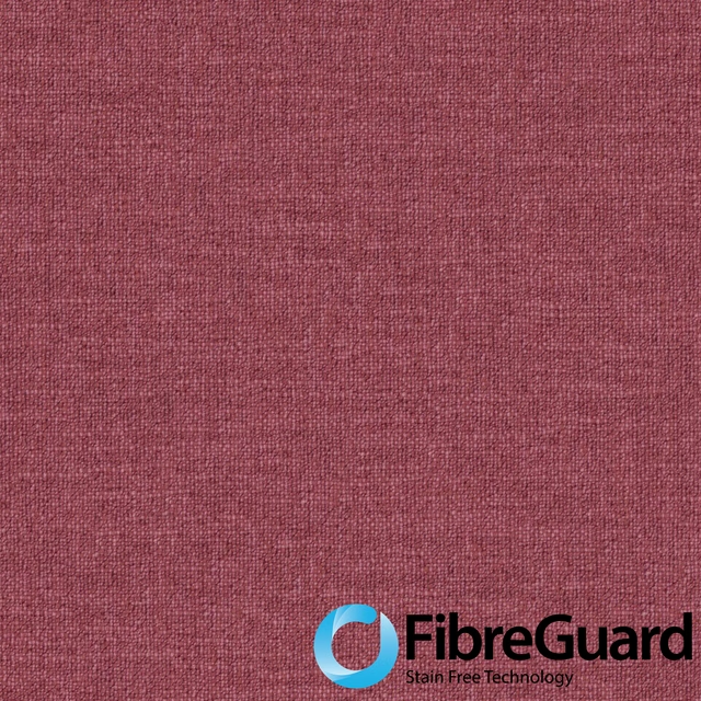
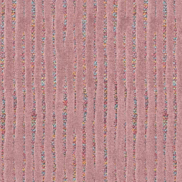
Cairn 21 Petal is a very pale blush pink with a delicate, close-grained texture visible across the surface. Its low-contrast appearance gives the colour a softly powdered, understated quality.
You have used your previews for today. Send one to Simon and you can carry on.
Your board
0 fabrics
See this fabric on Wemyss's own site, then order it through us.
See 21 Petal in your own room
A photograph of the piece you want re-covered. Straight on is best, and daylight helps. It is used to make your picture and nothing else.
Looking at your room
We found things here 21 Petal could go on. Tap one on the photograph, or choose below.
We could not see anything to re-cover
, s
21 Petal, on your
Drag to compare. AI impression, colours indicative: ask us for a cutting before you decide.
About this fabric
The surface appears finely woven and even, with tiny variations in the grain that prevent the pale pink from looking completely flat. This is a plain fabric rather than a motif-led design, so the colour and subtle texture carry the visual interest. The blush tone reads warm and muted, with a gentle chalkiness rather than a bright or saturated pink. No composition, width or performance specification has been supplied for this colourway.
How to use it
Use this pale blush pink for curtains, blinds or relaxed upholstered accents where a warm, quiet wash of colour is wanted. It pairs naturally with cream, warm white, pale timber and soft taupe, while the fine weave keeps the look restrained.
A quiet blush tone with a fine, understated weave for softly coloured curtains and blinds.
More from Cairn
The same book, other colourways.
08 Zinc
Cairn
10 Tea
Cairn
11 Biscuit
Cairn

12 Oatmeal
Cairn

15 Snow
Cairn

17 Beige
Cairn

22 Dusk
Cairn

24 Shadow
Cairn
25 Flint
Cairn
26 River
Cairn

27 Spa
Cairn
29 Olive
Cairn
Pairs well with
21 Petal is a quiet cloth, so it carries a pattern beside it: one of these on the curtains and this on the chair. Mixed across the houses we hold, which is the part a single supplier's book cannot do.
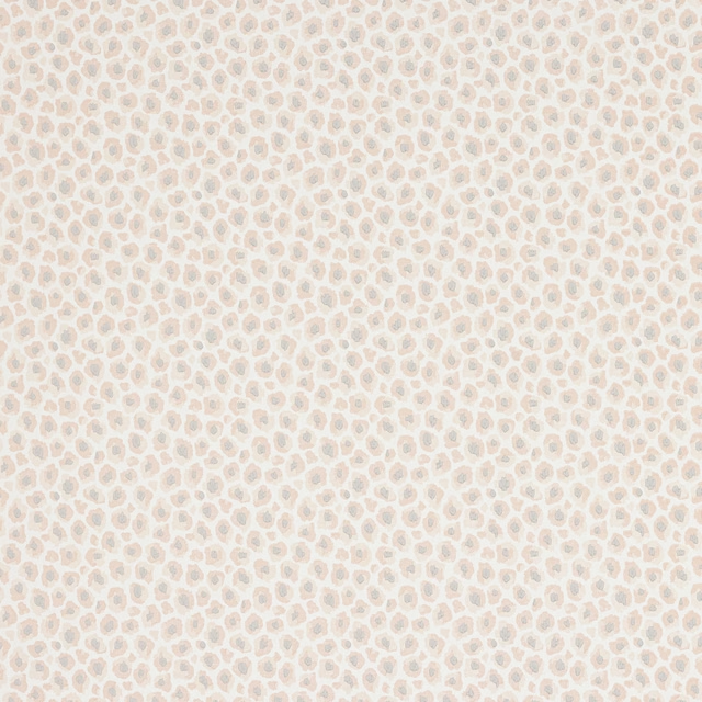
Cleo Wallpaper Pink
Camber Wallpapers
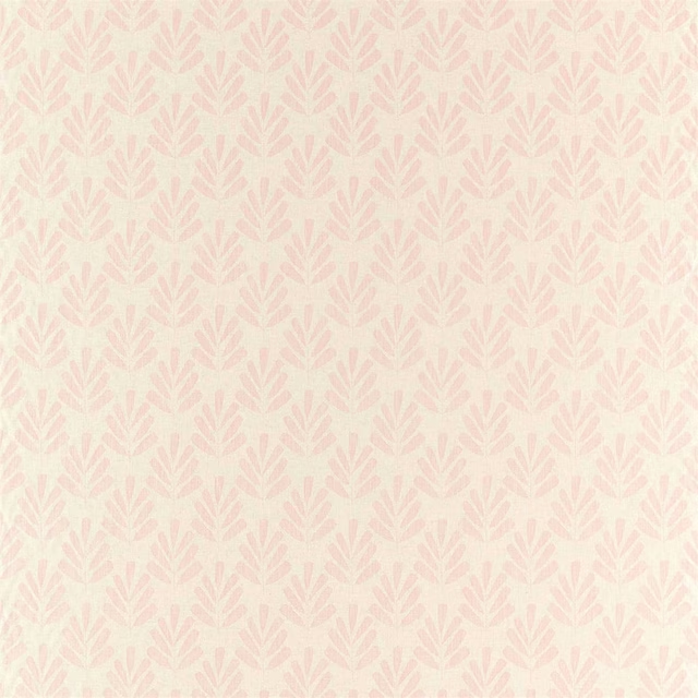
Poacea Blush
Zanzibar Weaves
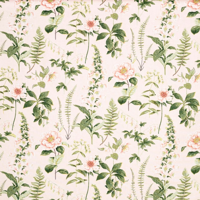
Floren 73
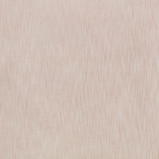
Wave Blossom
Wave
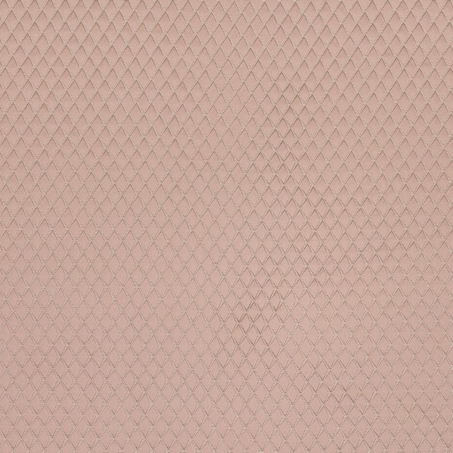
Argyle Blush
Essential Weaves Vol 2
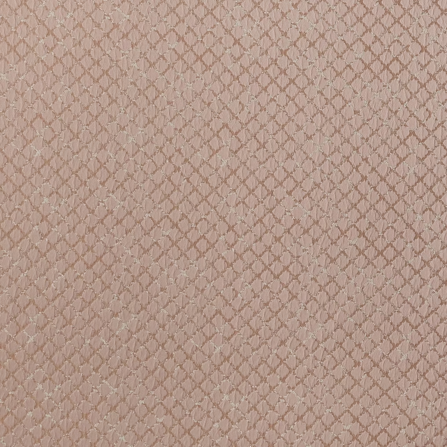
Atwood Blush
Essential Weaves Vol 2
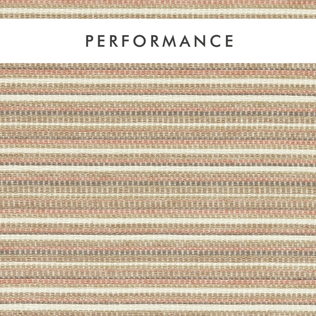
Integer Blush
Aqueous Performance
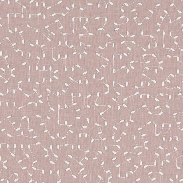
Bibury Heather
Avebury
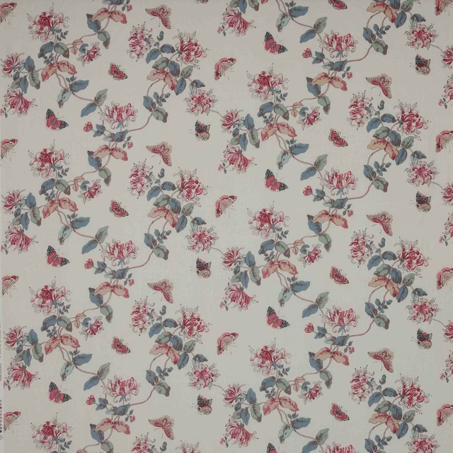
Honeysuckle Pink/Slate
Ashdown
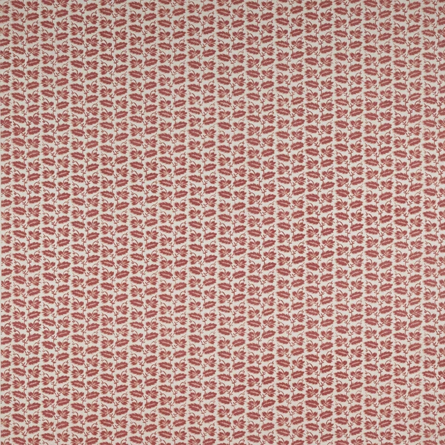
Leaf Stripe Pink
Ashmead Block Prints
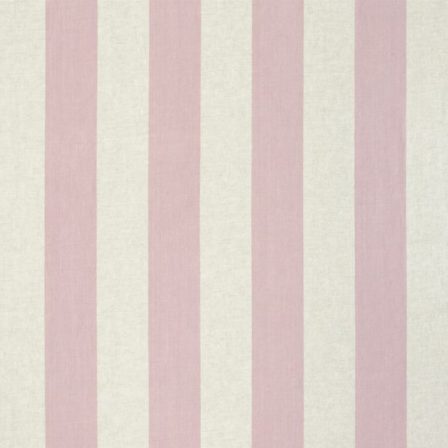
Brera Largo Blossom
Brera Rigato III Fabrics
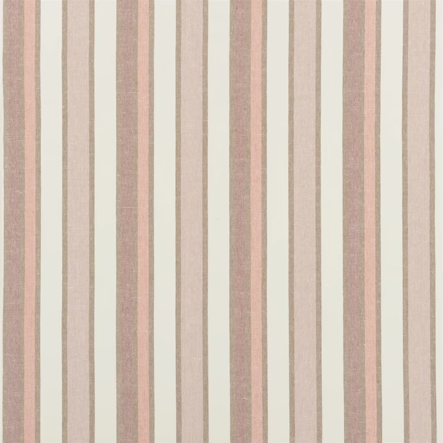
Brera Viale Quartz Rose
Brera Striato Fabrics
Paint that goes with it
Two ways to take the room. Both colours are from houses we hold, so a pot can come off the same order as the cloth. Screens shift colour, so treat these as a direction and bring the cloth to the shelf before you buy the paint.
To sit quietly behind it
Ciao, Sofia
Coat Paints · #d3beb9
To stand against it
Bengal Red
Sanderson · #95554c
Other pink fabrics
Across the houses we hold. See all 2,519.