Tap the swatch to see it full screen. Hover it to magnify the weave. Colours on a screen are a guide, not a match, so come and feel the real cloth.
Scroll up or down to zoom in and out.
Beachcomber
Primo Plus Carpet
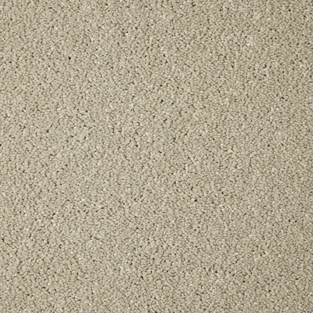
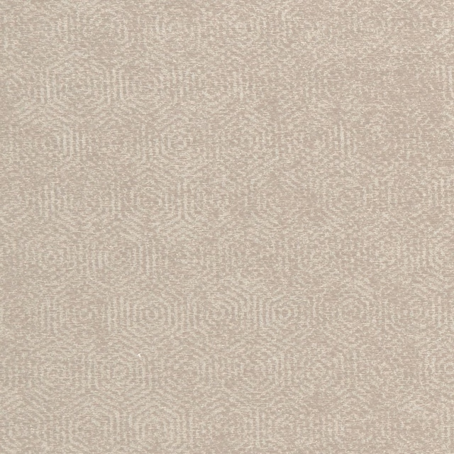
Beachcomber has a warm sandy-beige tone with a quietly mottled surface that gives the plain colour gentle depth. Its dense, even appearance reads clearly as a carpet swatch.
You have used your previews for today. Send one to Simon and you can carry on.
Your board
0 fabrics
See this carpet on Cormar's own site, then order it through us.
See Beachcomber in your own room
A photograph of the piece you want re-covered. Straight on is best, and daylight helps. It is used to make your picture and nothing else.
Looking at your room
We found things here Beachcomber could go on. Tap one on the photograph, or choose below.
We could not see anything to re-cover
, s
Beachcomber, on your
Drag to compare. AI impression, colours indicative: ask us for a cutting before you decide.
About this carpet
This Cormar Primo Plus colourway is catalogued as carpet and listed in the Easy Clean category. The surface appears closely textured and softly flecked, rather than sharply patterned, with subtle tonal variation across the sandy beige ground. Its warm, muted cast avoids a stark cream look and gives the colour a grounded, natural feel. The dense visual weight makes it better suited to upholstery-led applications than fluid drapery.
How to use it
Pair this warm sandy beige with oatmeal, ivory and natural timber for a quiet, sun-washed scheme. It can also soften deeper olive, terracotta or charcoal accents without competing with them.
Use this softly mottled sandy beige as a calm, versatile foundation for relaxed upholstery schemes.
More from Primo Plus
The same book, other colourways.

Alloy Grey
Primo Plus

Chenille
Primo Plus

Cloudy Bay
Primo Plus

Cotswold Clay
Primo Plus

Ecru
Primo Plus

French Grey
Primo Plus

Gemstone
Primo Plus

Manilla
Primo Plus

Misty Morning
Primo Plus

Muscovado
Primo Plus

Pannacotta
Primo Plus

Pumice
Primo Plus
Pairs well with
Beachcomber is a quiet cloth, so it carries a pattern beside it: one of these on the curtains and this on the chair. Mixed across the houses we hold, which is the part a single supplier's book cannot do.
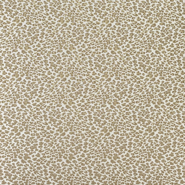
Senegal Sand
Serengeti Collection

Dart Stripe Beige
Hector

Ascot Sand
Misc
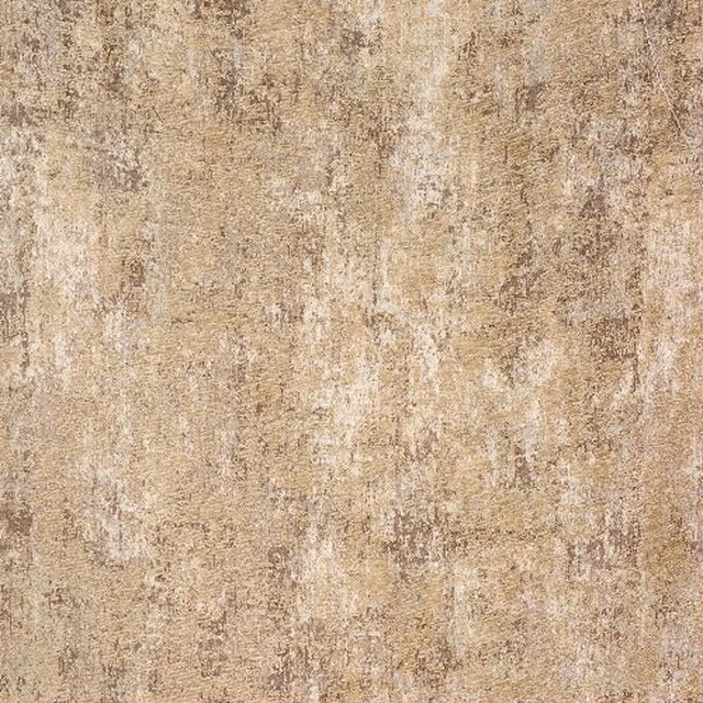
Evora natural
Other Fabrics & Weaves
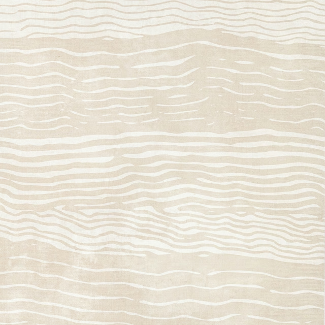
Seascape Wallcovering Natural
Duna
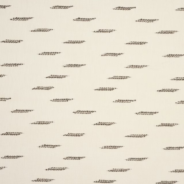
Misti Bark
Misti
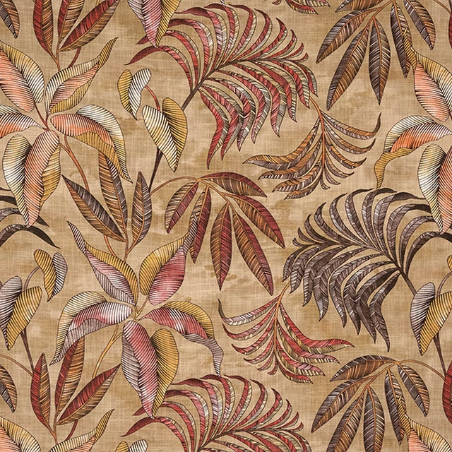
Bryony Earth
Digital Prints

Melford Squirrel
Melford Weaves
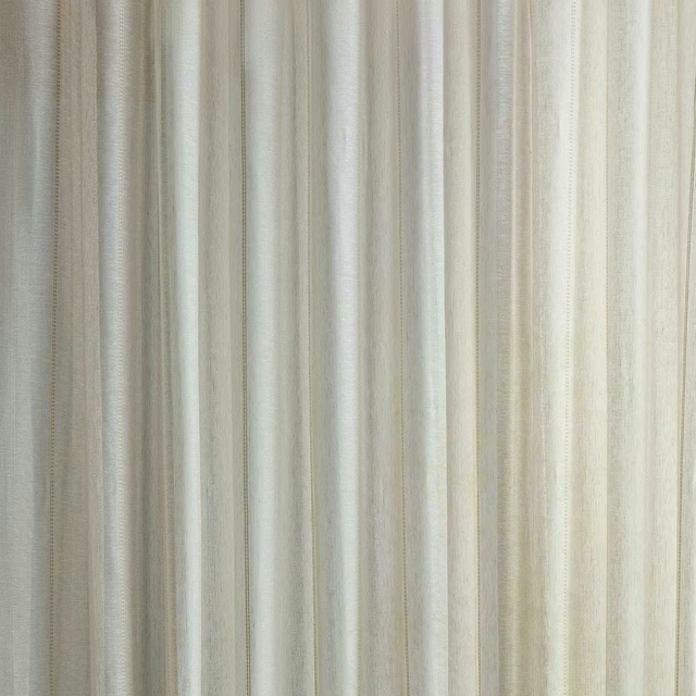
Sounding Driftwood
Sheers
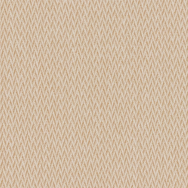
Malita
Lina Weaves Vol 1 Collection
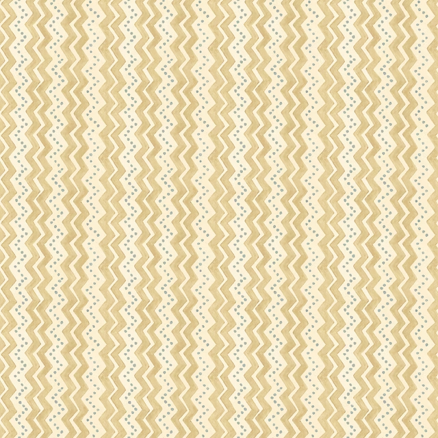
Ziggy Sand
House Small Prints II Wallpaper
Yoruba Natural
Amara
Paint that goes with it
Two ways to take the room. Both colours are from houses we hold, so a pot can come off the same order as the cloth. Screens shift colour, so treat these as a direction and bring the cloth to the shelf before you buy the paint.
To sit quietly behind it
Roman Plaster
Little Greene · #bfb08f
To stand against it
Graphite
Sanderson · #585858
Other beige fabrics
Across the houses we hold. See all 4,485.