

Tap the swatch to see it full screen. Hover it to magnify the weave. Colours on a screen are a guide, not a match, so come and feel the real cloth.
Scroll up or down to zoom in and out.
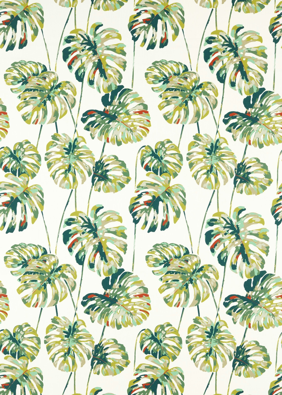
Kelapa Emerald
Indoor Outdoor Prints OutdoorHAF0445-01
Kelapa Emerald brings a lively tropical canopy to a pale ivory ground, with layered palm and split-leaf forms painted in emerald, olive, yellow-green and ochre. Small touches of terracotta add warmth within the predominantly cool green pattern.
You have used your previews for today. Send one to Simon and you can carry on.
Your board
0 fabrics
See this fabric on Harlequin's own site, then order it through us.
See Kelapa Emerald in your own room
A photograph of the piece you want re-covered. Straight on is best, and daylight helps. It is used to make your picture and nothing else.
Looking at your room
We found things here Kelapa Emerald could go on. Tap one on the photograph, or choose below.
We could not see anything to re-cover
, s
Kelapa Emerald, on your
Drag to compare. AI impression, colours indicative: ask us for a cutting before you decide.
About this fabric
The medium-scale botanical print scatters elongated palm leaves and broad tropical foliage across the light ground, creating clear depth through overlapping brush-like marks. Emerald and deep forest green provide the strongest accents, while muted olive, lime and ochre soften the overall colourway; occasional terracotta strokes keep it from feeling one-dimensional. At 220 gsm, the fabric has a versatile mid-weight suitable for both upholstery and drapery applications, including outdoor settings. Its 138.8 cm usable width and 88.5 cm vertical by 68.5 cm horizontal pattern repeat give the leafy layout a consistent rhythm when cut for cushions, blinds or curtains.
How to use it
Use Kelapa Emerald to energise a sheltered outdoor seating area or a sunroom, balancing its saturated emerald leaves with ivory upholstery, olive accents and pale timber. The warm terracotta flecks also work well with rattan and natural ochre accessories.
Use the emerald foliage on outdoor cushions, blinds or relaxed curtains, pairing it with warm ivory, olive and natural timber.
More from Indoor Outdoor Prints
The same book, other colourways.
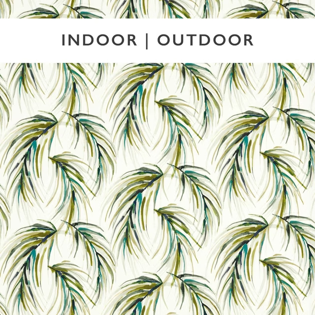
Alvaro Lime/Palm/Palm
Indoor Outdoor Prints
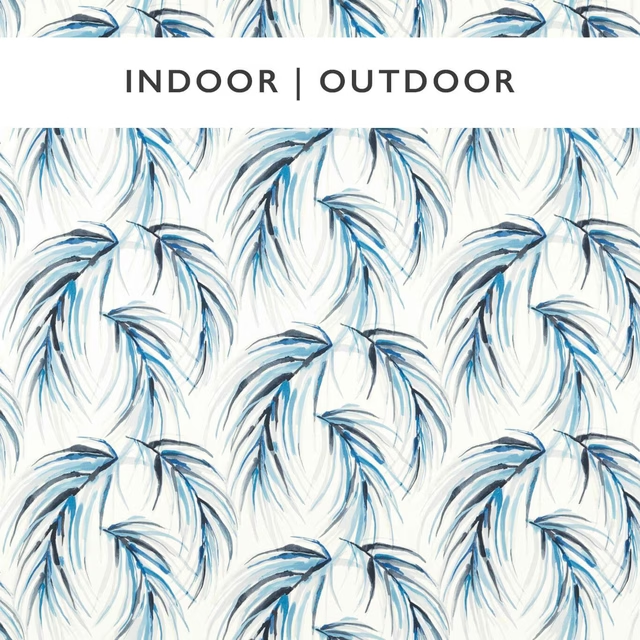
Alvaro Pebble/Sky
Indoor Outdoor Prints
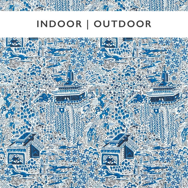
Edo Ink/Ivory
Indoor Outdoor Prints
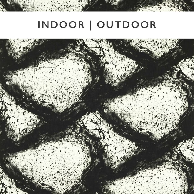
Enigmatic Black Earth/First Light
Indoor Outdoor Prints
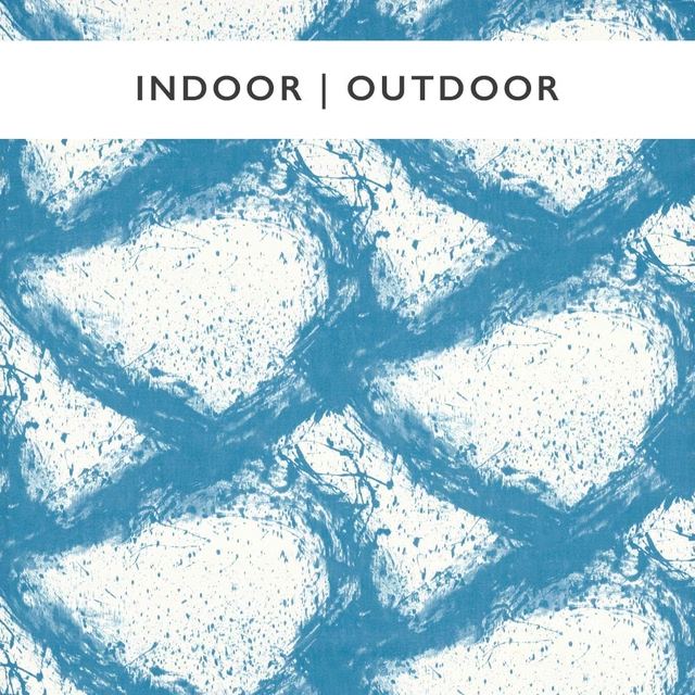
Enigmatic Sky/First Light
Indoor Outdoor Prints
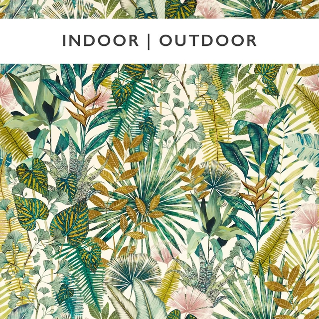
Floreana Bleached Coral/Succulent
Indoor Outdoor Prints
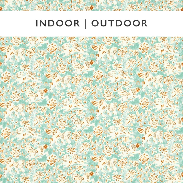
Koya Azul/Paprika
Indoor Outdoor Prints
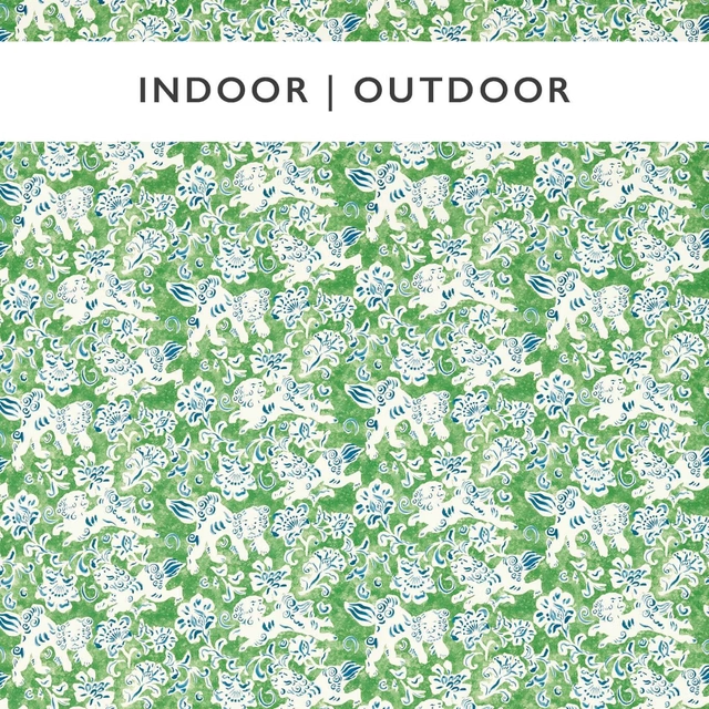
Koya Kelly/Indigo
Indoor Outdoor Prints
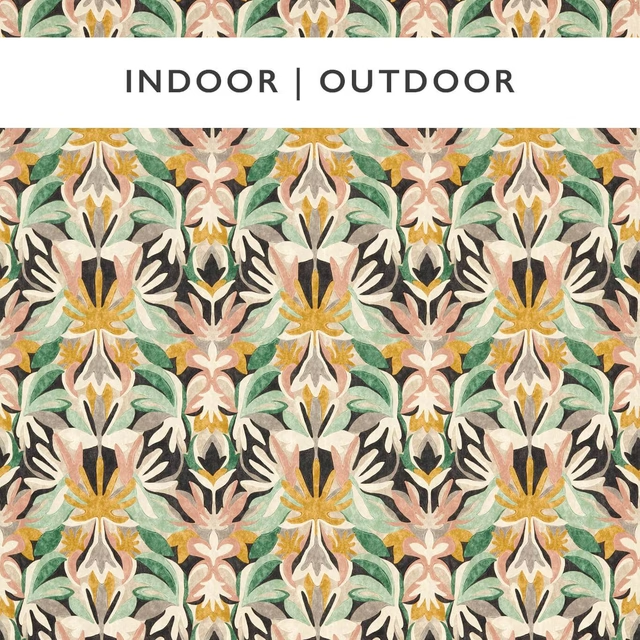
Melora Blush/Eucalyptus/Sand
Indoor Outdoor Prints
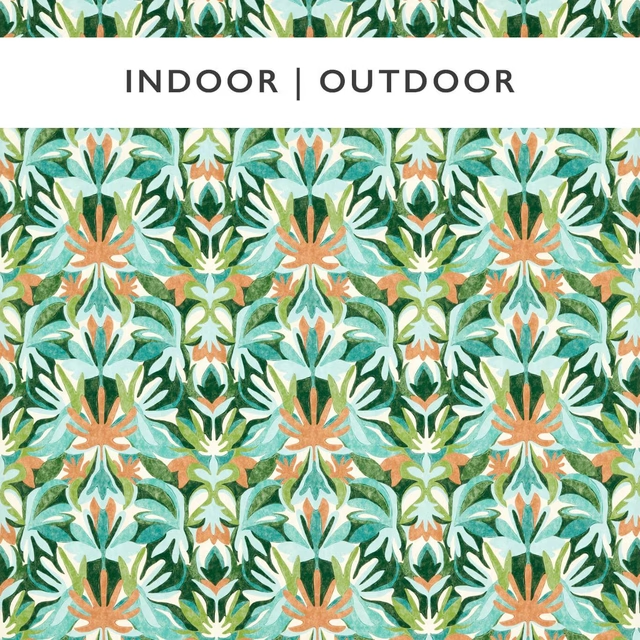
Melora Fig Leaf/Paprika/Azul
Indoor Outdoor Prints
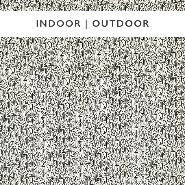
Mini Melodic Black Earth/Origami
Indoor Outdoor Prints
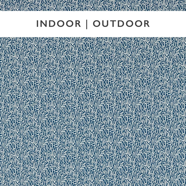
Mini Melodic Indigo/Origami
Indoor Outdoor Prints
Pairs well with
A pattern needs somewhere for the eye to rest, so these are the plains and textures that sit beside Kelapa Emerald without fighting it. Mixed across the houses we hold, which is the part a single supplier's book cannot do.

Pacific Dove
Atlantic Collection
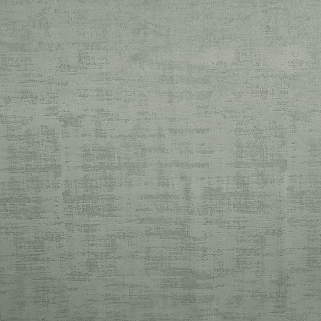
Dakota Willow
Dakota Collection
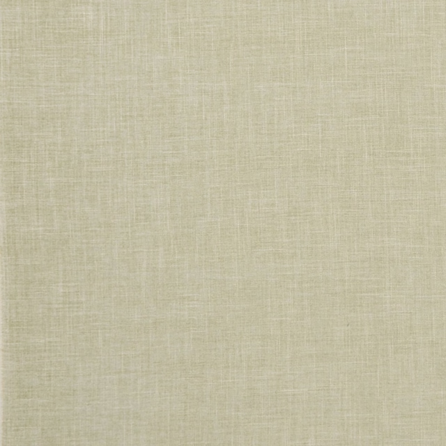
Albany Sage
Albany and Moray
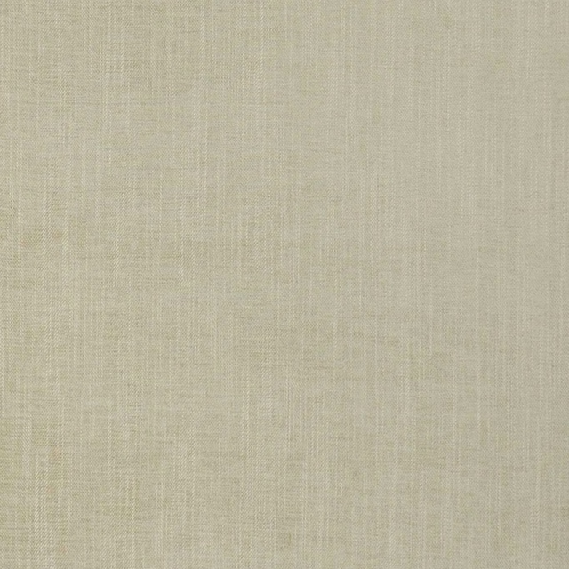
Moray Sage
Albany and Moray

Brandon Celadon
Albeck
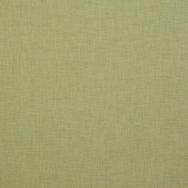
Appledore Green
Appledore
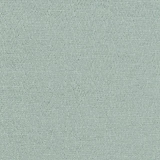
Anshu Sky
Anshu Fabrics
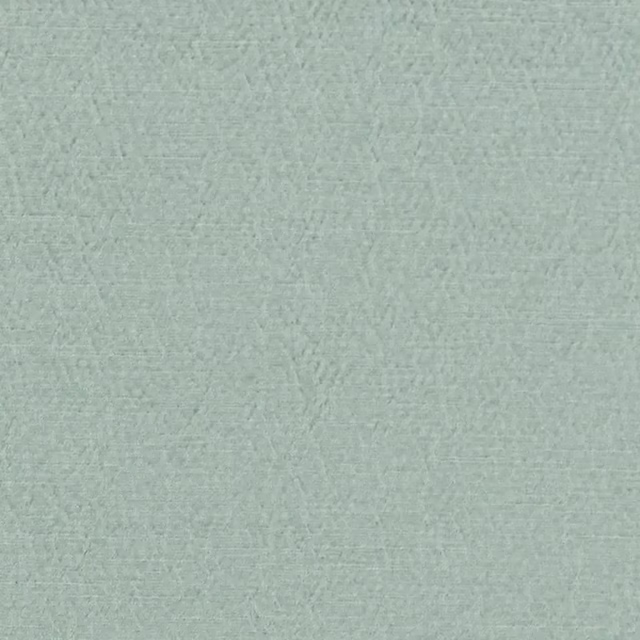
Anshu Alta Sky
Anshu Fabrics
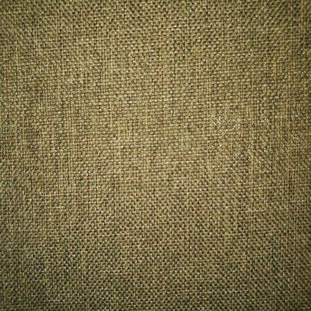
Arran FR Sage
Alderney
Monza Pampas
Arezzo
Amalfi Sage Green
Amalfi
Bohemian Atmosphere
Bohemian
Paint that goes with it
Two ways to take the room. Both colours are from houses we hold, so a pot can come off the same order as the cloth. Screens shift colour, so treat these as a direction and bring the cloth to the shelf before you buy the paint.
To sit quietly behind it
Tabernacle
Little Greene · #bed3bb
To stand against it
Double Boughs
Morris & Co. · #4b754d
Other green fabrics
Across the houses we hold. See all 4,855.

Pepita Stripe Kelly/First Light
Idyllic Fabrics
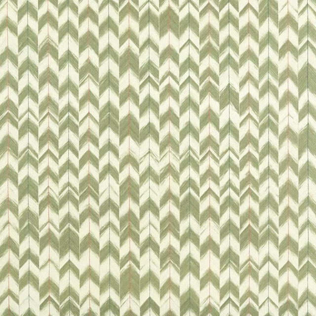
Suisai Moss/Positano/First Light
Idyllic Fabrics

Tree Tops Forest/Kelly/Aqua
Idyllic Fabrics
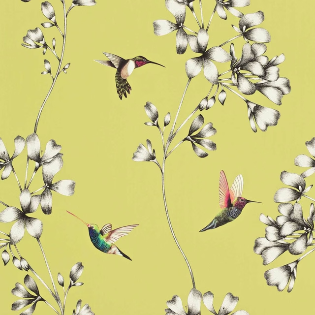
Amazilia Wide Width Gooseberry
Idyllic Wallcoverings
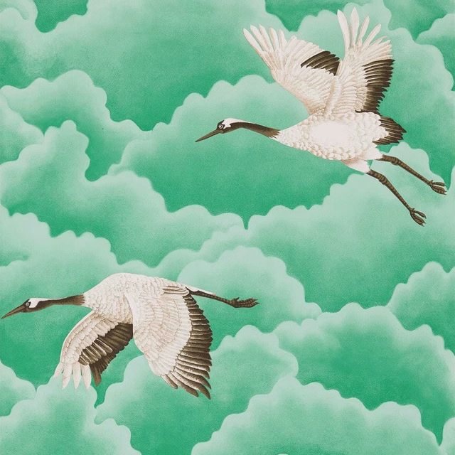
Cranes In Flight Wide Width Emerald
Idyllic Wallcoverings
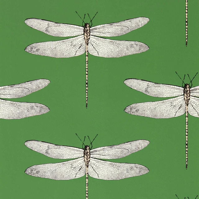
Demoiselle Kelly/First Light/Blush
Idyllic Wallcoverings
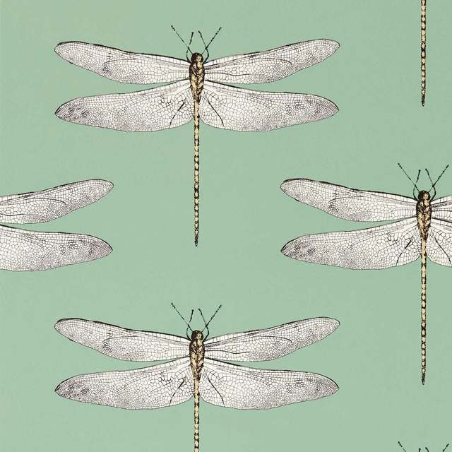
Demoiselle Seaglass/First Light/Sand
Idyllic Wallcoverings
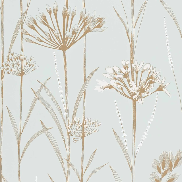
Gardinum Seafoam/Gold/Gold
Idyllic Wallcoverings
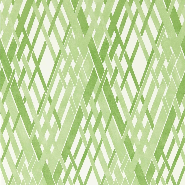
Locronan Wide Width Clover/First Light
Idyllic Wallcoverings
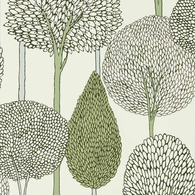
Silhouette Seaglass/Forest
Idyllic Wallcoverings
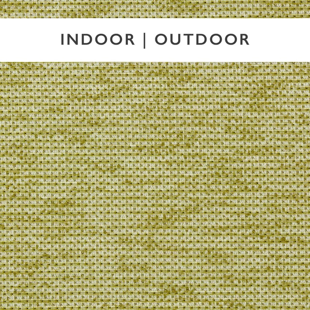
Aelius Grass/Ivory
Indoor Outdoor Weaves
Nalani Grass/Chalk
Indoor Outdoor Weaves II