Tap the swatch to see it larger. Hover it to magnify the weave. Colours on a screen are a guide, not a match, so come and feel the real cloth.
Scroll up or down to zoom in and out.
Ivory
Kasia Carpet
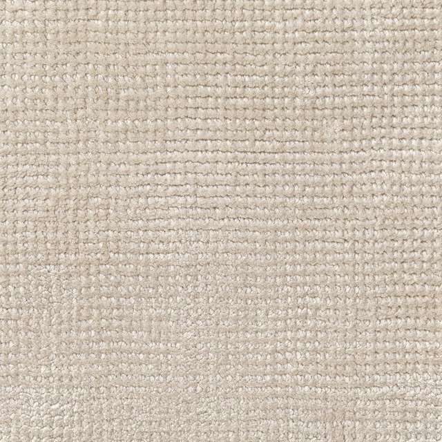
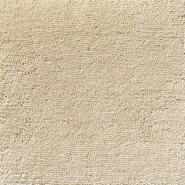
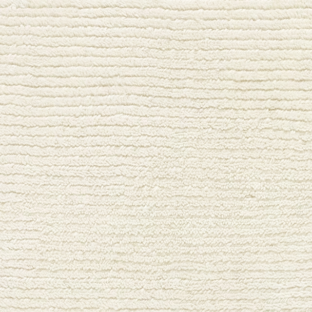
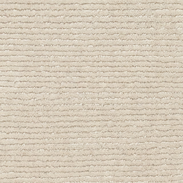
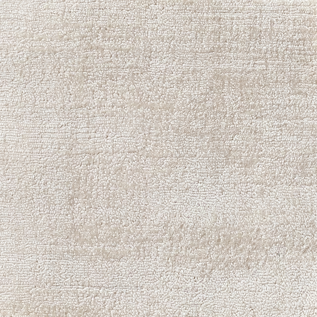
Kasia in Ivory has a warm, lightly shaded appearance, with a softly textured surface that gives the pale colour subtle depth. The close-up view shows an understated, almost plain finish rather than a defined motif.
Your board
0 fabrics
See this fabric on Jacaranda's own site, then order it through us.
About this fabric
Catalogued as a Carpet, Kasia in Ivory presents a warm ivory-beige tone with faint tonal movement across the surface. Its fine, close-grained texture is visible throughout the swatch, while the gently uneven shading keeps the colour from appearing flat. The pale face catches the light softly, creating a calm, tactile look with no strong pattern or contrast.
How to use it
Use this warm ivory colourway to soften upholstered seating, headboards or occasional pieces in rooms built around natural creams, pale timber and muted beige tones. Its quiet surface also works well where a tactile finish is wanted without introducing a visible motif.
Its warm ivory tone and softly textured surface bring a calm, tactile finish to upholstered pieces.
More from Kasia
The same book, other colourways.

Shell
Kasia

Snow
Kasia

Platinum
Kasia

Ash
Kasia
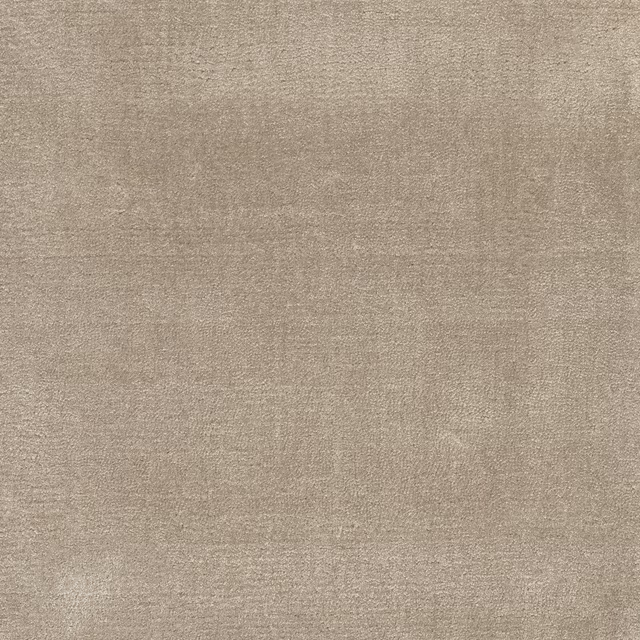
Quartzite
Kasia

Walrus
Kasia

Koala
Kasia

Sturgeon
Kasia
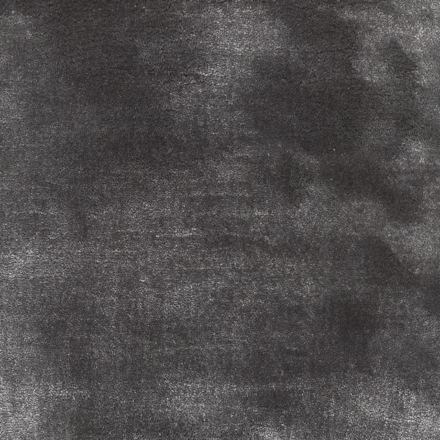
Basalt
Kasia
Pairs well with
Ivory is a quiet cloth, so it carries a pattern beside it: one of these on the curtains and this on the chair. Mixed across the houses we hold, which is the part a single supplier's book cannot do.

Avenza Linen
Mezzola Bellusco Fabrics
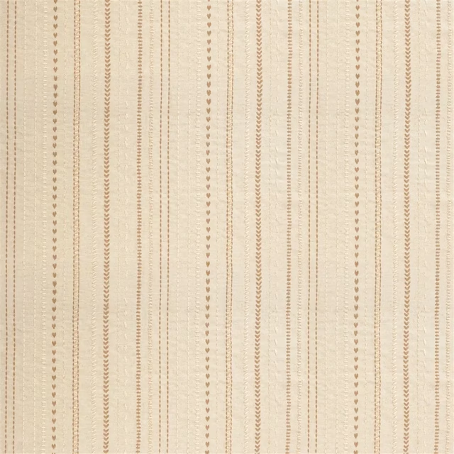
Panier Tresse Linen
Palette Provençale Fabrics & Wallpaper
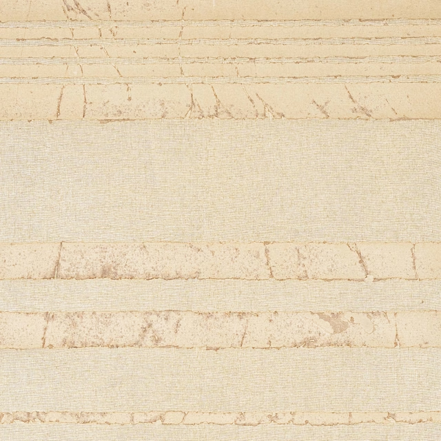
Pinene Wallcovering Natural
Duna
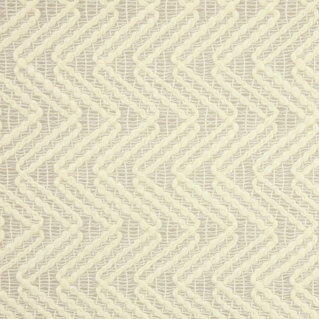
Chary Cream
Tana

Sea Bird Sheer Stripe Sand
Signature Half Moon Bay Fabrics

Bird Feet Driftwood
Sanderson Home Fabrics
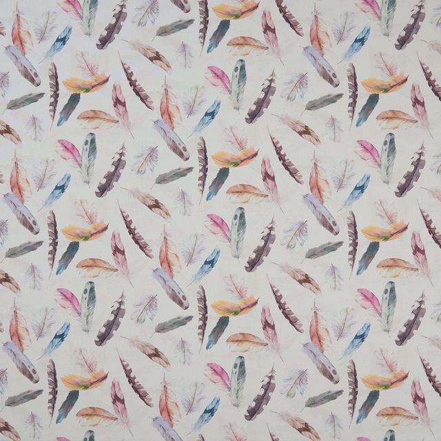
Feather PVC Cream
Country Garden
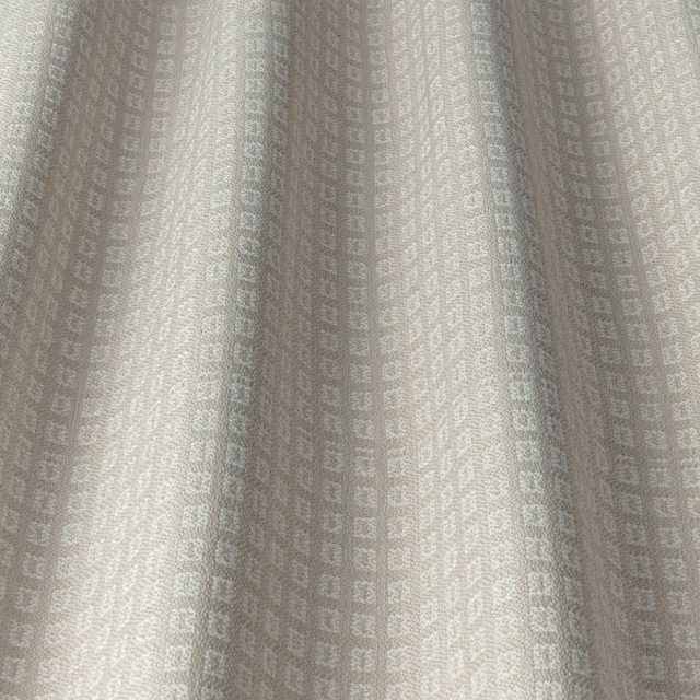
CALI Ivory 2
Nalina
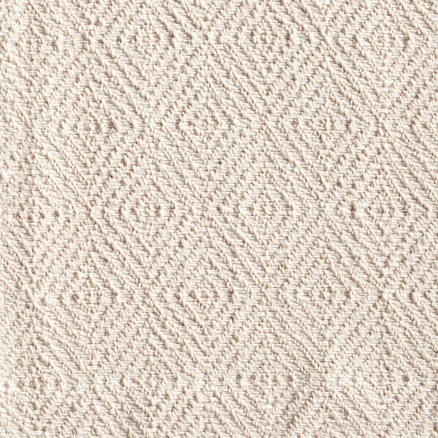
Calobra Jasmine
Weave
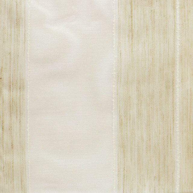
Keira 01
Sheer
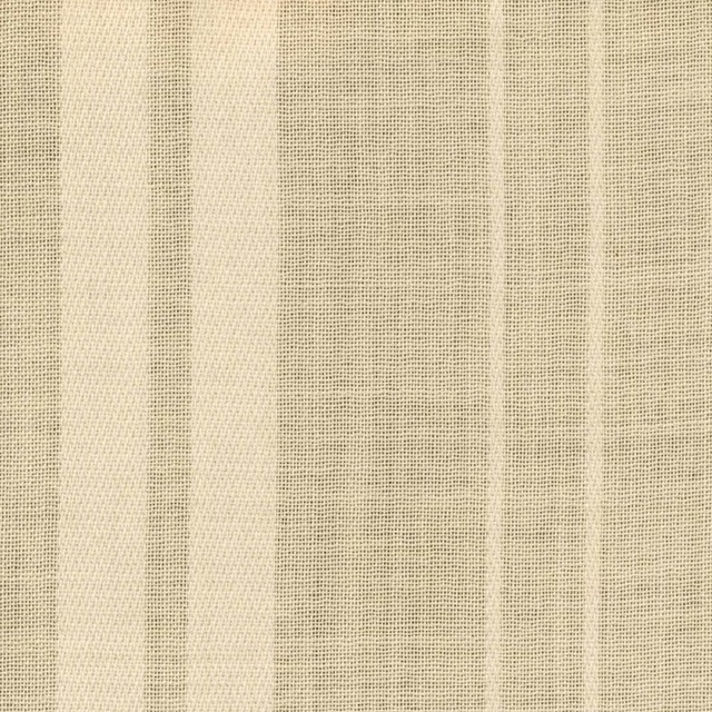
Viento Ivory
Sencillo Sheers

1464/KD01
Misc
Paint that goes with it
Two ways to take the room. Both colours are from houses we hold, so a pot can come off the same order as the cloth. Screens shift colour, so treat these as a direction and bring the cloth to the shelf before you buy the paint.
To sit quietly behind it
Broncho
Sanderson · #c8ba9d
To stand against it
Etruscan Red
Farrow & Ball · #7f5348
Other cream fabrics
Across the houses we hold. See all 5,411.