
Tap the swatch to see it full screen. Hover it to magnify the weave. Colours on a screen are a guide, not a match, so come and feel the real cloth.
Scroll up or down to zoom in and out.
06 Burnt Sugar
Cara Fabric06
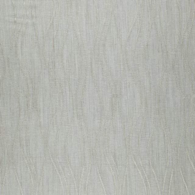
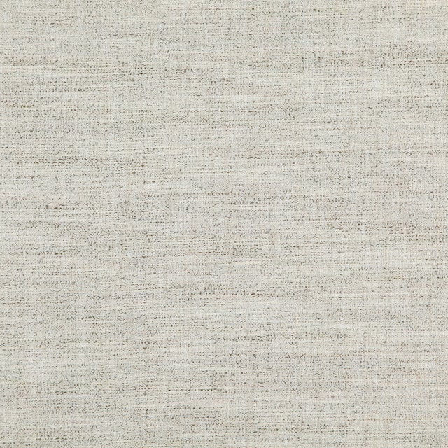
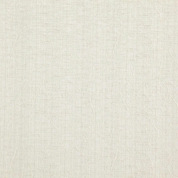
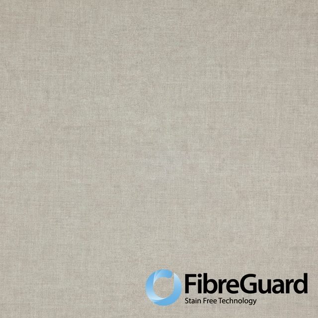
Cara 06 Burnt Sugar has a pale, warm greige appearance with a softly irregular woven surface. Its understated colour and fine texture give the cloth a calm, natural character.
You have used your previews for today. Send one to Simon and you can carry on.
Your board
0 fabrics
See this fabric on Wemyss's own site, then order it through us.
See 06 Burnt Sugar in your own room
A photograph of the piece you want re-covered. Straight on is best, and daylight helps. It is used to make your picture and nothing else.
Looking at your room
We found things here 06 Burnt Sugar could go on. Tap one on the photograph, or choose below.
We could not see anything to re-cover
, s
06 Burnt Sugar, on your
Drag to compare. AI impression, colours indicative: ask us for a cutting before you decide.
About this fabric
The close-up shows a finely woven textile with a subtle crosshatch effect rather than a printed motif. Pale beige, soft grey and warmer taupe threads combine to create the gently mottled Burnt Sugar tone, with the texture adding quiet depth as the light moves across it. No performance features are noted for this fabric, so its visual appeal rests on its restrained colour and tactile-looking weave.
How to use it
Use this warm greige colourway to bring a light, textural finish to upholstered seating or relaxed window treatments. It pairs naturally with warm white, stone, pale timber and muted taupe tones.
A softly textured neutral for understated upholstery, curtains and relaxed layered schemes.
More from Cara
The same book, other colourways.
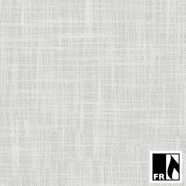
01 Feather
Cara
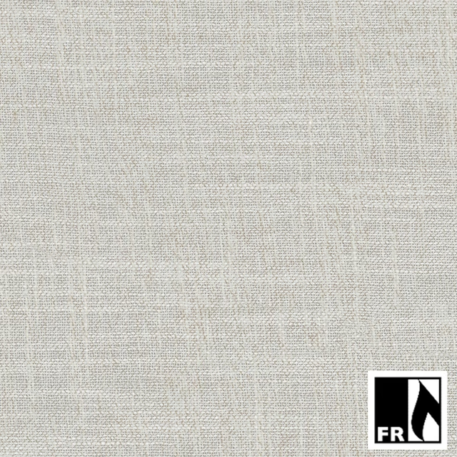
02 Oat
Cara
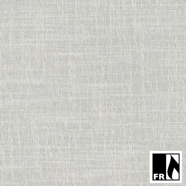
03 Stone
Cara
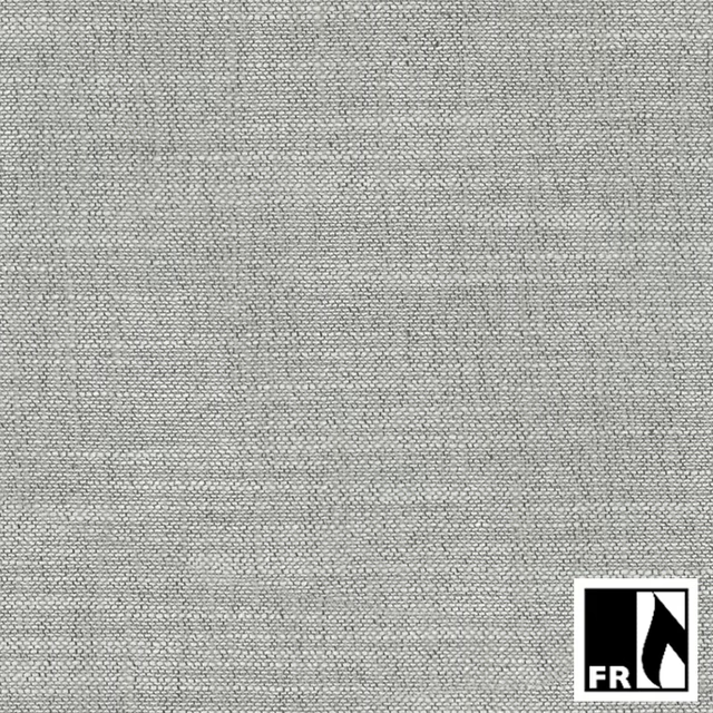
04 Granite
Cara
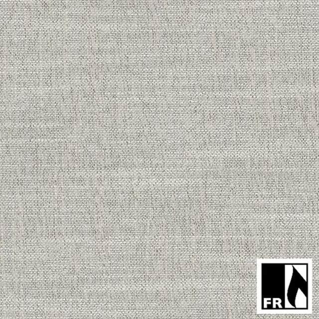
09 Mushroom
Cara
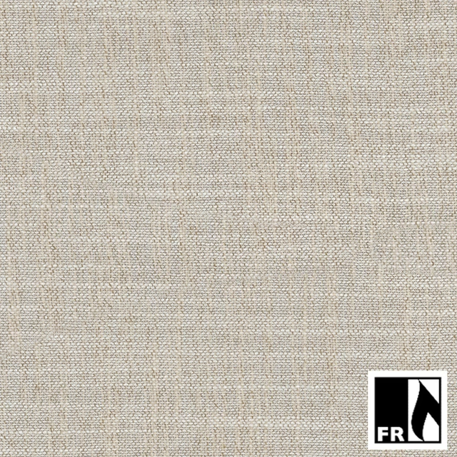
12 Coconut
Cara
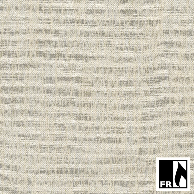
14 Bamboo
Cara
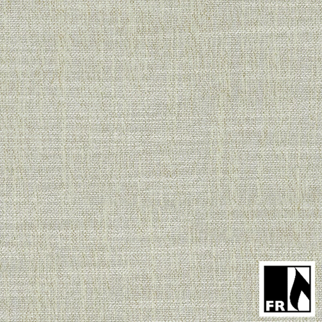
16 Lime Sorbet
Cara
17 Seasage
Cara
18 Lagoon
Cara
19 Bondi
Cara
20 Steel Blue
Cara
Pairs well with
06 Burnt Sugar is a quiet cloth, so it carries a pattern beside it: one of these on the curtains and this on the chair. Mixed across the houses we hold, which is the part a single supplier's book cannot do.
Silvi Clouds Cloud
Elysian Wallpapers

Bonomo Spacedust
Pantelleria Plains
Otoko Pampas
Nuala
Beckett Danube
Belvoir Collection
Kielder Natural Natural
Belvoir Collection
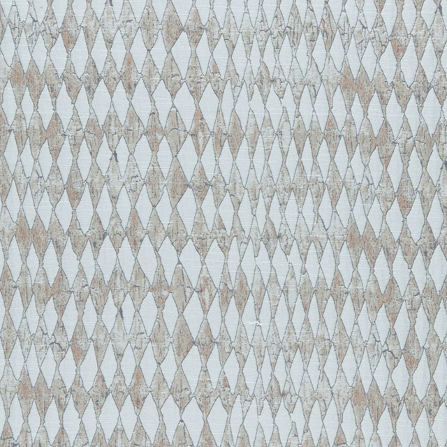
Amara Natural
Amara
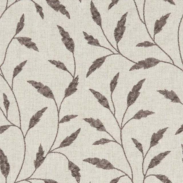
Fairford Charcoal
Avebury
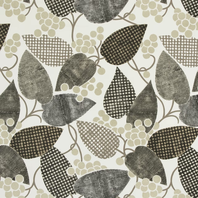
Barcelona Ecru
Barcelona Fabrics
Carlu Nickel
Carlu WALLPAPER
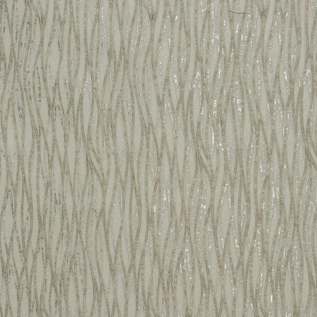
Linear Natural
Acacia
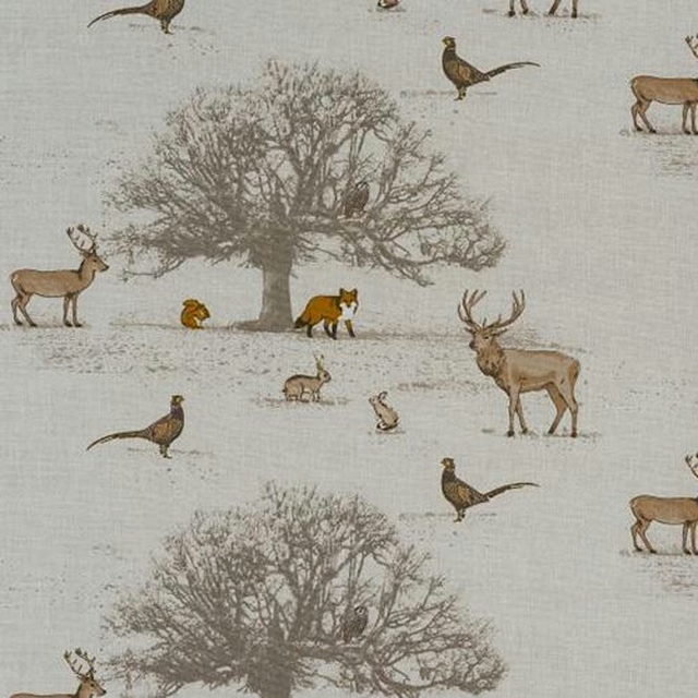
Tatton Autumn
Animal Kingdom
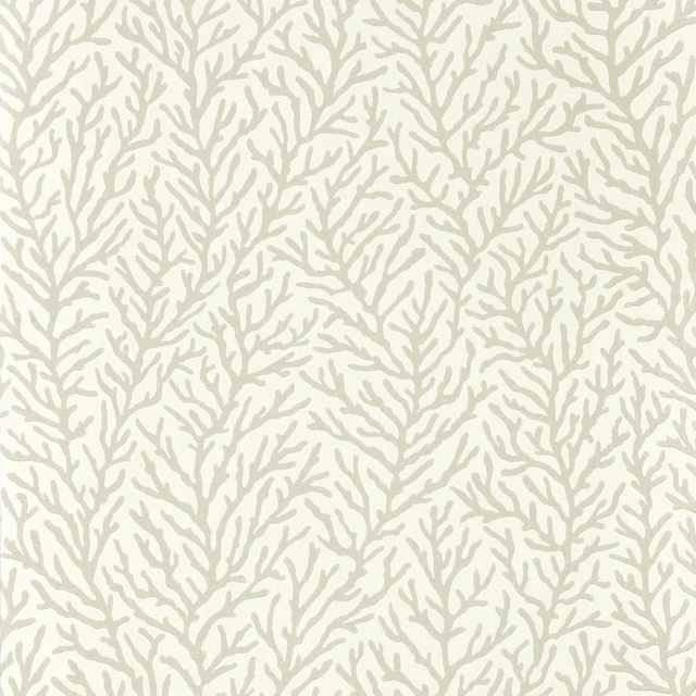
Atoll Awakening/Diffused Light
Colour 1 Wallpapers
Paint that goes with it
Two ways to take the room. Both colours are from houses we hold, so a pot can come off the same order as the cloth. Screens shift colour, so treat these as a direction and bring the cloth to the shelf before you buy the paint.
To sit quietly behind it
Owlswick
Sanderson · #bfbbb2
To stand against it
Velvet Blue
Zoffany · #526176
Other neutral fabrics
Across the houses we hold. See all 911.