
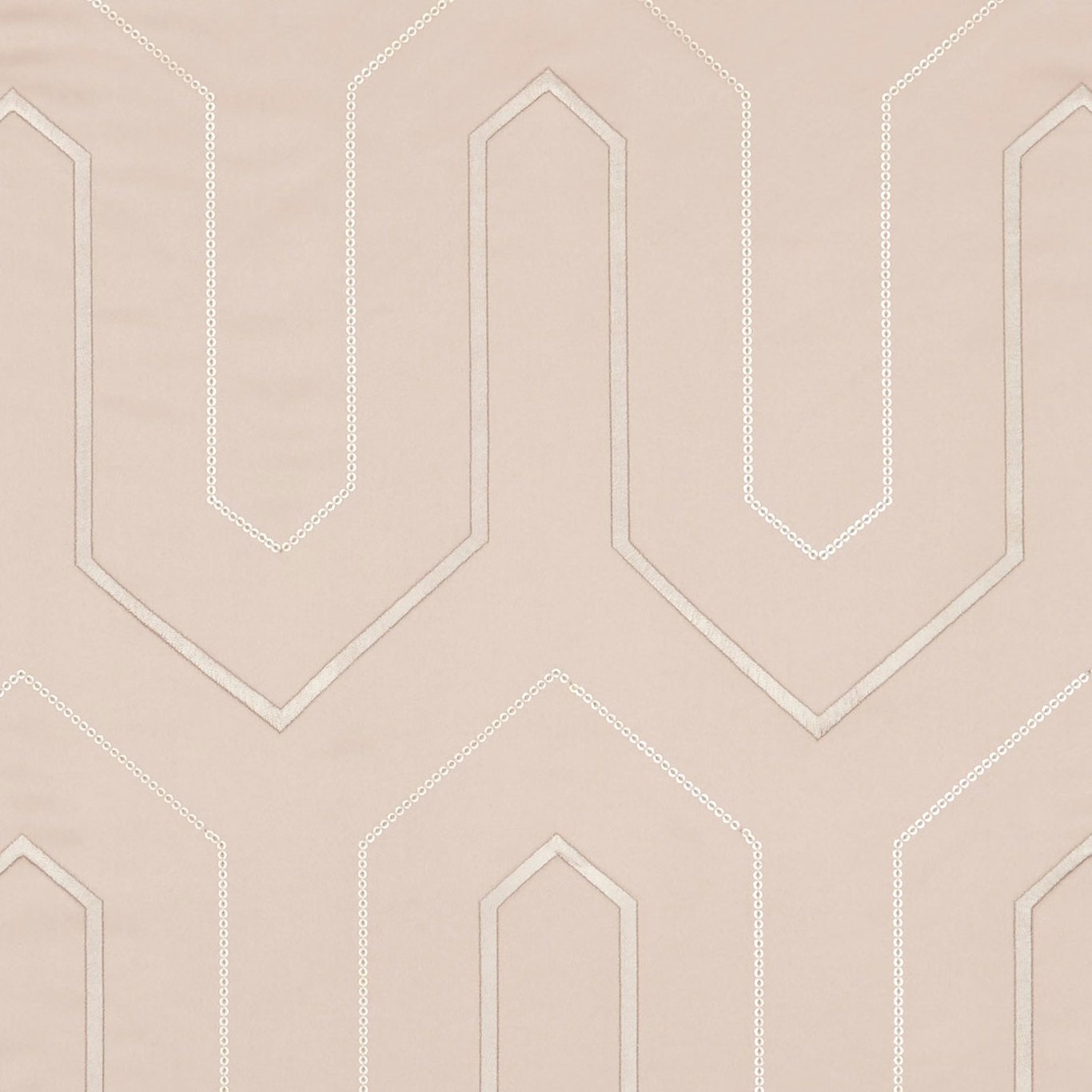

Tap the swatch to see it full screen. Hover it to magnify the weave. Colours on a screen are a guide, not a match, so come and feel the real cloth.
Scroll up or down to zoom in and out.
Gatsby Blush
Lusso FabricCCF0211-01
Gatsby Blush is a warm, muted pink textile with a softly tonal geometric design. Pale ivory lines trace elongated, stepped arch shapes across the blush ground, while the subtle surface variation keeps the colour from appearing flat.
You have used your previews for today. Send one to Simon and you can carry on.
Your board
0 fabrics
Part of the range we hold from Clarke & Clarke.
See Gatsby Blush in your own room
A photograph of the piece you want re-covered. Straight on is best, and daylight helps. It is used to make your picture and nothing else.
Looking at your room
We found things here Gatsby Blush could go on. Tap one on the photograph, or choose below.
We could not see anything to re-cover
, s
Gatsby Blush, on your
Drag to compare. AI impression, colours indicative: ask us for a cutting before you decide.
About this fabric
The pattern combines solid pale outline bands with finer dotted edging, creating a crisp architectural rhythm without a high-contrast effect. Its dusty blush tone reads gentle and warm, with the pale detailing catching the light more softly than a bright white would. At 199 gsm, the fabric has a versatile mid-weight presence suited to both upholstery and drapery. The 137 cm usable width is accompanied by a 23.5 cm vertical repeat and a 16.3 cm horizontal repeat, allowing the repeating geometry to be planned accurately across a project.
How to use it
Pair Gatsby Blush with warm ivory, chalky taupe or light timber to emphasise its softly romantic tone, or use it on a tailored chair where the pale architectural lines can be clearly seen. Its 137 cm width also makes it practical for coordinated curtains and cushions.
Use the warm blush ground and pale outlined geometry to bring a soft, tailored finish to upholstered seating, cushions or relaxed curtains.
More from Lusso
The same book, other colourways.
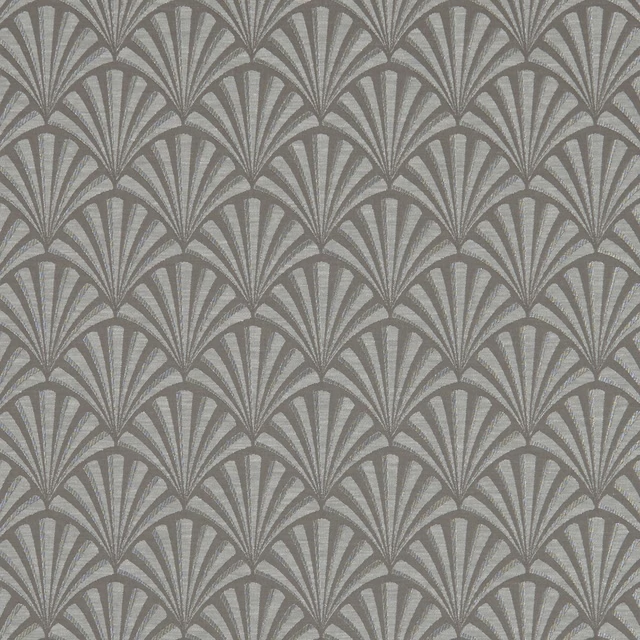
Chrysler Charcoal
Lusso
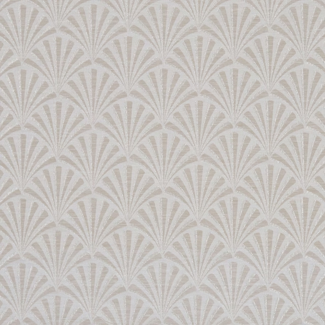
Chrysler Ivory
Lusso
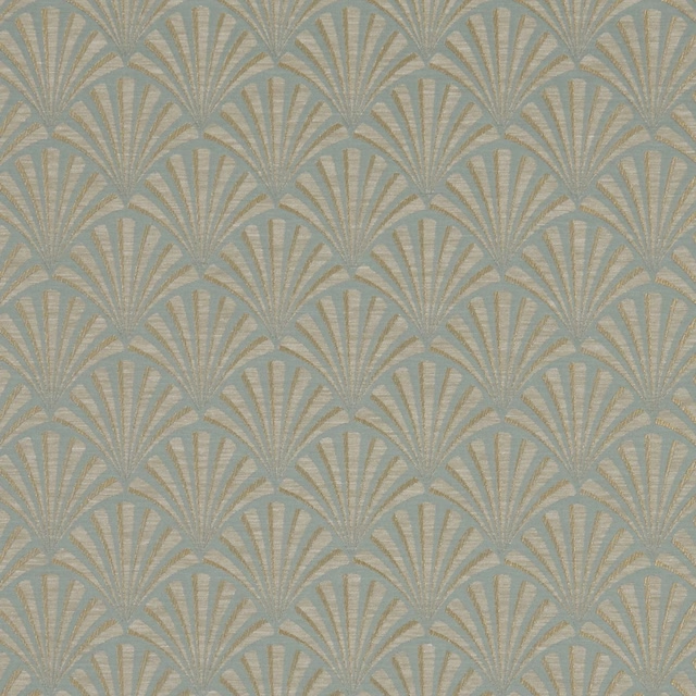
Chrysler Mineral
Lusso
Chrysler Mocha
Lusso
Chrysler Pebble
Lusso
Chrysler Rose Gold
Lusso
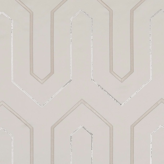
Gatsby Champagne
Lusso
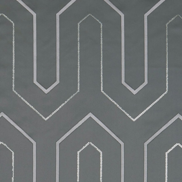
Gatsby Charcoal
Lusso
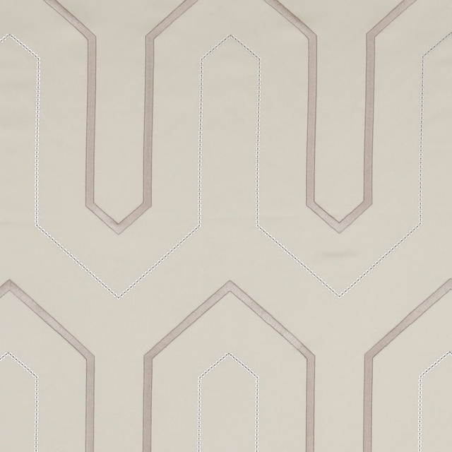
Gatsby Ivory
Lusso
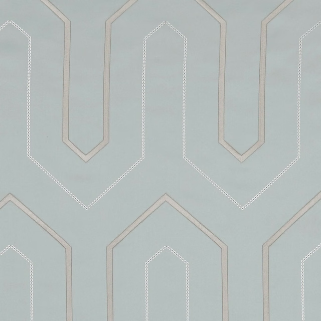
Gatsby Mineral
Lusso
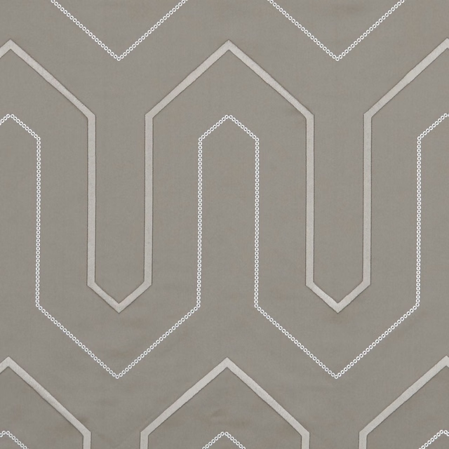
Gatsby Mocha
Lusso
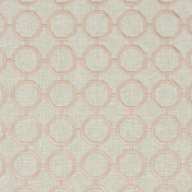
Glamour Blush
Lusso
Pairs well with
A pattern needs somewhere for the eye to rest, so these are the plains and textures that sit beside Gatsby Blush without fighting it. Mixed across the houses we hold, which is the part a single supplier's book cannot do.
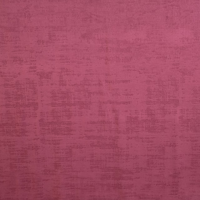
Dakota Berry
Dakota Collection
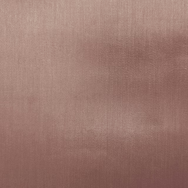
Galaxy Blush
Galaxy Collection
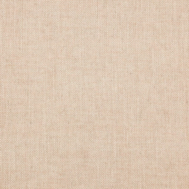
Marldon Pink
Albeck
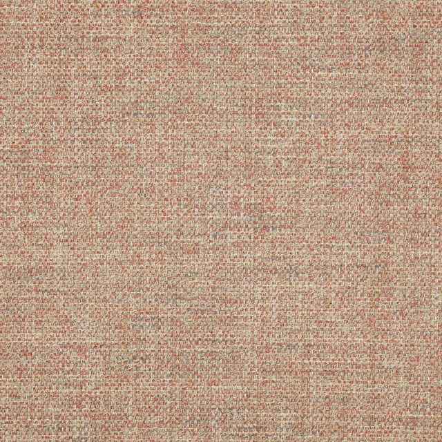
Foley Pink
Brett Weaves
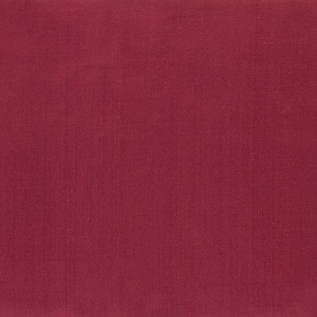
Amboise Crhysantemum
Amboise
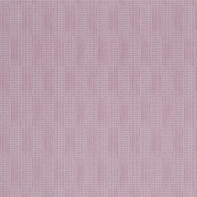
Reverdy Magenta
Carlu WALLPAPER
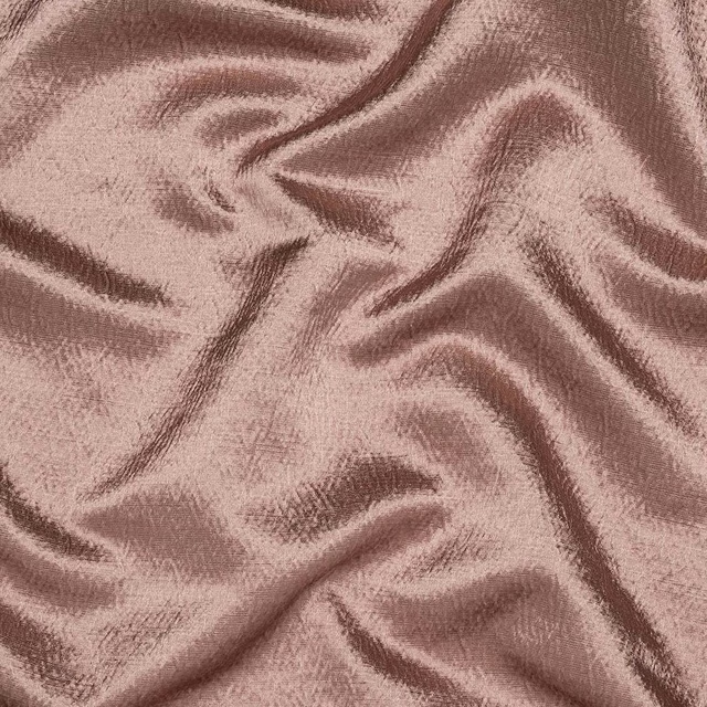
Alchemy Dusky Pink
Alchemy
Kensington Antique Rose
Brodsworth
Allegra Peony
Allegra
Allegra Postiano
Allegra

Amalfi Lilac
Amalfi
Amalfi Pink
Amalfi
Paint that goes with it
Two ways to take the room. Both colours are from houses we hold, so a pot can come off the same order as the cloth. Screens shift colour, so treat these as a direction and bring the cloth to the shelf before you buy the paint.
To sit quietly behind it
Latte
Zoffany · #dcccbf
To stand against it
Galette
Little Greene · #957246
Other pink fabrics
Across the houses we hold. See all 2,519.
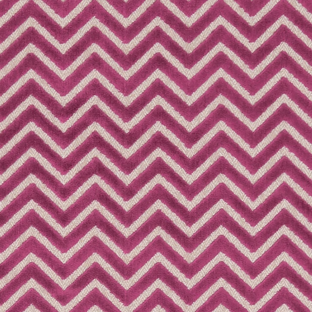
Prisma Fuchsia
Kaleidoscope
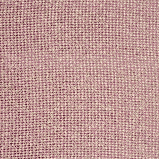
Beauvoir Orchid
Latour
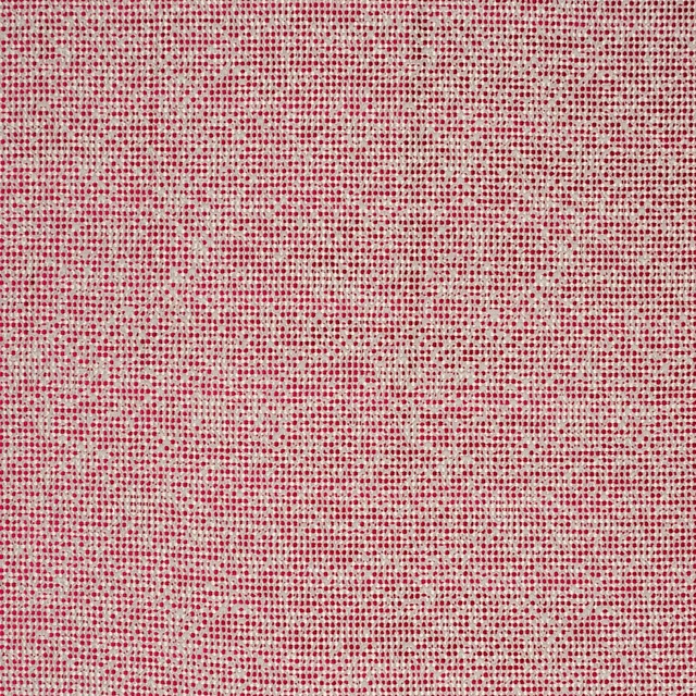
Beauvoir Passion
Latour
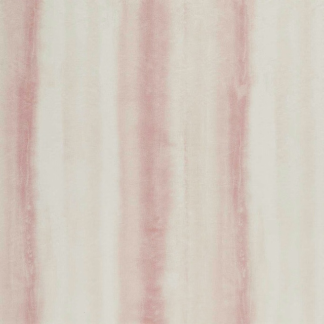
Diano Blush
Levanto Sheers Fabric
Rapello Blush
Levanto Sheers Fabric
Remo Blush
Levanto Sheers Fabric
Lavico Blush
Lusso Wallpaper
Tribeca Orchid
Manhattan
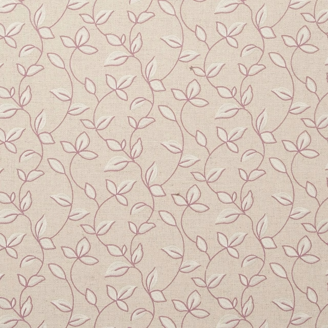
Chartwell Orchid
Manor House
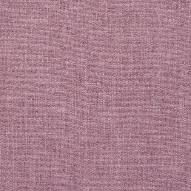
Easton Orchid
Manor House
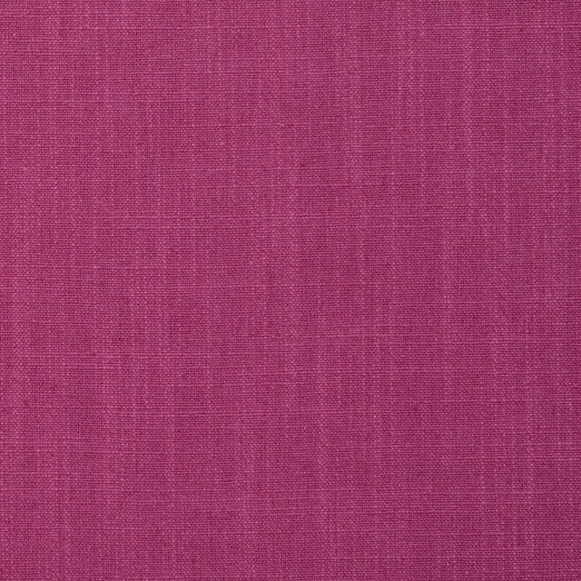
Easton Raspberry
Manor House
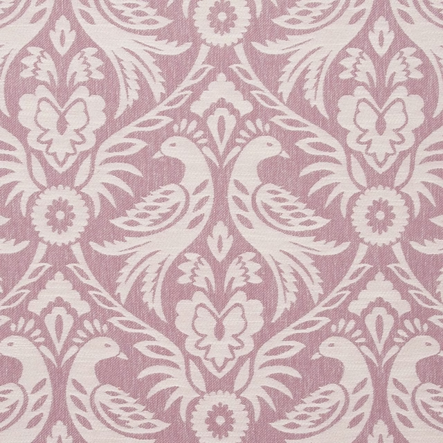
Harewood Orchid
Manor House