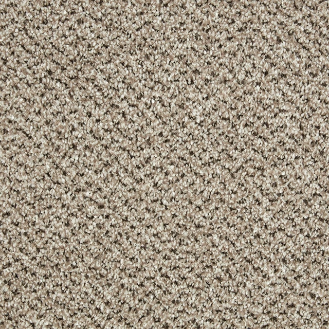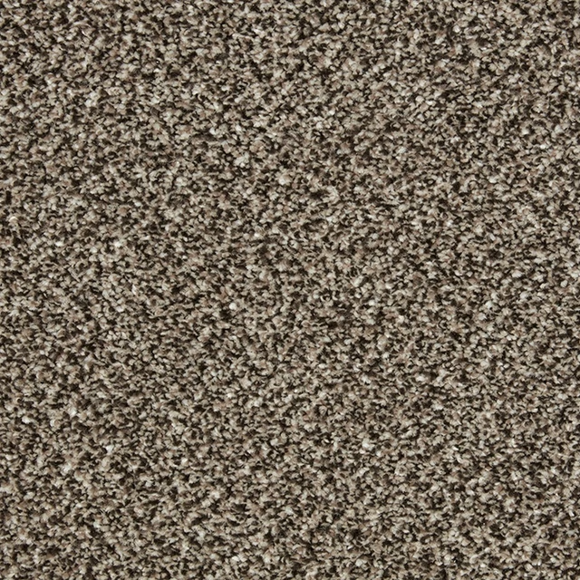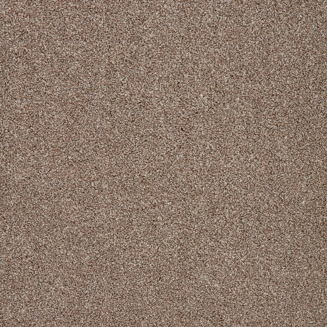
Tap the swatch to see it full screen. Hover it to magnify the weave. Colours on a screen are a guide, not a match, so come and feel the real cloth.
Scroll up or down to zoom in and out.
Cotswold Clay
Primo Ultra Carpet
Cotswold Clay settles into a warm taupe-beige tone with a subtle clay cast. Its close-up surface is softly mottled, combining fine pale flecks with slightly deeper threads for quiet visual depth.
You have used your previews for today. Send one to Simon and you can carry on.
Your board
0 fabrics
See this carpet on Cormar's own site, then order it through us.
See Cotswold Clay in your own room
A photograph of the piece you want re-covered. Straight on is best, and daylight helps. It is used to make your picture and nothing else.
Looking at your room
We found things here Cotswold Clay could go on. Tap one on the photograph, or choose below.
We could not see anything to re-cover
, s
Cotswold Clay, on your
Drag to compare. AI impression, colours indicative: ask us for a cutting before you decide.
About this carpet
The close-up shows a muted, warm taupe carpet surface rather than a cool grey, with a softly flecked texture that keeps the colour gently varied. Fine light and darker marks are dispersed across the ground, creating understated movement without a visible motif. The supplied category for this carpet is Easy Clean, adding a practical specification to its tactile, neutral appearance.
How to use it
Use Cotswold Clay to bring warmth to a room built around creamy whites, natural wood and soft stone tones; its clay-taupe depth will sit comfortably beneath more textured furnishings.
A warm, softly flecked taupe-beige that brings gentle depth to practical interiors.
More from Primo Ultra
The same book, other colourways.

Alloy Grey
Primo Ultra

Argent
Primo Ultra

Beaver
Primo Ultra

Cloudy Bay
Primo Ultra

Doeskin
Primo Ultra

Ecru
Primo Ultra
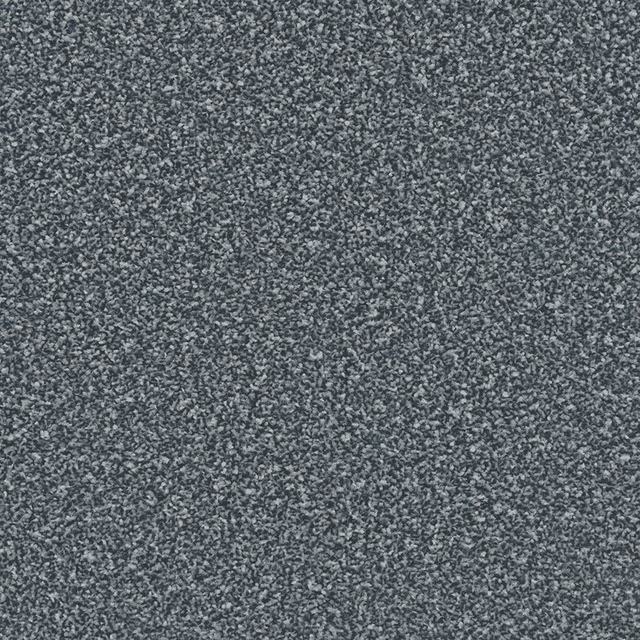
Eucalyptus
Primo Ultra
Fern
Primo Ultra
Foxton Flax
Primo Ultra

French Grey
Primo Ultra

Gemstone
Primo Ultra

Nougat
Primo Ultra
Pairs well with
Cotswold Clay is a quiet cloth, so it carries a pattern beside it: one of these on the curtains and this on the chair. Mixed across the houses we hold, which is the part a single supplier's book cannot do.
Sontuoso Mink
Dimora
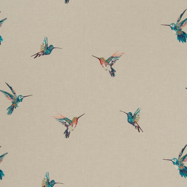
Woodstar Tropical
Exotica
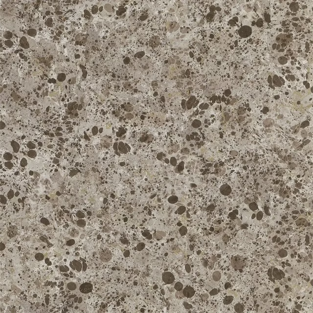
Lustro Tbc
Majolica Wallpaper
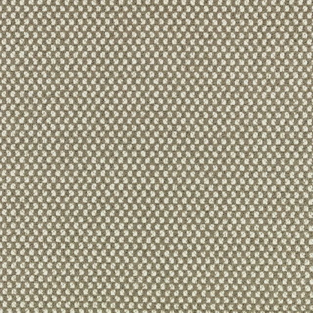
Okan Outdoor Stucco
Xandri Outdoor
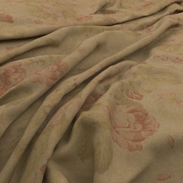
Bibury Teastain
Bibury

Checkers Calico
Checkers
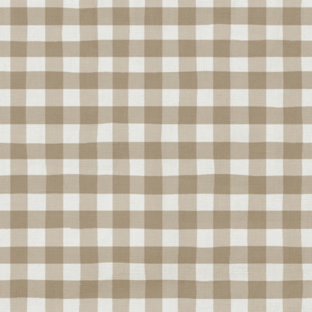
25 Fudge
Coorie
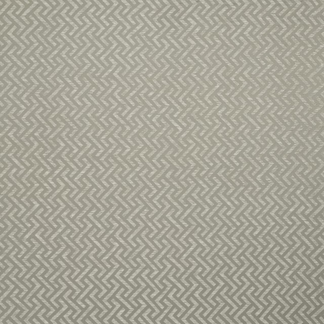
Millbrook Latte
Essential Weaves Vol 3
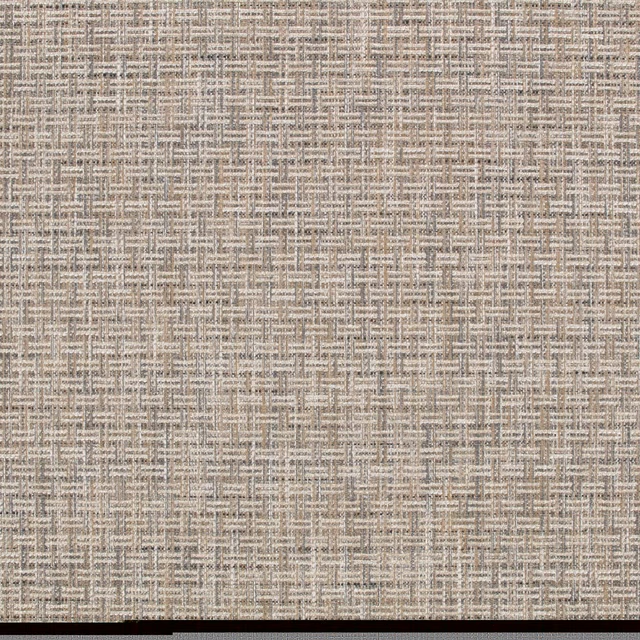
Heskin Twine
Elbury
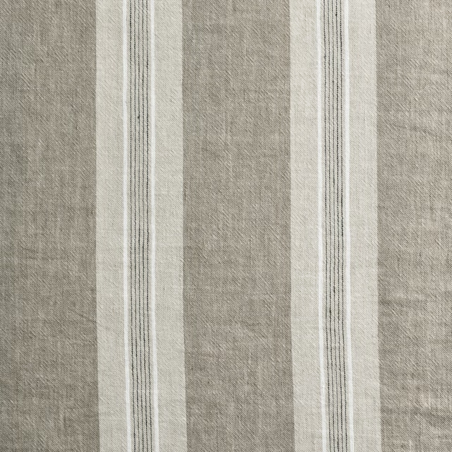
Thora Fawn
Anneli
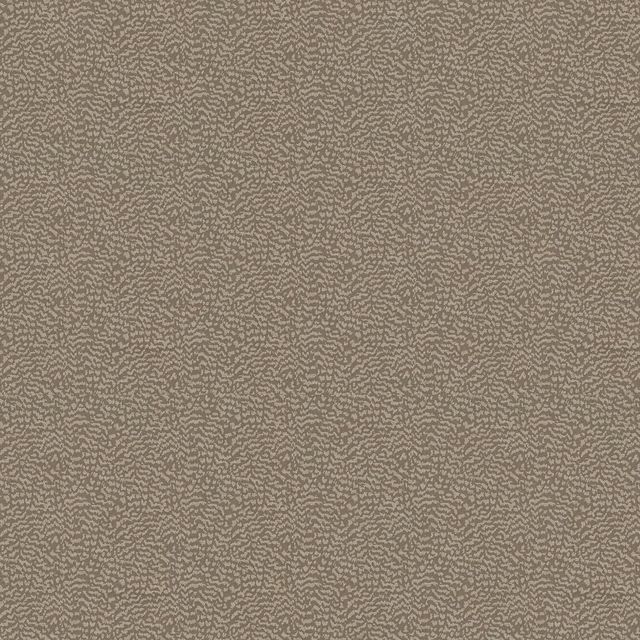
Ontario Mole
Eden Collection
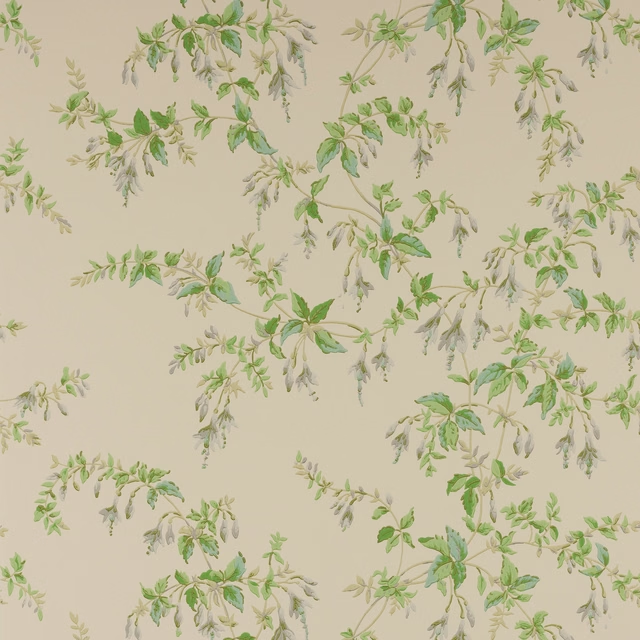
Fuchsia Wallpaper Grey/Green
Ashdown Wallpaper
Paint that goes with it
Two ways to take the room. Both colours are from houses we hold, so a pot can come off the same order as the cloth. Screens shift colour, so treat these as a direction and bring the cloth to the shelf before you buy the paint.
To sit quietly behind it
Suede
Zoffany · #b6a699
To stand against it
Wild Plum Light
Sanderson · #a25776
Other taupe fabrics
Across the houses we hold. See all 4,148.