

Tap the swatch to see it full screen. Hover it to magnify the weave. Colours on a screen are a guide, not a match, so come and feel the real cloth.
Scroll up or down to zoom in and out.
Pablo
Neutrals Paint
Pablo is a soft, warm neutral with a quiet off-white feel. In Coat Paints it sits in the Neutrals range as an easy colour for walls and woodwork.
You have used your previews for today. Send one to Simon and you can carry on.
Your board
0 fabrics
See this colour on Coat Paints's own site, then order it through us.
See Pablo in your own room
A photograph of the piece you want re-covered. Straight on is best, and daylight helps. It is used to make your picture and nothing else.
Looking at your room
We found things here Pablo could go on. Tap one on the photograph, or choose below.
We could not see anything to re-cover
, s
Pablo, on your
Drag to compare. AI impression, colours indicative: ask us for a cutting before you decide.
About this colour
At #EEEAE4, Pablo reads as a pale, creamy neutral with a faint warmth that keeps it from looking stark. It lifts light well without turning bright, so rooms feel open but still calm. In a north-facing room it can appear a touch cooler and more subdued, while in south-facing light the warmth becomes more apparent and the colour feels softer and creamier. It sits well beside natural oak, painted joinery in deeper neutrals, and upholstery in linen, taupe, stone, or muted green.
How to use it
Pablo suits living rooms, bedrooms, and hallways where a restrained backdrop is needed. It works neatly with painted woodwork, as well as upholstery in warm greys, oatmeal, and earthy browns.
A pale warm neutral that gives walls a calm, off-white look.
More from Neutrals
The same book, other colourways.

Mindful
Neutrals

Modest
Neutrals

Mrs. Bouquet
Neutrals

Nada
Neutrals

Naptime
Neutrals

No Offence
Neutrals

Off Script
Neutrals

On Mute
Neutrals
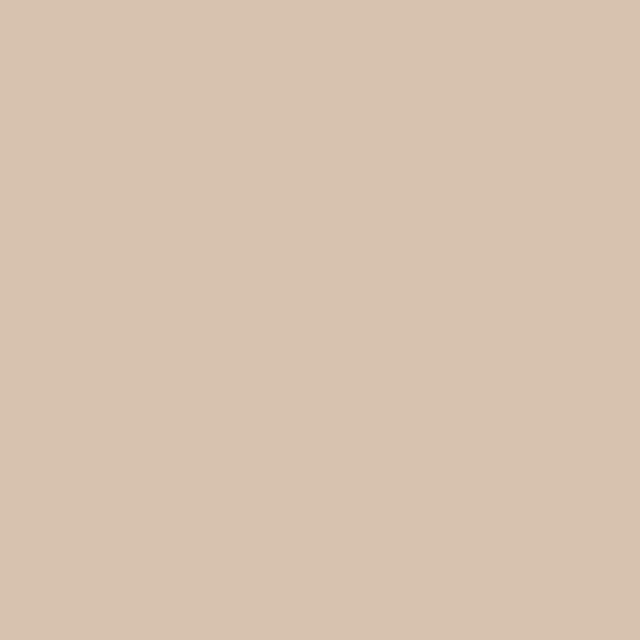
Out Of Office
Neutrals

Pampas
Neutrals

Paper Plane
Neutrals
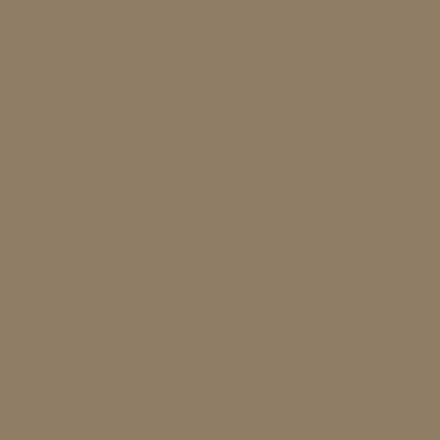
Percolate
Neutrals