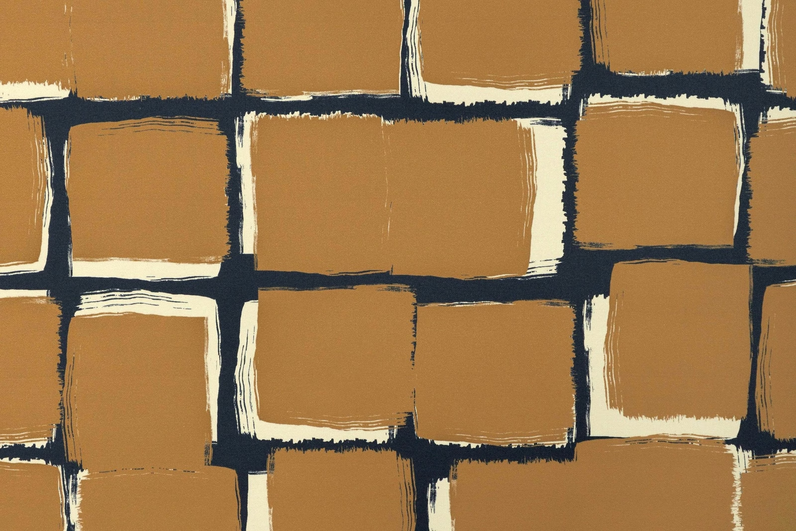

Tap the swatch to see it larger. Hover it to magnify the weave. Colours on a screen are a guide, not a match, so come and feel the real cloth.
Scroll up or down to zoom in and out.
Palettes - Camel
Résonance Fabric1486-05
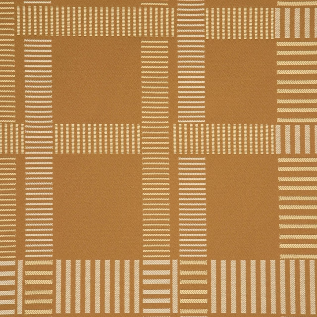
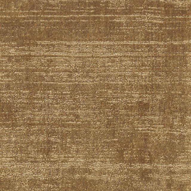
Palettes - Camel from Lelievre’s Résonance collection combines a warm camel-brown ground with irregular, hand-painted-looking blocks. Dark navy lines and flashes of cream define the loose grid and give the surface a distinctly graphic character.
Your board
0 fabrics
See this fabric on Lelievre's own site, then order it through us.
About this fabric
The design is built from uneven camel rectangles, with rough brush-like edges rather than a precise geometric repeat. Deep navy bands form the grid and give the warm brown-camel field a strong inked outline, while narrow cream passages brighten selected joins. Variations across the blocks make some areas appear flatter and darker, while others read as lighter ochre under the light. No further performance or construction specification is supplied for this fabric.
How to use it
Use this warm camel colourway to add earthy depth to a room with cream upholstery, pale walls or dark navy accents. Its irregular block pattern is especially effective on a statement chair, bench or full-length curtain where the painterly grid can be read clearly.
Use the warm camel ground with dark navy and cream accents to bring painterly contrast to upholstery or curtains.
More from Résonance
The same book, other colourways.
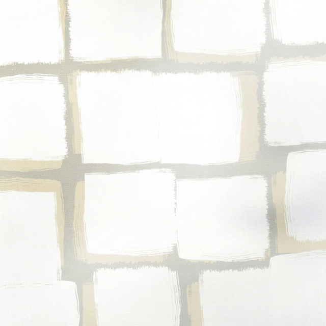
Palettes - Naturel
Résonance
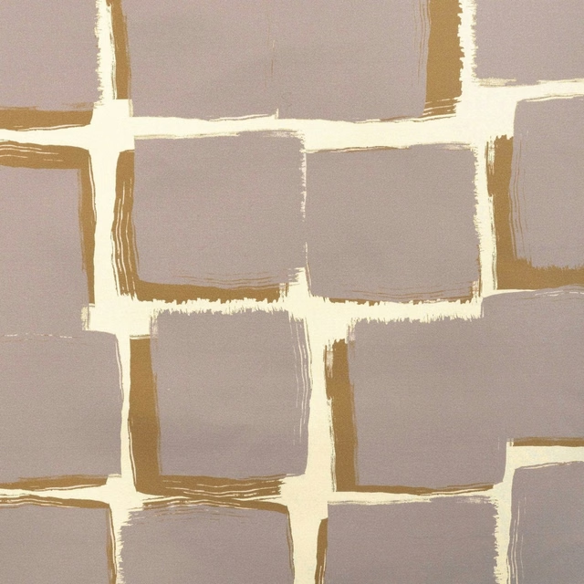
Palettes - Tourterelle
Résonance
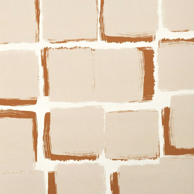
Palettes - Poudre
Résonance
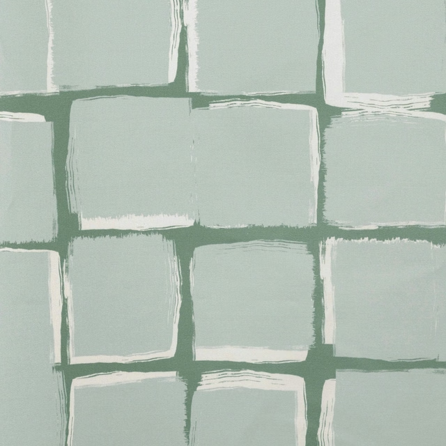
Palettes - Celadon
Résonance
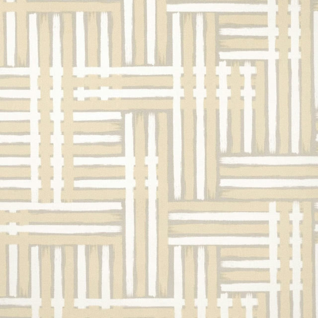
Nuances - Naturel
Résonance
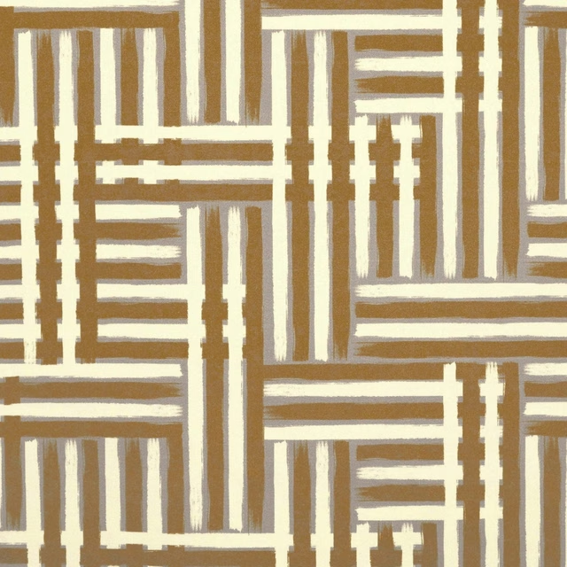
Nuances - Tourterelle
Résonance
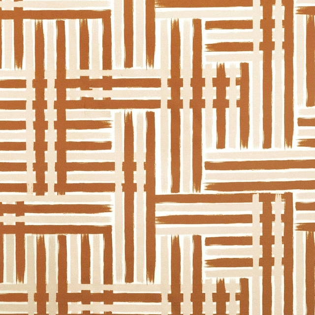
Nuances - Poudre
Résonance
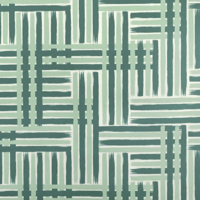
Nuances - Celadon
Résonance
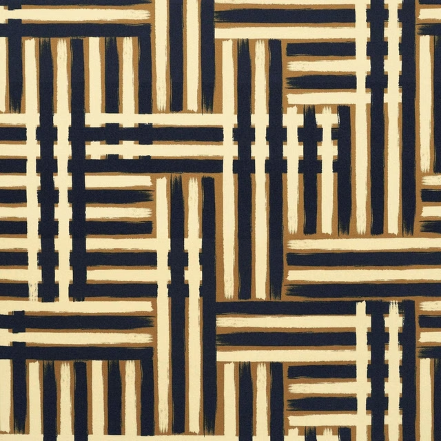
Nuances - Camel
Résonance
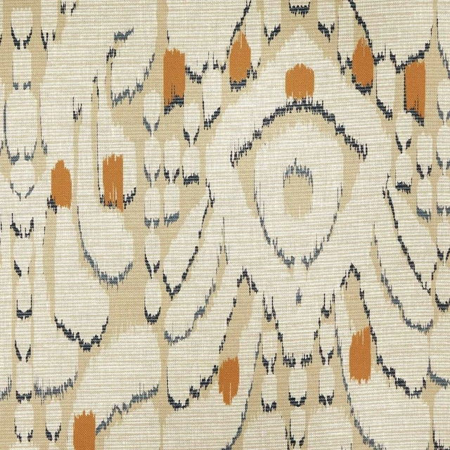
Ikati - Naturel
Résonance
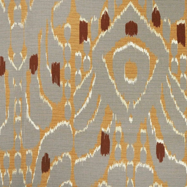
Ikati - Tourterelle
Résonance
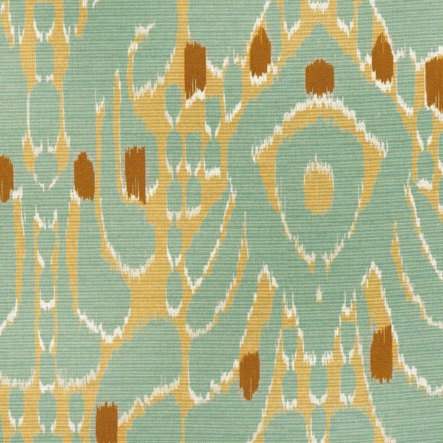
Ikati - Celadon
Résonance
Pairs well with
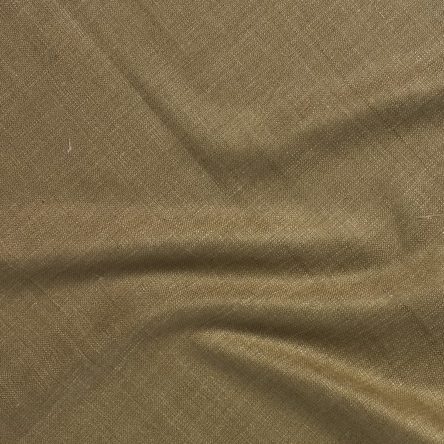
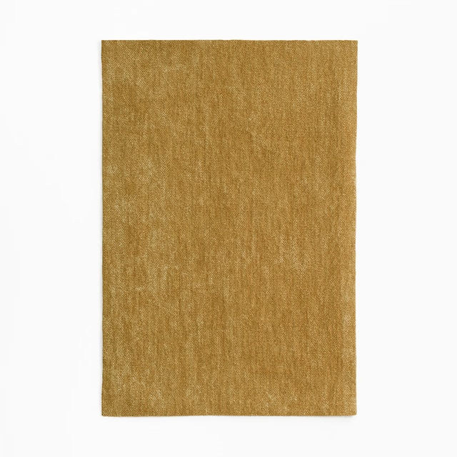
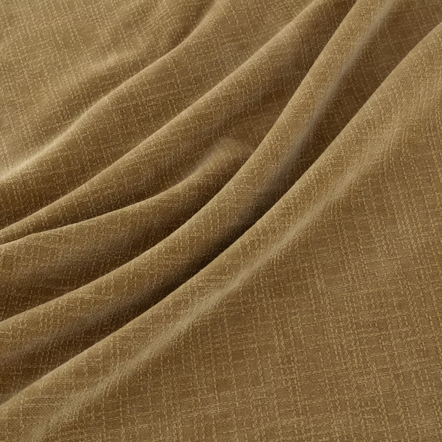
A pattern needs somewhere for the eye to rest, so these are the plains and textures that sit beside Palettes - Camel without fighting it. Mixed across the houses we hold, which is the part a single supplier's book cannot do.








Paint that goes with it
Two ways to take the room. Both colours are from houses we hold, so a pot can come off the same order as the cloth. Screens shift colour, so treat these as a direction and bring the cloth to the shelf before you buy the paint.
To sit quietly behind it
Muddy Amber
Zoffany · #927951
To stand against it
Calamine
Farrow & Ball · #e3d0ca
Other brown fabrics
Across the houses we hold. See all 2,272.