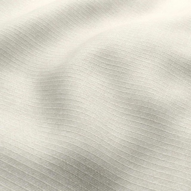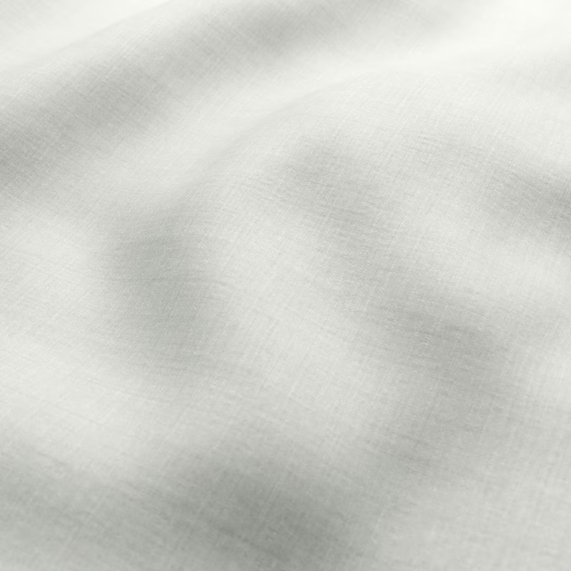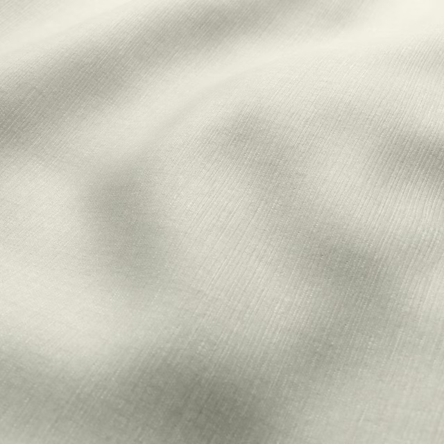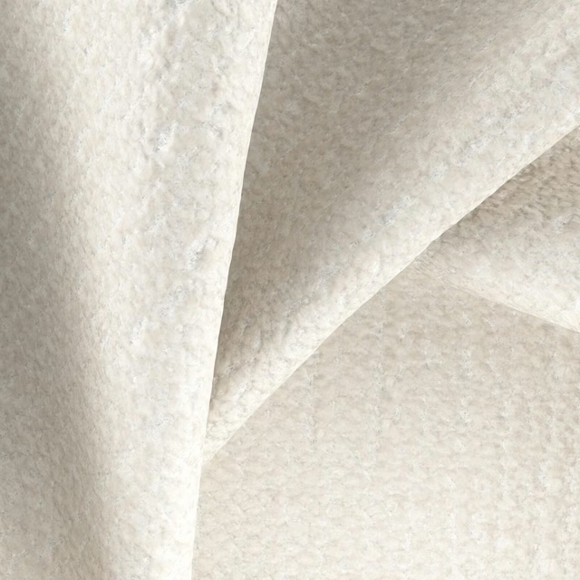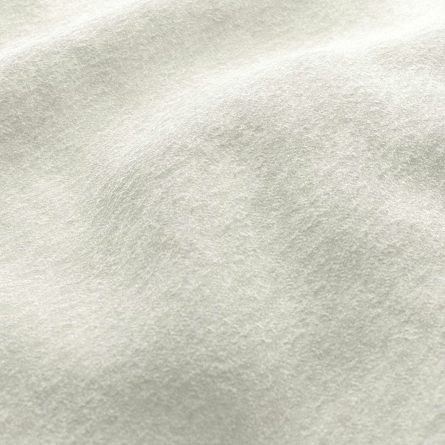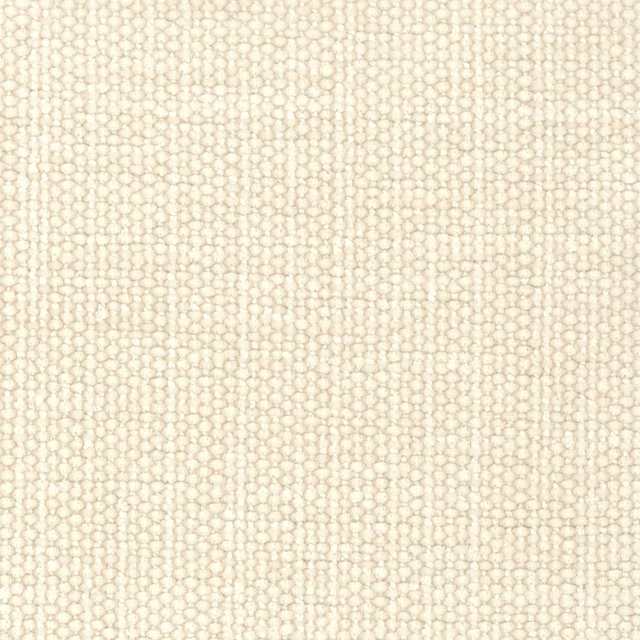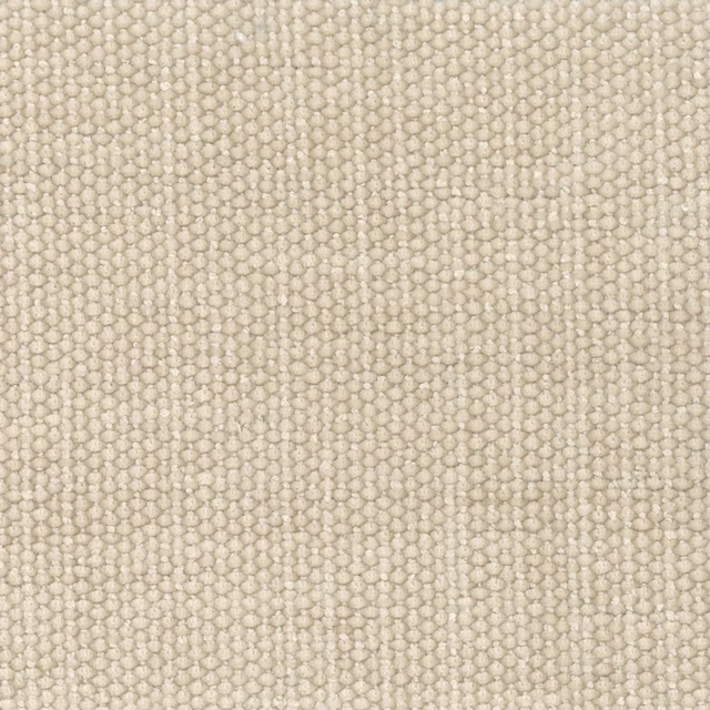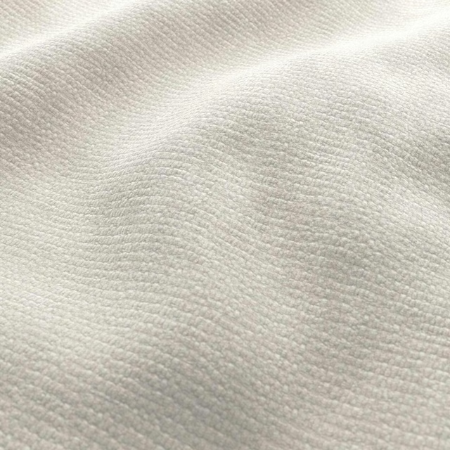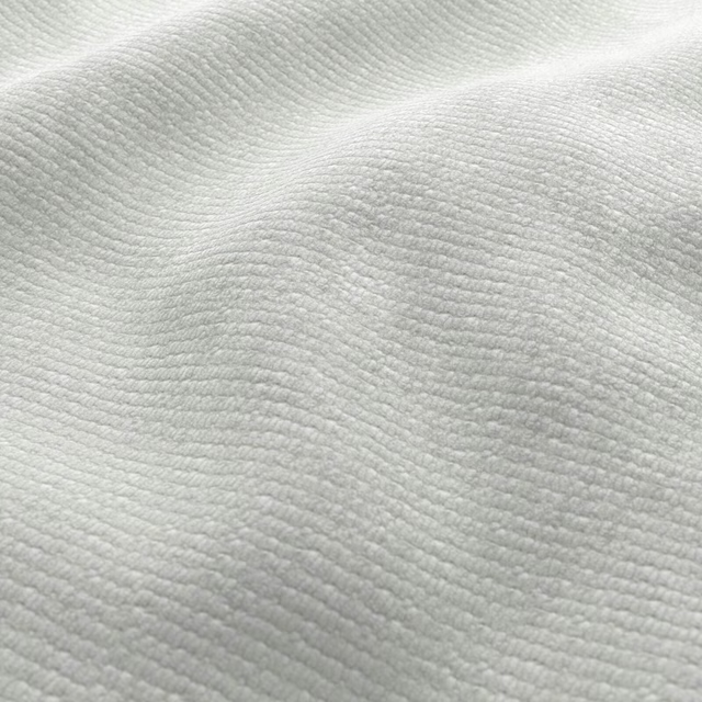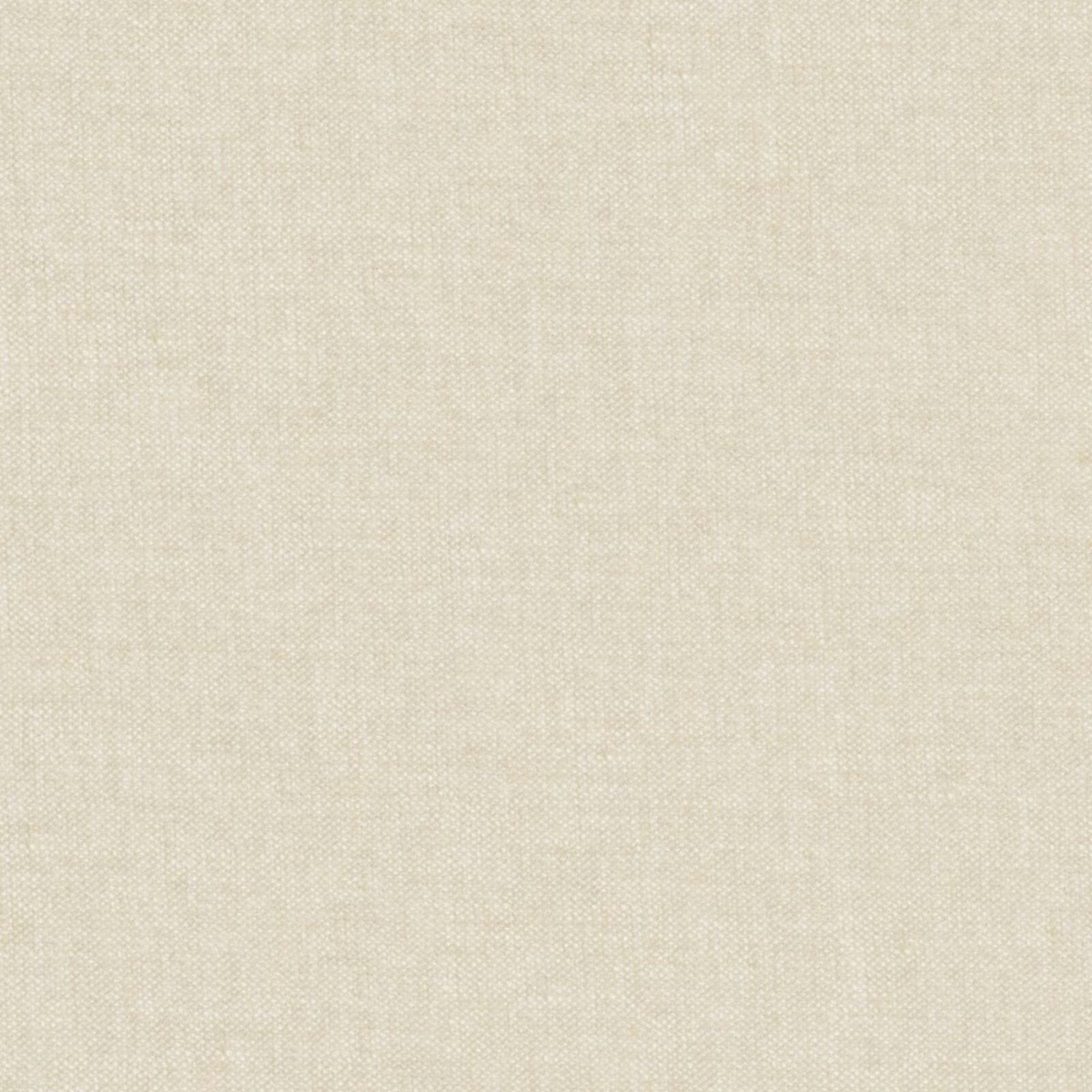

Tap the swatch to see it full screen. Hover it to magnify the weave. Colours on a screen are a guide, not a match, so come and feel the real cloth.
Scroll up or down to zoom in and out.
06 Cream
Imperial Fabric06
Imperial 06 Cream presents a pale, warm cream ground with a delicate woven texture. Its close-up surface shows fine intersecting threads that create gentle tonal variation rather than a printed pattern.
You have used your previews for today. Send one to Simon and you can carry on.
Your board
0 fabrics
See this fabric on Wemyss's own site, then order it through us.
See 06 Cream in your own room
A photograph of the piece you want re-covered. Straight on is best, and daylight helps. It is used to make your picture and nothing else.
Looking at your room
We found things here 06 Cream could go on. Tap one on the photograph, or choose below.
We could not see anything to re-cover
, s
06 Cream, on your
Drag to compare. AI impression, colours indicative: ask us for a cutting before you decide.
About this fabric
This colourway reads as a soft, warm cream, with slightly deeper beige flecks visible between the lighter threads. The fine plain weave gives the surface a restrained crosshatched character and a subtly tactile finish. Light catches individual threads unevenly, preventing the pale shade from appearing flat or stark. No composition, width, rub test or additional performance specification has been supplied for this exact fabric.
How to use it
Use 06 Cream to soften a room with warm white walls, pale timber or natural stone; its quiet woven depth also works well alongside oatmeal, sand and muted taupe textiles.
A softly textured cream weave that brings quiet warmth to upholstery, cushions or relaxed window treatments.
More from Imperial
The same book, other colourways.
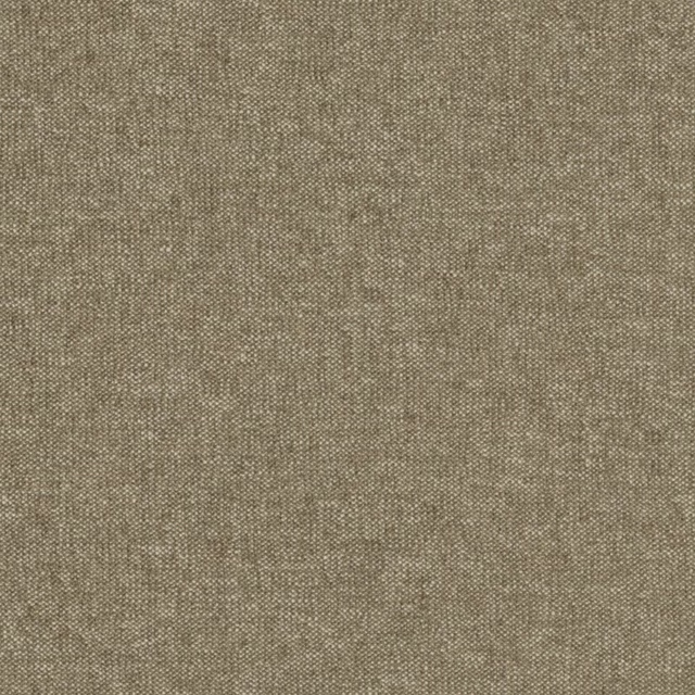
01 Peanut
Imperial
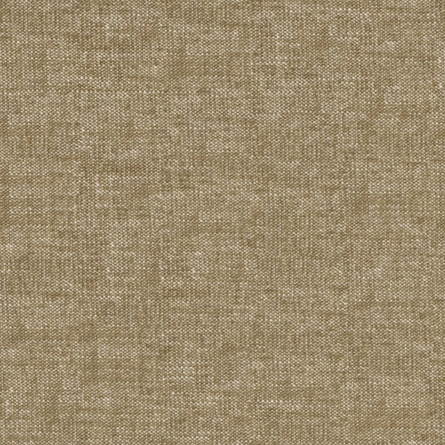
02 Coffee
Imperial
04 Desert
Imperial
05 Oat
Imperial
12 Rhino
Imperial
13 Mole
Imperial
14 Coal
Imperial

15 Denim
Imperial
16 River
Imperial
18 Teal
Imperial
19 Kiwi
Imperial
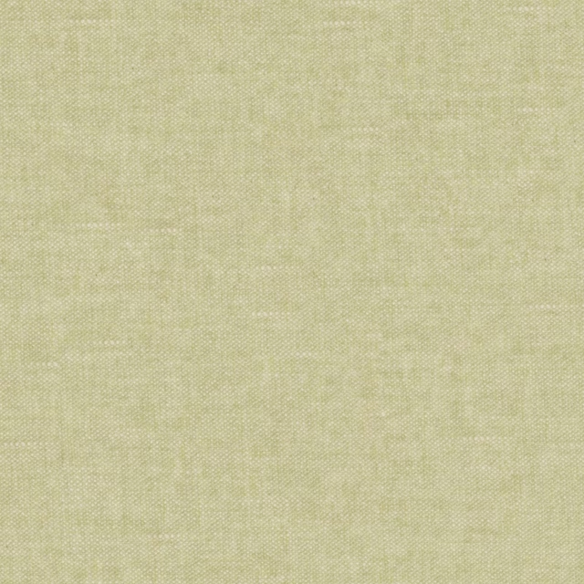
20 Pear
Imperial
Pairs well with
06 Cream is a quiet cloth, so it carries a pattern beside it: one of these on the curtains and this on the chair. Mixed across the houses we hold, which is the part a single supplier's book cannot do.

Zocalo Linen
Espectro Weaves

Jersey FR Cream
Upholstery
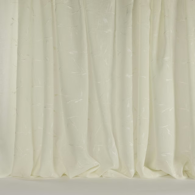
Twig Cream
Moonrise
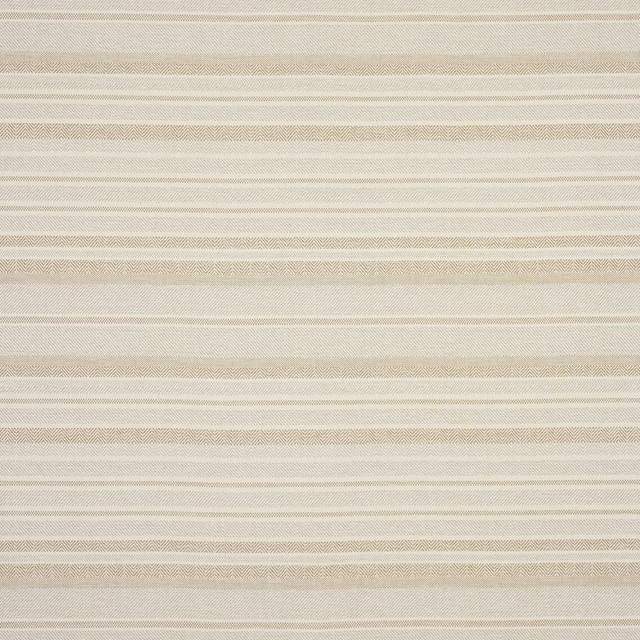
Patio Natural
Oasis
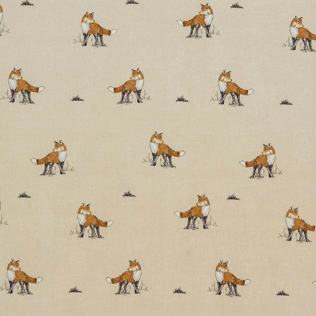
Vixen Natural
Animal Kingdom
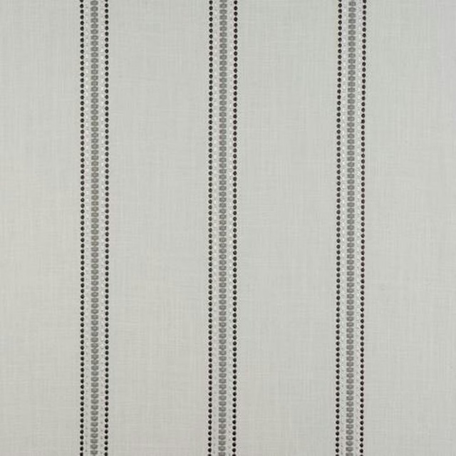
Bromley Stripe Linen
Misc

Sandringham Sand 02
Woven Fabric
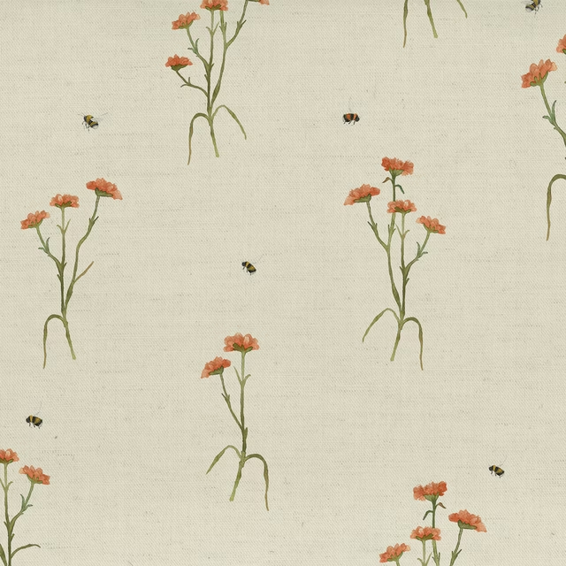
Allimore Linen
Botanical Stories
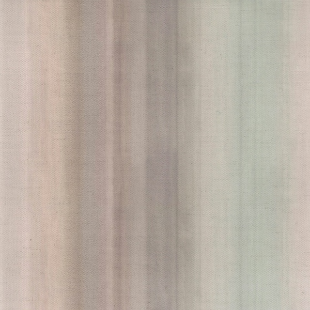
Serenity Sandstone
Oceania
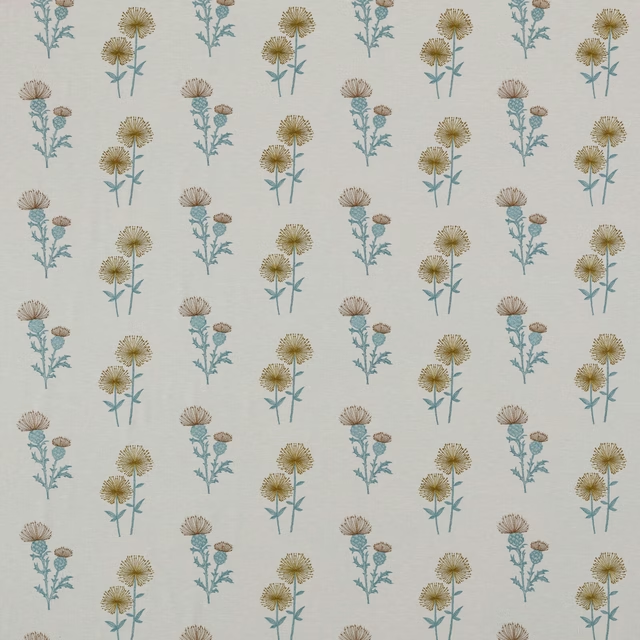
Lismore Citrus
Belvoir Collection
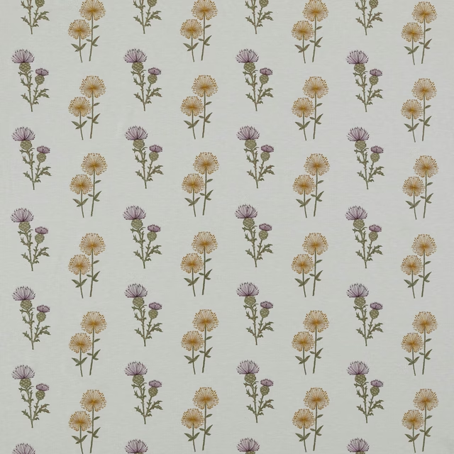
Lismore Heather
Belvoir Collection

Bibury Ivory
Avebury
Paint that goes with it
Two ways to take the room. Both colours are from houses we hold, so a pot can come off the same order as the cloth. Screens shift colour, so treat these as a direction and bring the cloth to the shelf before you buy the paint.
To sit quietly behind it
Oyster White
Sanderson · #dfd8c5
To stand against it
Olivine
Zoffany · #726e62
Other cream fabrics
Across the houses we hold. See all 4,572.