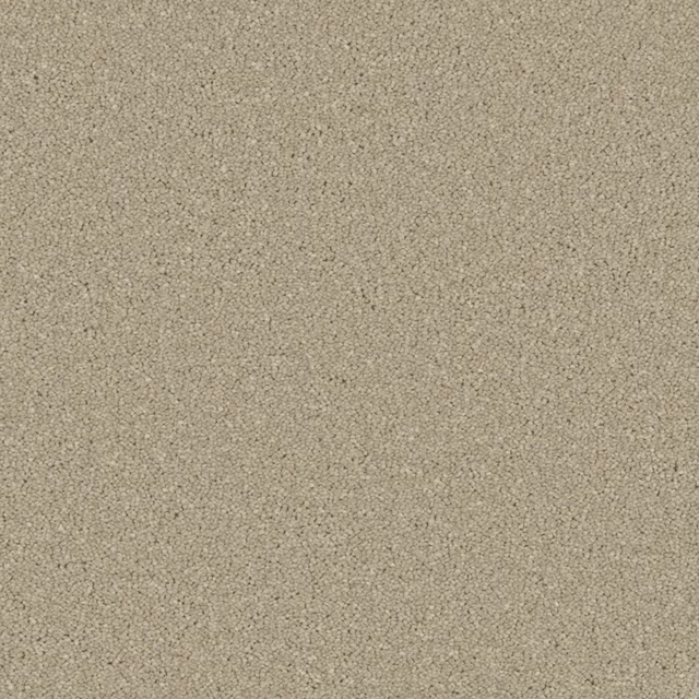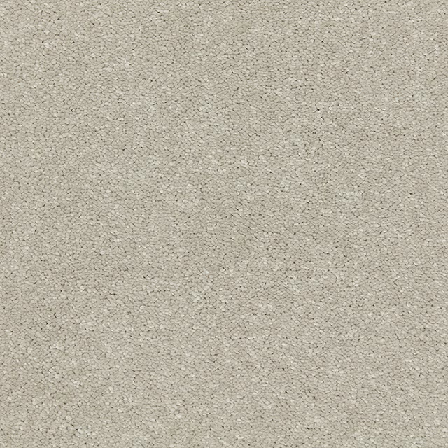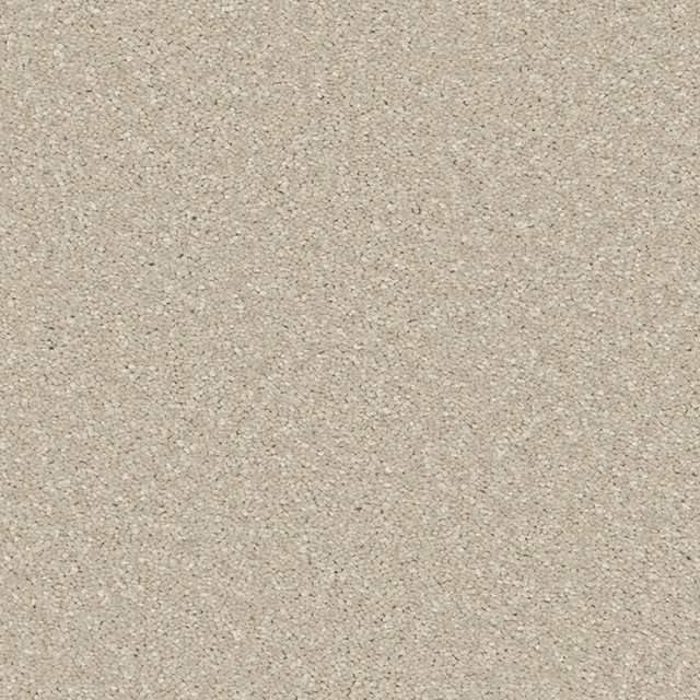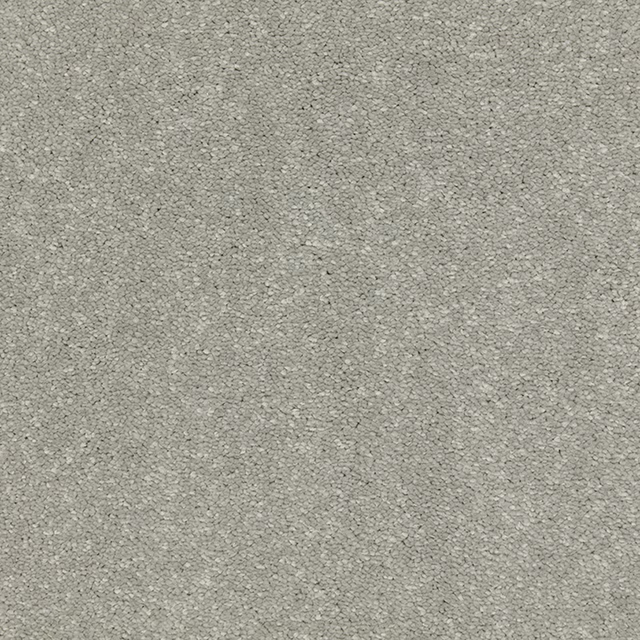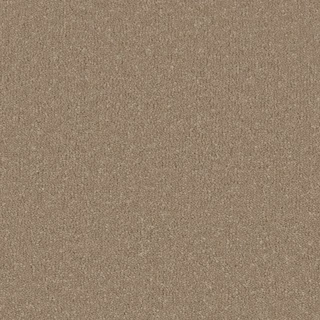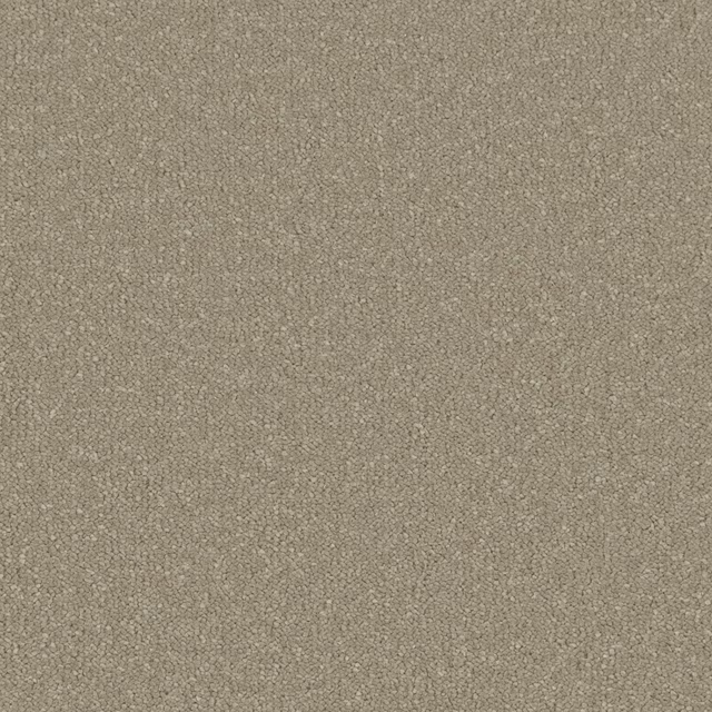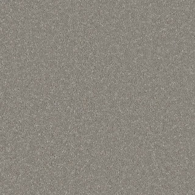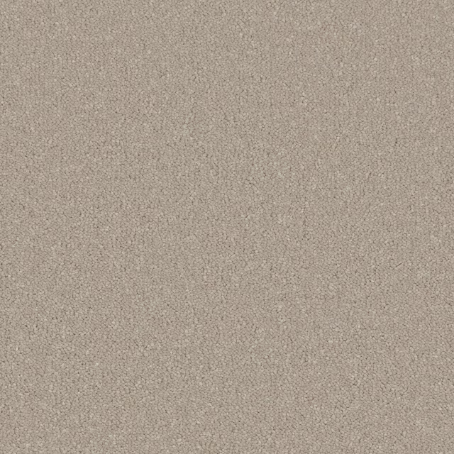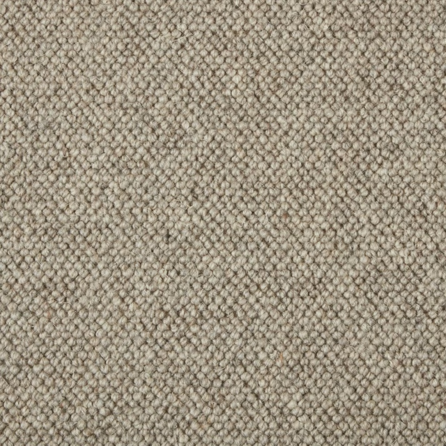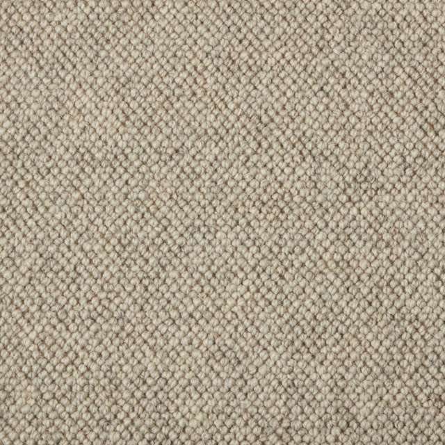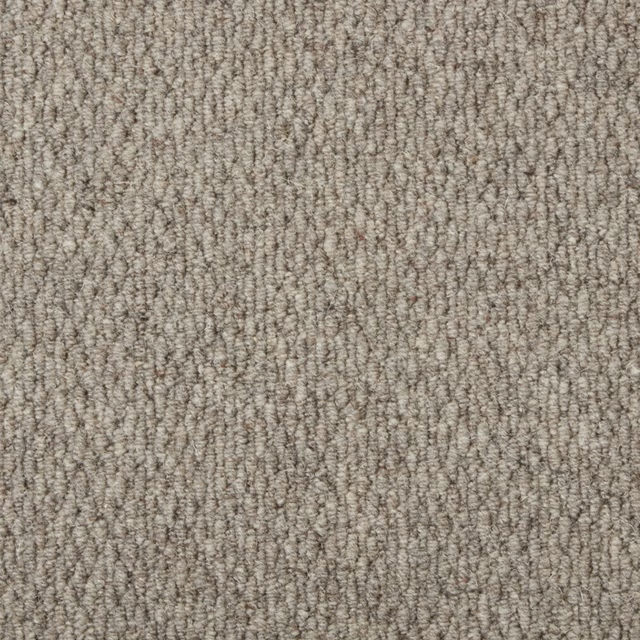
Tap the swatch to see it full screen. Hover it to magnify the weave. Colours on a screen are a guide, not a match, so come and feel the real cloth.
Scroll up or down to zoom in and out.
Mother of Pearl
Sensation Carpet
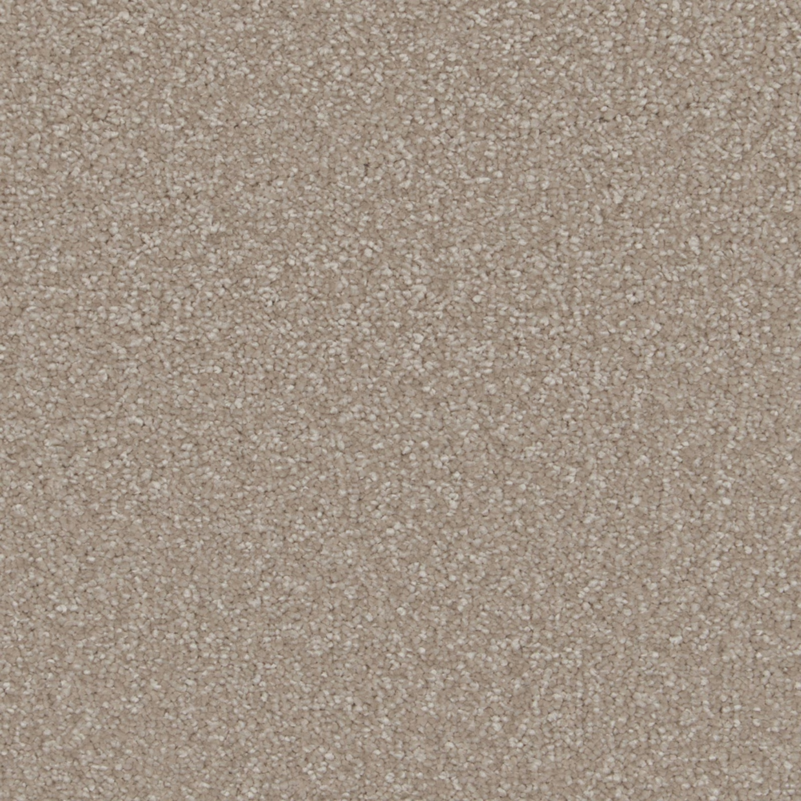
Mother of Pearl brings together a warm taupe-beige tone and a softly irregular surface, visible in the close-up as a field of tiny pale and darker flecks. Its deep pile gives the colour a gently cushioned, tactile appearance.
You have used your previews for today. Send one to Simon and you can carry on.
Your board
0 fabrics
See this carpet on Cormar's own site, then order it through us.
See Mother of Pearl in your own room
A photograph of the piece you want re-covered. Straight on is best, and daylight helps. It is used to make your picture and nothing else.
Looking at your room
We found things here Mother of Pearl could go on. Tap one on the photograph, or choose below.
We could not see anything to re-cover
, s
Mother of Pearl, on your
Drag to compare. AI impression, colours indicative: ask us for a cutting before you decide.
About this carpet
Catalogued as a Carpet in the Sensation collection, Mother of Pearl has a Soft Deep Pile that reads clearly across the swatch. The warm beige-taupe ground is muted rather than stark, with closely packed flecks creating a softly mottled texture instead of a defined motif. Light catches the raised fibres unevenly, adding quiet variation across the otherwise calm colourway. No performance features are noted for this fabric.
How to use it
Use this warm taupe-beige colourway where a room needs a soft, grounded neutral with visible texture rather than a flat block of colour. Its relaxed deep-pile character pairs naturally with similarly tactile upholstery and understated natural tones.
A warm, softly flecked taupe-beige with a deep, tactile pile that brings gentle depth to upholstered pieces.
More from Sensation
The same book, other colourways.
Greystone
Sensation
Icing Sugar
Sensation
Laguna
Sensation
Latte
Sensation
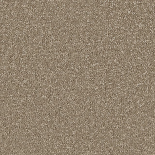
Light Taupe
Sensation
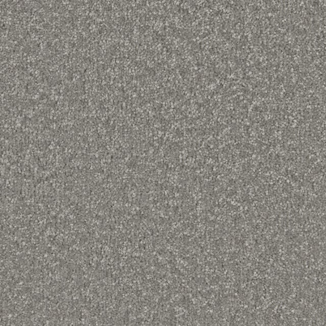
Lone Star
Sensation
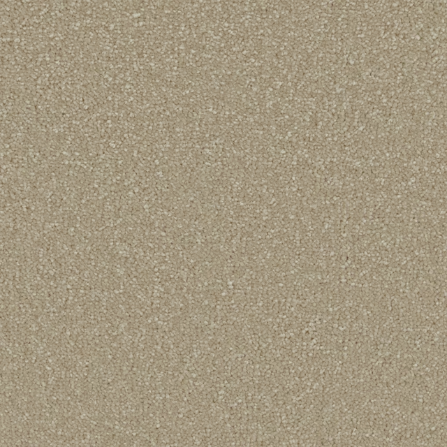
Monterey Sand
Sensation
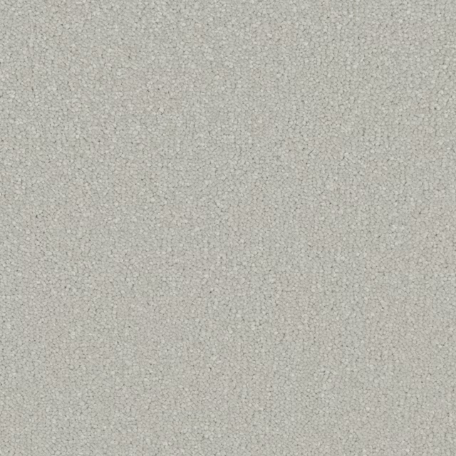
Radiance
Sensation
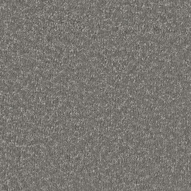
Shale Grey
Sensation

Soft Orchid
Sensation
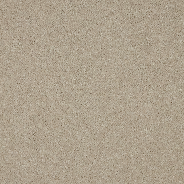
Ventura Opal
Sensation
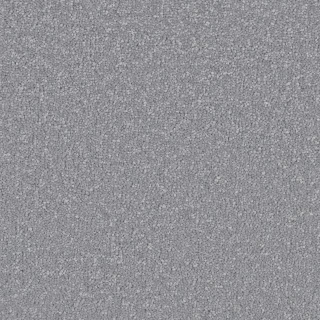
Wedgwood
Sensation
Pairs well with
Mother of Pearl is a quiet cloth, so it carries a pattern beside it: one of these on the curtains and this on the chair. Mixed across the houses we hold, which is the part a single supplier's book cannot do.
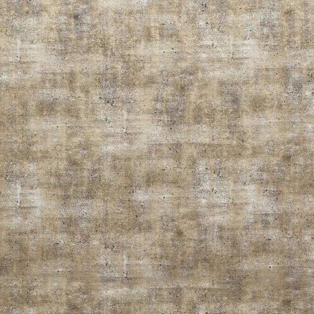
Sontuoso Mink
Dimora
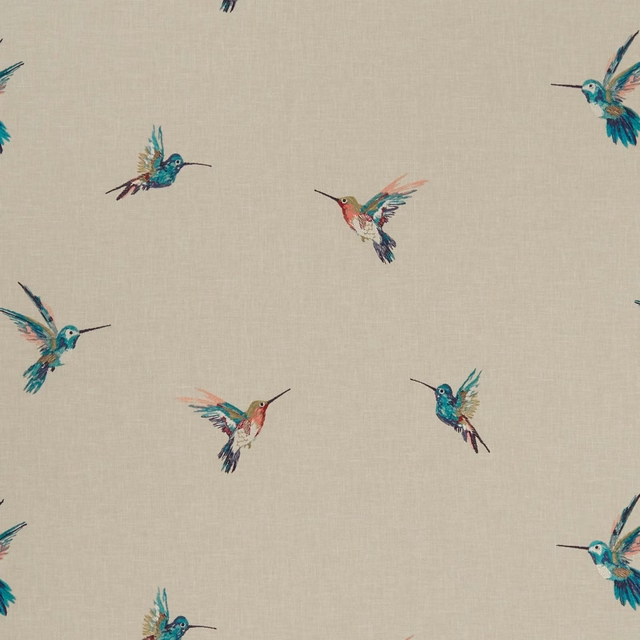
Woodstar Tropical
Exotica
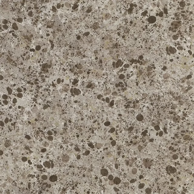
Lustro Tbc
Majolica Wallpaper
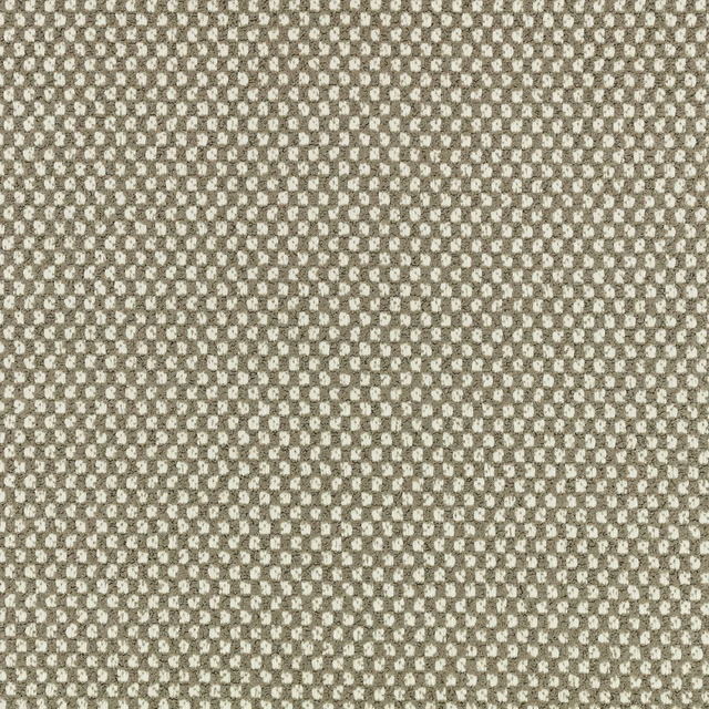
Okan Outdoor Stucco
Xandri Outdoor
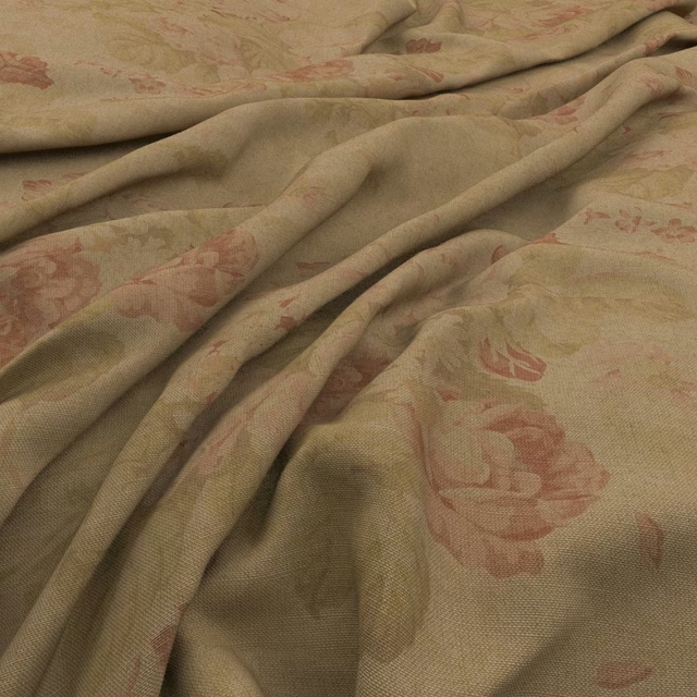
Bibury Teastain
Bibury
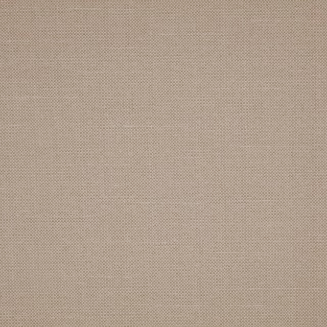
Checkers Calico
Checkers
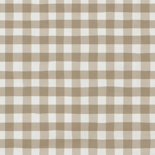
25 Fudge
Coorie
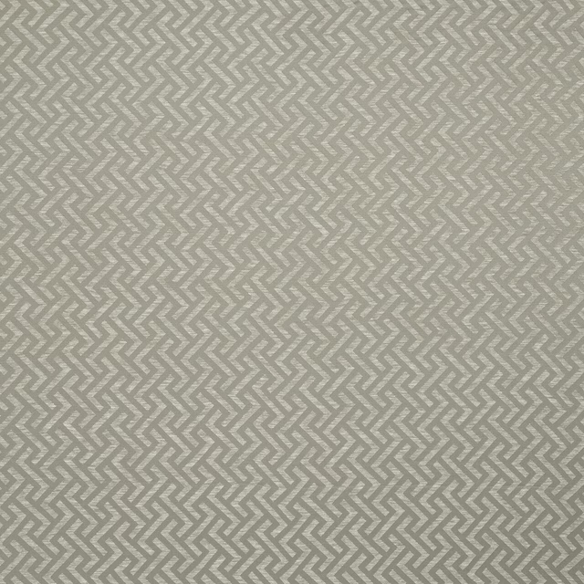
Millbrook Latte
Essential Weaves Vol 3
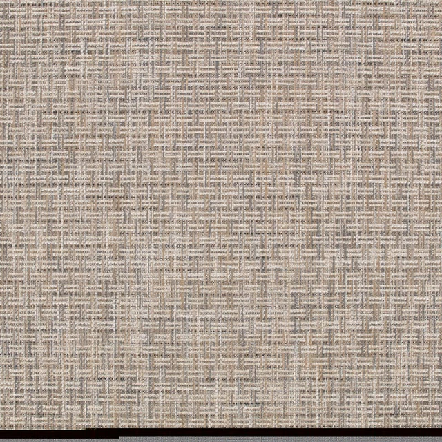
Heskin Twine
Elbury
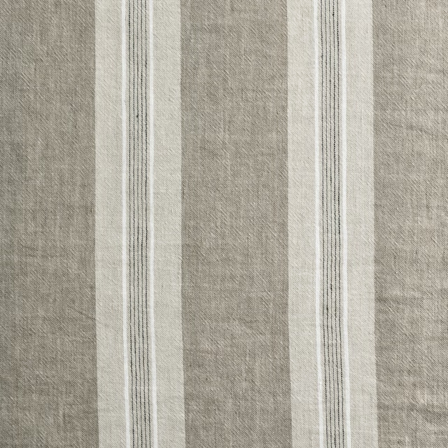
Thora Fawn
Anneli
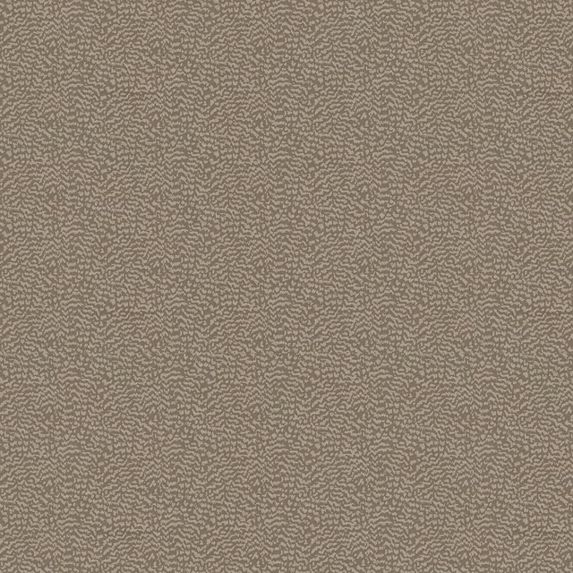
Ontario Mole
Eden Collection
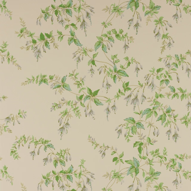
Fuchsia Wallpaper Grey/Green
Ashdown Wallpaper
Paint that goes with it
Two ways to take the room. Both colours are from houses we hold, so a pot can come off the same order as the cloth. Screens shift colour, so treat these as a direction and bring the cloth to the shelf before you buy the paint.
To sit quietly behind it
Cold Brew
Coat Paints · #a5978d
To stand against it
Sunlight
Little Greene · #dfc774
Other taupe fabrics
Across the houses we hold. See all 4,148.