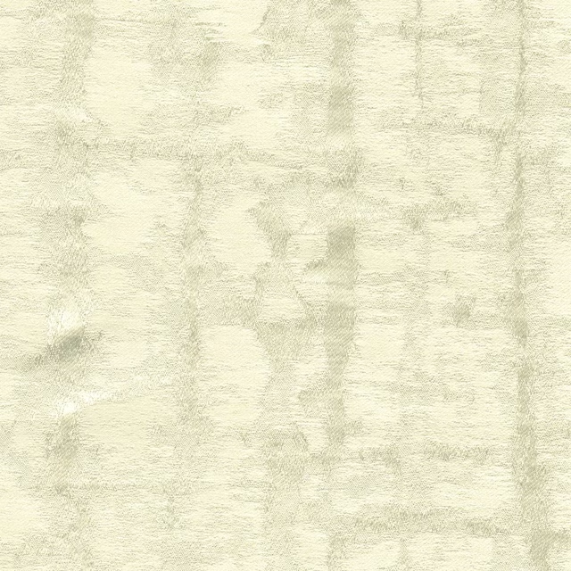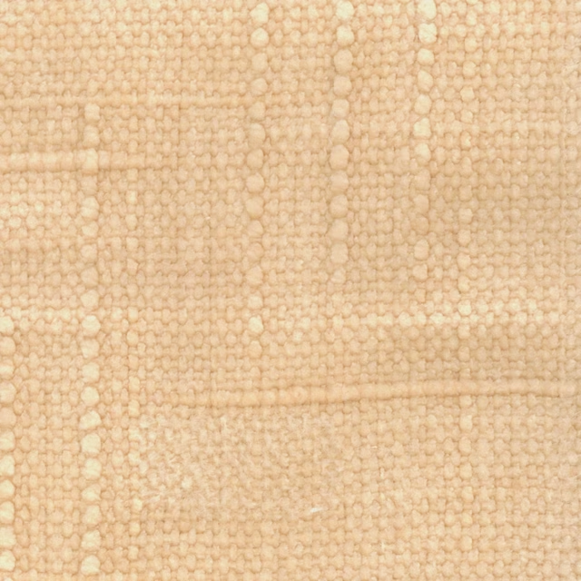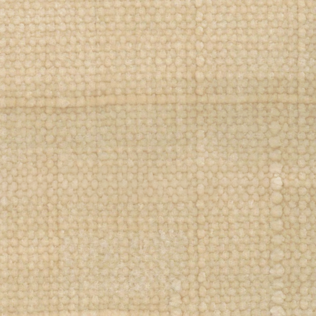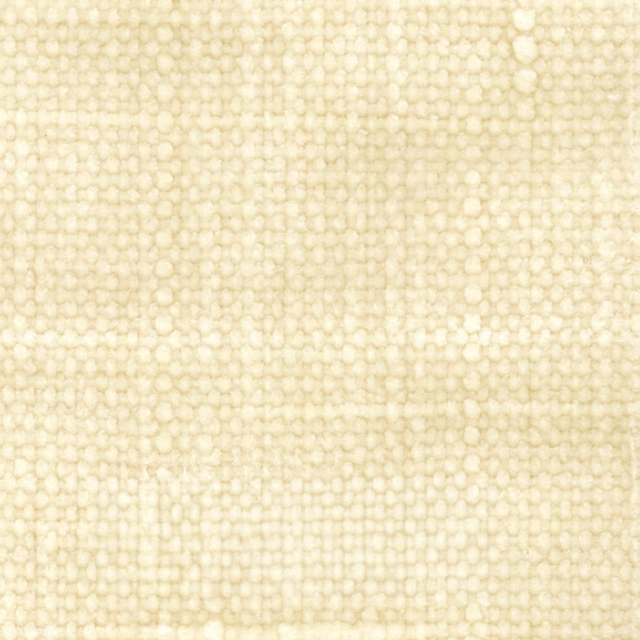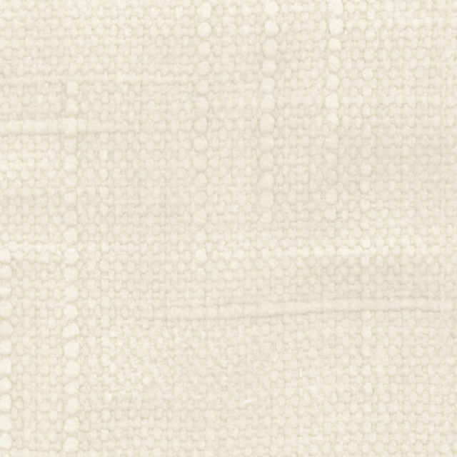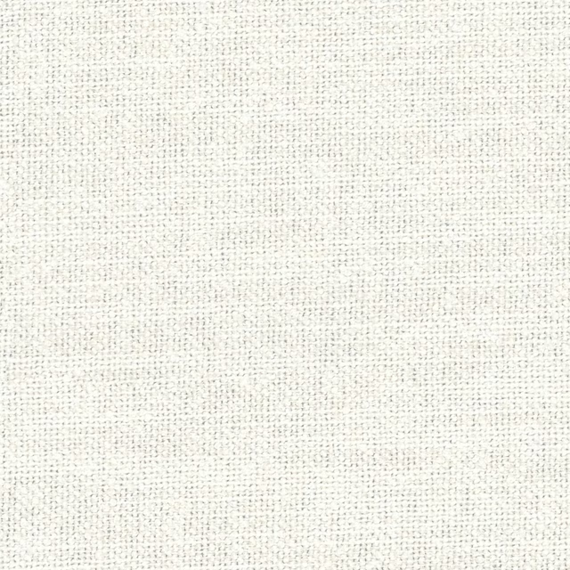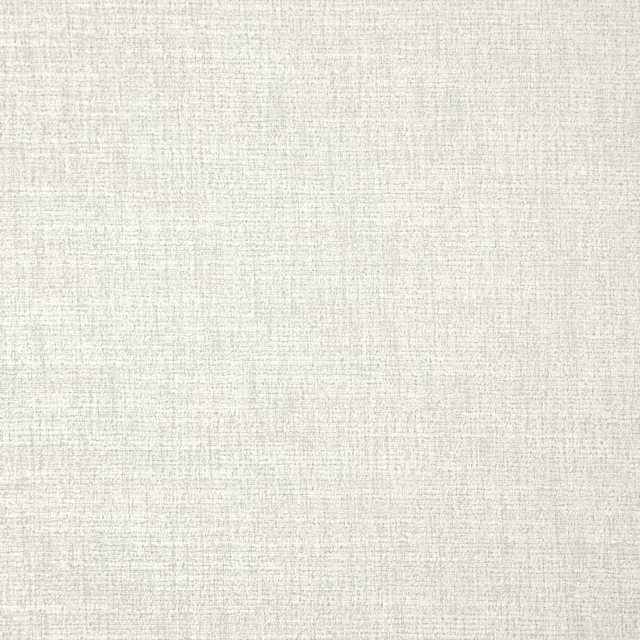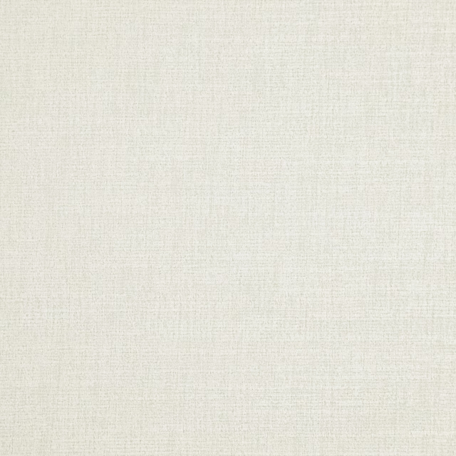
Tap the swatch to see it full screen. Hover it to magnify the weave. Colours on a screen are a guide, not a match, so come and feel the real cloth.
Scroll up or down to zoom in and out.
Travertine - Light
Neutrals Paint
Travertine - Light is a gentle Little Greene neutral with a creamy beige note and a calm, workable softness. It sits easily in rooms where you want warmth without turning the walls yellow.
You have used your previews for today. Send one to Simon and you can carry on.
Your board
0 fabrics
See this colour on Little Greene's own site, then order it through us.
See Travertine - Light in your own room
A photograph of the piece you want re-covered. Straight on is best, and daylight helps. It is used to make your picture and nothing else.
Looking at your room
We found things here Travertine - Light could go on. Tap one on the photograph, or choose below.
We could not see anything to re-cover
, s
Travertine - Light, on your
Drag to compare. AI impression, colours indicative: ask us for a cutting before you decide.
About this colour
At #F0E4CA, Travertine - Light reads as a pale warm beige with a subtle stone-like softness and enough cream in it to lift a room. On a wall it reflects light comfortably without feeling bright, so it can make a space feel lighter while still keeping some depth. In north-facing rooms it will look a touch warmer and more buffered against cool light, which helps prevent it from appearing flat. In south-facing light the colour opens out, reading sunnier and creamier, while still staying quietly neutral beside natural oak, painted joinery, linen upholstery and deeper browns.
How to use it
It suits living rooms, bedrooms and hallways where you want a neutral backdrop that sits well with timber. Pair it with off-white woodwork, walnut furniture, cane, and upholstery in stone, taupe or muted green.
A warm pale neutral like this gives a room an easy, settled feel without going stark.
More from Neutrals
The same book, other colourways.

Hollyhock
Neutrals

Joanna
Neutrals

Julie's Dream
Neutrals

Silent White - Mid
Neutrals

Clay - Pale
Neutrals

Clay - Mid
Neutrals

Silent White - Deep
Neutrals

Stone-Pale-Warm
Neutrals

Travertine - Mid
Neutrals

Mushroom
Neutrals

Clay
Neutrals

Travertine
Neutrals
Pairs well with
Travertine - Light is a wall colour, so these are the cloths that sit against it: one of them on the curtains, the paint behind. Mixed across the houses we hold, which is the part a single supplier's book cannot do.

Camley Ivory
Essential Weaves Vol 1
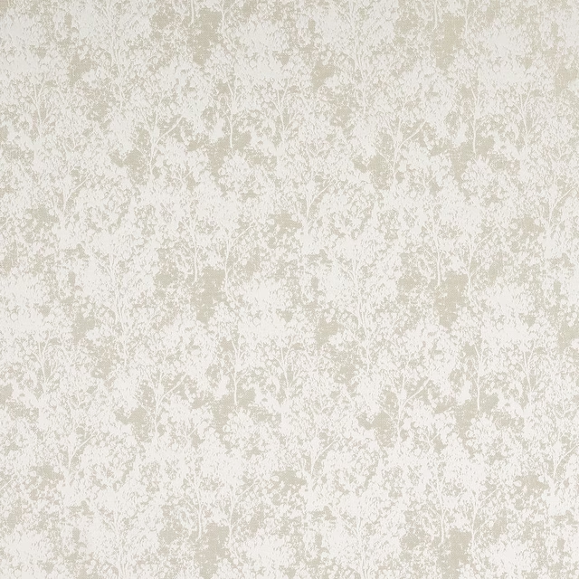
Poplar Ivory
Essential Weaves Vol 1

Bibury Ivory
Avebury
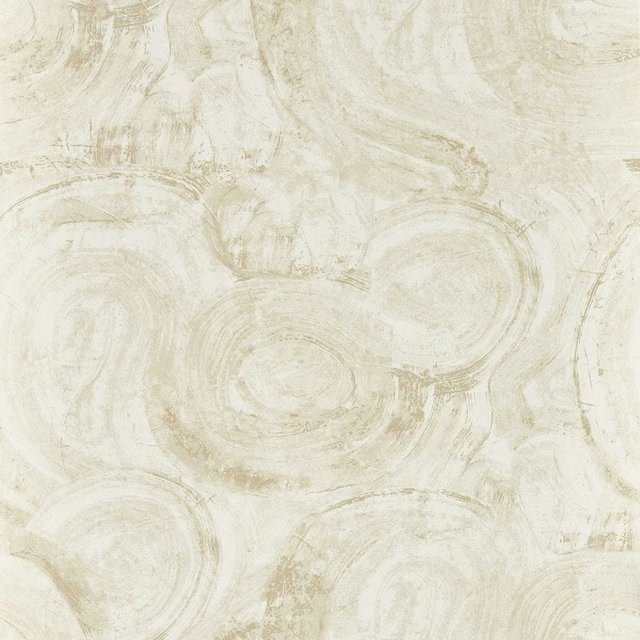
Hatoum Ivory
Metropolitan Wallcoverings
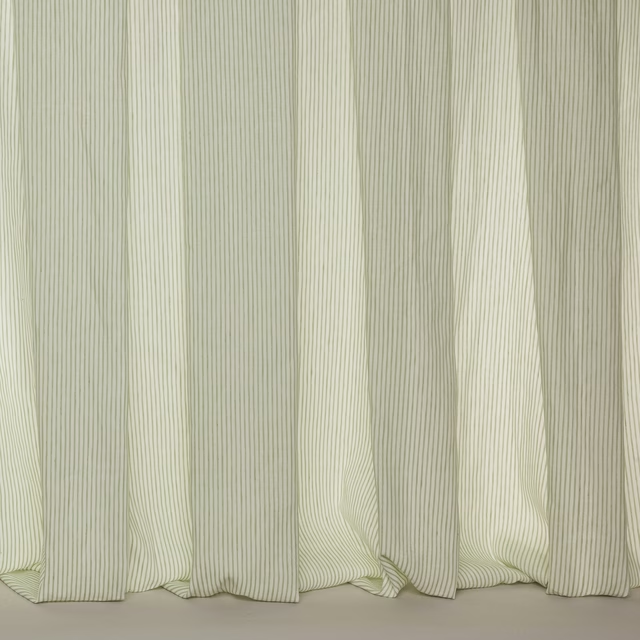
Maddox Leaf
Florenza Sheers

Spot Voile Cream
Florenza Sheers
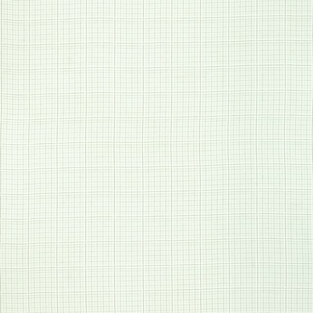
Ardenne Noir
Around The World Fabrics
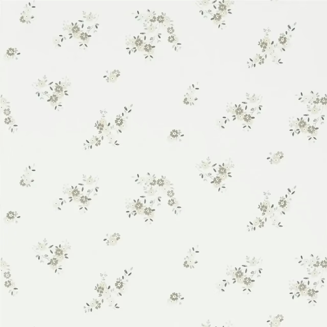
Gentian Ecru
Brera WALLPAPER
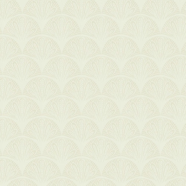
Kingsley Ivory
Kingsley
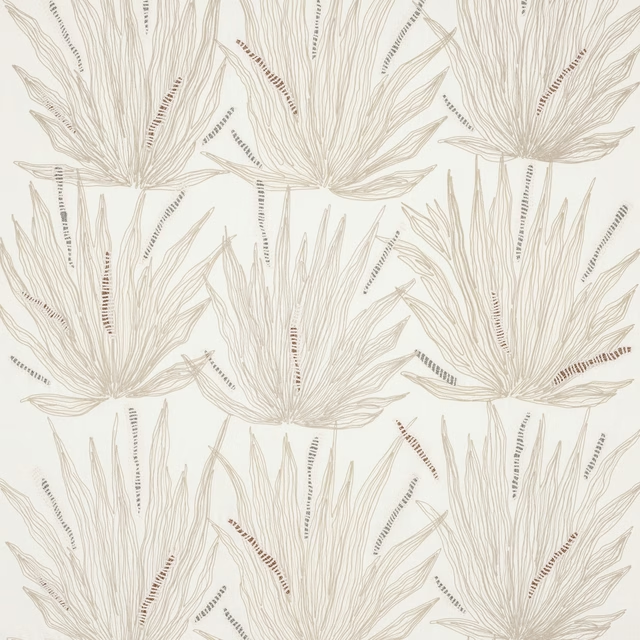
Eloa Ivory
Brasilia
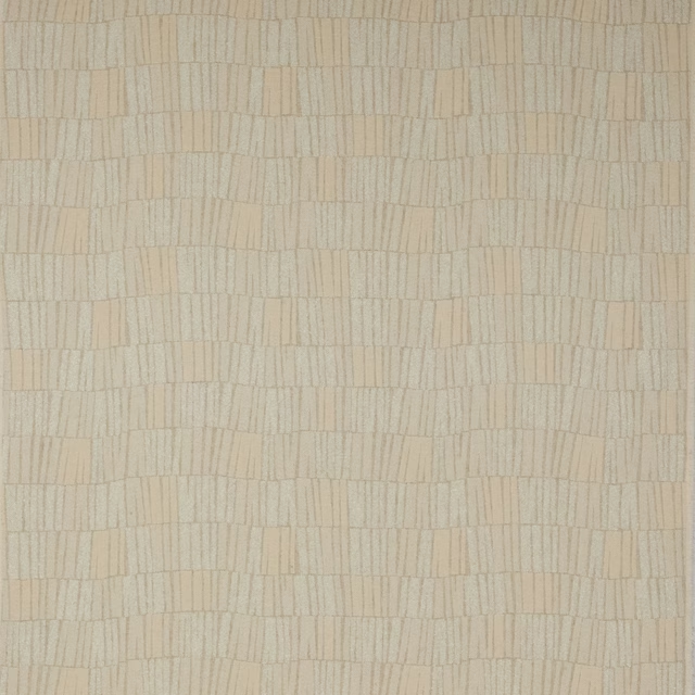
Napa White
Jack
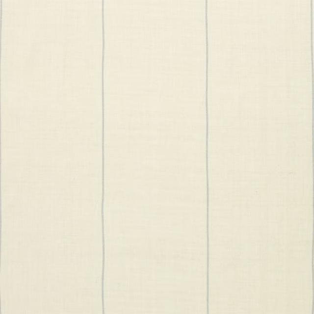
Ice House Stripe Chambray
Archival Traveler Fabrics
Other cream fabrics
Across the houses we hold. See all 4,572.