
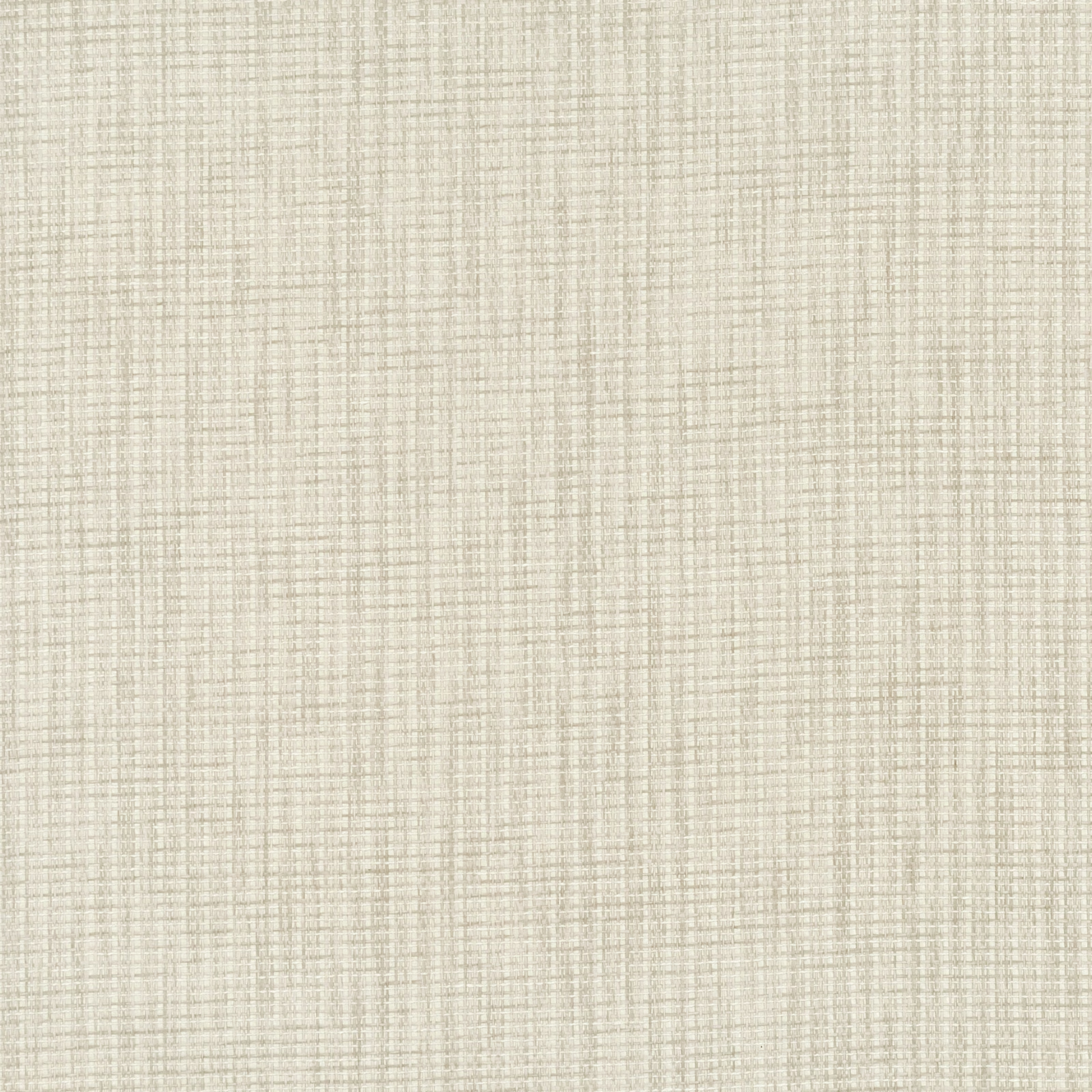

Tap the swatch to see it full screen. Hover it to magnify the weave. Colours on a screen are a guide, not a match, so come and feel the real cloth.
Scroll up or down to zoom in and out.
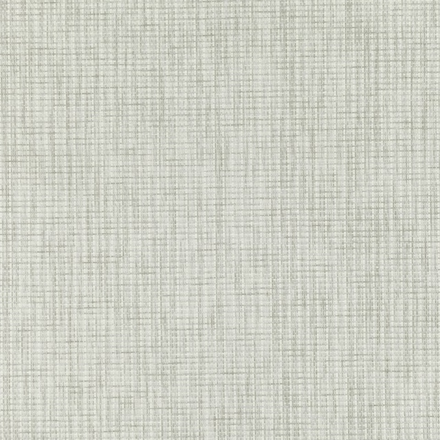
Kami Pearl
Paperweave Wallpaper
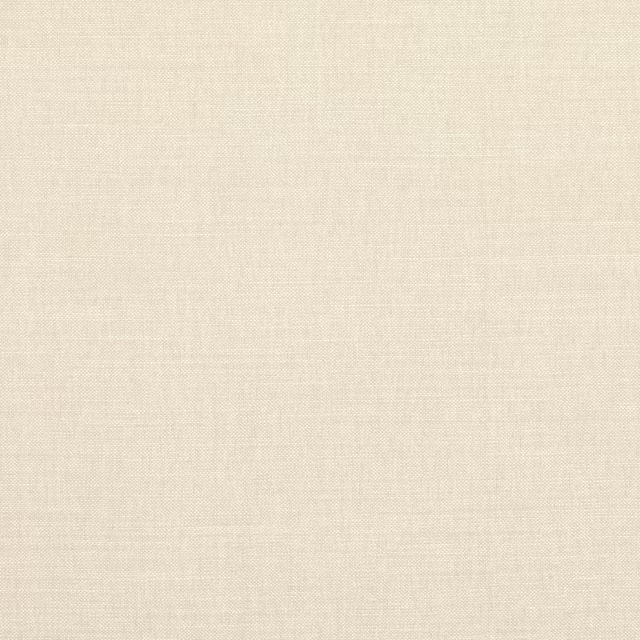
Kami Pearl has a pale pearl-ivory ground with a finely drawn, woven-looking grid that stays subtle across the surface. Its restrained variation gives the colourway a softly tactile appearance rather than a flat white finish.
You have used your previews for today. Send one to Simon and you can carry on.
Your board
0 fabrics
See this wallpaper on Mark Alexander's own site, then order it through us.
See Kami Pearl in your own room
A photograph of the piece you want re-covered. Straight on is best, and daylight helps. It is used to make your picture and nothing else.
Looking at your room
We found things here Kami Pearl could go on. Tap one on the photograph, or choose below.
We could not see anything to re-cover
, s
Kami Pearl, on your
Drag to compare. AI impression, colours indicative: ask us for a cutting before you decide.
About this wallpaper
This Mark Alexander wallpaper is defined by a close crosshatch of delicate vertical and horizontal lines, creating the impression of a fine paperweave. In the Pearl colourway, warm ivory and light beige threads sit together with very little contrast, so the surface reads calm and gently dimensional. The fine grid remains visible on close inspection while receding into a light, almost chalky field from farther away. As a wallpaper, it is suited to creating a quietly textured backdrop without introducing a strong motif.
How to use it
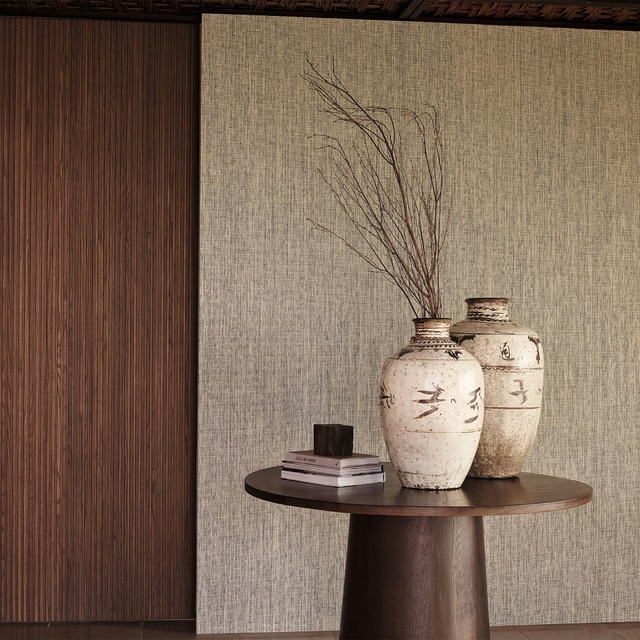
Use Kami Pearl on walls where a soft ivory backdrop is wanted, pairing it with pale oak, linen tones and understated cream upholstery. Its low-contrast weave also works well in rooms that need texture without a darker or more graphic pattern.
Use this softly textured pearl ground to add quiet structure behind warm neutrals, timber and pale upholstery.
More from Paperweave
The same book, other colourways.
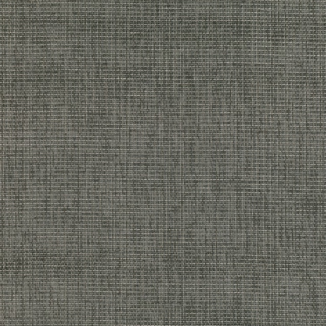
Kami Anthracite
Paperweave
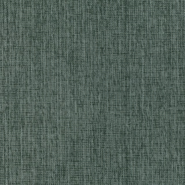
Kami Caspian
Paperweave
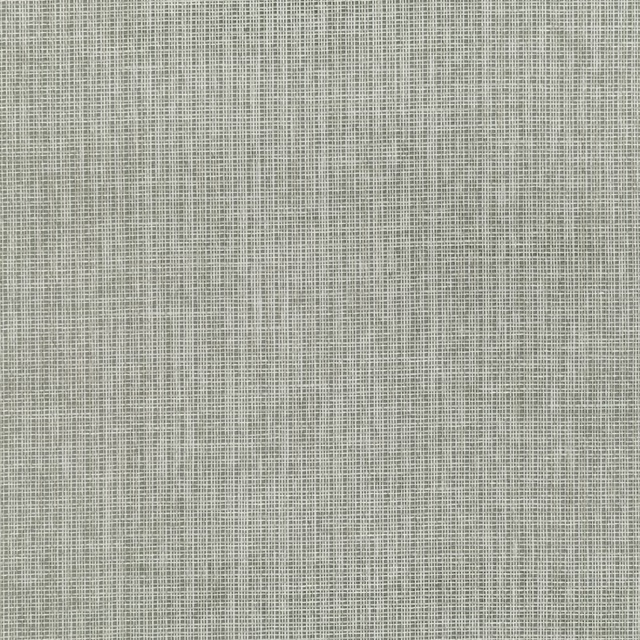
Kami Lake
Paperweave
Kami Powder
Paperweave
Ori Indigo
Paperweave
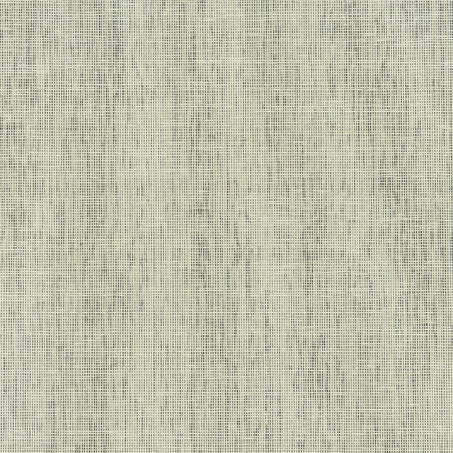
Ori Sage
Paperweave
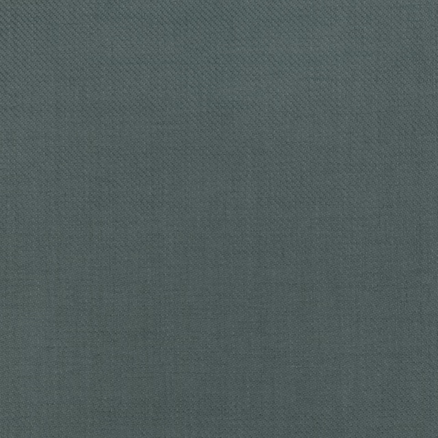
Papier Caspian
Paperweave
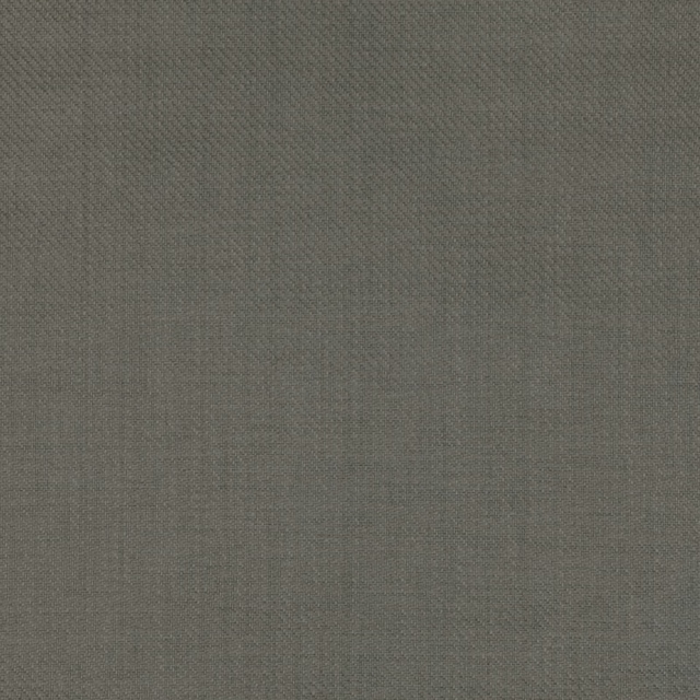
Papier Chestnut
Paperweave
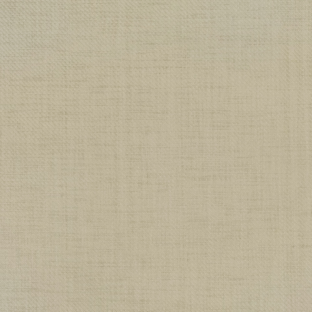
Papier Greenware
Paperweave
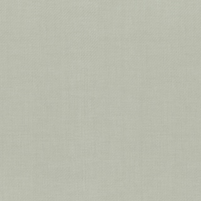
Papier Gris
Paperweave
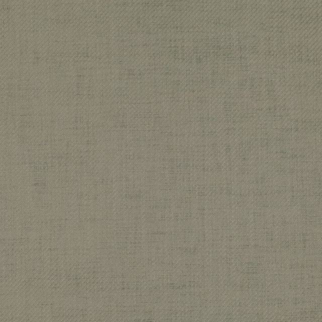
Papier Heath
Paperweave
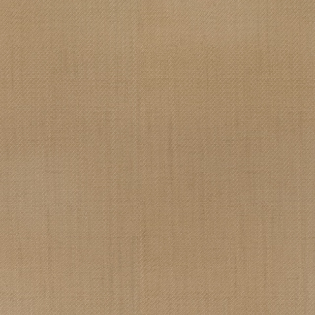
Papier Honey
Paperweave
Pairs well with
Kami Pearl is a quiet cloth, so it carries a pattern beside it: one of these on the curtains and this on the chair. Mixed across the houses we hold, which is the part a single supplier's book cannot do.
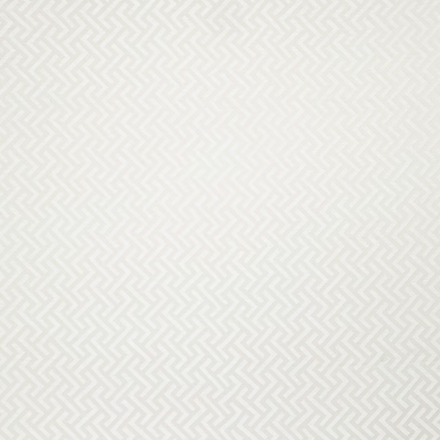
Millbrook Pearl
Essential Weaves Vol 3

Mowsley Pearl
Essential Weaves Vol 3

Dawson Pearl
Dawson Fabrics
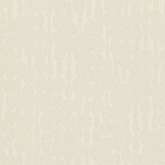
Links Pearl
Momentum Wallcoverings Volume 2
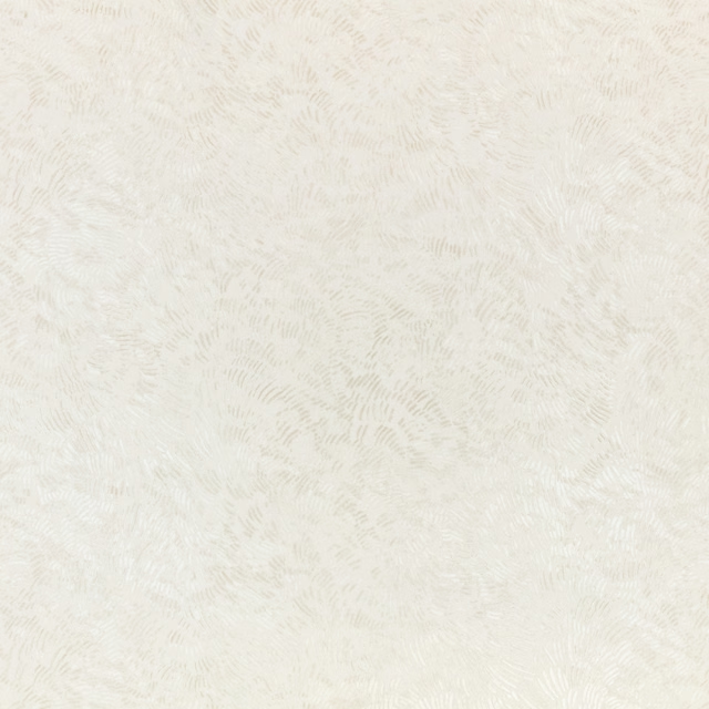
Shiri Wallcovering Pearl
Ottavia Wallcoverings
Klaudia Outdoor Natural
Alfresco Indoor Outdoor Fabric
Bertram Beige
Alberry
Leaf Damask Beige
Ashdown
Lotus Flower Oyster
Amrapali WALLPAPER
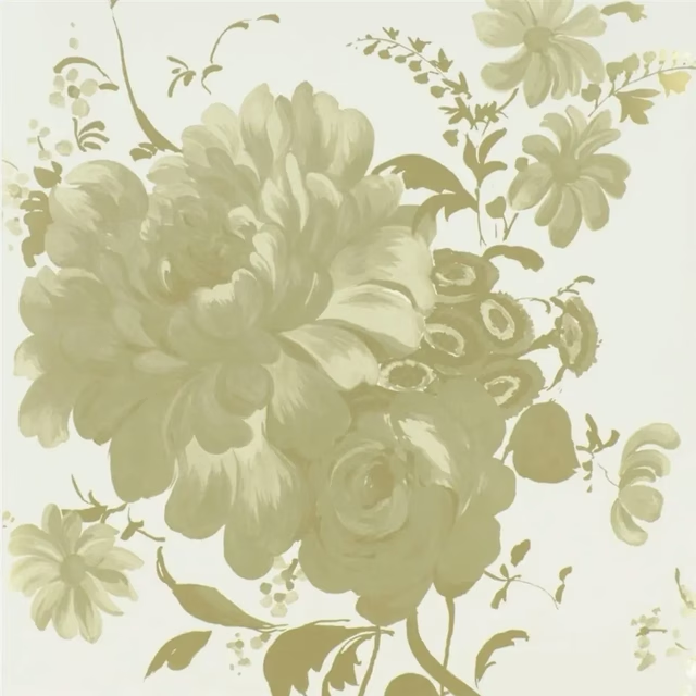
Mehsama Oyster
Amrapali WALLPAPER
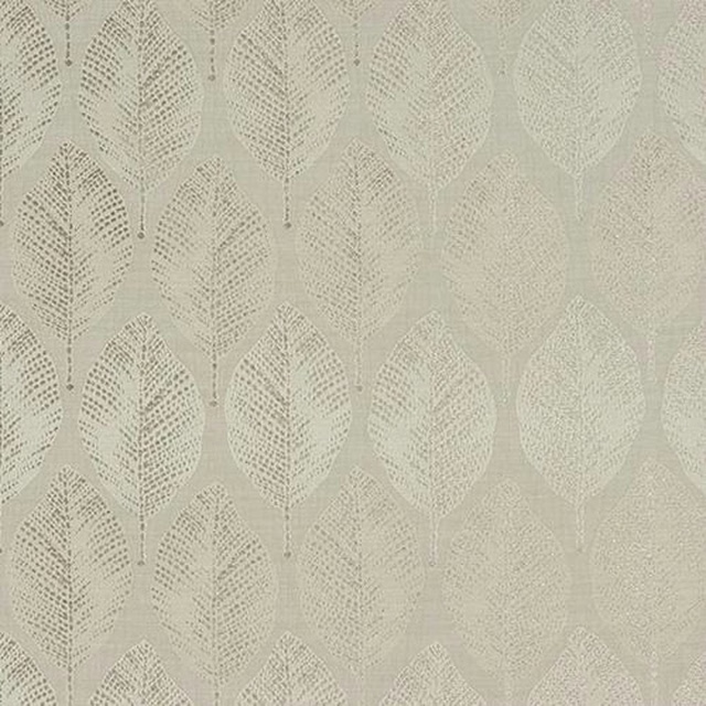
Acacia Natural
Acacia
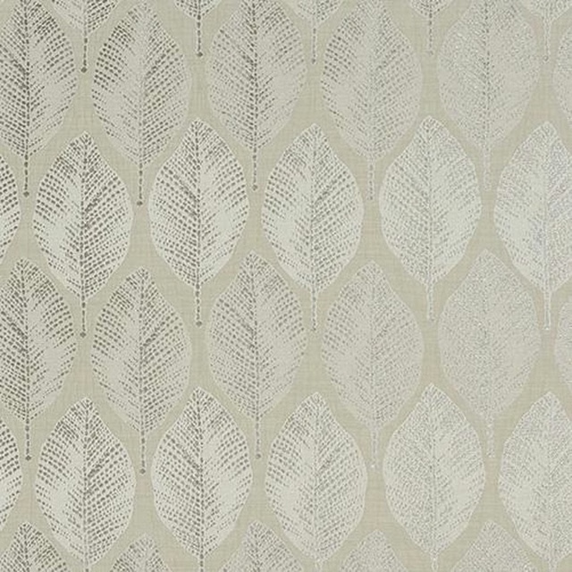
Acacia Oyster
Acacia
Paint that goes with it
Two ways to take the room. Both colours are from houses we hold, so a pot can come off the same order as the cloth. Screens shift colour, so treat these as a direction and bring the cloth to the shelf before you buy the paint.
To sit quietly behind it
Half Pebble
Zoffany · #dfd8c6
To stand against it
Eggplant
Sanderson · #7b7380
Other cream fabrics
Across the houses we hold. See all 4,572.
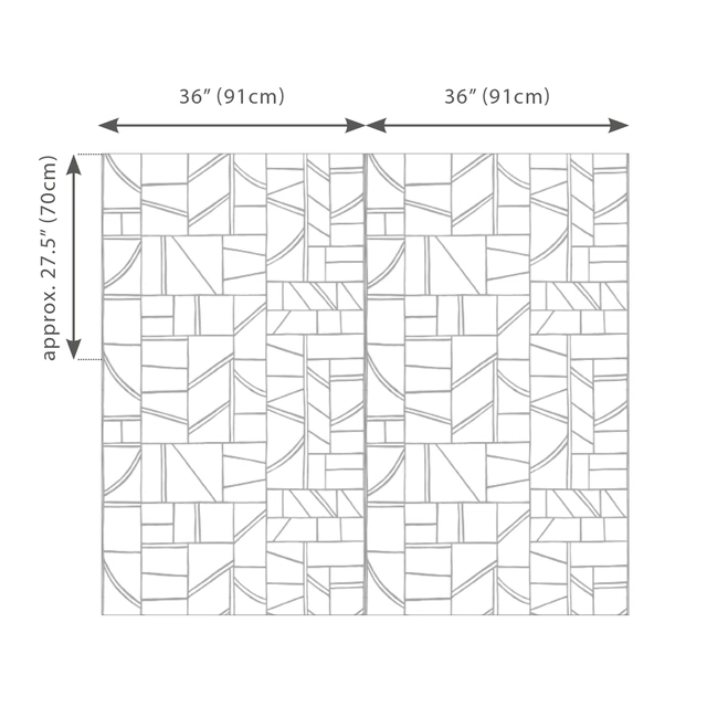
Odyssey Wallcovering Alabaster
Grasscloth Prints
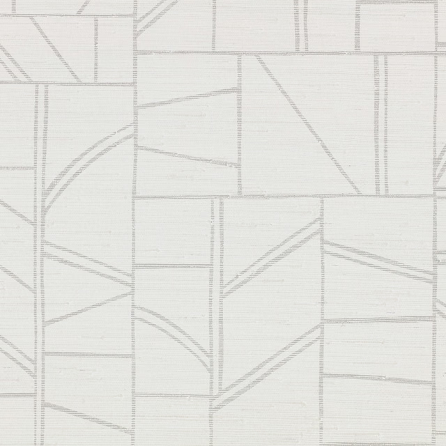
Odyssey Wallcovering Chalk
Grasscloth Prints
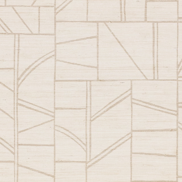
Odyssey Wallcovering Whitewash
Grasscloth Prints
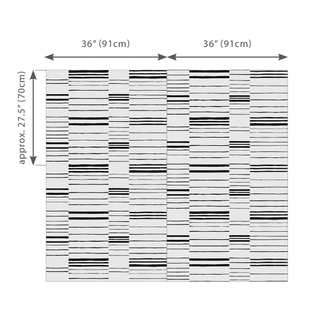
Offset Wallcovering Chalk
Grasscloth Prints
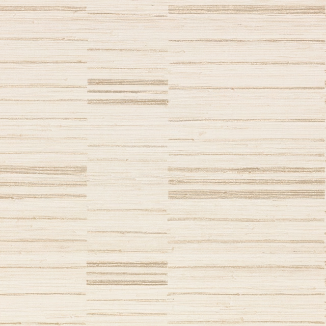
Offset Wallcovering Whitewash
Grasscloth Prints
Abaca Alabaster
Grasscloth
Duosisal Calcite
Grasscloth
Mw108 Canvas
Grasscloth

Sisal Alabaster
Grasscloth
Haze Silk Wallcovering Parchment
Haze Silk Wallcovering
Linara Briosca
Linara

Linara Cream
Linara