


Tap the swatch to see it full screen. Hover it to magnify the weave. Colours on a screen are a guide, not a match, so come and feel the real cloth.
Scroll up or down to zoom in and out.
Chrysanthemum
Pink Paint
Chrysanthemum is a warm, muted pink from Morris & Co. with an earthy, terracotta-leaning softness that keeps it grounded. In Signature Emulsion Paint, it gives walls and ceilings a calm, lived-in colour rather than a sharp decorative pink.
You have used your previews for today. Send one to Simon and you can carry on.
Your board
0 fabrics
See this colour on Morris & Co.'s own site, then order it through us.
See Chrysanthemum in your own room
A photograph of the piece you want re-covered. Straight on is best, and daylight helps. It is used to make your picture and nothing else.
Looking at your room
We found things here Chrysanthemum could go on. Tap one on the photograph, or choose below.
We could not see anything to re-cover
, s
Chrysanthemum, on your
Drag to compare. AI impression, colours indicative: ask us for a cutting before you decide.
About this colour
This shade reads as a dusty pink with a clear brown undertone, so it feels warm and steady rather than sugary. Its #CB9480 value gives it enough depth to hold its own on a wall, while still lifting a room gently instead of making it feel heavy. In north-facing light it can appear more muted and clay-like, with the pinks settling back and the warmth becoming more subdued. In south-facing rooms it comes forward more clearly, showing its peachy pink character and taking on a softer glow. It sits well beside natural oak, dark walnut, cream paintwork, and patterned upholstery in muted greens, browns, and faded reds.
How to use it
Chrysanthemum suits sitting rooms, bedrooms, and hallways where a warm, restful wall colour is wanted. It works well with painted woodwork in soft cream or deeper timber tones, and with upholstery in linen, velvet, or patterned fabrics that carry sage, rust, or taupe.
On a wall, Chrysanthemum feels warm, settled, and gently rosy without turning bright.



Pairs well with
Chrysanthemum is a wall colour, so these are the cloths that sit against it: one of them on the curtains, the paint behind. Mixed across the houses we hold, which is the part a single supplier's book cannot do.

Minack Check Pink
Lamorna Chk & Stp

Goa Stripe Fushsia
Misc
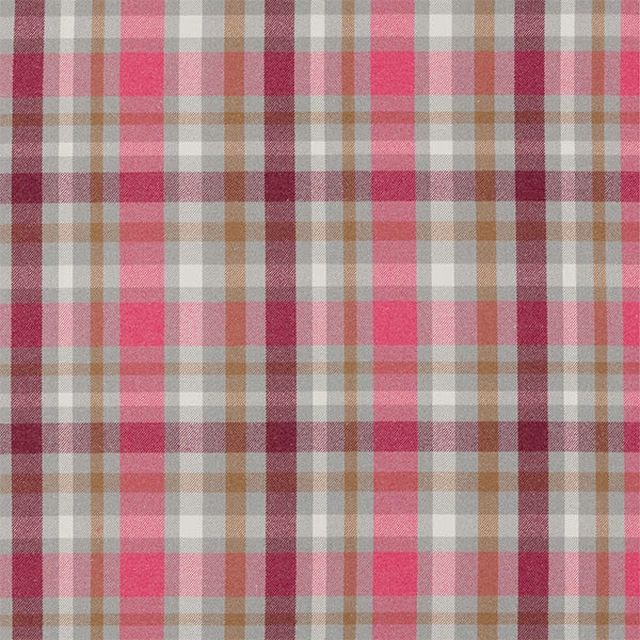
Troon Fuchsia
Misc

Balancing Act Blossom/Raspberry/Grape
Book of Little Treasures Fabrics

Sweet Heart Pink/Purple
Book of Little Treasures Fabrics
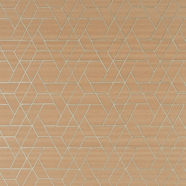
Zelma Wallpaper Pink
Azzura Wallpapers
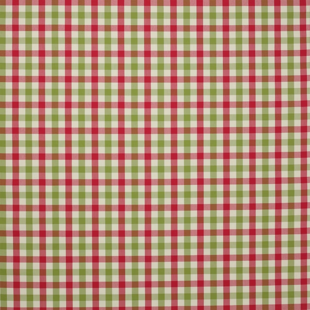
Kali Check Pink/Green
Hartwell
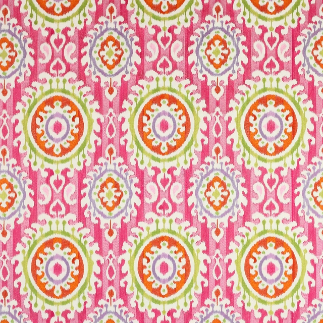
Daya Rose
Tara

Balmoral Fushsia
Misc

Mickey & Minnie Blancmange
Disney Home X Sanderson Fabrics
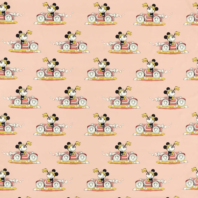
Minnie On the Move Candy Floss
Disney Home X Sanderson Fabrics
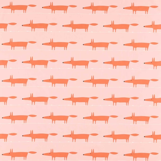
Midi Fox Milkshake/Rose
Midi Fox Fabrics
Other pink fabrics
Across the houses we hold. See all 2,440.
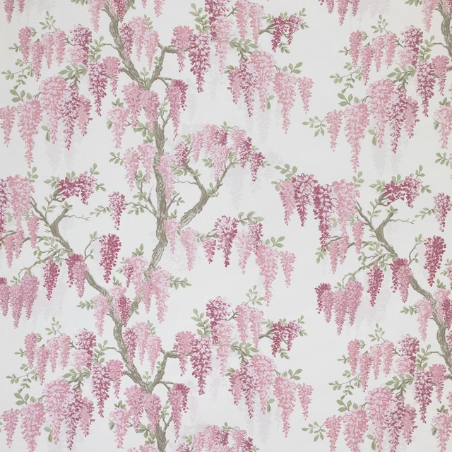
Wisteria Coral Pink
70th Anniversary Collection

Louise Star Pink
70th Anniversary Collection

Rowena Peony
70th Anniversary Collection
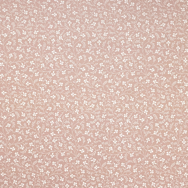
Campion Plaster
70th Anniversary Collection

Wickerwork Coral Pink
70th Anniversary Collection

Fire Pink
2026 Paint

French Rose
2026 Paint

Peony Pink
2026 Paint

Rhodera
2026 Paint

Wild Plum Light
2026 Paint

Sorilla
2026 Paint

Inkwood
2026 Paint