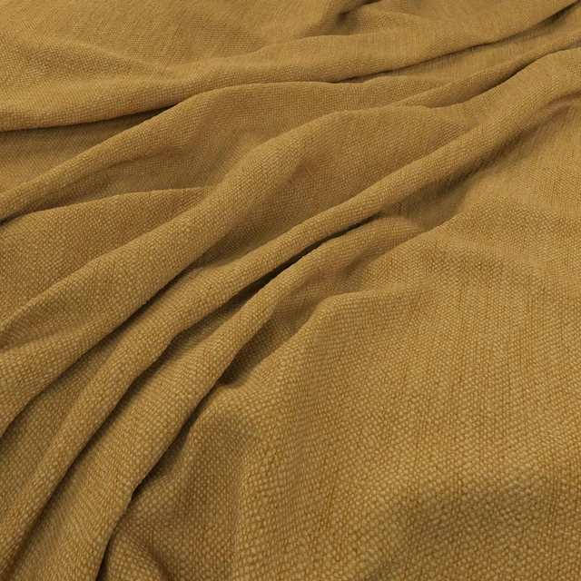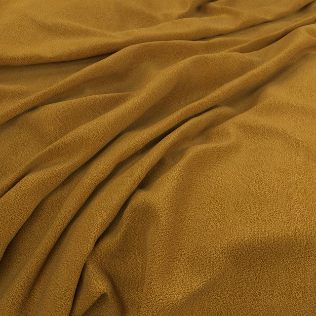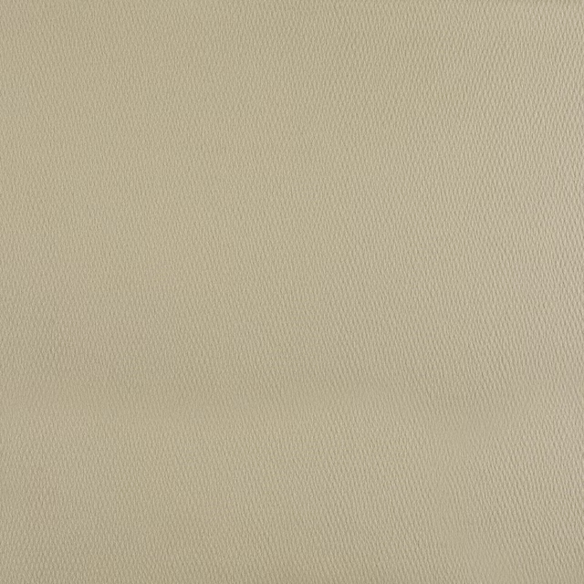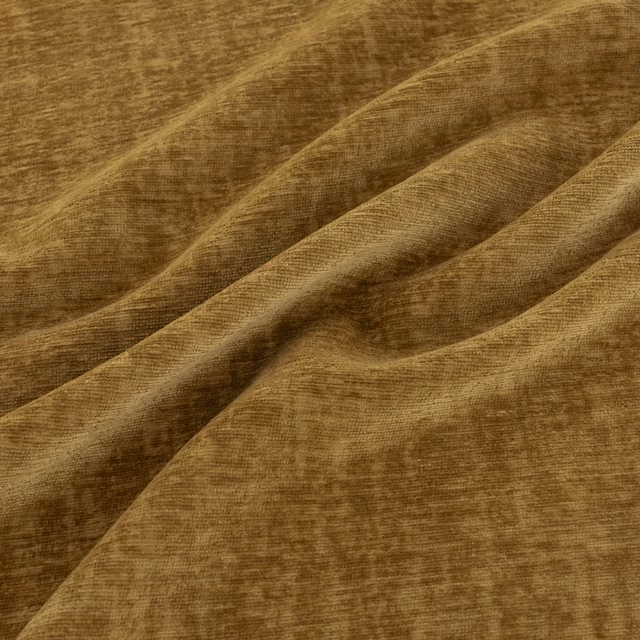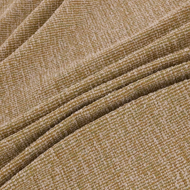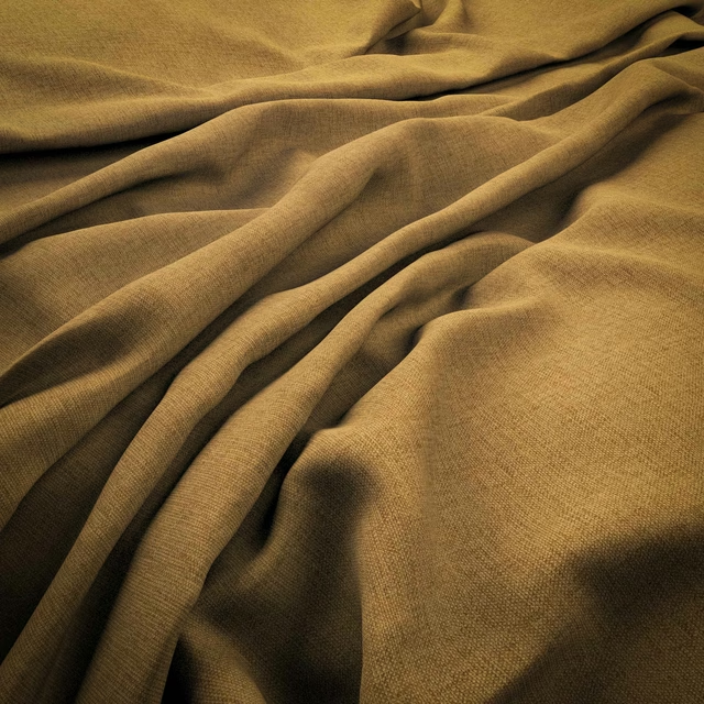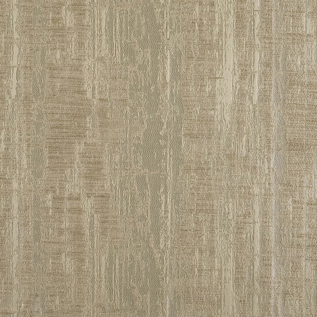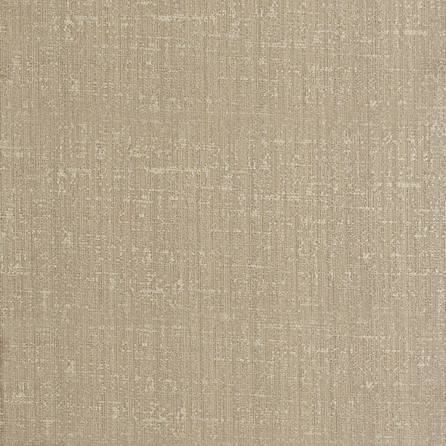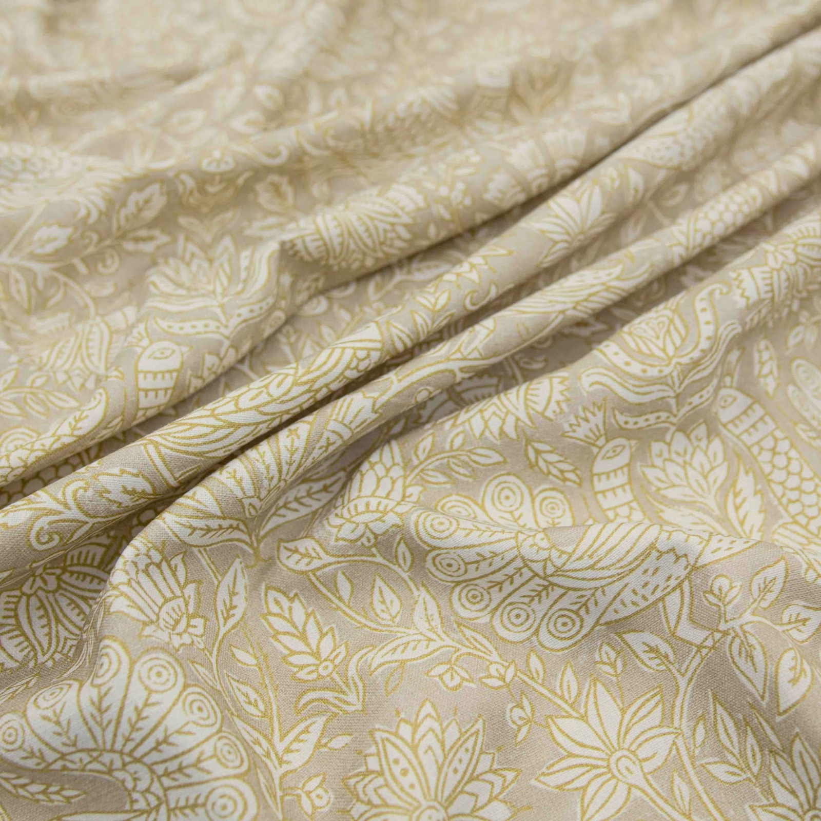

Tap the swatch to see it full screen. Hover it to magnify the weave. Colours on a screen are a guide, not a match, so come and feel the real cloth.
Scroll up or down to zoom in and out.
Petronella Saffron
Petronella Fabric
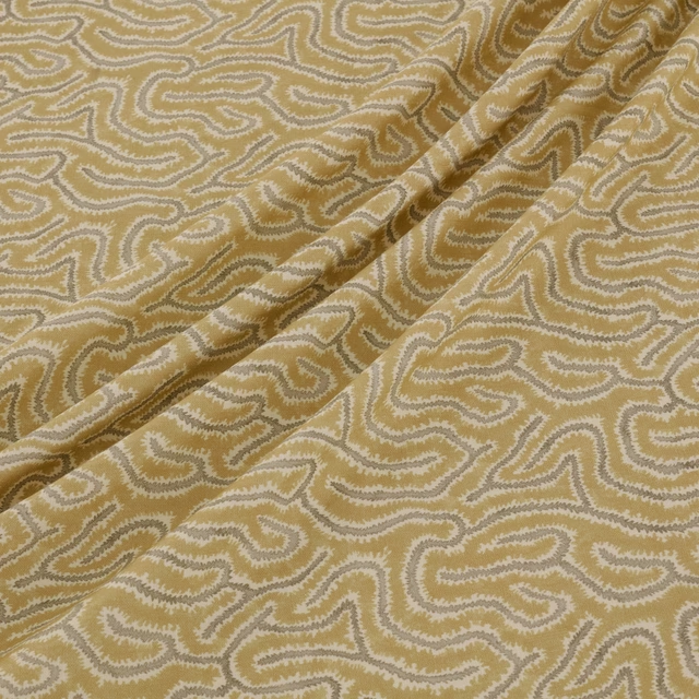
Petronella Saffron has a softly luminous, pale stone ground overlaid with muted saffron-gold botanical forms. The folded swatch shows a fluid paisley arrangement of leaves, flowers and fine curling lines, with gentle tonal depth rather than a high-contrast finish.
You have used your previews for today. Send one to Simon and you can carry on.
Your board
0 fabrics
See this fabric on Warwick's own site, then order it through us.
See Petronella Saffron in your own room
A photograph of the piece you want re-covered. Straight on is best, and daylight helps. It is used to make your picture and nothing else.
Looking at your room
We found things here Petronella Saffron could go on. Tap one on the photograph, or choose below.
We could not see anything to re-cover
, s
Petronella Saffron, on your
Drag to compare. AI impression, colours indicative: ask us for a cutting before you decide.
About this fabric
The fabric’s warm stone base is enlivened by subdued saffron motifs, giving the colourway a mellow, sun-washed character rather than a bright yellow appearance. Botanical leaves, stylised blooms, paisley shapes and delicate linear details create a medium-scale pattern that remains intricate at close range. Its softly structured folds suggest a versatile mid-weight cloth suitable for both upholstery and drapery. No composition, width, rub-test or performance specification has been supplied for this exact fabric.
How to use it
Use Petronella Saffron to bring warmth to a light, neutral room, pairing its stone ground with natural timber, ivory upholstery and aged brass. The muted saffron detail works especially well as a gentle accent on a chair, headboard or full-length curtain.
A softly structured stone ground and muted saffron pattern bring warm, quietly decorative character to upholstery or curtains.
Pairs well with
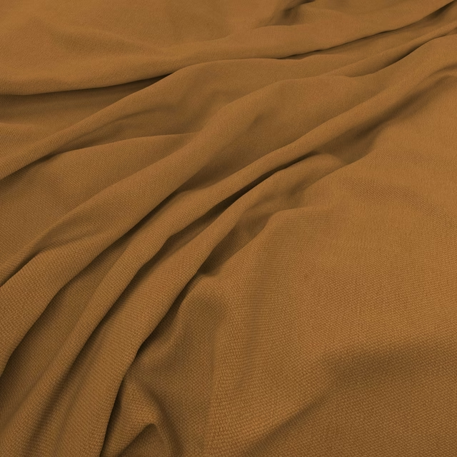
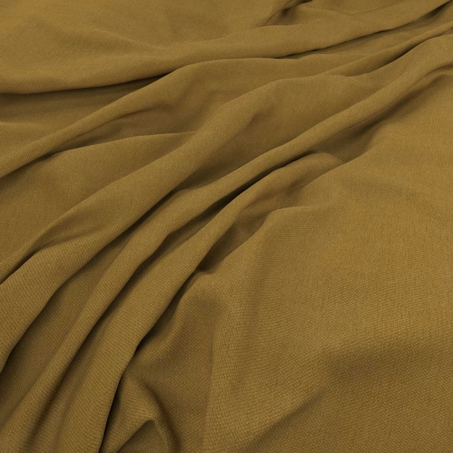
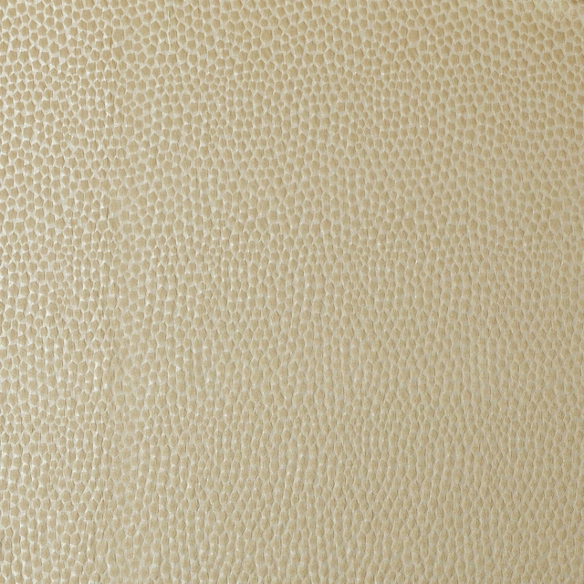
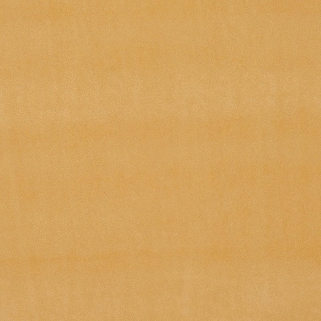
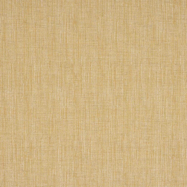
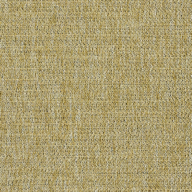
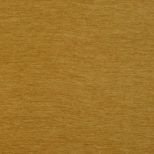
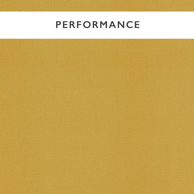
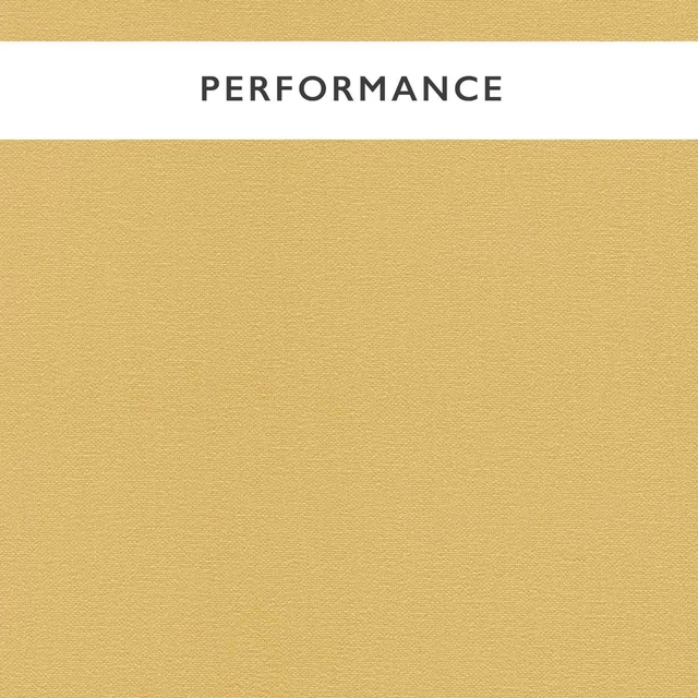
A pattern needs somewhere for the eye to rest, so these are the plains and textures that sit beside Petronella Saffron without fighting it. Mixed across the houses we hold, which is the part a single supplier's book cannot do.




Paint that goes with it
Two ways to take the room. Both colours are from houses we hold, so a pot can come off the same order as the cloth. Screens shift colour, so treat these as a direction and bring the cloth to the shelf before you buy the paint.
To sit quietly behind it
Thames Reeds
Morris & Co. · #bbb196
To stand against it
Rhodera
Sanderson · #bb687a
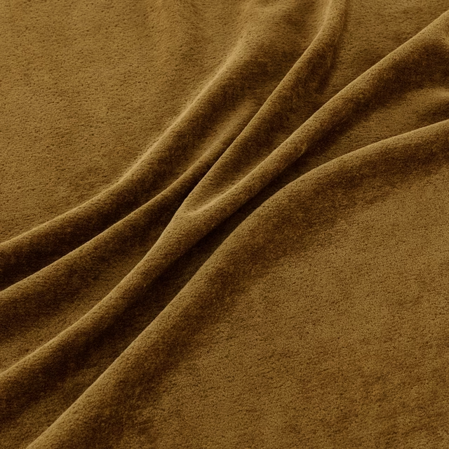
Other gold fabrics
Across the houses we hold. See all 1,418.