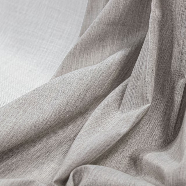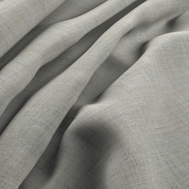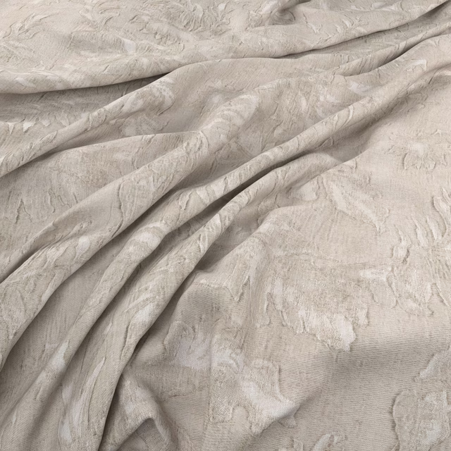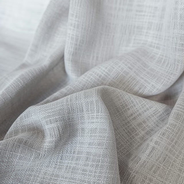

Tap the swatch to see it full screen. Hover it to magnify the weave. Colours on a screen are a guide, not a match, so come and feel the real cloth.
Scroll up or down to zoom in and out.
Piana Oyster
Piana Fabric
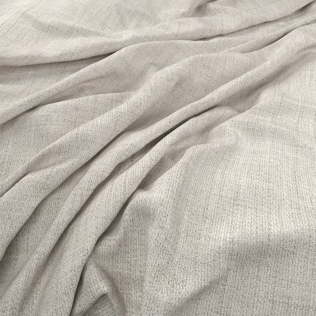
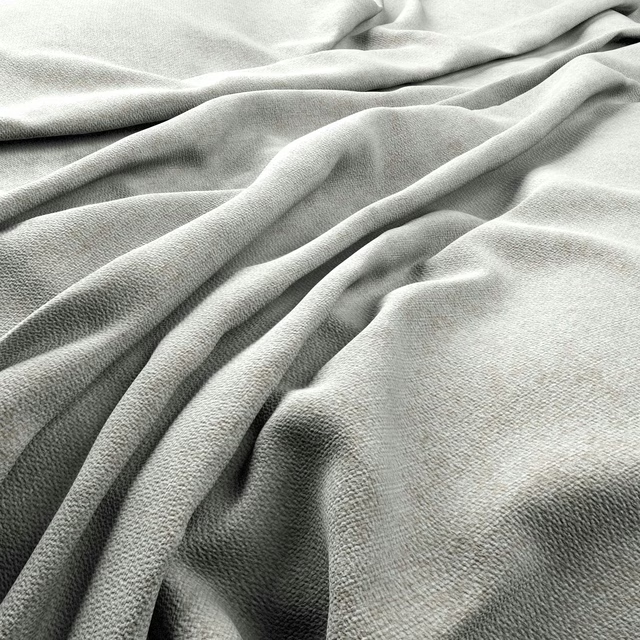
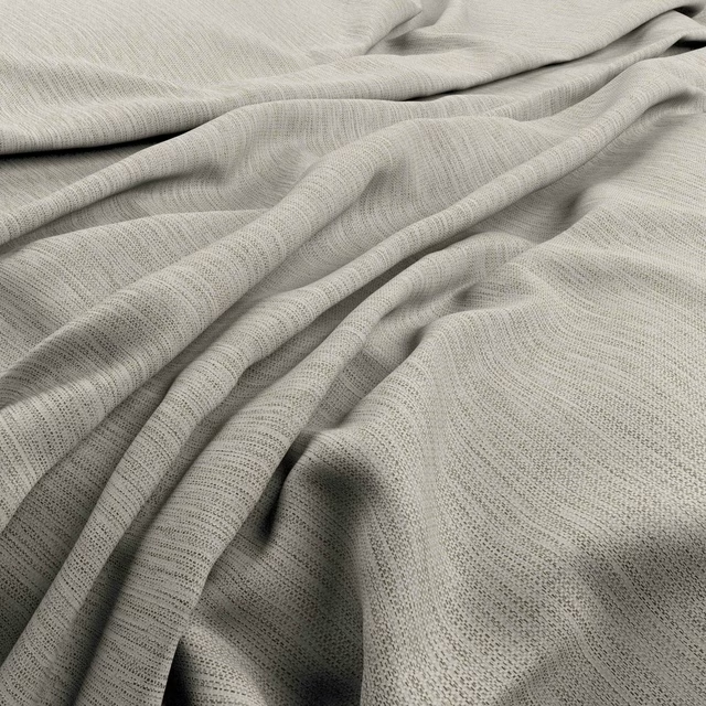
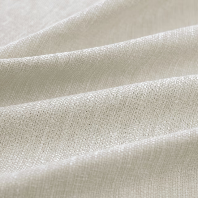
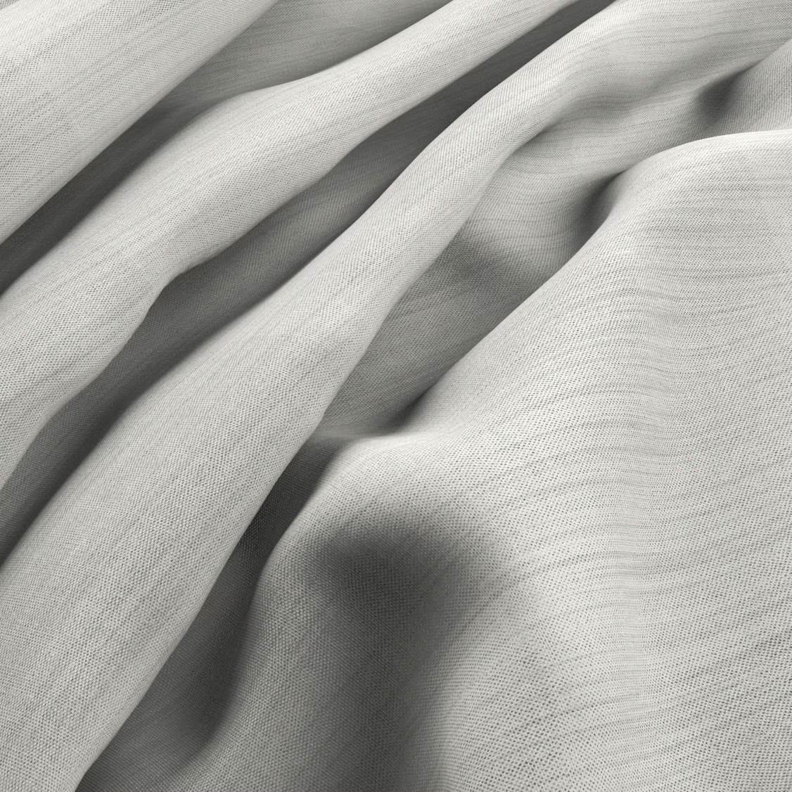
Piana Oyster is a quiet, pale neutral with a soft oyster-grey cast. In the swatch image, its fine woven surface bends into fluid folds, revealing subtle shifts between light silvered areas and gentle shadow.
You have used your previews for today. Send one to Simon and you can carry on.
Your board
0 fabrics
See this fabric on Warwick's own site, then order it through us.
See Piana Oyster in your own room
A photograph of the piece you want re-covered. Straight on is best, and daylight helps. It is used to make your picture and nothing else.
Looking at your room
We found things here Piana Oyster could go on. Tap one on the photograph, or choose below.
We could not see anything to re-cover
, s
Piana Oyster, on your
Drag to compare. AI impression, colours indicative: ask us for a cutting before you decide.
About this fabric
The closely woven face has a delicate, even texture rather than a pronounced motif, with fine linear detail visible across the surface. Its oyster tone sits between warm off-white and cool light grey, giving the colourway more depth than a plain white. The fabric falls softly in the photographed folds, where the changing angles create understated tonal movement. With no performance features or further specification data supplied, its suitability should be assessed against the intended project requirements.
How to use it
Use Piana Oyster at the window where its pale grey-beige tone can soften daylight without making the scheme feel stark. Pair it with chalky whites, light timber and warm stone for a relaxed, quietly layered interior.
Use this softly textured oyster shade for fluid curtains that keep a room light, calm and understated.
More from Piana
The same book, other colourways.
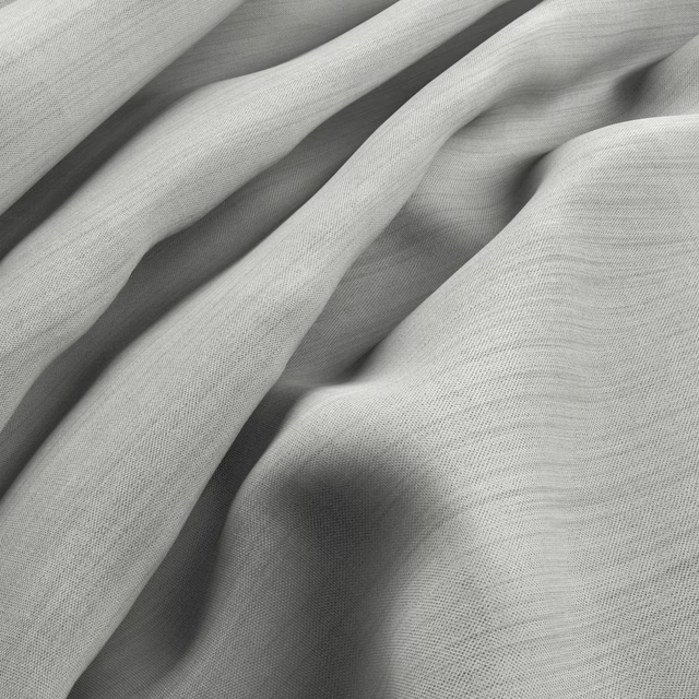
Piana Frost
Piana
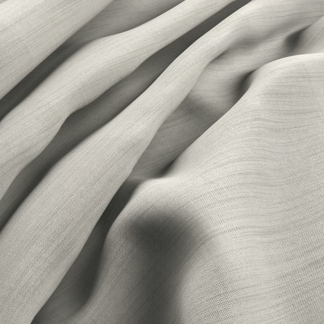
Piana Natural
Piana
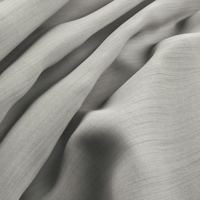
Piana Smoke
Piana
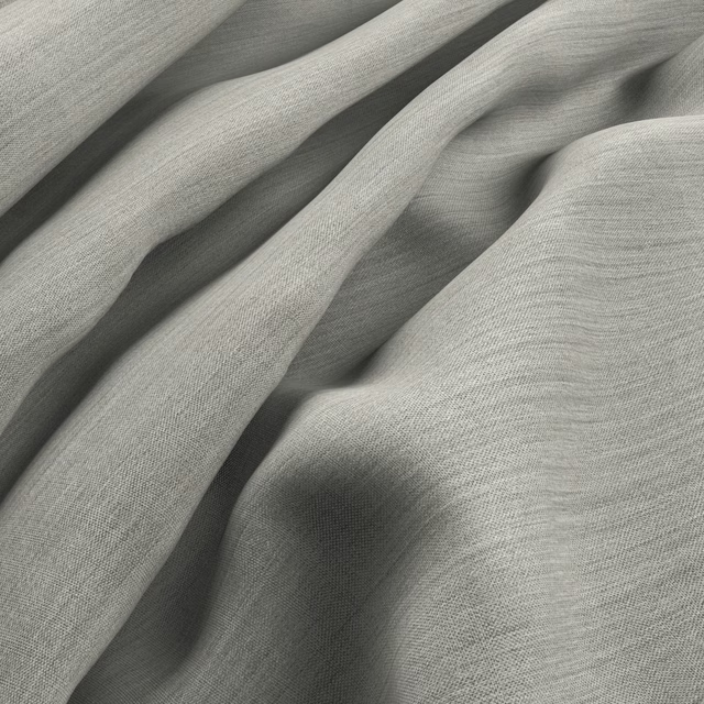
Piana Mist
Piana
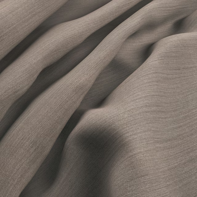
Piana Flax
Piana
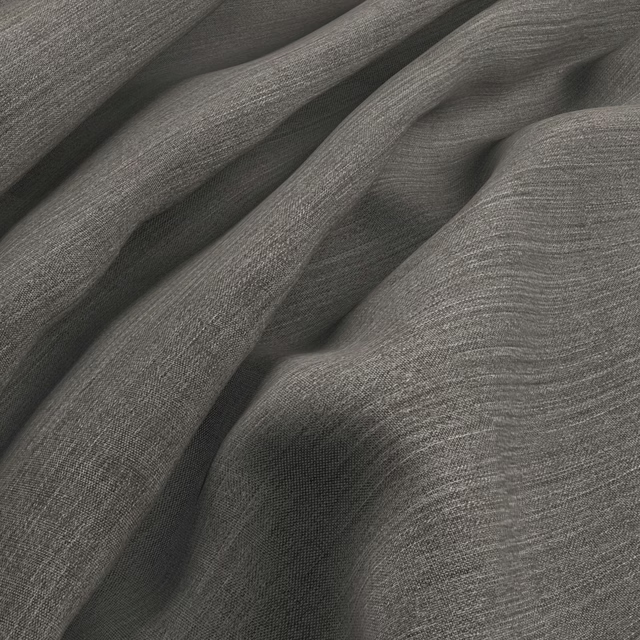
Piana Graphite
Piana
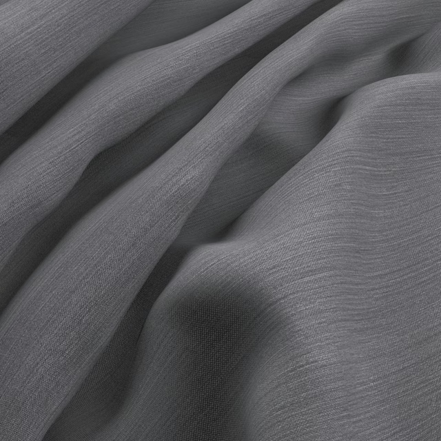
Piana Storm
Piana
Pairs well with
Piana Oyster is a quiet cloth, so it carries a pattern beside it: one of these on the curtains and this on the chair. Mixed across the houses we hold, which is the part a single supplier's book cannot do.
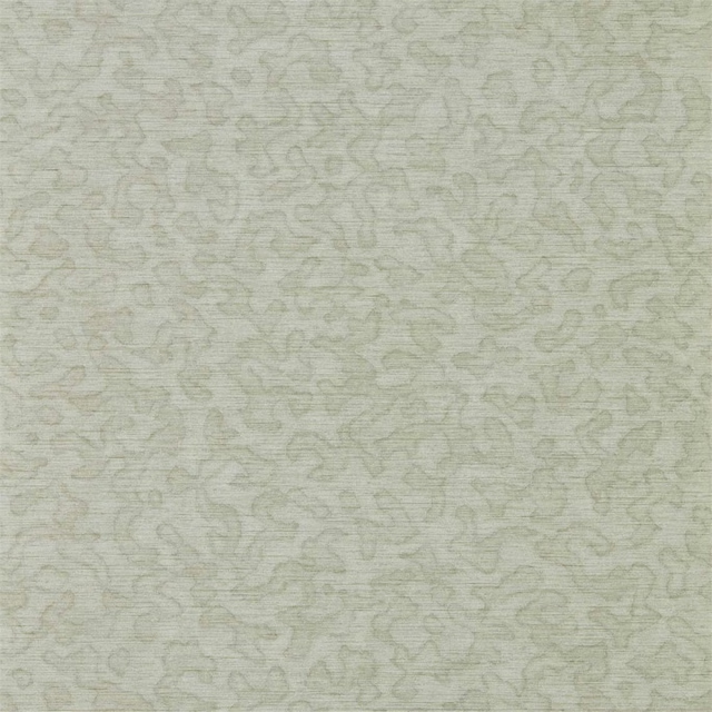
Nakuru Wide Width Oyster
Mirador Wallpaper
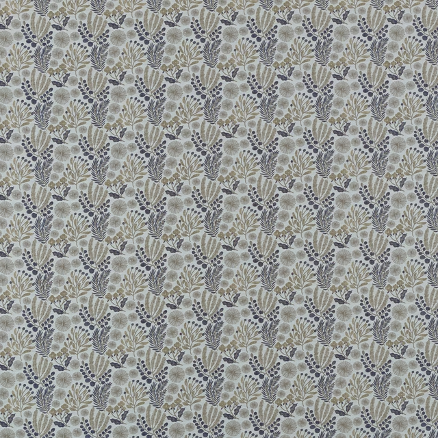
Beckett Danube
Belvoir Collection
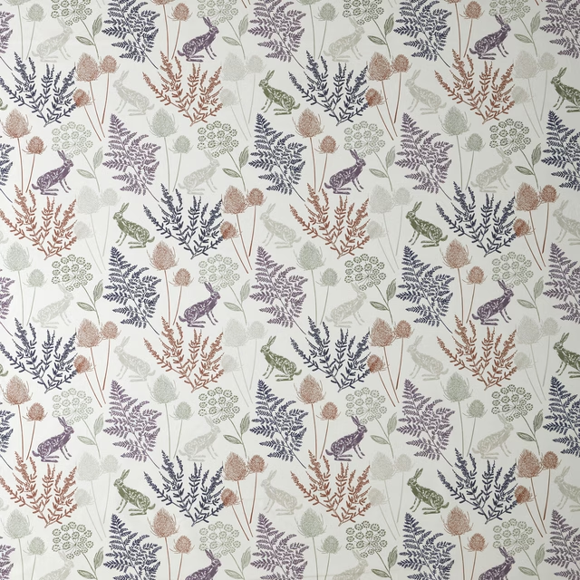
Kielder Natural Natural
Belvoir Collection
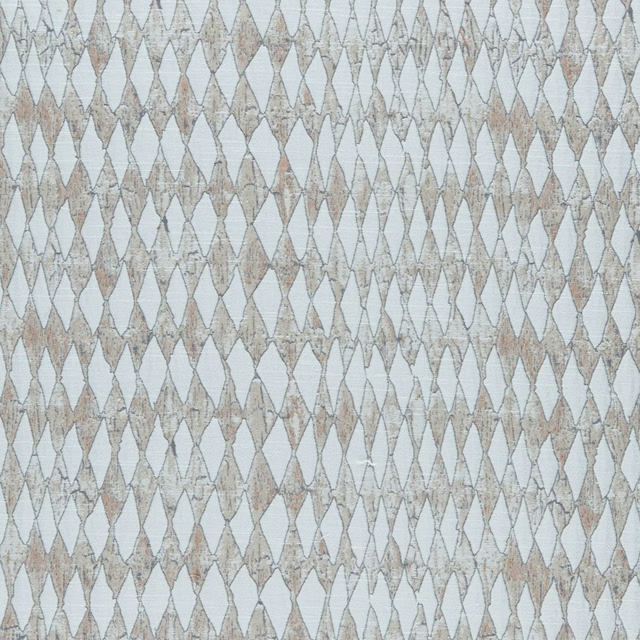
Amara Natural
Amara
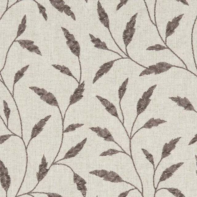
Fairford Charcoal
Avebury
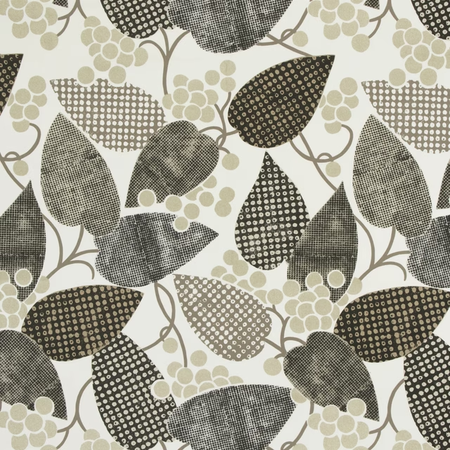
Barcelona Ecru
Barcelona Fabrics
Carlu Nickel
Carlu WALLPAPER
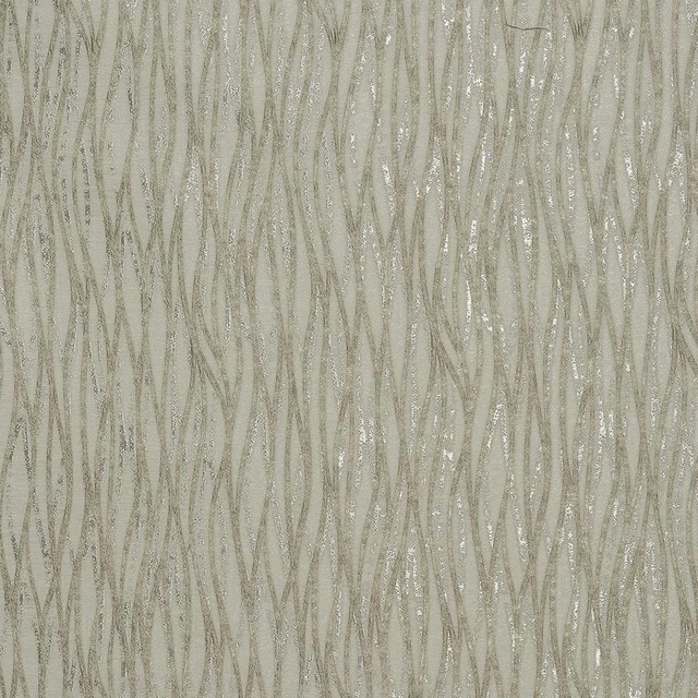
Linear Natural
Acacia
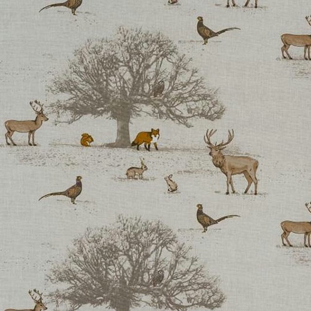
Tatton Autumn
Animal Kingdom
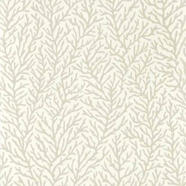
Atoll Awakening/Diffused Light
Colour 1 Wallpapers
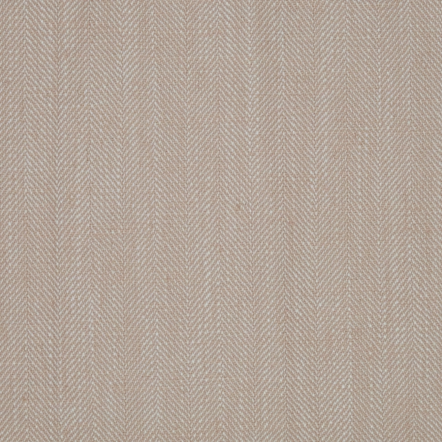
Chambray Blush
Chambray
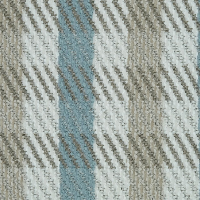
Hampton Gingham Oatmeal
Hampton
Paint that goes with it
Two ways to take the room. Both colours are from houses we hold, so a pot can come off the same order as the cloth. Screens shift colour, so treat these as a direction and bring the cloth to the shelf before you buy the paint.
To sit quietly behind it
English Grey
Sanderson · #a6a8a5
To stand against it
The Tobacconist
Coat Paints · #62502a
Other neutral fabrics
Across the houses we hold. See all 911.