
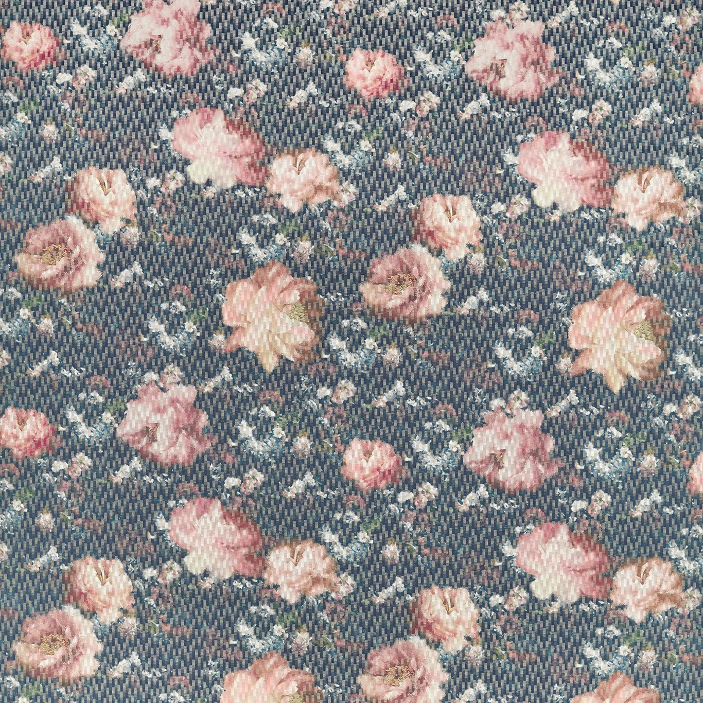

Tap the swatch to see it full screen. Hover it to magnify the weave. Colours on a screen are a guide, not a match, so come and feel the real cloth.
Scroll up or down to zoom in and out.
Camile Spice/Dusk
Fusion FabricCCF0550-04
Camile Spice/Dusk pairs a dusky blue-grey woven ground with scattered blush, peach and soft pink blooms. The close texture gives the floral pattern a gently weathered, tactile finish rather than a crisp printed look.
You have used your previews for today. Send one to Simon and you can carry on.
Your board
0 fabrics
Part of the range we hold from Clarke & Clarke.
See Camile Spice/Dusk in your own room
A photograph of the piece you want re-covered. Straight on is best, and daylight helps. It is used to make your picture and nothing else.
Looking at your room
We found things here Camile Spice/Dusk could go on. Tap one on the photograph, or choose below.
We could not see anything to re-cover
, s
Camile Spice/Dusk, on your
Drag to compare. AI impression, colours indicative: ask us for a cutting before you decide.
About this fabric
This 205gsm fabric has a visibly fine, ribbed weave that gives depth to the cool blue background and softly blends the surrounding floral detail. Medium-sized blooms are spaced across the ground in faded pink, peach and muted rose tones, with tiny pale sprigs filling the intervals. A 78.5cm vertical repeat and 68.5cm horizontal repeat give the pattern a considered rhythm when matched across larger pieces. With a 137cm usable width, it is a versatile mid-weight choice for upholstery or drapery.
How to use it
Use the blue-grey ground to temper warm timber, chalky whites or aged brass, while the blush and peach flowers can be picked up in cushions or painted joinery. Its softened contrast suits a relaxed bedroom curtain, occasional chair or floral seat cushion.
The dusky blue ground and softly faded blush flowers bring a relaxed vintage character to seating, cushions or curtains.
More from Fusion
The same book, other colourways.
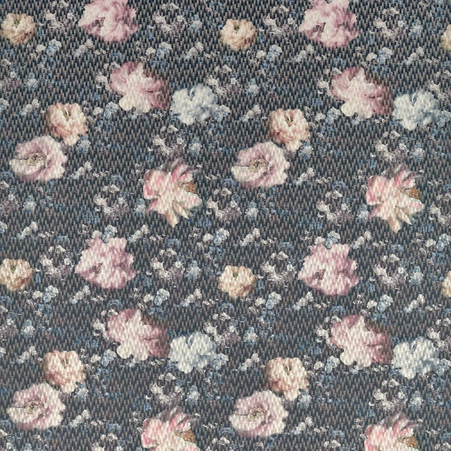
Camile Blush/Charcoal
Fusion
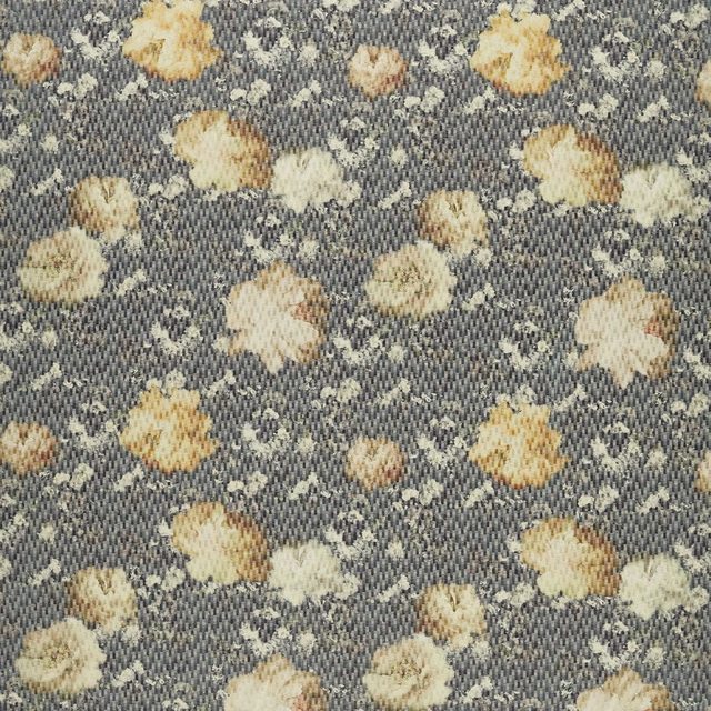
Camile Chartreuse/Charcoal
Fusion
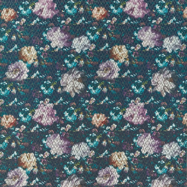
Camile Midnight
Fusion
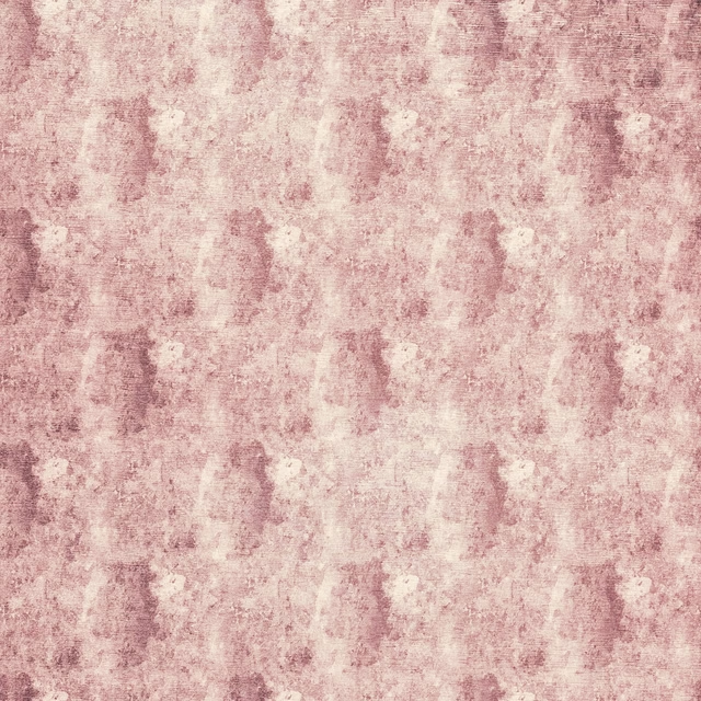
Impression Blush
Fusion
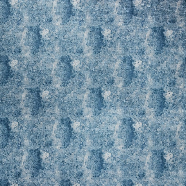
Impression Midnight
Fusion
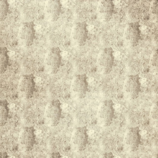
Impression Natural
Fusion
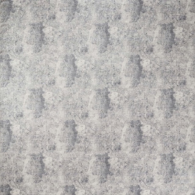
Impression Pewter
Fusion
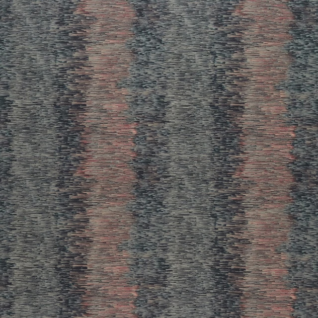
Ombre Blush/Charcoal
Fusion
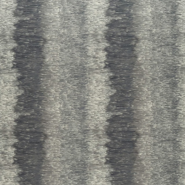
Ombre Charcoal
Fusion

Ombre Midnight
Fusion
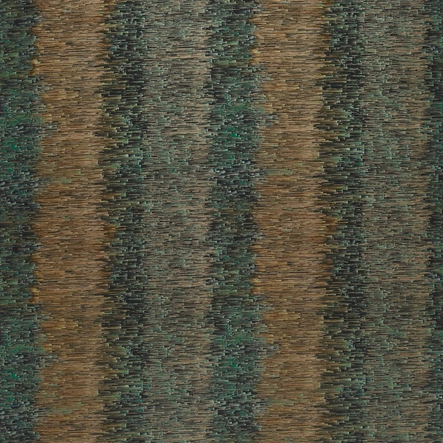
Ombre Spice
Fusion
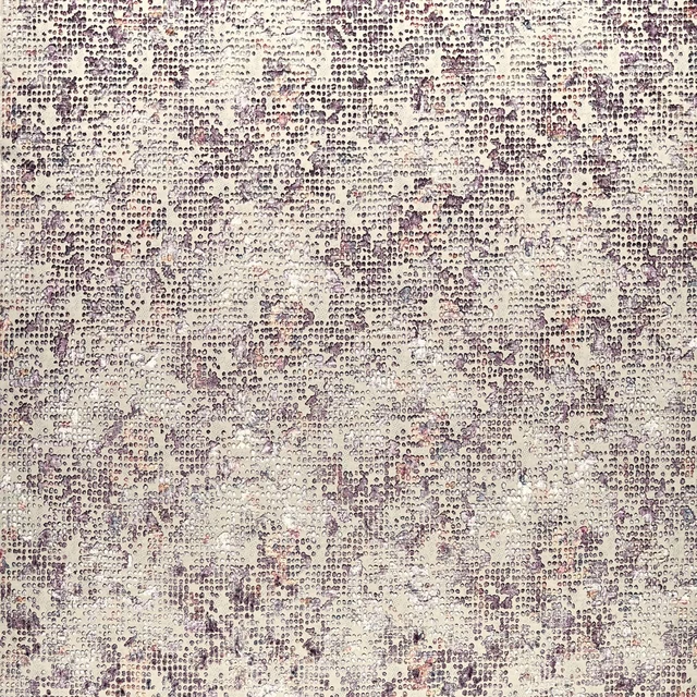
Scintilla Blush
Fusion
Pairs well with
A pattern needs somewhere for the eye to rest, so these are the plains and textures that sit beside Camile Spice/Dusk without fighting it. Mixed across the houses we hold, which is the part a single supplier's book cannot do.

Baltic Sky
Atlantic Collection

Bronte Mineral
Darwin Collection
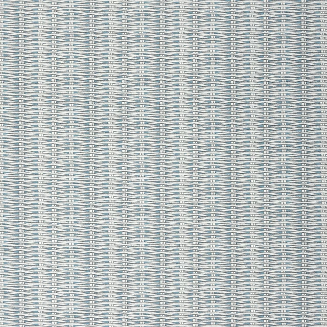
Barbade Turquoise
Nouveaux Mondes Fabrics
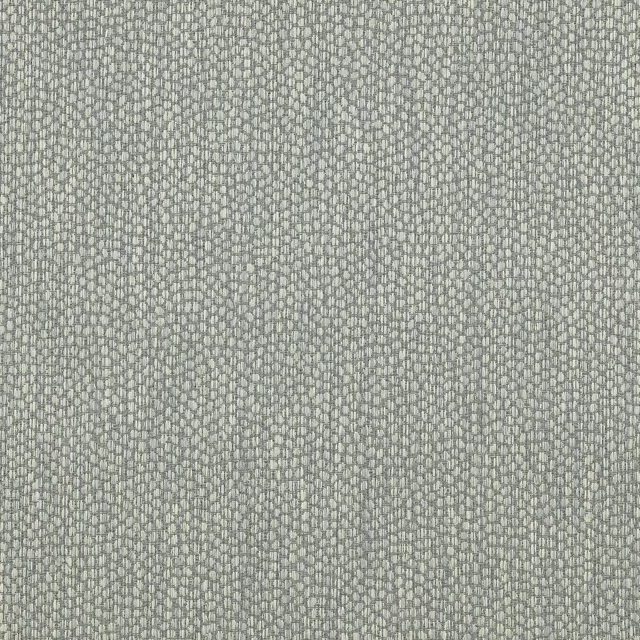
Lyncombe Aqua
Albeck
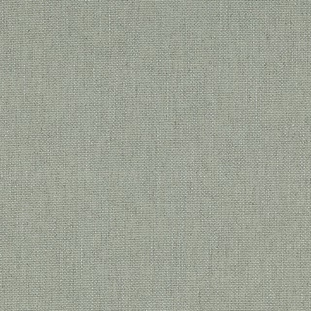
Marldon Pale Aqua
Albeck

Mayura Cobalt
Amrapali WALLPAPER

Bellavista Sky
Bellavista Fabrics
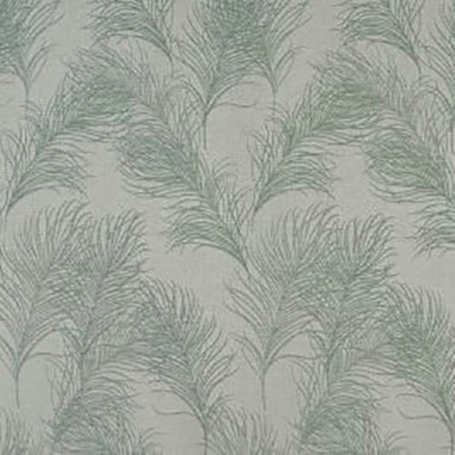
Feather Duck Egg
Acacia

Monza Denim
Arezzo

Allegra Sky
Allegra

Ario Eggshell
Ario

Amalfi Sky
Amalfi
Paint that goes with it
Two ways to take the room. Both colours are from houses we hold, so a pot can come off the same order as the cloth. Screens shift colour, so treat these as a direction and bring the cloth to the shelf before you buy the paint.
To sit quietly behind it
Mid Lead Colour
Little Greene · #8c8c8c
To stand against it
Flint
Little Greene · #f9f7f2
Other blue fabrics
Across the houses we hold. See all 7,566.
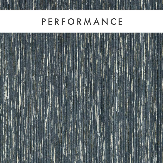
Asper Midnight
Expressions Performance Wallcoverings
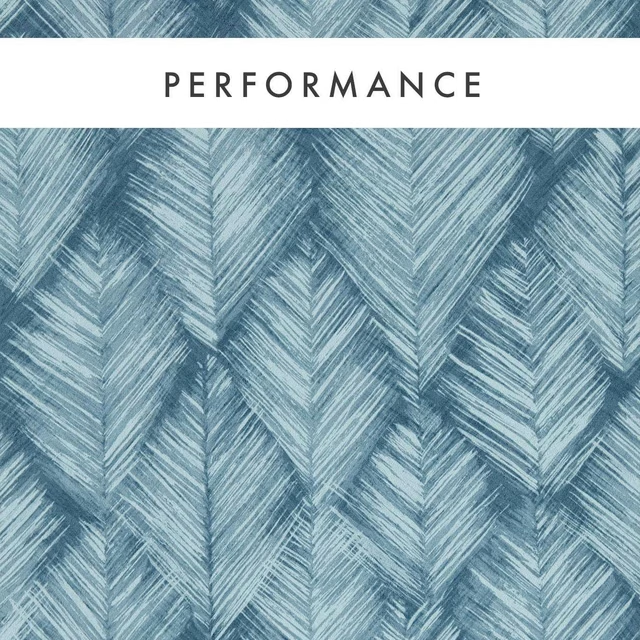
Folius Midnight
Expressions Performance Wallcoverings
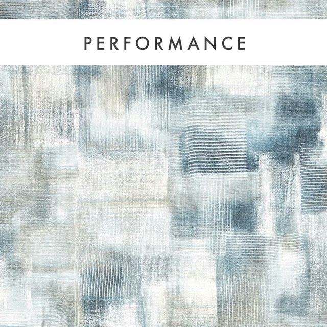
Lavatus Midnight
Expressions Performance Wallcoverings
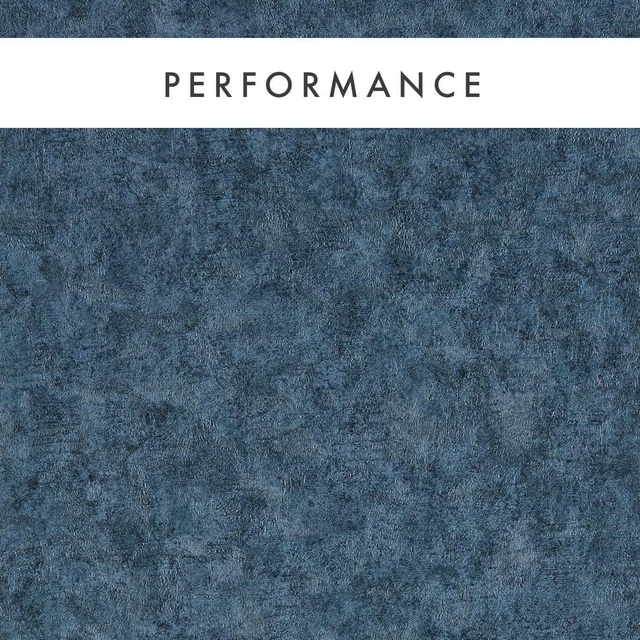
Marmor Midnight
Expressions Performance Wallcoverings
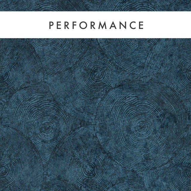
Silvan Midnight
Expressions Performance Wallcoverings
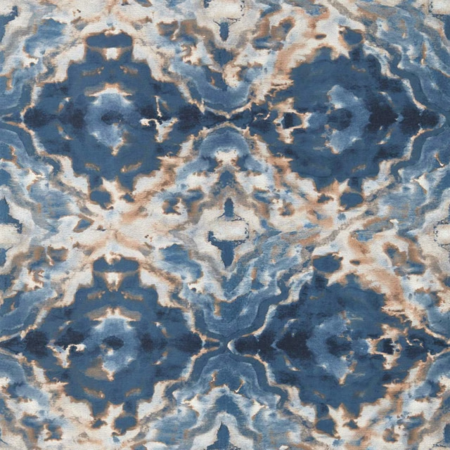
Aqueous Midnight/Spice
Fusion Wallpaper
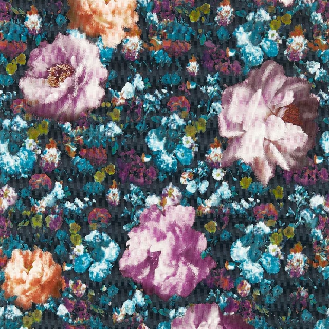
Camile Midnight
Fusion Wallpaper
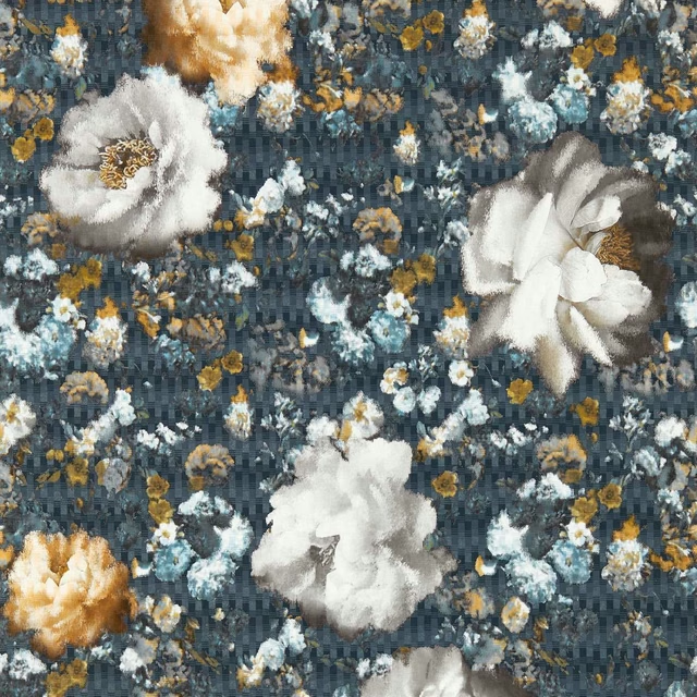
Camile Midnight/Gold
Fusion Wallpaper

Fragment Midnight/Copper
Fusion Wallpaper

Ombre Denim
Fusion Wallpaper
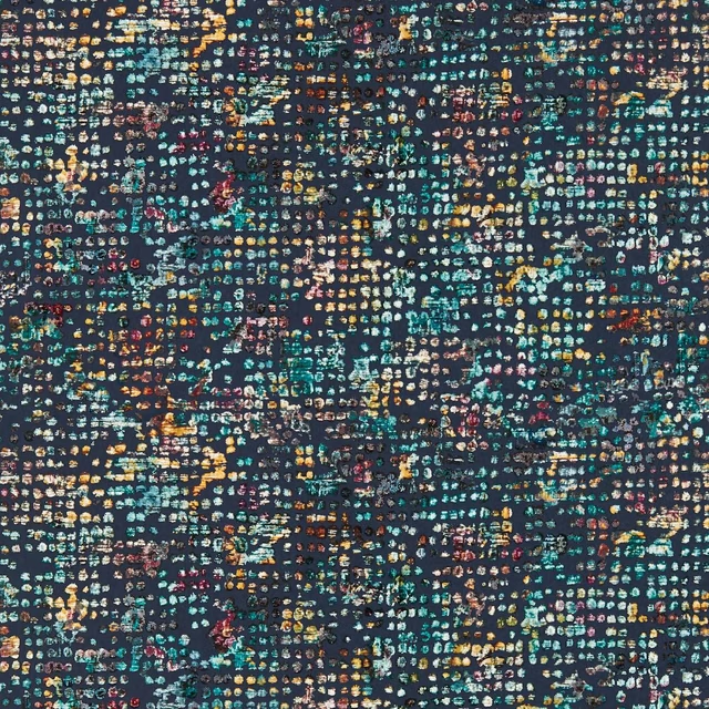
Scintilla Midnight
Fusion Wallpaper
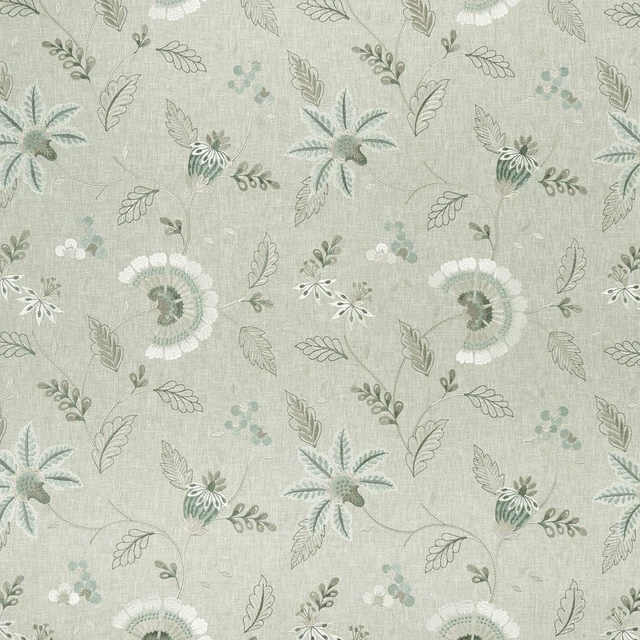
Delamere Duckegg
Halcyon