
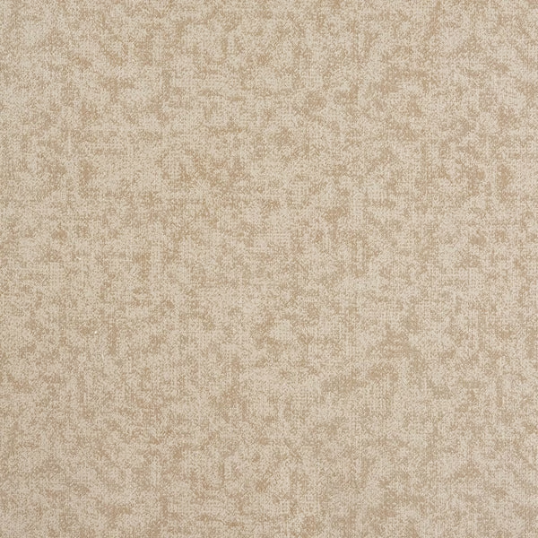
Tap the swatch to see it full screen. Hover it to magnify the weave. Colours on a screen are a guide, not a match, so come and feel the real cloth.
Scroll up or down to zoom in and out.
Dreamy FR Pearl
Dreamy FR Fabric
Dreamy FR Pearl is a softly luminous cream fabric with a delicate mottled surface that gives the cloth a gentle, clouded depth. Its pale pearl tone reads warm and calming rather than stark, with the texture adding interest without strong contrast.
You have used your previews for today. Send one to Simon and you can carry on.
Your board
0 fabrics
See this fabric on Porter & Stone's own site, then order it through us.
See Dreamy FR Pearl in your own room
A photograph of the piece you want re-covered. Straight on is best, and daylight helps. It is used to make your picture and nothing else.
Looking at your room
We found things here Dreamy FR Pearl could go on. Tap one on the photograph, or choose below.
We could not see anything to re-cover
, s
Dreamy FR Pearl, on your
Drag to compare. AI impression, colours indicative: ask us for a cutting before you decide.
About this fabric
This colourway has a smooth, quietly textural appearance, with fine tonal movement across the surface that catches the light in a soft, diffused way. The pearl cream shade feels warm and understated, making the pattern read almost like a haze rather than a bold motif. Made from 100% polyester, this fabric is 140cm wide with a 0cm pattern repeat, which makes it straightforward to cut and match for larger upholstery projects. The overall effect is refined and versatile, with enough surface detail to keep pale interiors from feeling flat.
How to use it
Use Dreamy FR Pearl on a sofa, headboard or dining chair to bring a light, tailored softness to the room. It works especially well with natural oak, linen whites and brushed brass, where its warm pearl tone feels calm and elevated.
A quiet pearl-toned ground that pairs beautifully with pale timber and warm neutrals.
More from Dreamy FR
The same book, other colourways.
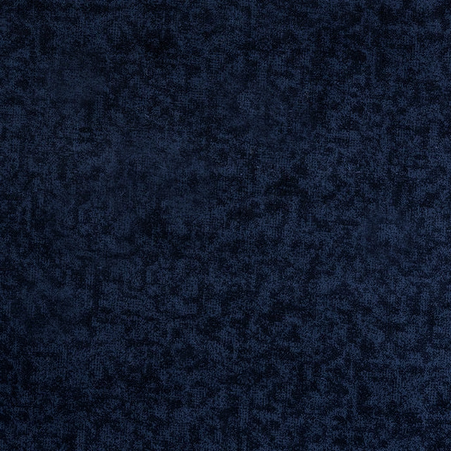
Dreamy FR Indigo
Dreamy FR
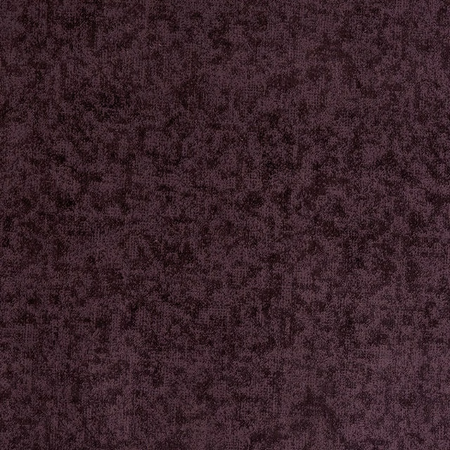
Dreamy FR Lavender
Dreamy FR
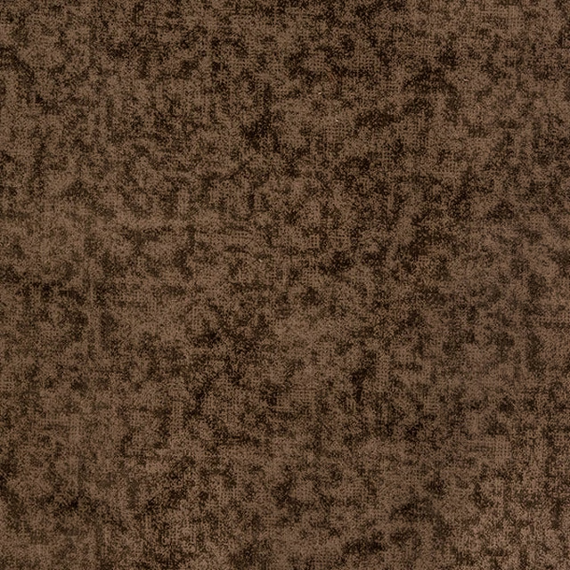
Dreamy FR Mink
Dreamy FR

Dreamy FR Mulberry
Dreamy FR
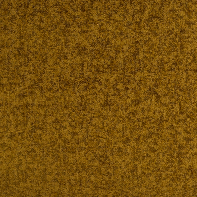
Dreamy FR Ochre
Dreamy FR

Dreamy FR Peacock
Dreamy FR

Dreamy FR Pewter
Dreamy FR

Dreamy FR Platinum
Dreamy FR

Dreamy FR Rose
Dreamy FR

Dreamy FR Ruby
Dreamy FR
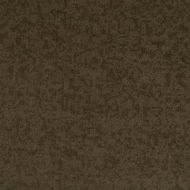
Dreamy FR Sage
Dreamy FR

Dreamy FR Slate
Dreamy FR
Pairs well with
A pattern needs somewhere for the eye to rest, so these are the plains and textures that sit beside Dreamy FR Pearl without fighting it. Mixed across the houses we hold, which is the part a single supplier's book cannot do.
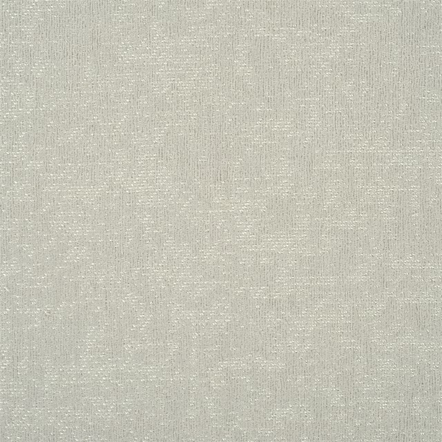
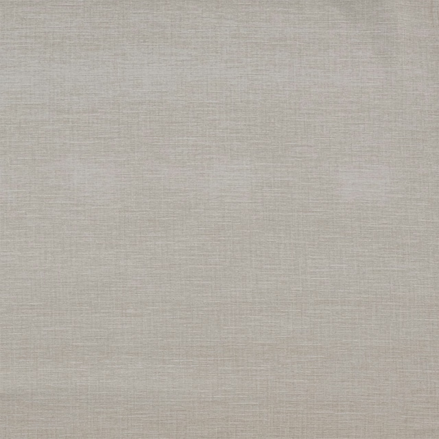





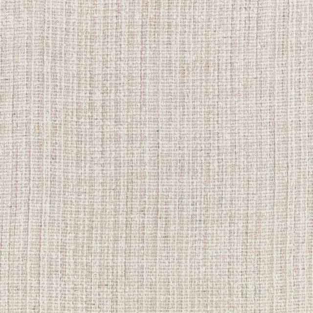
Paint that goes with it
Two ways to take the room. Both colours are from houses we hold, so a pot can come off the same order as the cloth. Screens shift colour, so treat these as a direction and bring the cloth to the shelf before you buy the paint.
To sit quietly behind it
Lute
Little Greene · #cab49c
To stand against it
Attic II
Little Greene · #5a5247
Other cream fabrics
Across the houses we hold. See all 4,572.
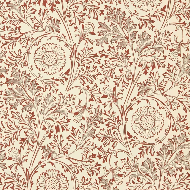
Chamomile Flax/Madder
The Unfinished Works Wallpapers
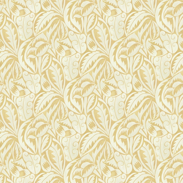
Dufy Leaf
Belvedere
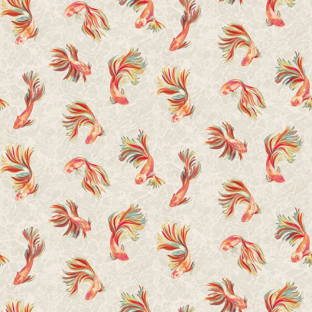
Aquaria
Solana

Carnegie Ivory
Animal Kingdom
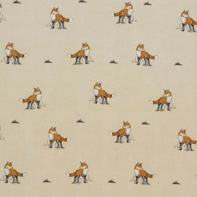
Vixen Natural
Animal Kingdom
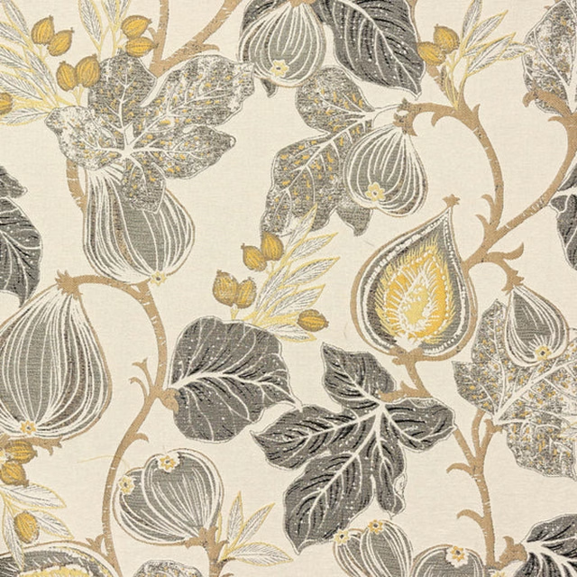
Chianti Ochre
Arezzo

Carrera Natural
Leon

Medici FR Ivory
Medici FR
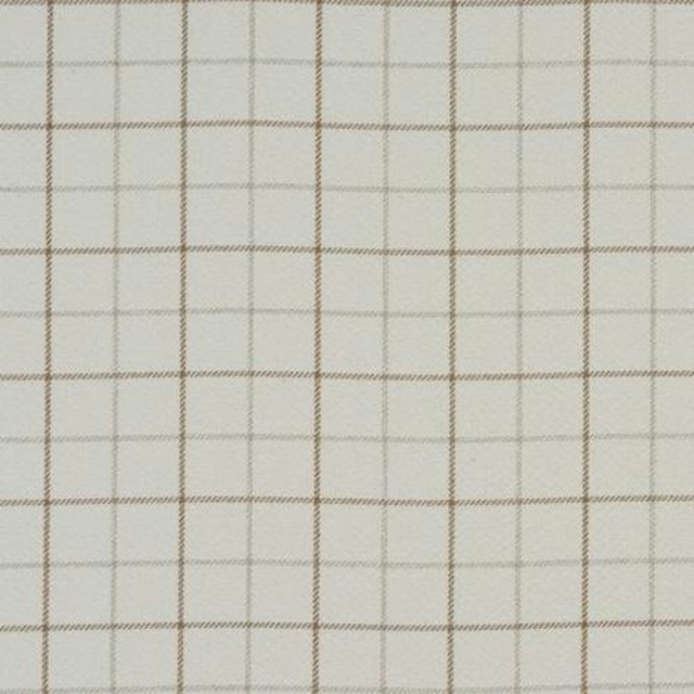
Bamburgh Natural
Misc
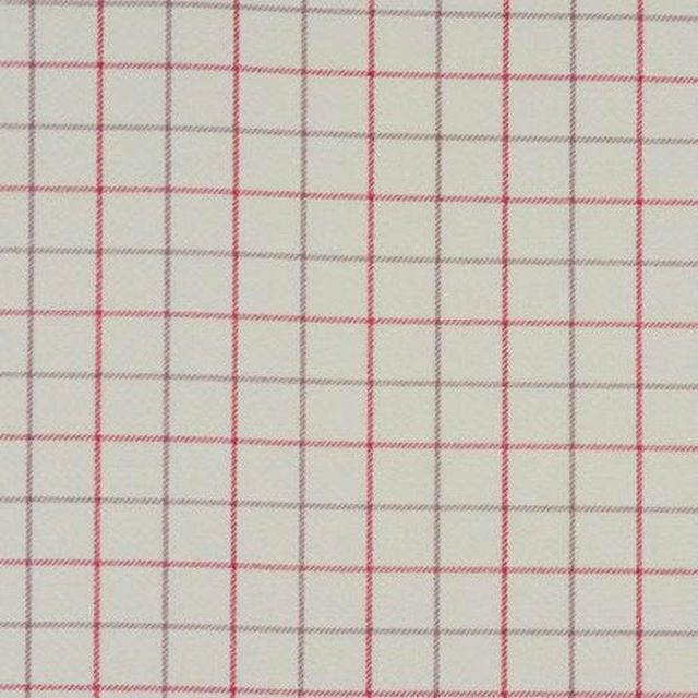
Bamburgh Sorbet
Misc
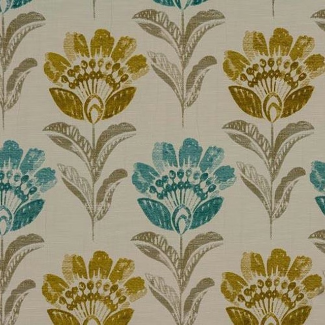
Bordeaux Duck Egg
Misc
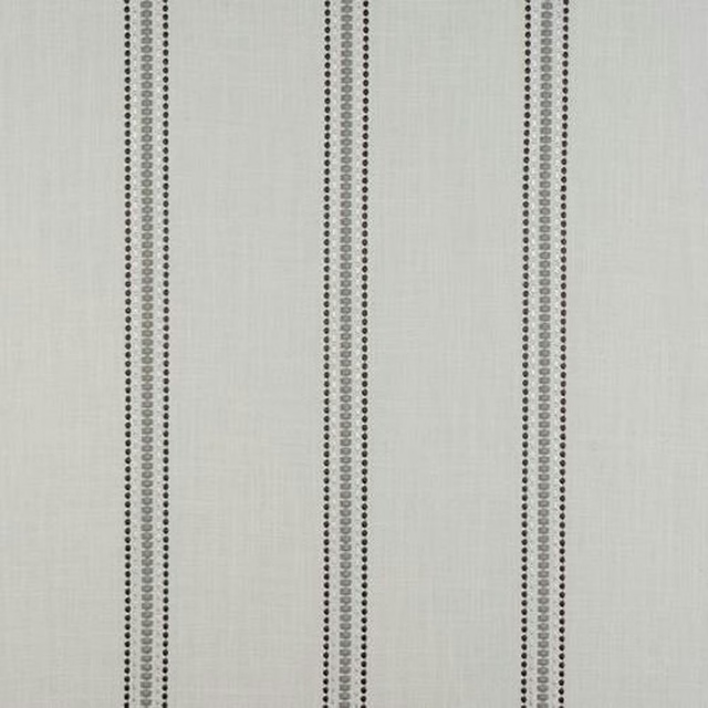
Bromley Stripe Linen
Misc