
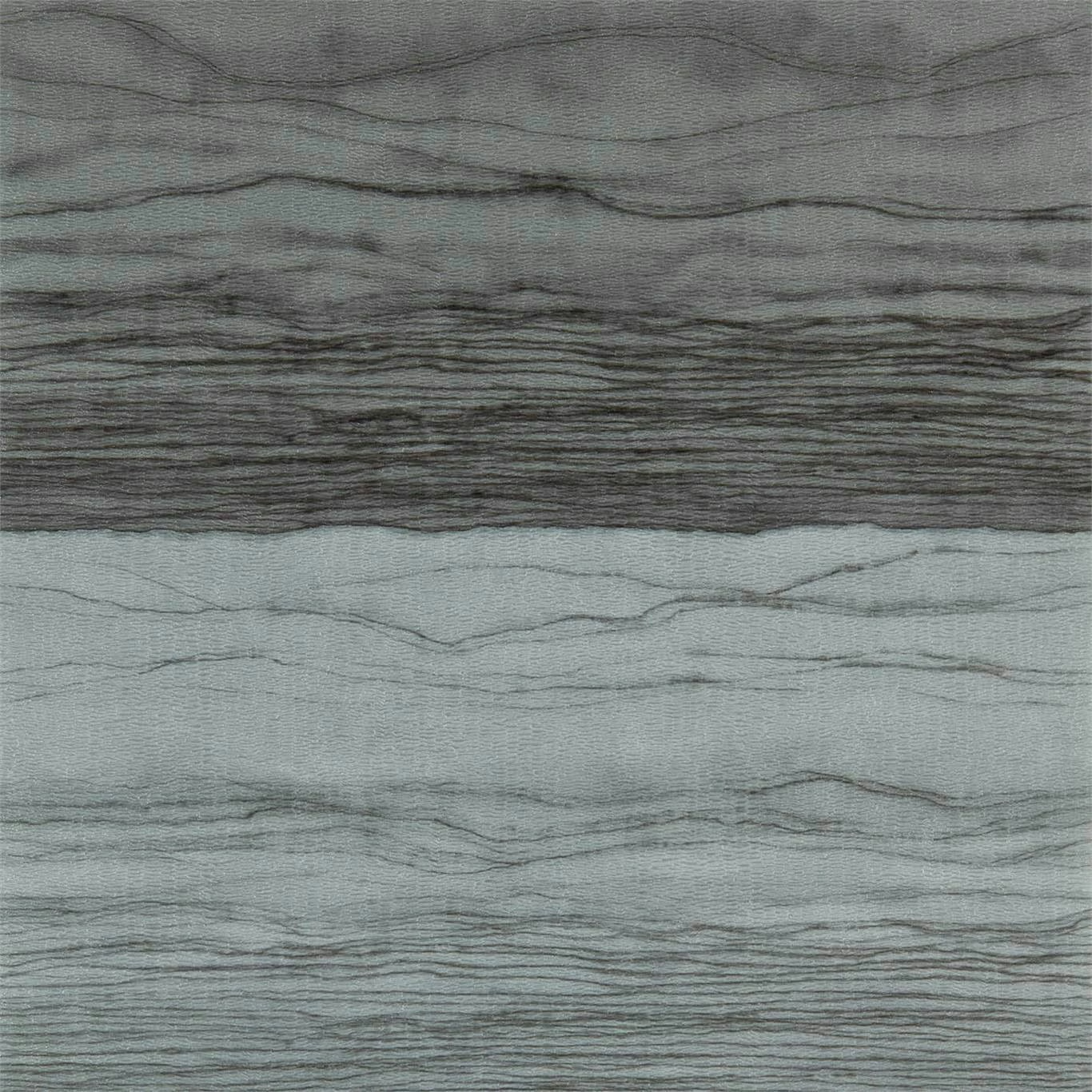

Tap the swatch to see it full screen. Hover it to magnify the weave. Colours on a screen are a guide, not a match, so come and feel the real cloth.
Scroll up or down to zoom in and out.
Metamorphic Wide Width Pewter / Lead
Anthology 06 WallpaperHAW0148-07
Metamorphic Wide Width in Pewter / Lead has a cool, silvery-grey ground crossed by fine, irregular horizontal lines. A concentrated band of darker lead-toned striations runs through the design, giving the surface the look of layered stone or softly weathered mineral.
You have used your previews for today. Send one to Simon and you can carry on.
Your board
0 fabrics
See this wallpaper on Harlequin's own site, then order it through us.
See Metamorphic Wide Width Pewter / Lead in your own room
A photograph of the piece you want re-covered. Straight on is best, and daylight helps. It is used to make your picture and nothing else.
Looking at your room
We found things here Metamorphic Wide Width Pewter / Lead could go on. Tap one on the photograph, or choose below.
We could not see anything to re-cover
, s
Metamorphic Wide Width Pewter / Lead, on your
Drag to compare. AI impression, colours indicative: ask us for a cutting before you decide.
About this wallpaper
The colourway moves between pale pewter, blue-grey and charcoal lead, with the darker striations adding a measured sense of depth rather than a high-contrast graphic effect. Its horizontally flowing motif has a 76.2 cm vertical repeat and no horizontal repeat, allowing the bands to read continuously across the 68.6 cm usable width. The wallpaper has a listed weight of 334 gsm and is supplied in a standard 10.05 m length. Fine linear texture and tonal variation remain visible across the lighter areas, while the dense central band provides a stronger visual anchor.
How to use it
Use Pewter / Lead across a quiet study, bedroom or contemporary sitting room where its cool mineral tones can sit alongside charcoal, pale timber, brushed metal and soft blue-grey upholstery. Position the darker striated band to bring depth to a feature wall without introducing a hard geometric pattern.
Use the cool pewter ground and darker lead striations to create a calm, mineral backdrop with visual depth.
More from Anthology 06
The same book, other colourways.
Groove Concrete
Anthology 06
Groove Limestone
Anthology 06

Groove Pumice
Anthology 06
Groove Sandstone
Anthology 06
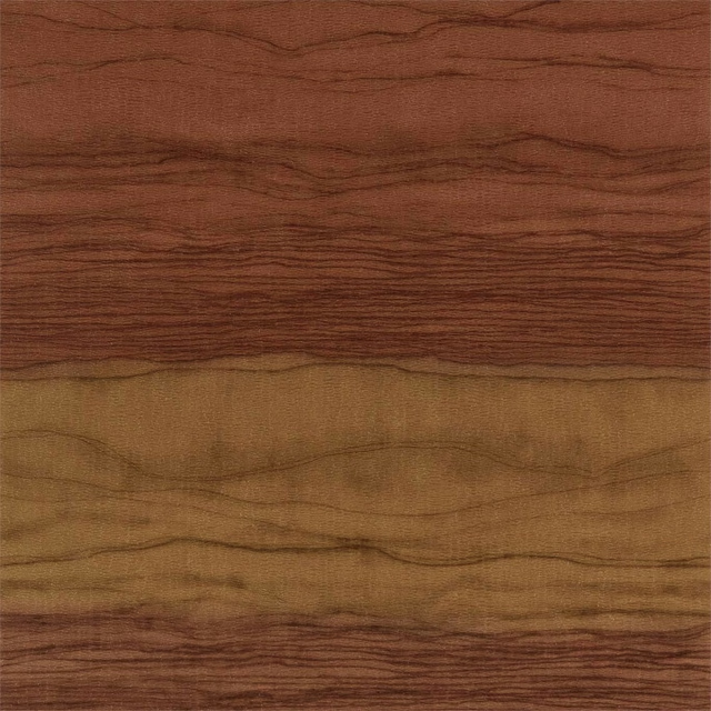
Metamorphic Wide Width Copper / Amber
Anthology 06
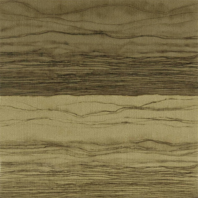
Metamorphic Wide Width Gold / Basalt
Anthology 06
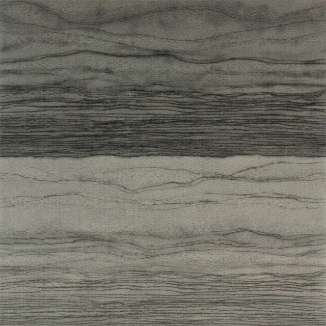
Metamorphic Wide Width Pyrite / Charcoal
Anthology 06
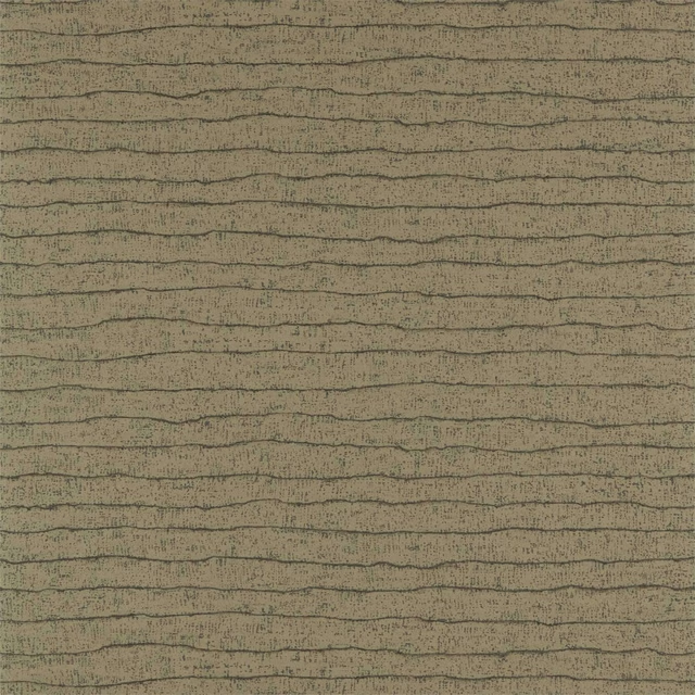
Nisiros Bronze / Basalt
Anthology 06
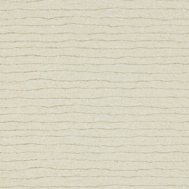
Nisiros Limestone
Anthology 06
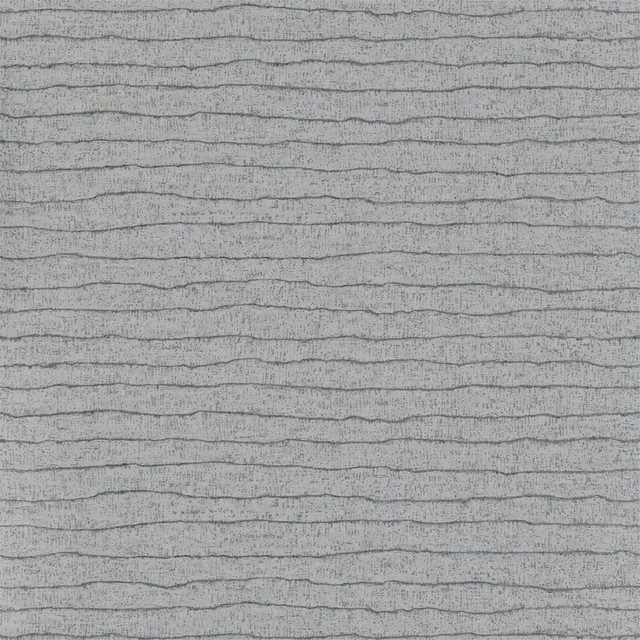
Nisiros Pumice
Anthology 06
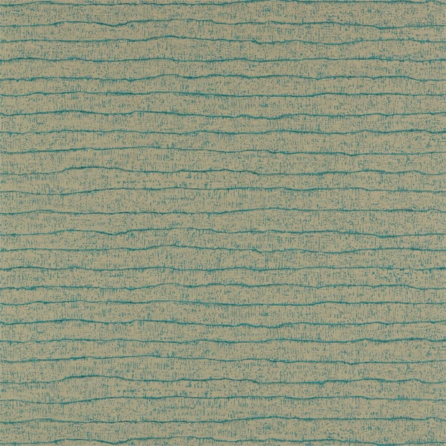
Nisiros Purite /Azurite
Anthology 06
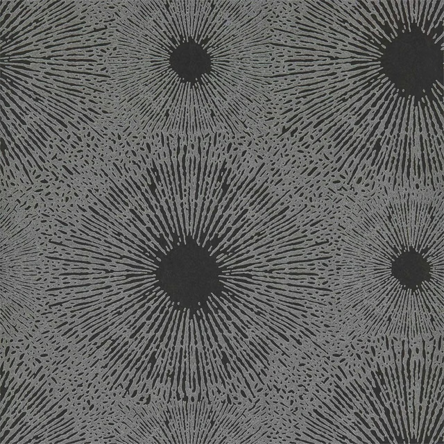
Perlite Wide Width Basalt / Quartz
Anthology 06
Pairs well with
A pattern needs somewhere for the eye to rest, so these are the plains and textures that sit beside Metamorphic Wide Width Pewter / Lead without fighting it. Mixed across the houses we hold, which is the part a single supplier's book cannot do.





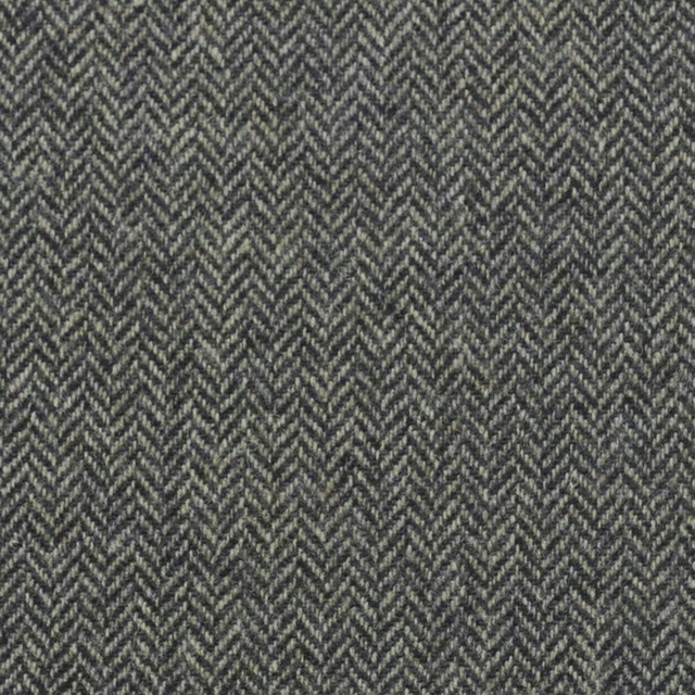
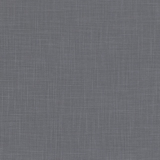

Paint that goes with it
Two ways to take the room. Both colours are from houses we hold, so a pot can come off the same order as the cloth. Screens shift colour, so treat these as a direction and bring the cloth to the shelf before you buy the paint.
To sit quietly behind it
Vineyard
Sanderson · #777976
To stand against it
Just, Barely
Coat Paints · #e8e6e2
Other grey fabrics
Across the houses we hold. See all 7,198.
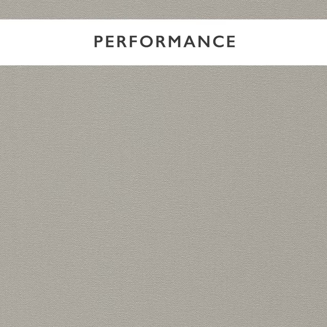
Allegra Dove
Allegra
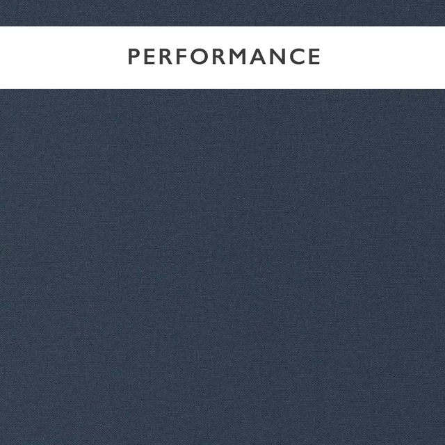
Allegra Eclipse
Allegra

Allegra Glacier
Allegra
Allegra Husky
Allegra

Allegra Pigeon
Allegra

Allegra Slate
Allegra
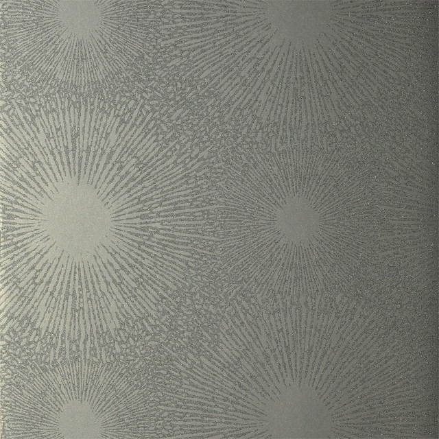
Shore Wide Width Raffia
Anthology 01
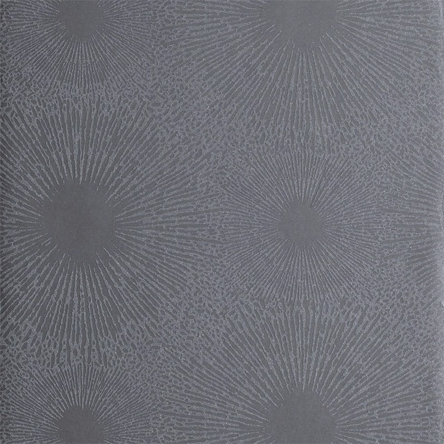
Shore Wide Width Steel
Anthology 01
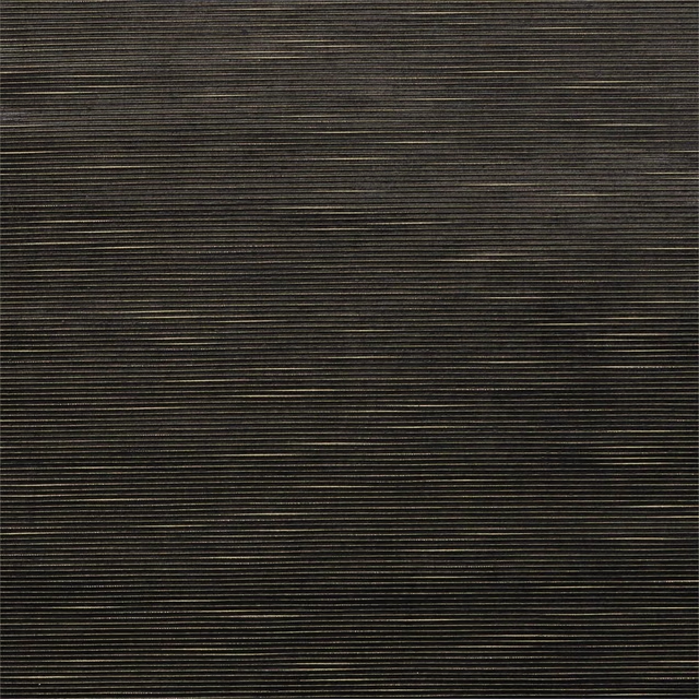
Hibiki Velvet Lead/Gold
Anthology Hibiki
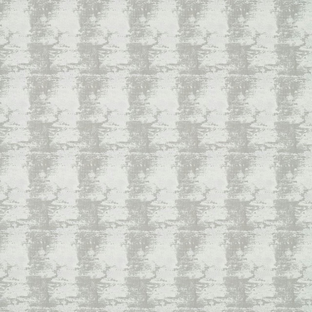
Pumice Pewter
Anthology Textures 01
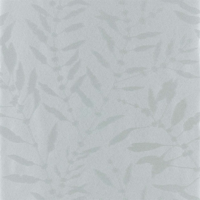
Chaconia Shimmer Wide Width Slate
Anthozoa Wallpapers
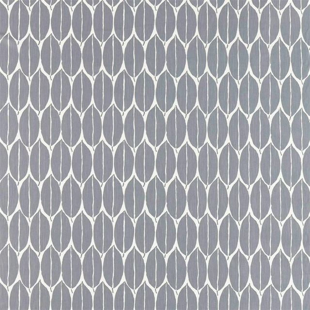
Rie Charcoal
Atelier Fabrics