

Tap the swatch to see it full screen. Hover it to magnify the weave. Colours on a screen are a guide, not a match, so come and feel the real cloth.
Scroll up or down to zoom in and out.
Hortense
Pastels Paint
Hortense is a soft pastel lilac from Little Greene, with a quiet grey note that keeps it from reading sugary. It sits easily in the Pastels range and feels considered rather than bright.
You have used your previews for today. Send one to Simon and you can carry on.
Your board
0 fabrics
See this colour on Little Greene's own site, then order it through us.
See Hortense in your own room
A photograph of the piece you want re-covered. Straight on is best, and daylight helps. It is used to make your picture and nothing else.
Looking at your room
We found things here Hortense could go on. Tap one on the photograph, or choose below.
We could not see anything to re-cover
, s
Hortense, on your
Drag to compare. AI impression, colours indicative: ask us for a cutting before you decide.
About this colour
In #D4CBD5, Hortense reads as a cool lilac with a muted, powdery character and a slight grey veil. It reflects plenty of light, so it can lift a room without becoming stark or chalky, and it feels especially calm on a wall. In a north-facing room it will lean cooler and a little more misted, while in south-facing light the lilac side comes forward and the colour feels softer and warmer. It sits well beside pale oak, walnut, charcoal, off-white linen and upholstery in duck egg, sage or stone.
How to use it
Use it in a bedroom, dressing room or sitting room where you want a gentle, restful backdrop. It works neatly with painted woodwork in white or deeper plum tones, and beside upholstery in warm greys, faded florals or small-scale stripes.
A pale lilac wall colour with a calm grey edge.
More from Pastels
The same book, other colourways.

Mono
Pastels

Gauze - Deep
Pastels

Echo
Pastels

Drizzle
Pastels

Dorchester Pink - Pale
Pastels

Dorchester Pink - Deep
Pastels

Dorchester Pink - Mid
Pastels
Pairs well with
Hortense is a wall colour, so these are the cloths that sit against it: one of them on the curtains, the paint behind. Mixed across the houses we hold, which is the part a single supplier's book cannot do.
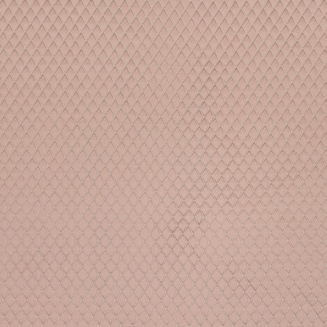
Argyle Blush
Essential Weaves Vol 2
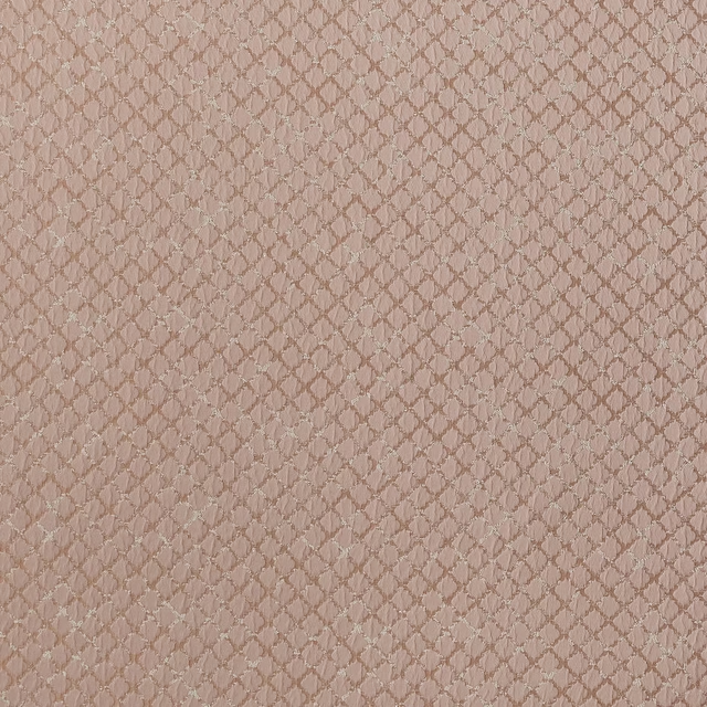
Atwood Blush
Essential Weaves Vol 2
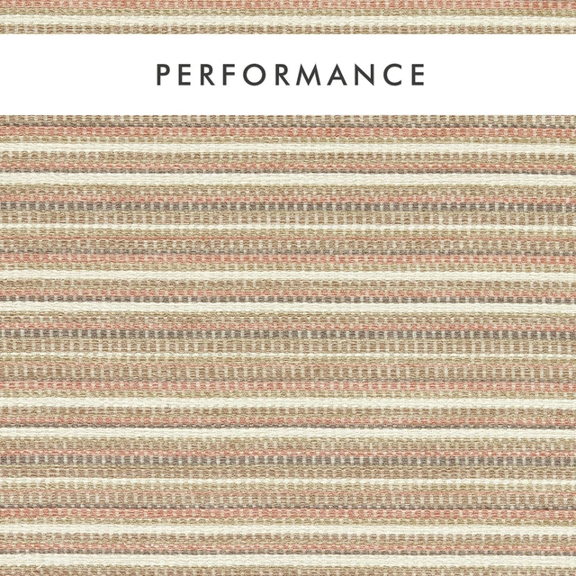
Integer Blush
Aqueous Performance
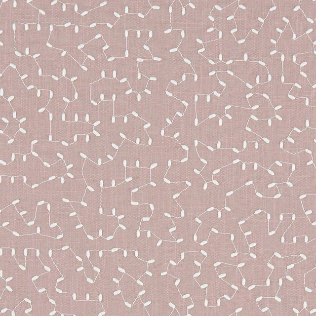
Bibury Heather
Avebury
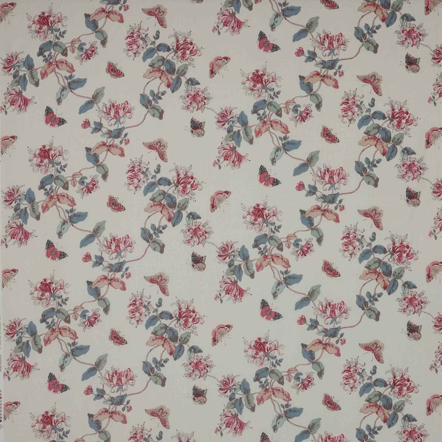
Honeysuckle Pink/Slate
Ashdown
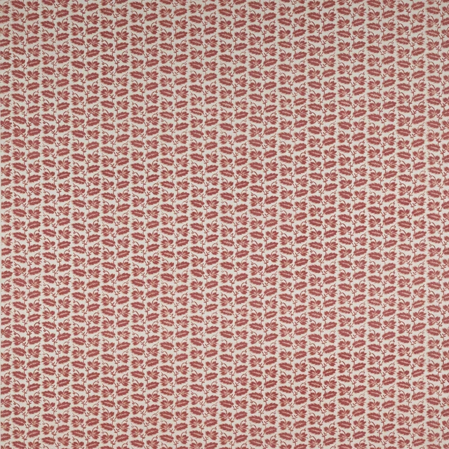
Leaf Stripe Pink
Ashmead Block Prints
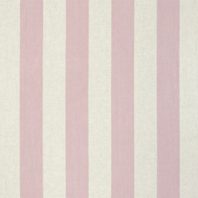
Brera Largo Blossom
Brera Rigato III Fabrics
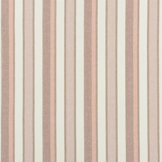
Brera Viale Quartz Rose
Brera Striato Fabrics
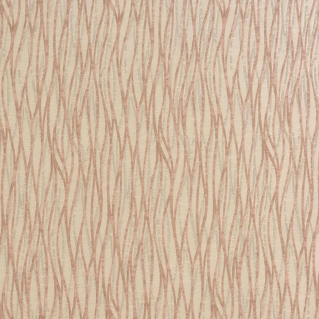
Linear Blush
Acacia

Troodos Blush
Alchemy
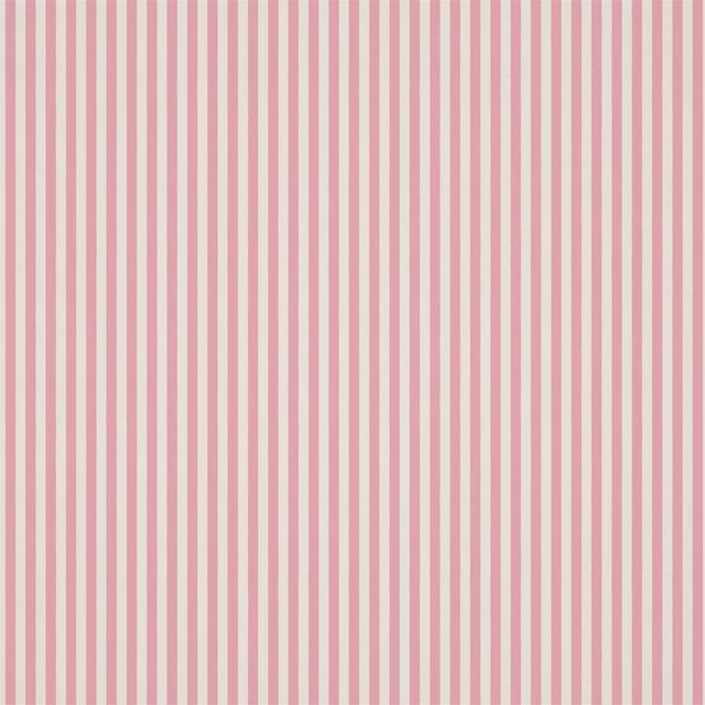
Carnival Stripe Blossom
Book of Little Treasures Fabrics
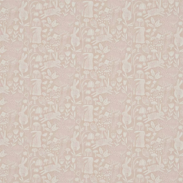
Into The Meadow Powder
Book of Little Treasures Fabrics
Other pink fabrics
Across the houses we hold. See all 2,519.

Blush
Reds and Pinks

Ashes of Roses
Reds and Pinks

Carmine
Reds and Pinks

Mischief
Reds and Pinks

Chemise
Reds and Pinks

Pink Slip
Reds and Pinks

Confetti
Reds and Pinks

Hellebore
Reds and Pinks
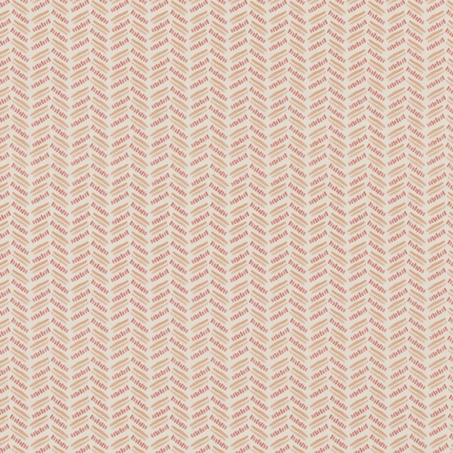
Alorara
Paloma Collection

Nancy Raspberry
Paloma Collection
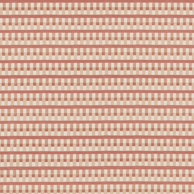
Anna Raspberry
Paloma Collection
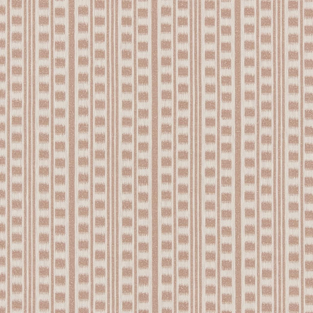
Margodu
Lina Weaves Vol 1 Collection