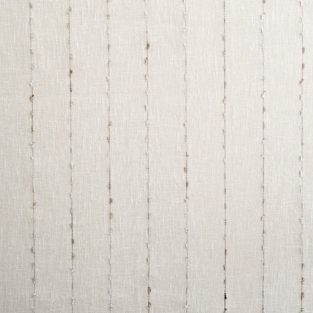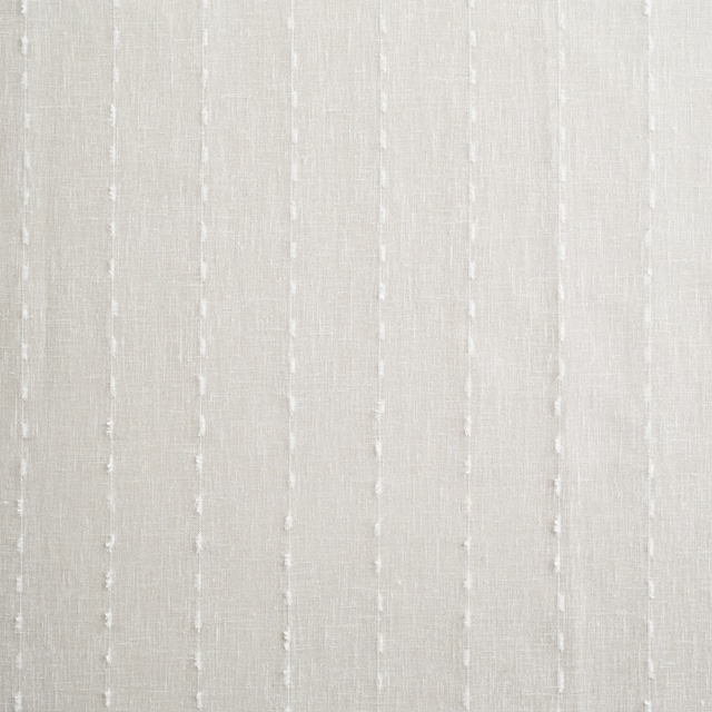
Tap the swatch to see it full screen. Hover it to magnify the weave. Colours on a screen are a guide, not a match, so come and feel the real cloth.
Scroll up or down to zoom in and out.
Dorchester Pink - Pale
Pastels Paint
Dorchester Pink - Pale is Little Greene’s quietest blush, a barely-there pink with a soft warm cast. At #F8F3F0, it reads more like a tinted neutral than a clear pink.
You have used your previews for today. Send one to Simon and you can carry on.
Your board
0 fabrics
See this colour on Little Greene's own site, then order it through us.
See Dorchester Pink - Pale in your own room
A photograph of the piece you want re-covered. Straight on is best, and daylight helps. It is used to make your picture and nothing else.
Looking at your room
We found things here Dorchester Pink - Pale could go on. Tap one on the photograph, or choose below.
We could not see anything to re-cover
, s
Dorchester Pink - Pale, on your
Drag to compare. AI impression, colours indicative: ask us for a cutting before you decide.
About this colour
This shade sits very lightly on a wall, lifting the room without turning chalky or cold. In north-facing light it can lean gently biscuit-pink and feel softer and more muted, while in south-facing rooms it shows a cleaner blush with a little more warmth. Its pale value means it reflects a good amount of light, so it works well where you want colour that stays discreet. It sits comfortably beside limewashed oak, painted joinery in off-white, and upholstery in warm neutrals, faded florals, or muted greens.
How to use it
Use it in bedrooms, dressing rooms, or sitting rooms where a restrained pink is wanted on the walls. It pairs well with natural woodwork, cream-painted trims, and upholstery in oatmeal, sage, or dusty rose tones.
A very pale blush pink that stays soft and understated on the wall.
More from Pastels
The same book, other colourways.

Mono
Pastels

Hortense
Pastels

Gauze - Deep
Pastels

Echo
Pastels

Drizzle
Pastels

Dorchester Pink - Deep
Pastels

Dorchester Pink - Mid
Pastels
Pairs well with
Dorchester Pink - Pale is a wall colour, so these are the cloths that sit against it: one of them on the curtains, the paint behind. Mixed across the houses we hold, which is the part a single supplier's book cannot do.
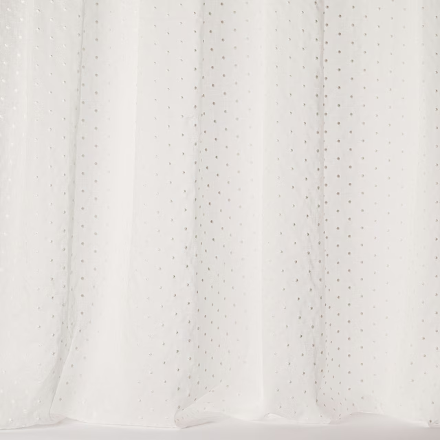
Margarita Ivory
Liliana Sheers
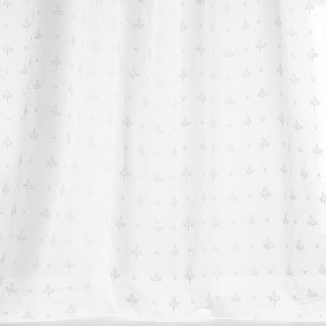
Ellen Ivory
Tilbury
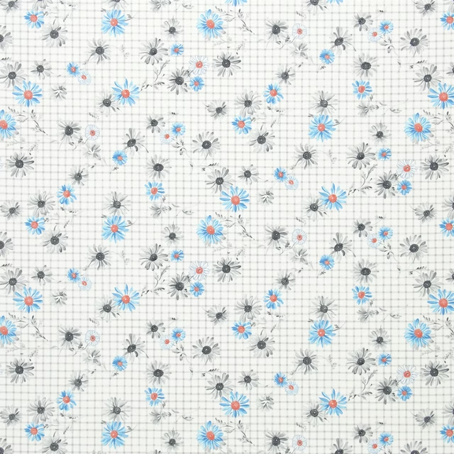
Cosmos Marine
Country Fabrics

Linnaeus Oyster
Linnaeus WALLPAPER

Ascot White
Misc
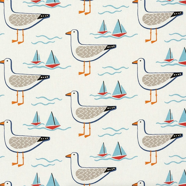
Gull PVC Multi
PVC Table covers
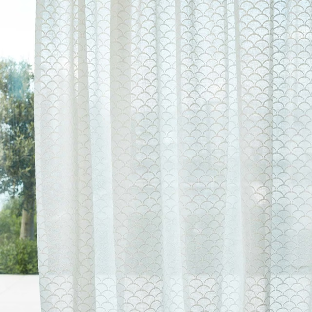
Nuvole Sheer Origami
Sheers 1
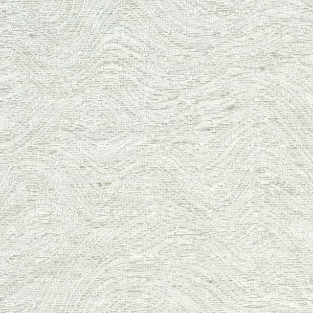
Strata Silk Silver Lining
Strata Silk

Meuron White
Carlo

Gaia White
Hillside
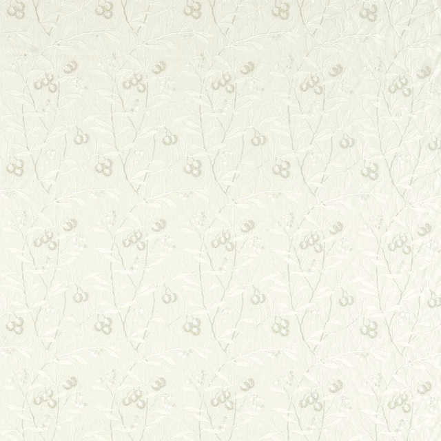
Pure Arbutus Embroidery White Clover
Pure Morris North Fabrics

Boat Blueprint Dark Blue on White
Coastal Papers
Other white fabrics
Across the houses we hold. See all 582.