
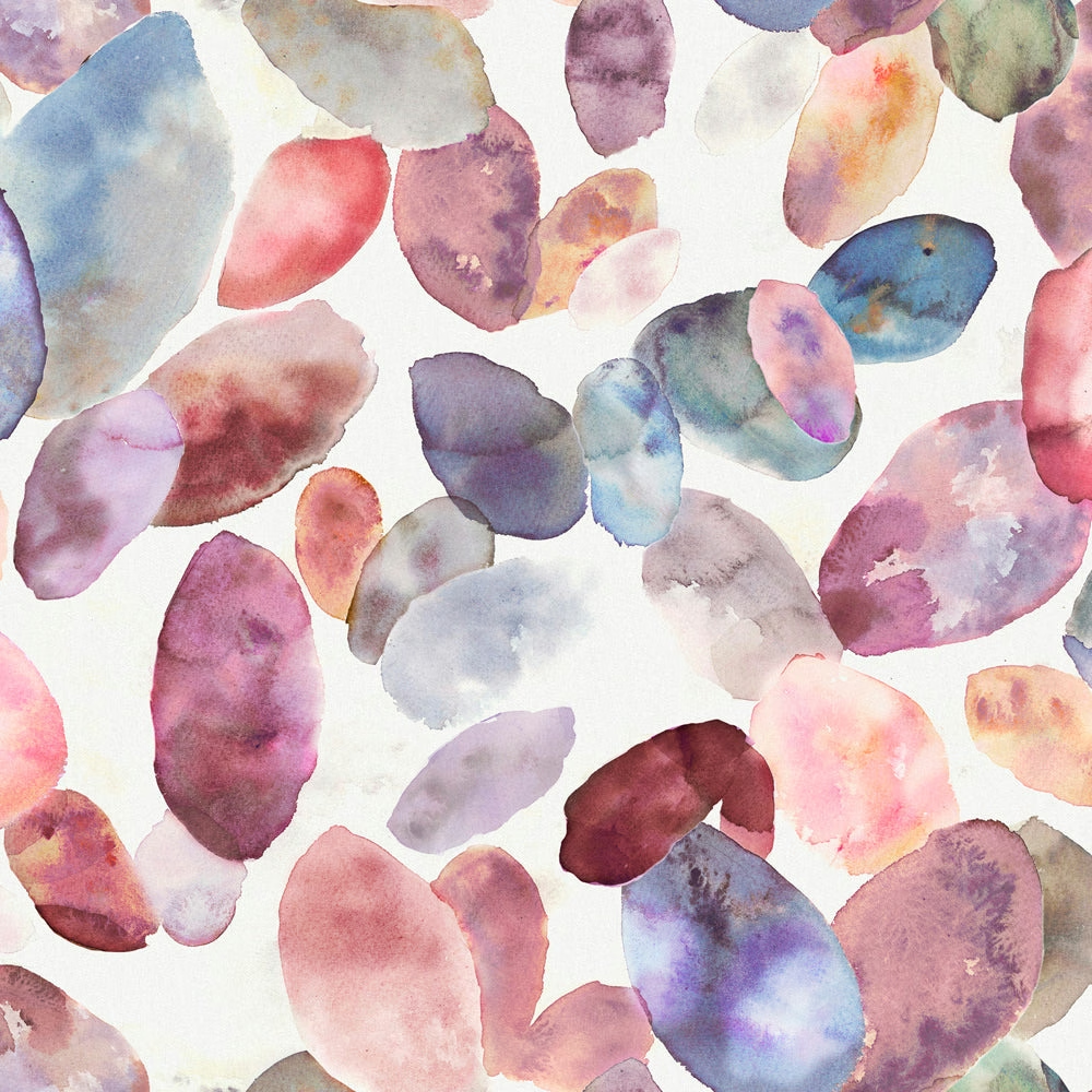

Tap the swatch to see it full screen. Hover it to magnify the weave. Colours on a screen are a guide, not a match, so come and feel the real cloth.
Scroll up or down to zoom in and out.
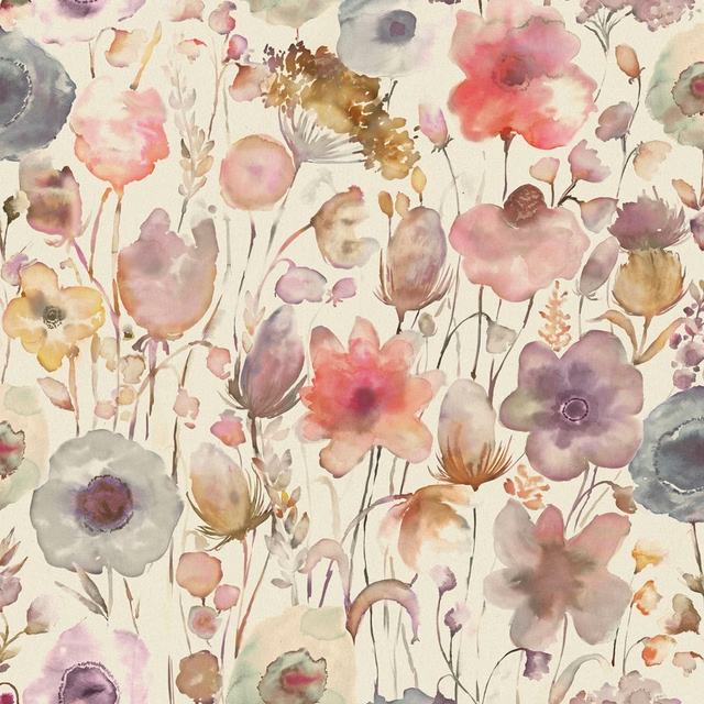
Correa Fuchsia Cream
Hibbertiameadows Fabriccorreac/fa1/fuc
Correa Fuchsia Cream scatters painterly, petal-like forms across a pale ground, with blush, mauve and lilac tones lifted by occasional cooler blue notes. The effect is airy and soft, but the repeat gives it enough presence to read clearly across a room.
You have used your previews for today. Send one to Simon and you can carry on.
Your board
0 fabrics
Part of the range we hold from Voyage Maison.
See Correa Fuchsia Cream in your own room
A photograph of the piece you want re-covered. Straight on is best, and daylight helps. It is used to make your picture and nothing else.
Looking at your room
We found things here Correa Fuchsia Cream could go on. Tap one on the photograph, or choose below.
We could not see anything to re-cover
, s
Correa Fuchsia Cream, on your
Drag to compare. AI impression, colours indicative: ask us for a cutting before you decide.
About this fabric
This fabric is made from 95% cotton and 5% linen, giving the surface a natural, lightly textured handle that suits soft furnishings as well as window treatments. At 230gsm, it sits comfortably in the mid-weight range, which helps explain why it is suitable for curtains, blinds and other decorative applications. The colourway is built around soft pinks and dusty mauves, with pale watery washes and a few deeper berry accents that keep the design from feeling overly sugary. Its 69cm horizontal repeat and 47.5cm vertical repeat create a generous, painterly scatter that shows well on larger drops and cushion fronts alike.
How to use it
Use Correa Fuchsia Cream where you want a light, romantic colour that still has movement and detail, especially in bedrooms or sitting rooms. It layers neatly with ivory, chalky beige and gentle lilac, while the cooler blue flecks give it extra freshness.
Pair with warm neutrals or muted lilac accents to let the painterly petals stay lively.
More from Hibbertiameadows
The same book, other colourways.
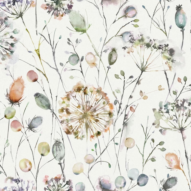
Boronia Coral
Hibbertiameadows
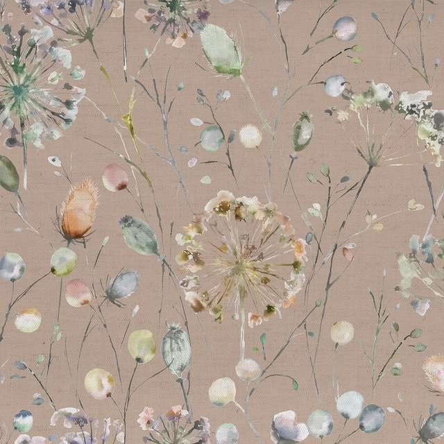
Boronia Boysenberry Heather
Hibbertiameadows
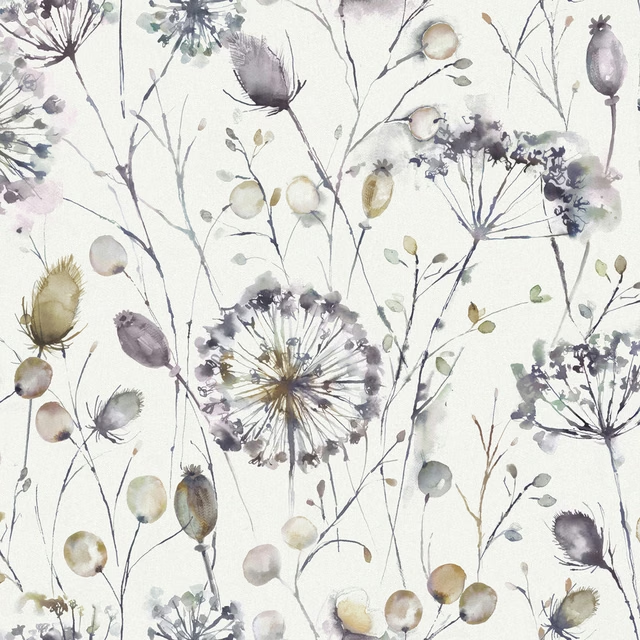
Boronia Ironstone Cream
Hibbertiameadows
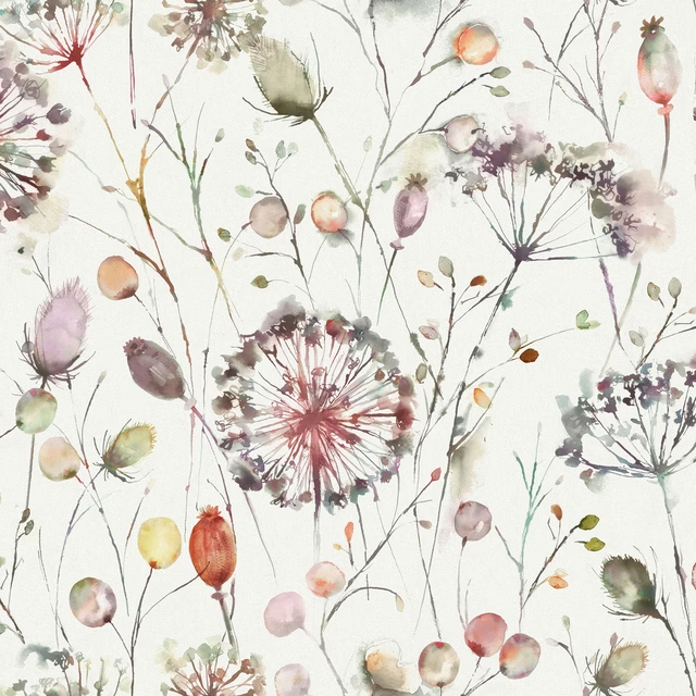
Boronia Boysenberry
Hibbertiameadows
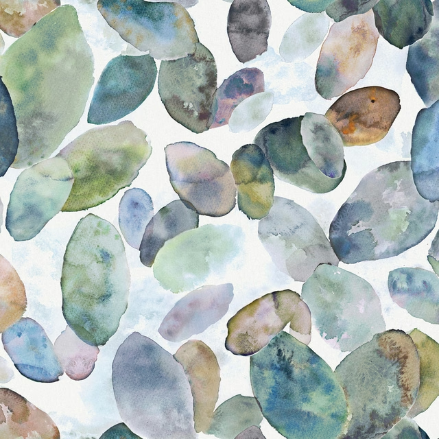
Correa Crocus
Hibbertiameadows
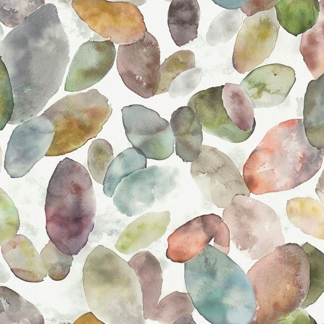
Correa Cloud
Hibbertiameadows
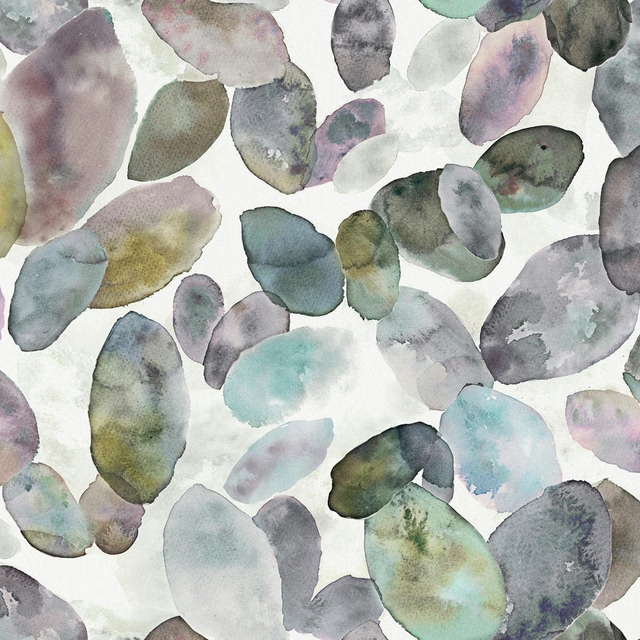
Correa Ironstone Cream
Hibbertiameadows
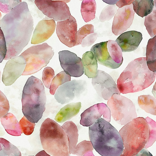
Correa Boysenberry Cream
Hibbertiameadows
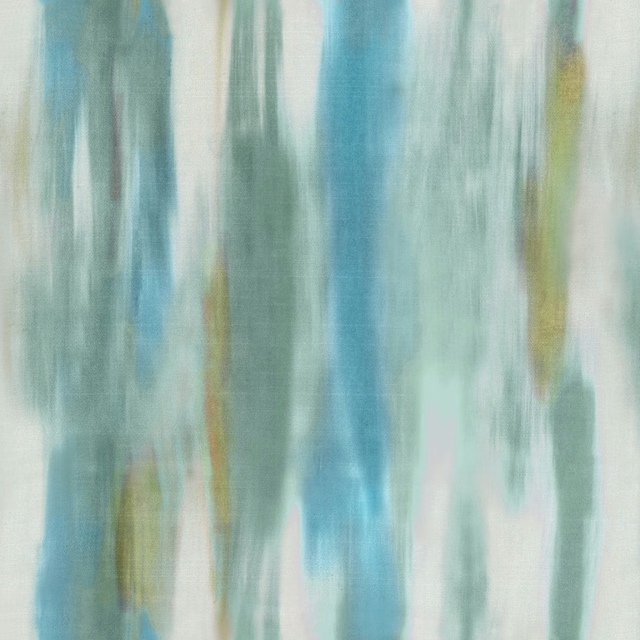
Dianelli Crocus
Hibbertiameadows
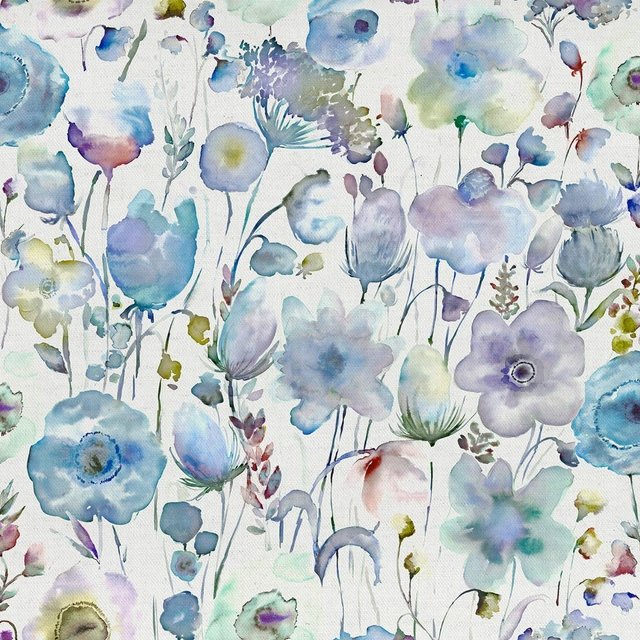
Gospiana Crocus Cream
Hibbertiameadows
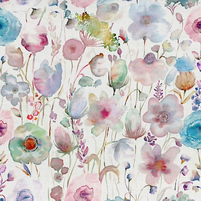
Gospiana Apricot Cream
Hibbertiameadows
Gospiana Boysenberry
Hibbertiameadows
Pairs well with
A pattern needs somewhere for the eye to rest, so these are the plains and textures that sit beside Correa Fuchsia Cream without fighting it. Mixed across the houses we hold, which is the part a single supplier's book cannot do.

Eldon Blush
Essential Weaves Vol 2
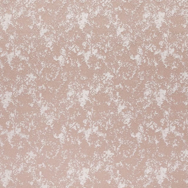
Poplar Blush
Essential Weaves Vol 2

Alvar Petal
Alvar 2

Avani Blush
Eco
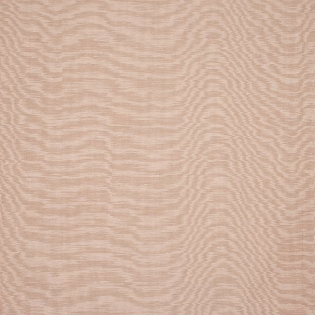
Eaton Plain Pink
Eaton Checks and Stripes

Foss Pink
Foss Linen II

Naples FR Blush
Alderney

Monza Blush
Arezzo

Ario Wide Width Blush
Ario

Amalfi Blush
Amalfi
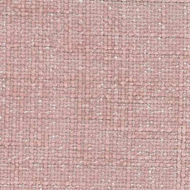
Bohemian Blush
Bohemian

Astor Cherry Blossom
Astor
Paint that goes with it
Two ways to take the room. Both colours are from houses we hold, so a pot can come off the same order as the cloth. Screens shift colour, so treat these as a direction and bring the cloth to the shelf before you buy the paint.
To sit quietly behind it
Rose Ash Light
Sanderson · #d0b6b5
To stand against it
Juniper Ash
Little Greene · #525969
Other pink fabrics
Across the houses we hold. See all 2,519.
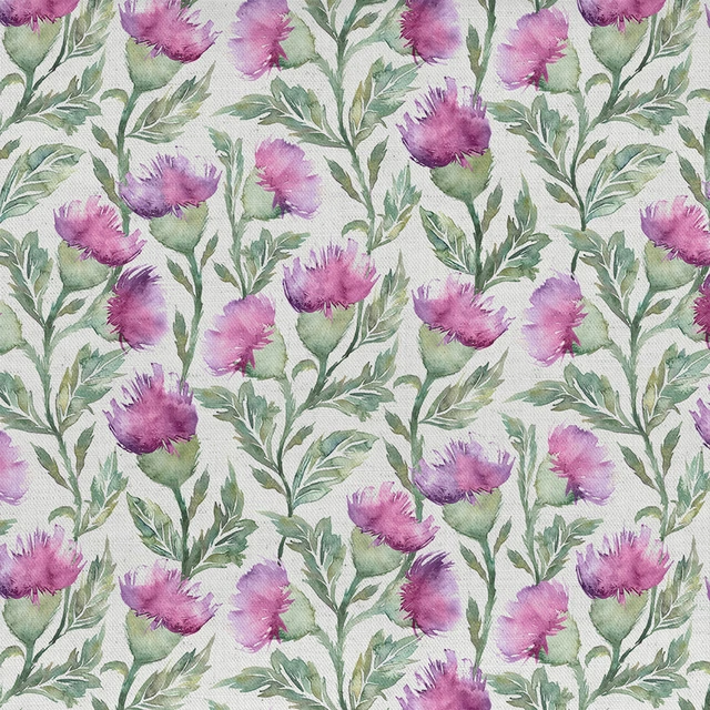
Ettrick Fuchsia Cream
Ettrick
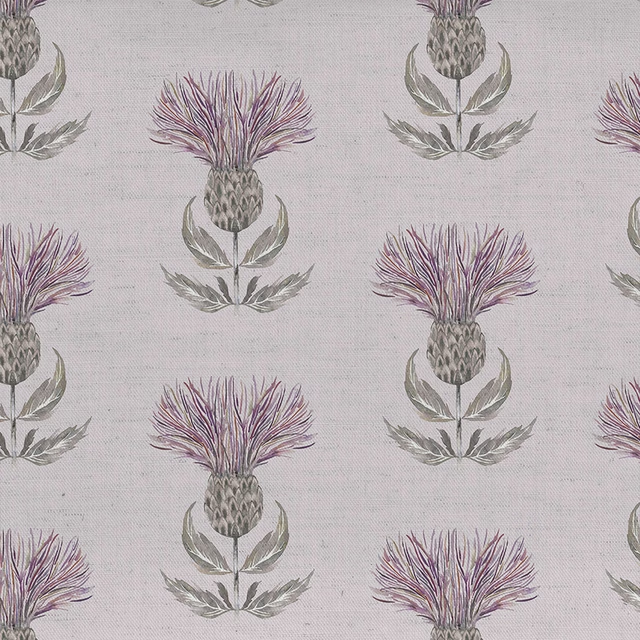
Firth Mauve Cream
Ettrick
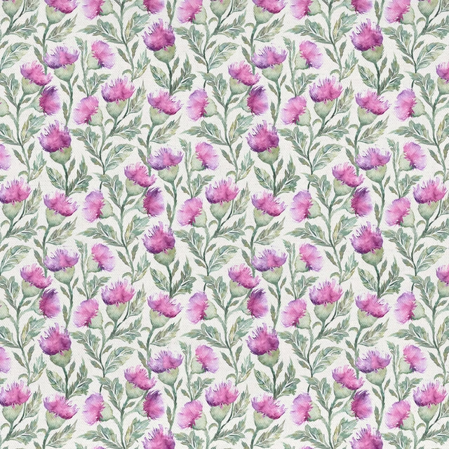
Hawick Fuchsia Cream
Ettrick
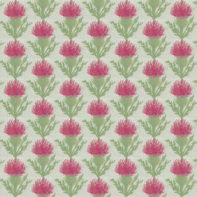
Moray Fuchsia
Ettrick
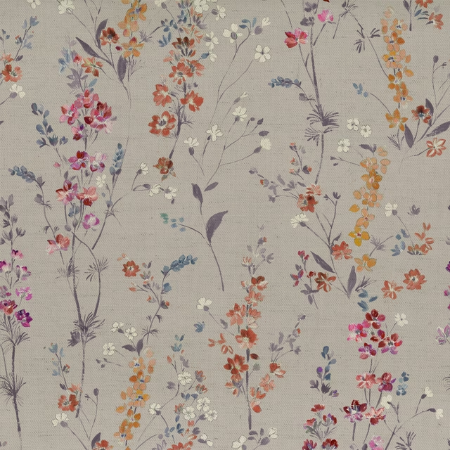
Briella Heather
Florabunda
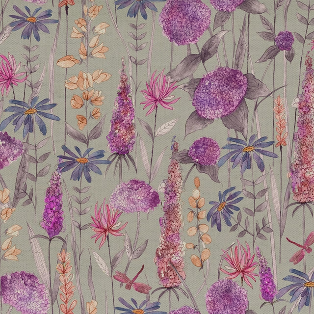
Florabunda Fuchsia
Florabunda
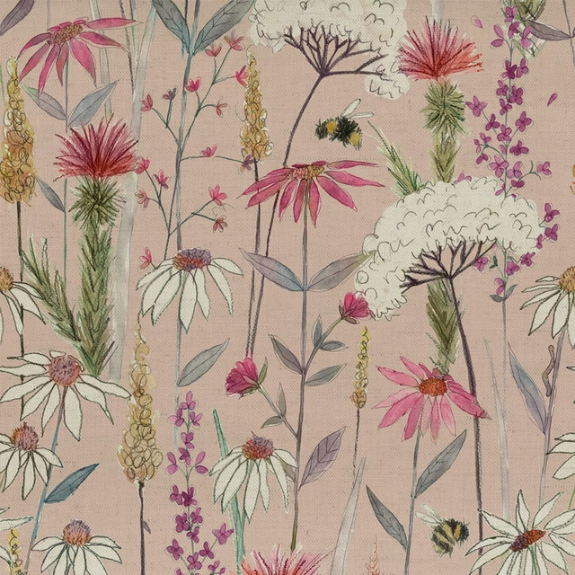
Hermione Blush
Florabunda
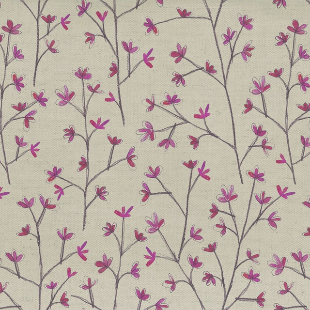
Ophelia Fuchsia Linen
Florabunda
Dotty Blossom
Imaginations
Unicorndance Blossom
Imaginations
Koyo Mulberry
Katsura
Mizuna Tourmaline
Kyotogardens