
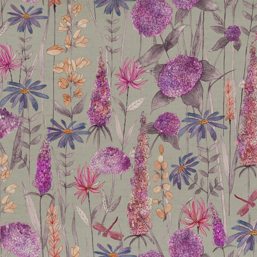

Tap the swatch to see it full screen. Hover it to magnify the weave. Colours on a screen are a guide, not a match, so come and feel the real cloth.
Scroll up or down to zoom in and out.
Florabunda Fuchsia
Florabunda Fabricflorabu/fa1/fuc
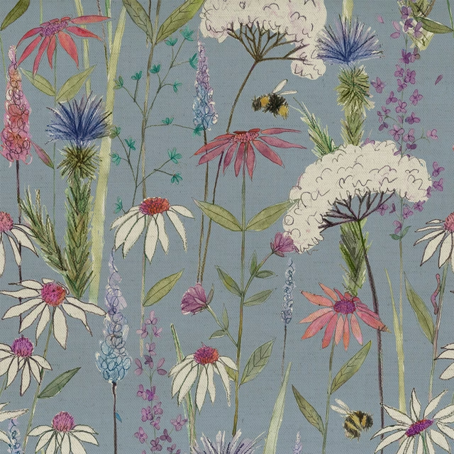
Florabunda Fuchsia brings a fresh meadow feel, with bright pink blooms and mauve floral stems set against a pale sage ground. The print feels airy and decorative, with the larger motifs giving it a lively, statement look.
You have used your previews for today. Send one to Simon and you can carry on.
Your board
0 fabrics
Part of the range we hold from Voyage Maison.
See Florabunda Fuchsia in your own room
A photograph of the piece you want re-covered. Straight on is best, and daylight helps. It is used to make your picture and nothing else.
Looking at your room
We found things here Florabunda Fuchsia could go on. Tap one on the photograph, or choose below.
We could not see anything to re-cover
, s
Florabunda Fuchsia, on your
Drag to compare. AI impression, colours indicative: ask us for a cutting before you decide.
About this fabric
This Voyage Maison fabric is composed of 95% cotton and 5% linen, giving the cloth a natural matt handle with a lightly textured surface that suits soft window dressing. At 230gsm and 138cm usable width, it reads as a mid-weight decorative fabric rather than something sheer or overly heavy, and it is suitable for curtains, blinds and soft furnishings. The palette is anchored by a soft sage-green ground, lifted with vivid pinks, lilacs, mauves and small accents of peach and blue, so the design feels bright but not harsh. The 69cm horizontal and 52.6cm vertical repeats allow the tall floral stems and rounded blossom forms to make a generous, expressive pattern across larger drops. Dry clean only and iron safe, it is a practical choice for tailored drapes where the colour can be shown at its full height.
How to use it
Use it for curtains or Roman blinds in a room that needs colour without darkness; the cool sage ground keeps the pinks feeling crisp and airy. It pairs well with pale timber, washed white paintwork and simple neutral upholstery.
A lively pink print that softens beautifully in curtains or Roman blinds.
More from Florabunda
The same book, other colourways.
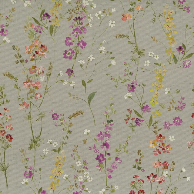
Briella Russett
Florabunda
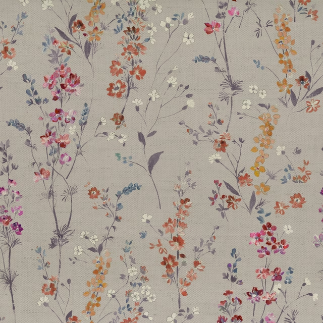
Briella Heather
Florabunda
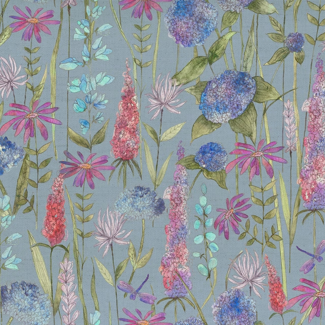
Florabunda Bluebell
Florabunda
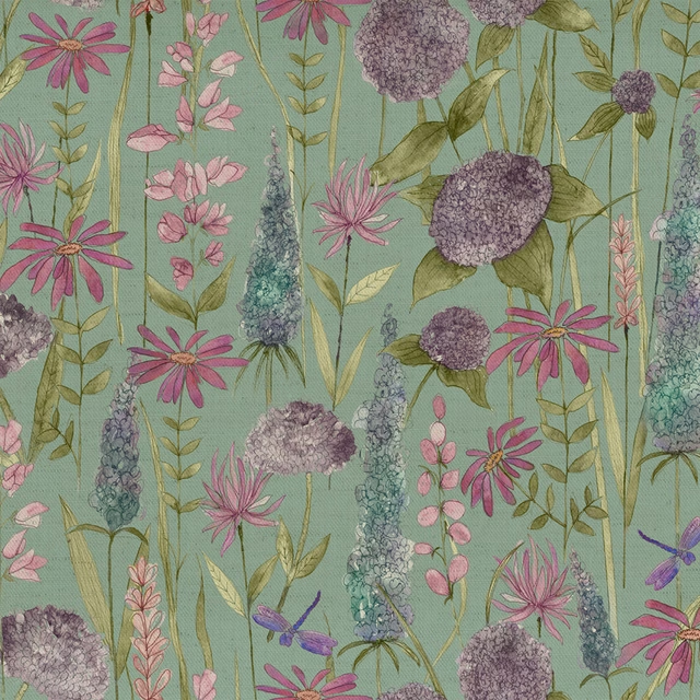
Florabunda Verde
Florabunda
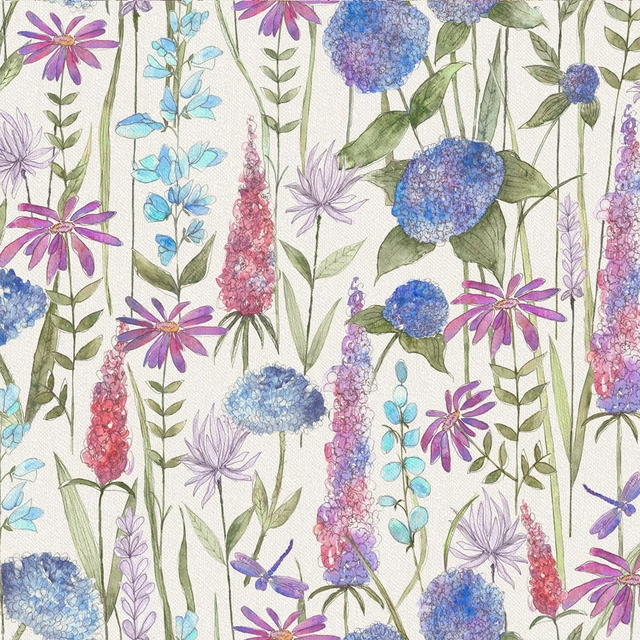
Florabunda Bluebell Ecru
Florabunda
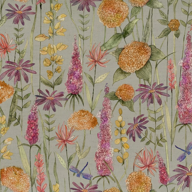
Florabunda Russet
Florabunda
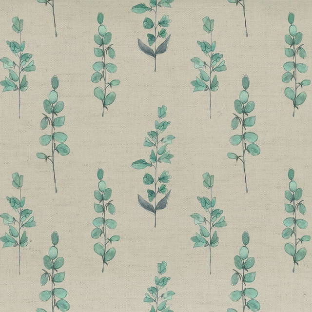
Helaine Aqua
Florabunda
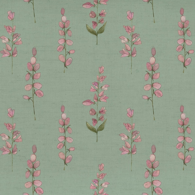
Helaine Verde
Florabunda
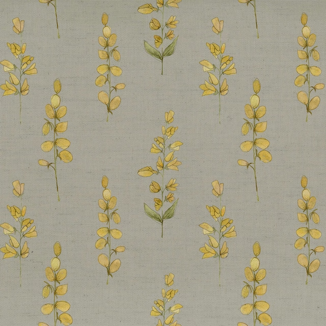
Helaine Gold
Florabunda
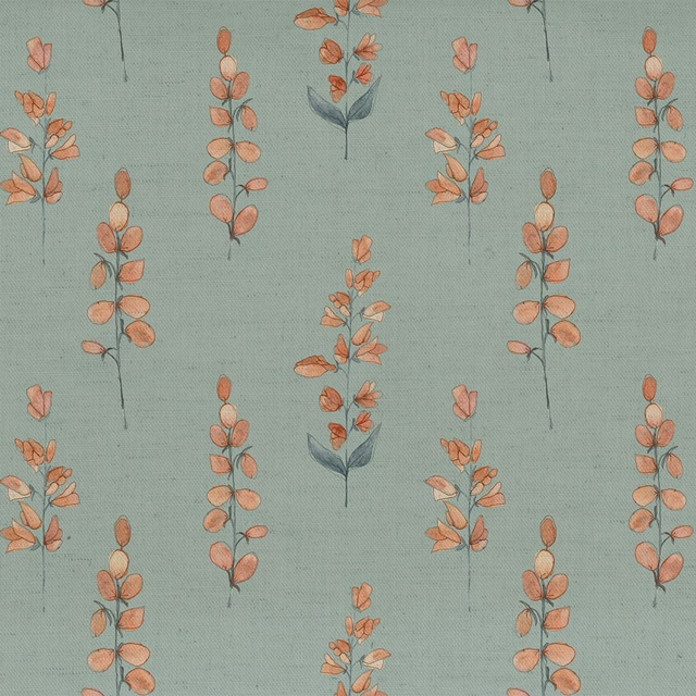
Helaine Coral
Florabunda
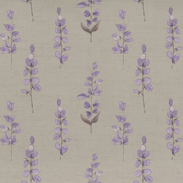
Helaine Heather
Florabunda
Hermione Bluebell
Florabunda
Pairs well with
A pattern needs somewhere for the eye to rest, so these are the plains and textures that sit beside Florabunda Fuchsia without fighting it. Mixed across the houses we hold, which is the part a single supplier's book cannot do.

Alaska Heather
Alaska Collection

Alaska Shell
Alaska Collection
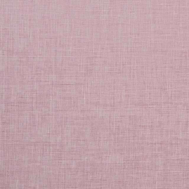
Albany Blush
Albany and Moray
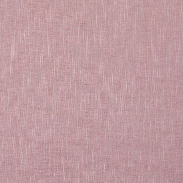
Moray Blush
Albany and Moray
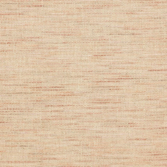
Brandon Old Pink
Albeck

Morton Old Pink
Bampton
Spinelli Alta Dewberry
Contract Essentials II Fabrics

Naples FR Blush
Alderney
Monza Blush
Arezzo
Allegra Heather
Allegra

Ario Blossom
Ario
Amalfi Blush
Amalfi
Paint that goes with it
Two ways to take the room. Both colours are from houses we hold, so a pot can come off the same order as the cloth. Screens shift colour, so treat these as a direction and bring the cloth to the shelf before you buy the paint.
To sit quietly behind it
Nightshade
Sanderson · #9e9495
To stand against it
White Lead
Little Greene · #f9f8e3
Other pink fabrics
Across the houses we hold. See all 2,519.
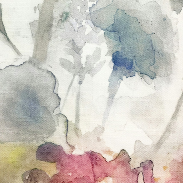
Sorong Coral
Equator
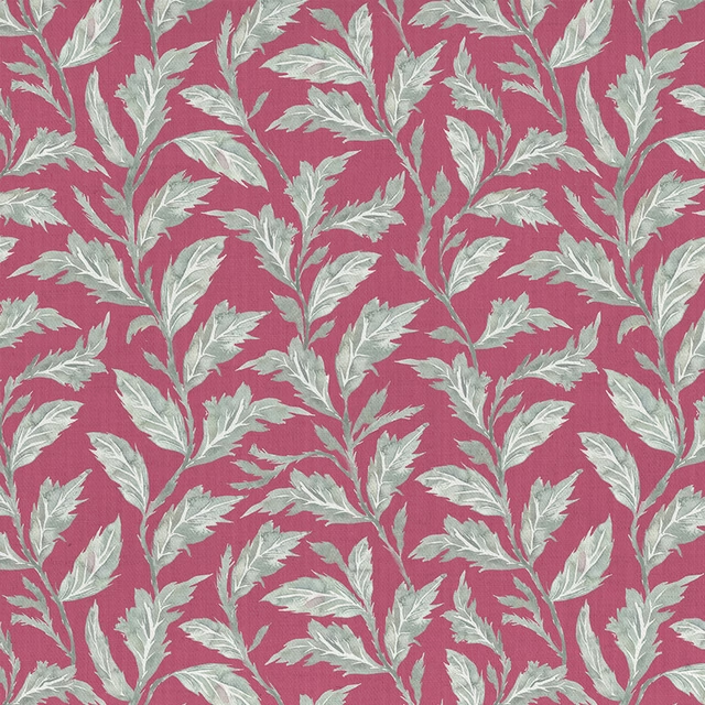
Eildon Fuchsia
Ettrick
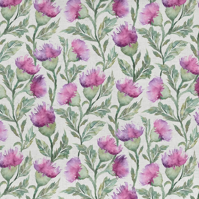
Ettrick Fuchsia Cream
Ettrick
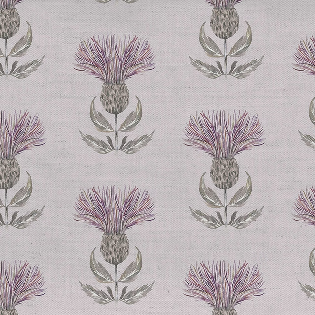
Firth Mauve Cream
Ettrick
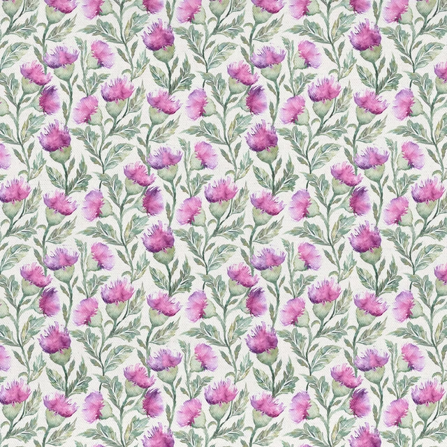
Hawick Fuchsia Cream
Ettrick
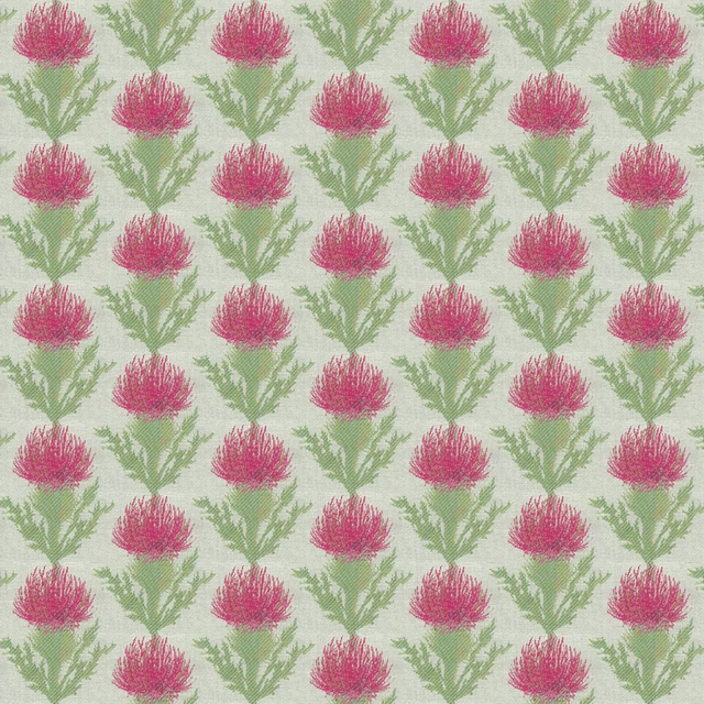
Moray Fuchsia
Ettrick
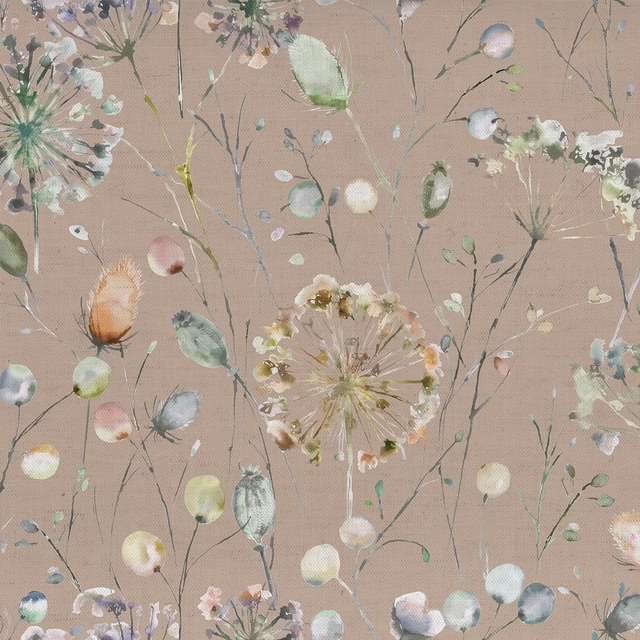
Boronia Boysenberry Heather
Hibbertiameadows
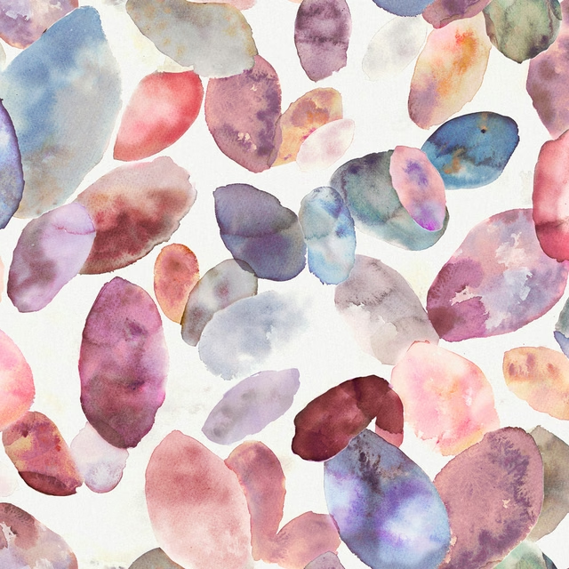
Correa Fuchsia Cream
Hibbertiameadows
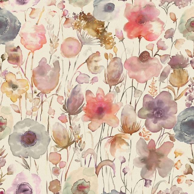
Gospiana Boysenberry
Hibbertiameadows
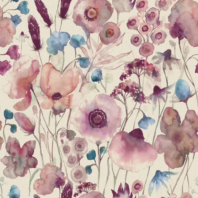
Hibbertia Fuchsia Cream
Hibbertiameadows
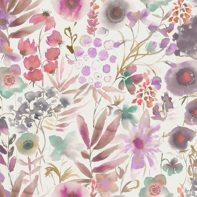
Lomondra Apricot Cream
Hibbertiameadows
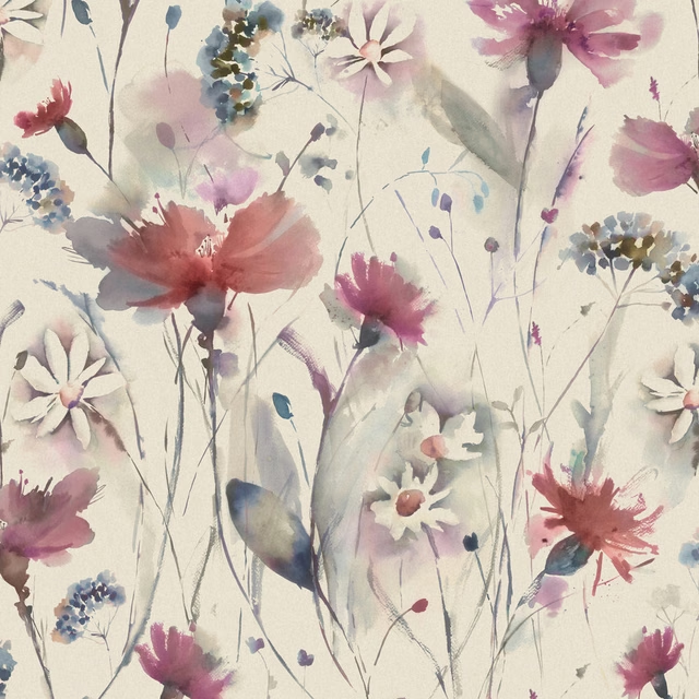
Olearia Fuchsia Linen
Hibbertiameadows