
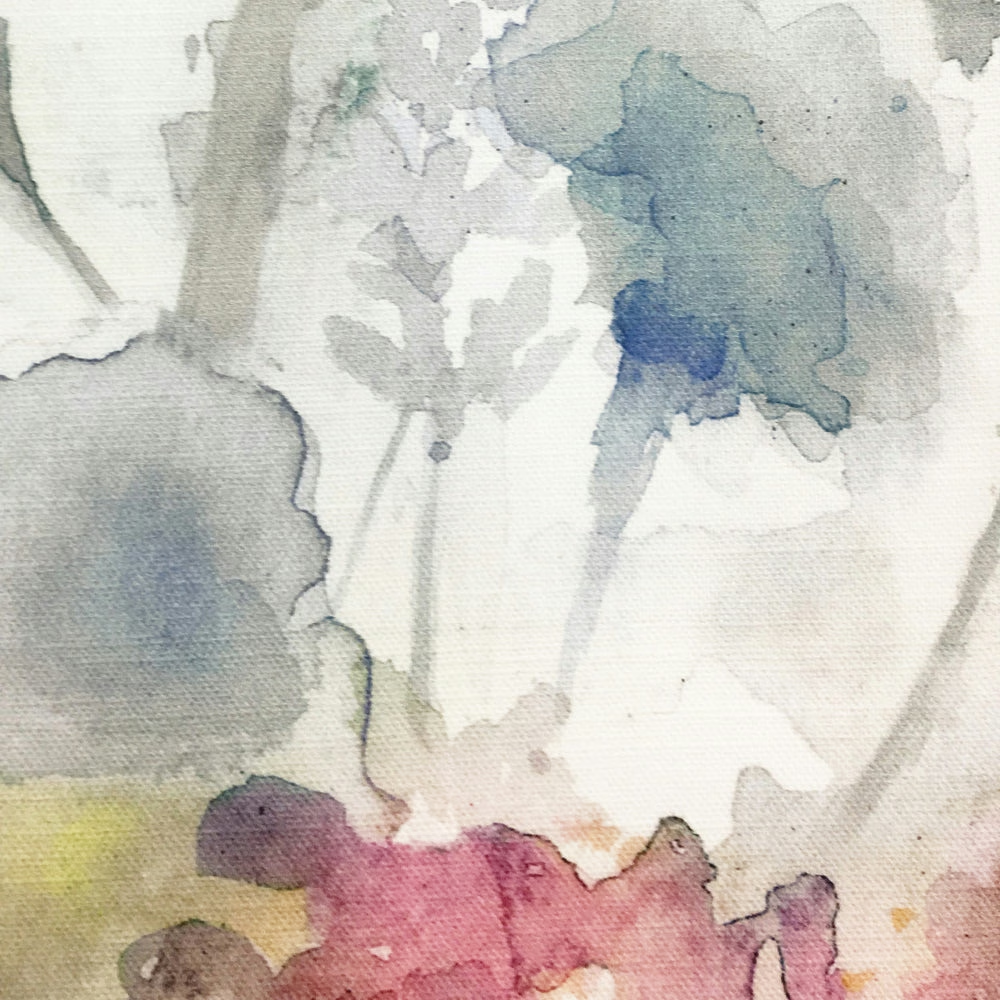

Tap the swatch to see it full screen. Hover it to magnify the weave. Colours on a screen are a guide, not a match, so come and feel the real cloth.
Scroll up or down to zoom in and out.
Sorong Coral
Equator Fabricsorong/fa1/cor
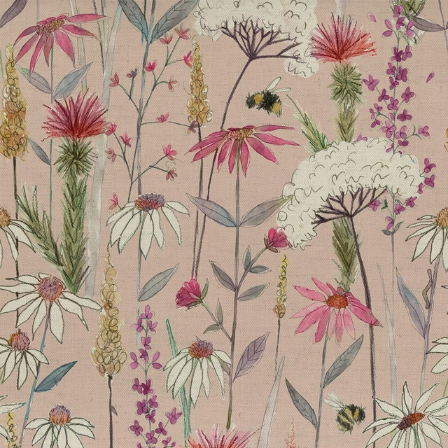
Sorong Coral brings a washed, painterly pink into the Equator design, softened by pale ground tones and loose, watercolour-style floral shapes. The result feels airy and gently romantic rather than sugary or bright.
You have used your previews for today. Send one to Simon and you can carry on.
Your board
0 fabrics
Part of the range we hold from Voyage Maison.
See Sorong Coral in your own room
A photograph of the piece you want re-covered. Straight on is best, and daylight helps. It is used to make your picture and nothing else.
Looking at your room
We found things here Sorong Coral could go on. Tap one on the photograph, or choose below.
We could not see anything to re-cover
, s
Sorong Coral, on your
Drag to compare. AI impression, colours indicative: ask us for a cutting before you decide.
About this fabric
This Sorong Coral colourway reads as a muted, dusty pink with deeper rose notes drifting through the floral washes, balanced by cool grey, blue and ivory areas in the pattern. Printed on a 95% cotton, 5% linen cloth, it has the natural look of a soft textile rather than a glossy finish, which suits its relaxed character. The fabric is 230gsm and has a usable width of 138cm, with a 138cm horizontal repeat and 93cm vertical repeat, so the scale of the motif is substantial and has real presence across curtains or blinds. Dry clean only and cool iron care make it a considered choice for soft furnishings where the painterly colour can be the main feature.
How to use it
Use it for full-length curtains or Roman blinds where the soft pink and cool background can lighten a room without feeling overly sweet. It works especially well with pale oak, stone, and dusky blue accents.
Pair with chalky neutrals and washed blues to keep the painterly feel fresh.
More from Equator
The same book, other colourways.
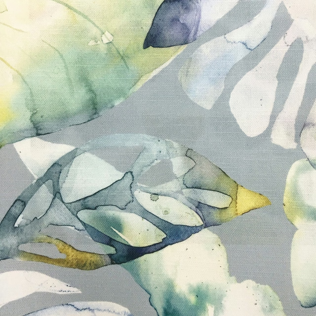
Salvador Grey
Equator
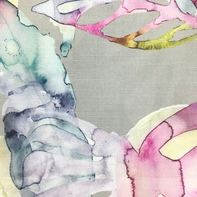
Salvador Summer
Equator
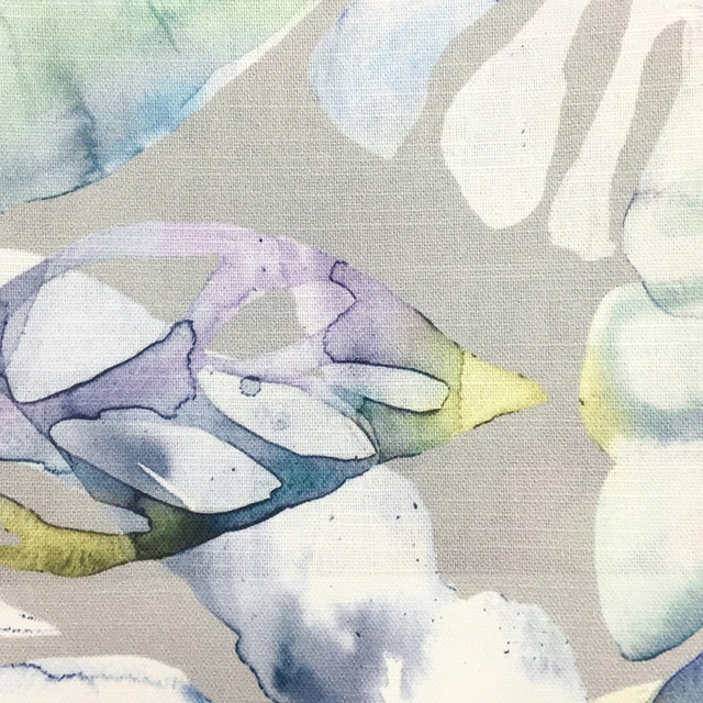
Salvador Violet
Equator
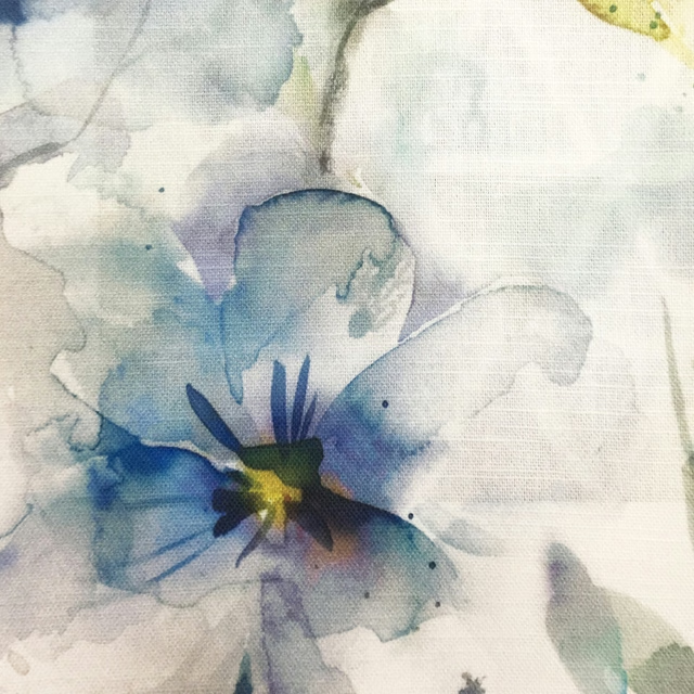
Samarinda Pacific
Equator
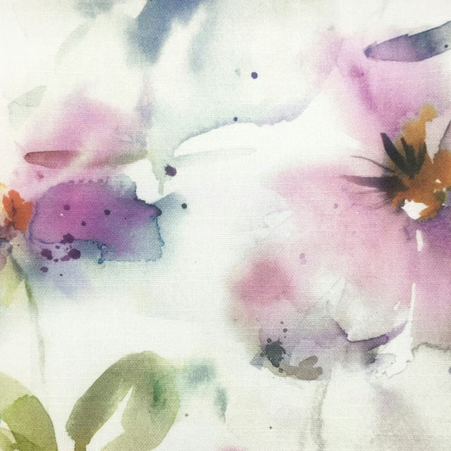
Samarinda Summer
Equator
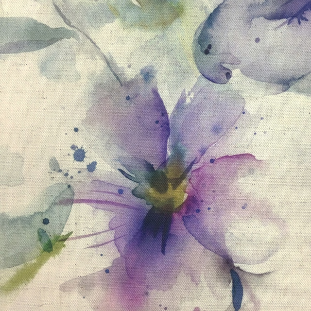
Samarinda Violet
Equator
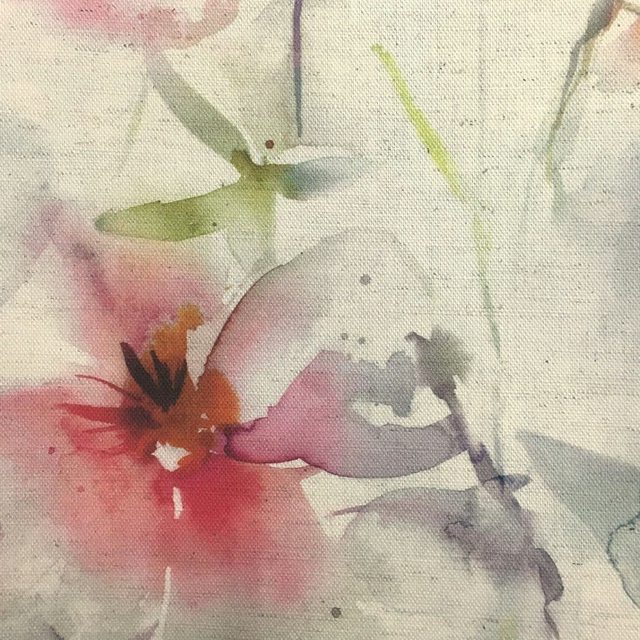
Samarinda Poppy Natural
Equator
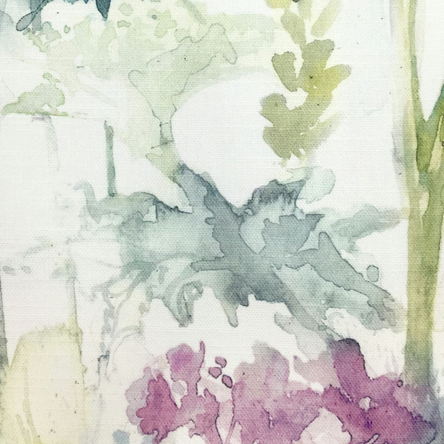
Sorong Summer
Equator
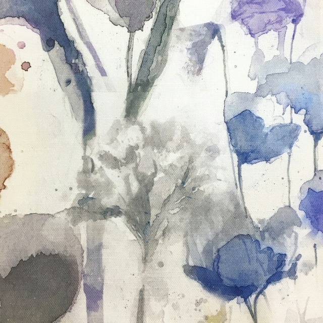
Sorong Clementine
Equator
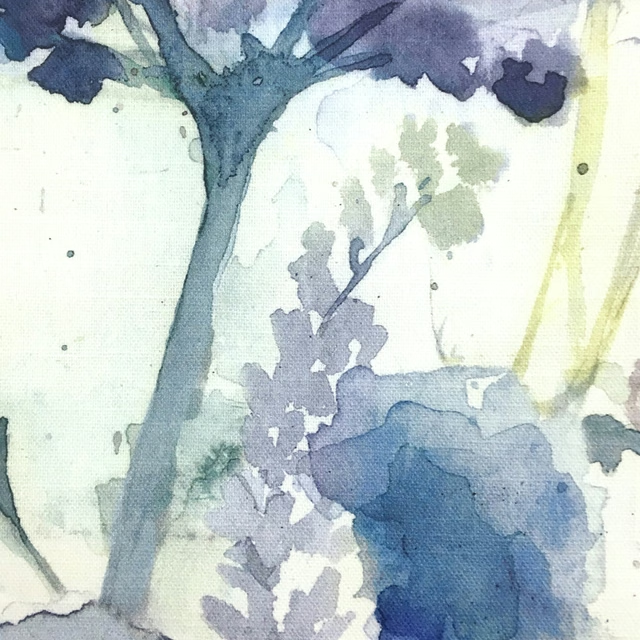
Sorong Violet
Equator
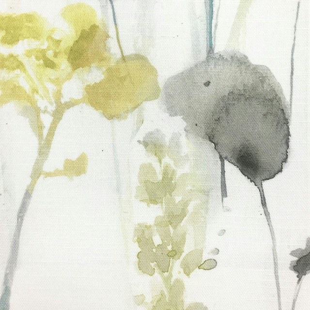
Sorong Lemon
Equator
Taifuph Lemon
Equator
Pairs well with
A pattern needs somewhere for the eye to rest, so these are the plains and textures that sit beside Sorong Coral without fighting it. Mixed across the houses we hold, which is the part a single supplier's book cannot do.
Brandon Old Pink
Albeck

Morton Old Pink
Bampton
Hendrix Rose Pink
Hendrix
Connaught Silk Wallcovering Blush
Wallcoverings
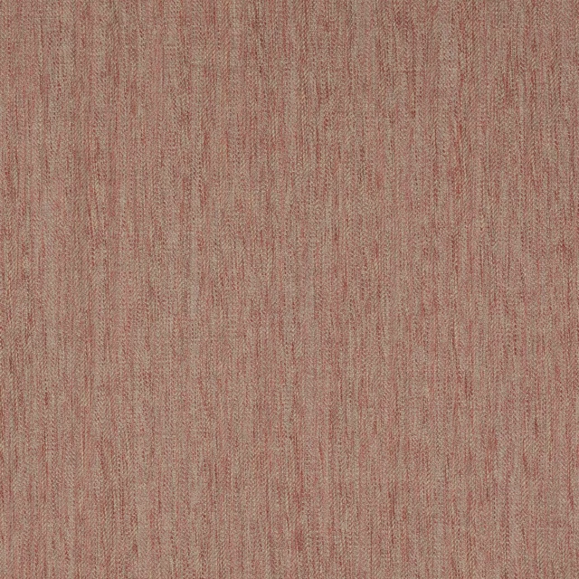
Boscombe Pink
Boscombe
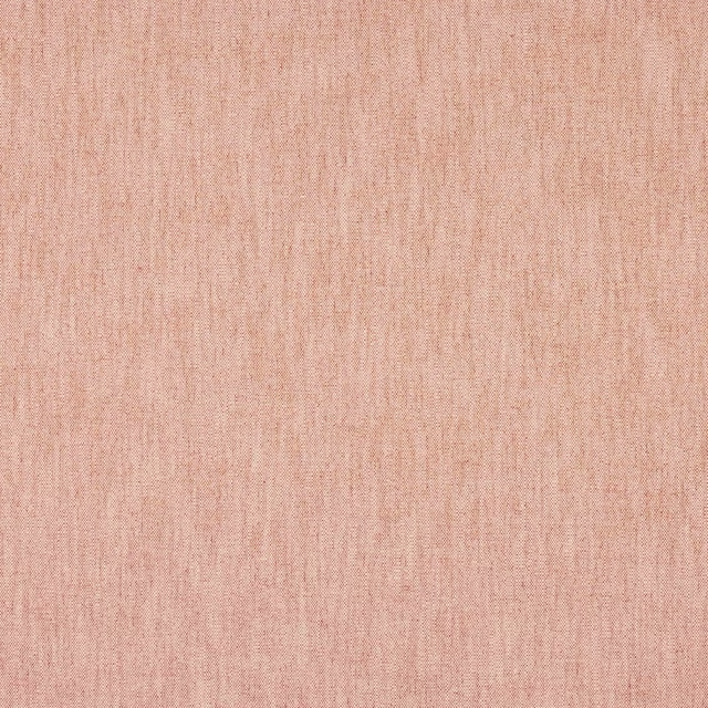
Hopper Pink
Hopper
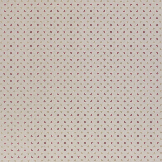
Chambord Chintz
Misc
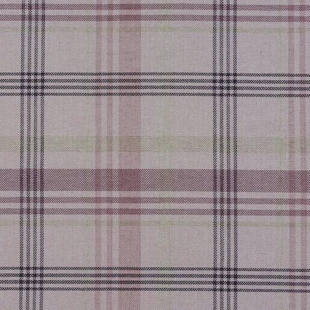
Melrose Pink
Misc

Tuscany Deep Pink
Tuscany II Weaves
GIA4271
Giardino

Rose Ash Light
2026 Paint

Faded Rose
2026 Paint
Paint that goes with it
Two ways to take the room. Both colours are from houses we hold, so a pot can come off the same order as the cloth. Screens shift colour, so treat these as a direction and bring the cloth to the shelf before you buy the paint.
To sit quietly behind it
Farringdon Grey
Morris & Co. · #cbc8c1
To stand against it
Gargoyle
Zoffany · #5f5f61
Other pink fabrics
Across the houses we hold. See all 2,519.
Carneum Raspberry
Edenmuir
Cassava Sorbet
Edenmuir
Colwin Sorbet
Edenmuir
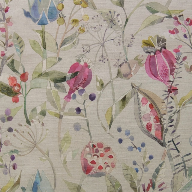
Kelston Sorbet
Edenmuir
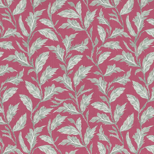
Eildon Fuchsia
Ettrick
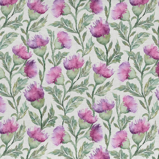
Ettrick Fuchsia Cream
Ettrick
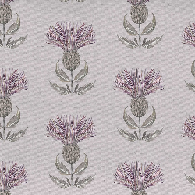
Firth Mauve Cream
Ettrick
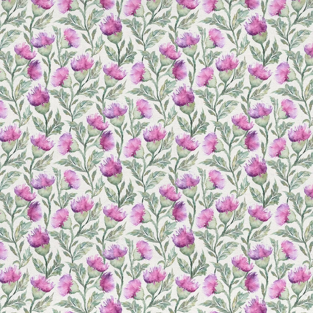
Hawick Fuchsia Cream
Ettrick
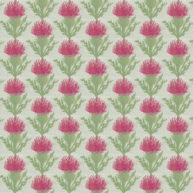
Moray Fuchsia
Ettrick
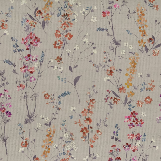
Briella Heather
Florabunda
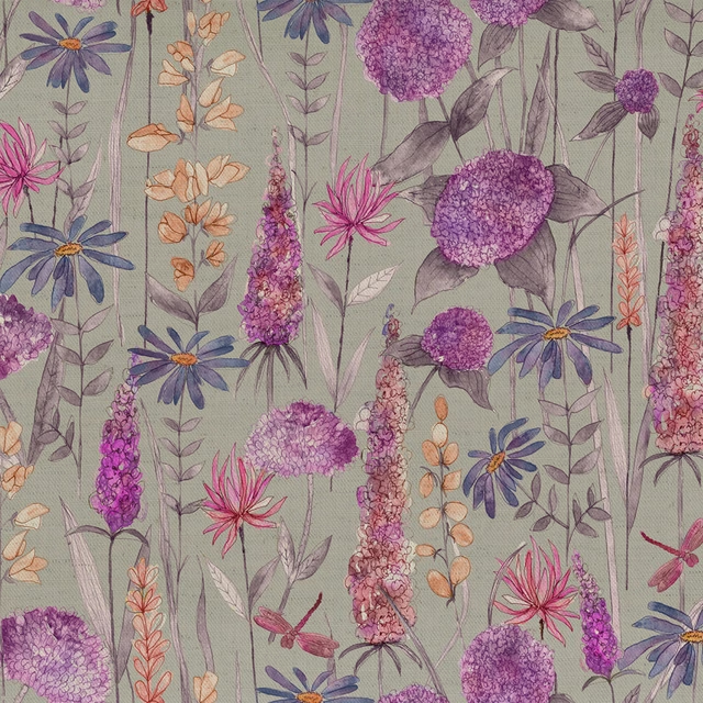
Florabunda Fuchsia
Florabunda
Hermione Blush
Florabunda