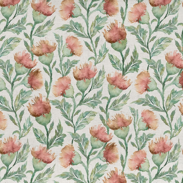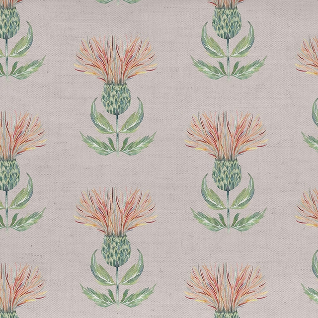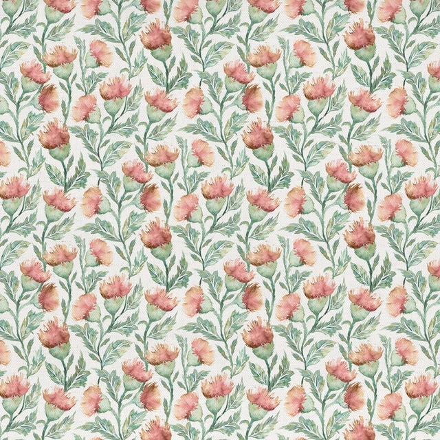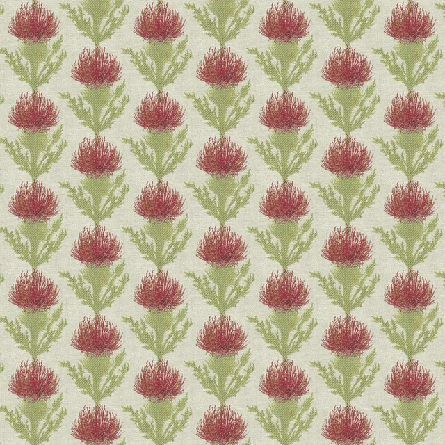

Tap the swatch to see it full screen. Hover it to magnify the weave. Colours on a screen are a guide, not a match, so come and feel the real cloth.
Scroll up or down to zoom in and out.
Sorong Clementine
Equator Fabricsorong/fa1/cle
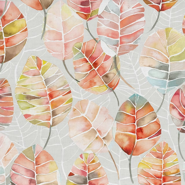
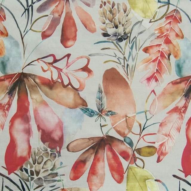
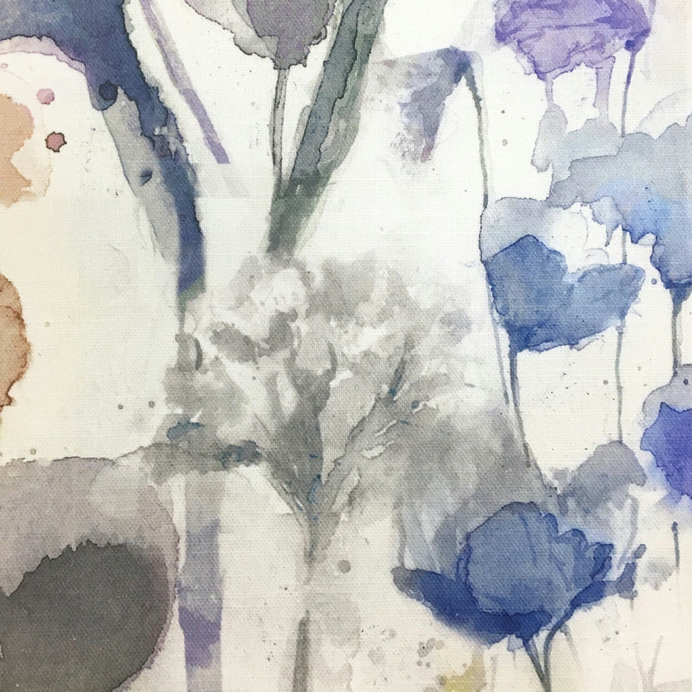
Sorong Clementine has a painterly, watercolour look with a softly weathered orange presence that sits among cool neutrals and indigo accents. The abstract motif feels fluid and expressive rather than rigid, giving the swatch an artistic, hand-finished character.
You have used your previews for today. Send one to Simon and you can carry on.
Your board
0 fabrics
Part of the range we hold from Voyage Maison.
See Sorong Clementine in your own room
A photograph of the piece you want re-covered. Straight on is best, and daylight helps. It is used to make your picture and nothing else.
Looking at your room
We found things here Sorong Clementine could go on. Tap one on the photograph, or choose below.
We could not see anything to re-cover
, s
Sorong Clementine, on your
Drag to compare. AI impression, colours indicative: ask us for a cutting before you decide.
About this fabric
Woven in 95% cotton and 5% linen, this 230gsm fabric has enough body for curtains, blinds and soft furnishings while still keeping a relaxed drape. The visible ground is a pale, creamy base, allowing the orange areas to read as warm, earthy accents rather than a flat, saturated tone. In this colourway, the strongest notes lean burnt orange and rust, softened by greyed washes that give the design a slightly faded, lived-in depth. The broad 138cm usable width and large 138cm horizontal repeat support a striking statement application, while the 93cm vertical repeat keeps the pattern spacious and artistic.
How to use it
Use Sorong Clementine to bring warmth into a neutral room, especially alongside oak, ivory and muted blue or grey upholstery. It works particularly well where you want a lively accent that still feels soft and considered.
Pair with natural linens and warm timber to let the painterly orange feel lively rather than loud.
More from Equator
The same book, other colourways.
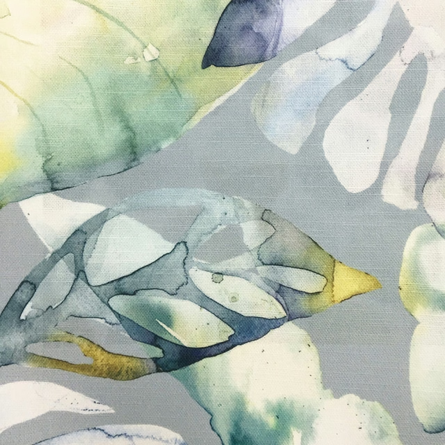
Salvador Grey
Equator
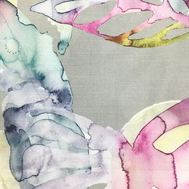
Salvador Summer
Equator
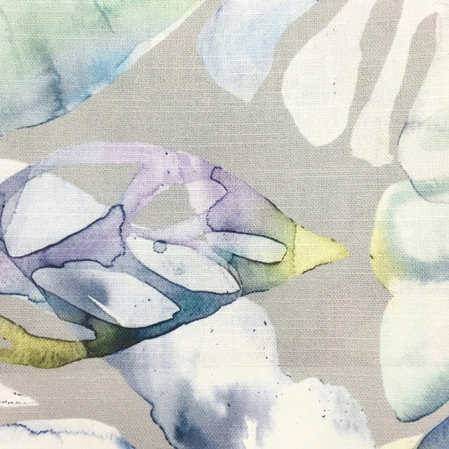
Salvador Violet
Equator
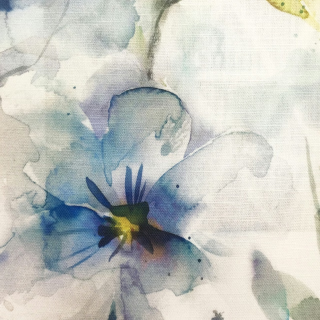
Samarinda Pacific
Equator
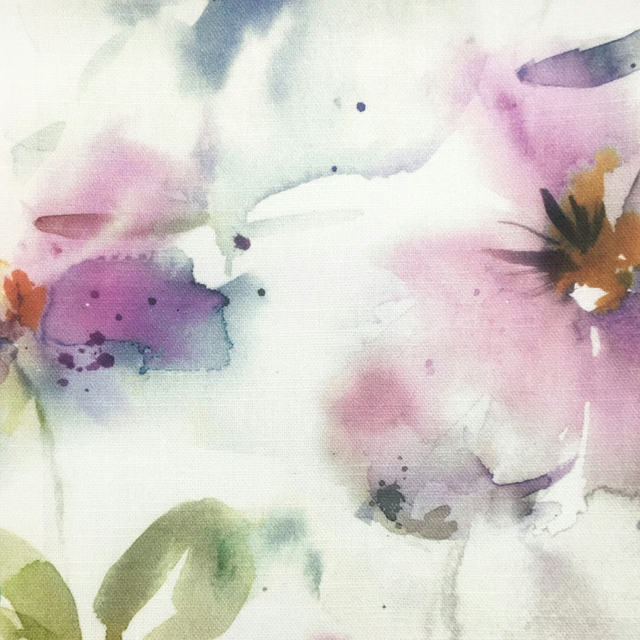
Samarinda Summer
Equator
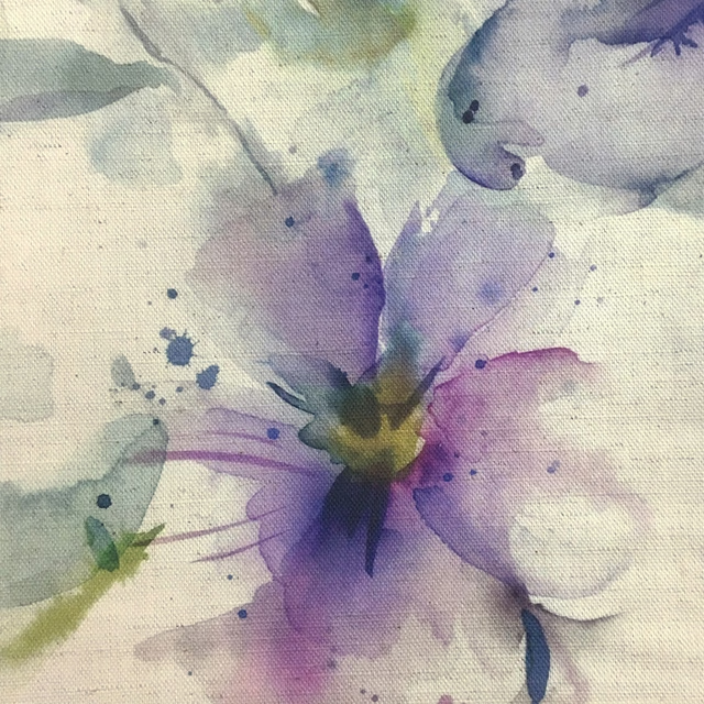
Samarinda Violet
Equator
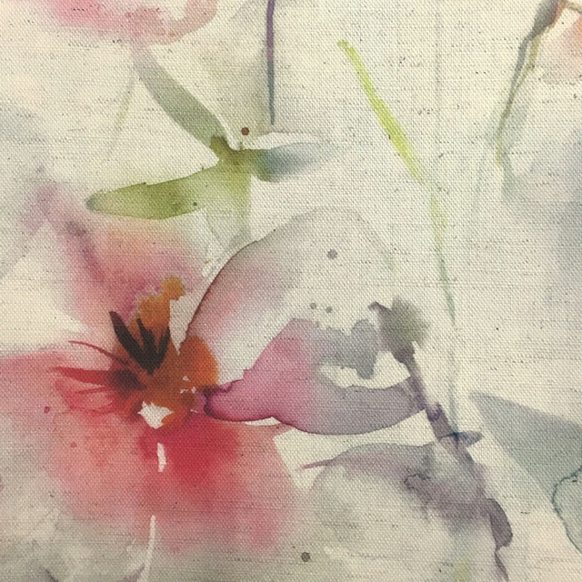
Samarinda Poppy Natural
Equator
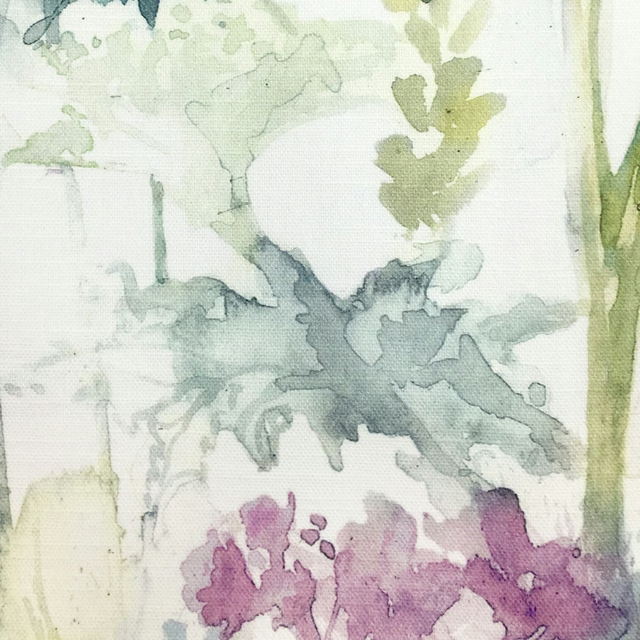
Sorong Summer
Equator
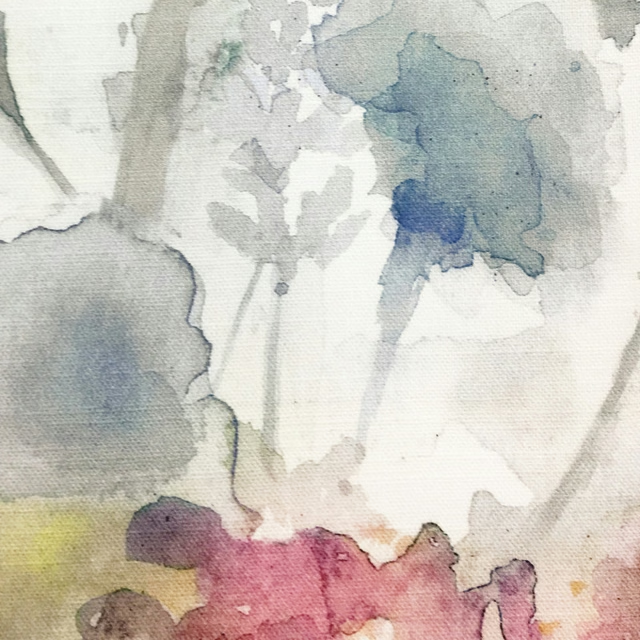
Sorong Coral
Equator
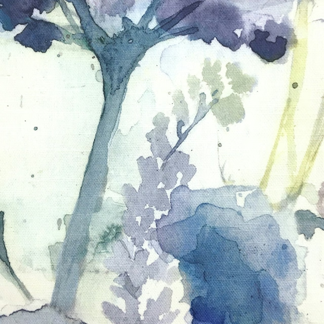
Sorong Violet
Equator
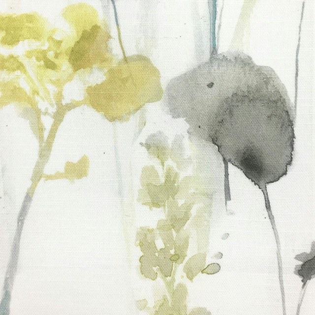
Sorong Lemon
Equator
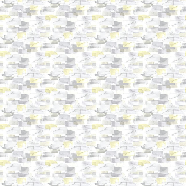
Taifuph Lemon
Equator
Pairs well with
A pattern needs somewhere for the eye to rest, so these are the plains and textures that sit beside Sorong Clementine without fighting it. Mixed across the houses we hold, which is the part a single supplier's book cannot do.

Bronte Saffron
Darwin Collection

Omari Nectarine
Omari Collection

Amalfi Flame
Amalfi

Rowland Turmeric
Burlington

Cosima Coral
Cosima Velvet II

Dante Burnt Orange
Dante Velvet

Bordeaux Plain Burnt Orange
Eco -Friendly Ranges
Carnaby Bronze
Magma
Florio Amber
Florio Plains

Camden Ochre
Camden

Hampton Plain Rust
Hampton

Astor Pumpkin
Astor
Paint that goes with it
Two ways to take the room. Both colours are from houses we hold, so a pot can come off the same order as the cloth. Screens shift colour, so treat these as a direction and bring the cloth to the shelf before you buy the paint.
To sit quietly behind it
La Seine
Zoffany · #bec0bf
To stand against it
Hopper
Little Greene · #5a6e48
Other orange fabrics
Across the houses we hold. See all 784.