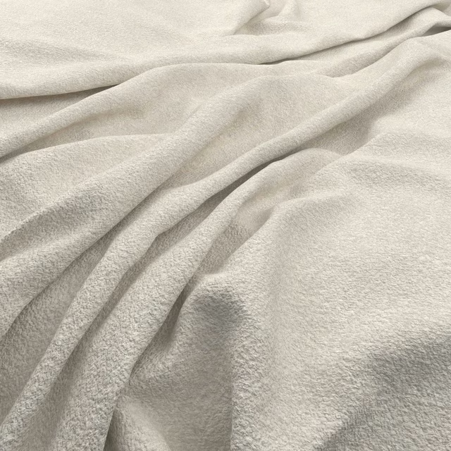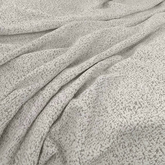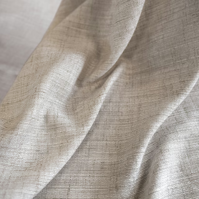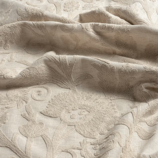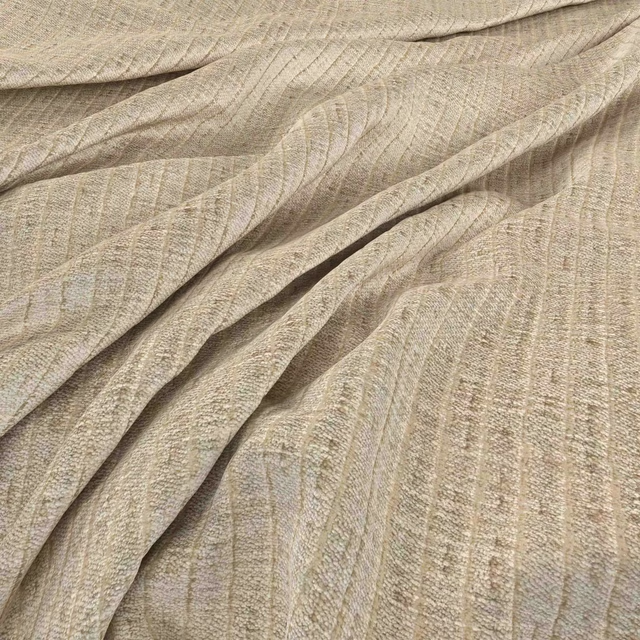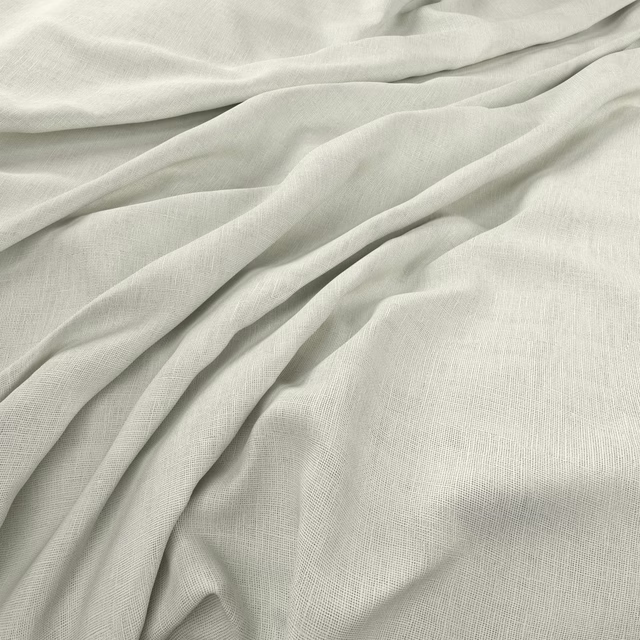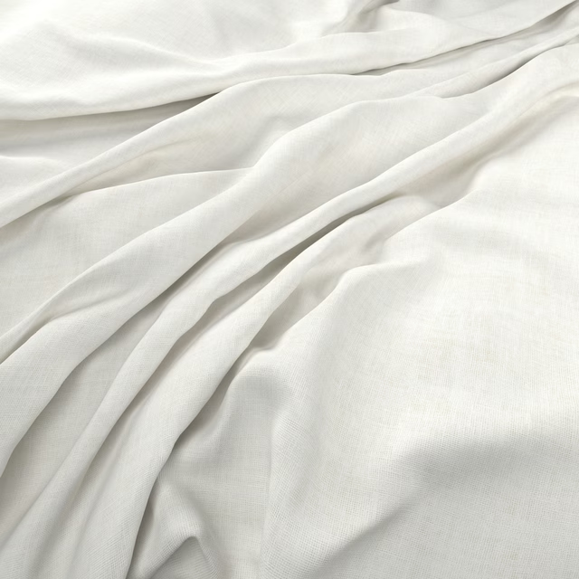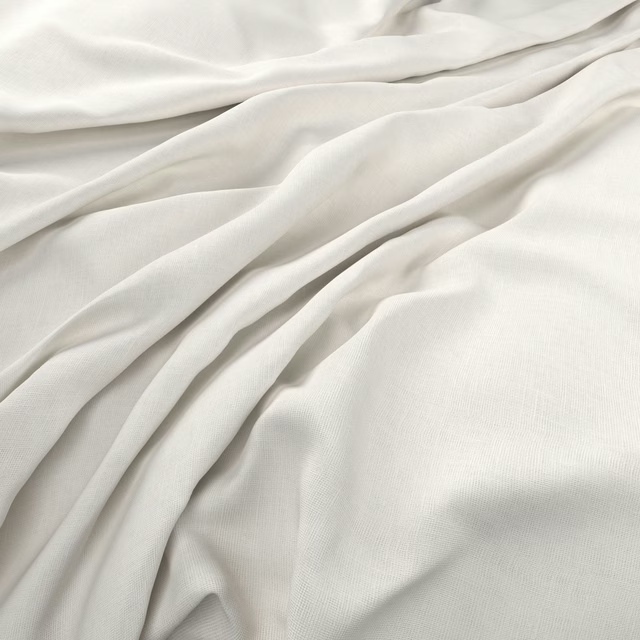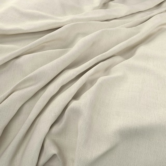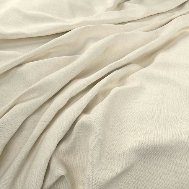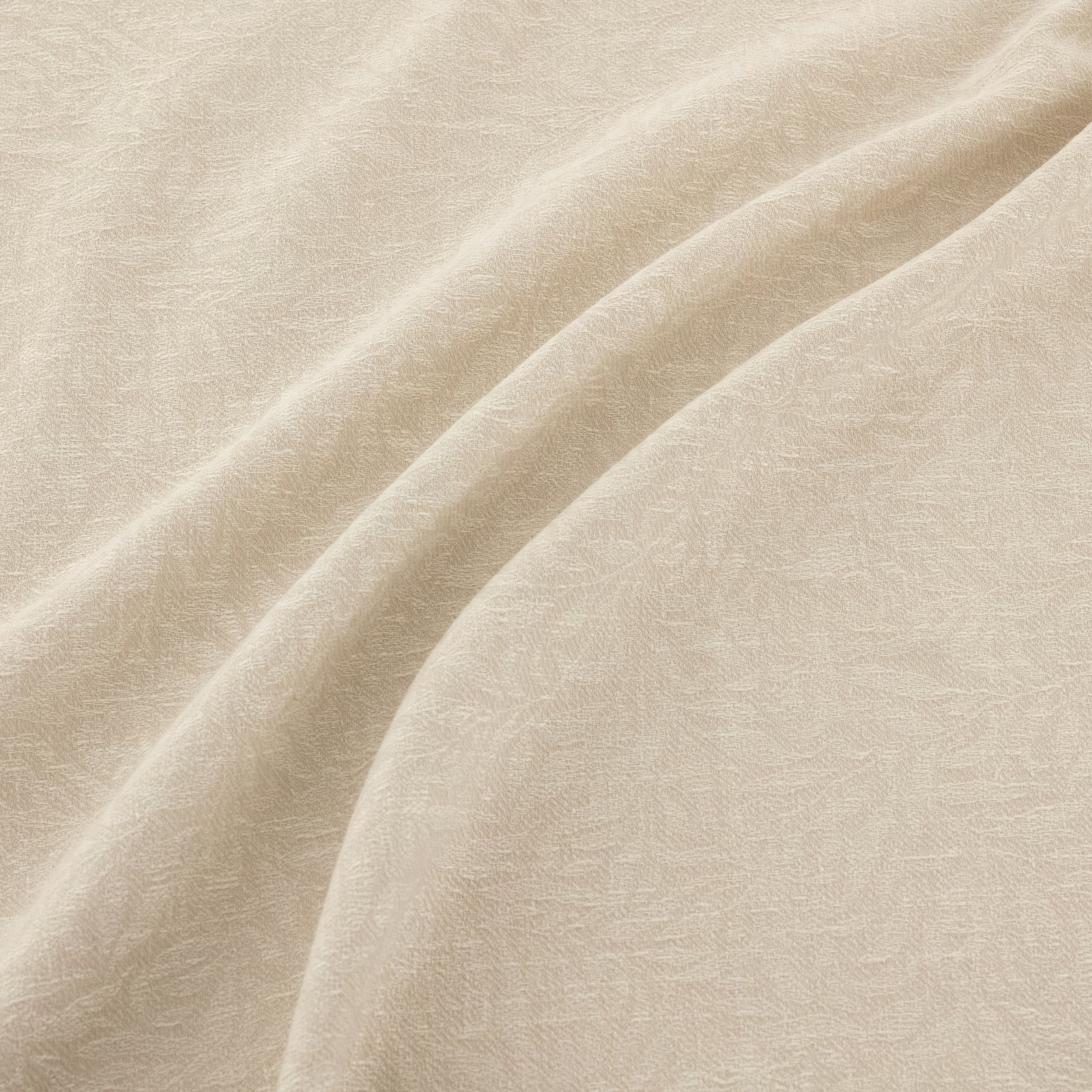

Tap the swatch to see it full screen. Hover it to magnify the weave. Colours on a screen are a guide, not a match, so come and feel the real cloth.
Scroll up or down to zoom in and out.
Filigree Ivory
Filigree Fabric
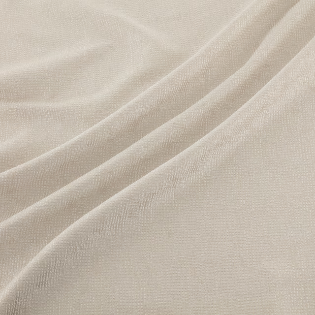
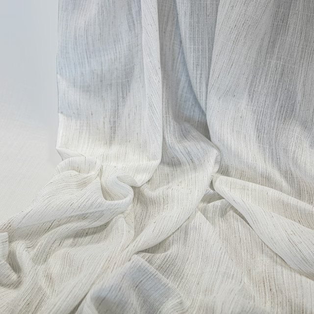
Filigree Ivory presents a pale ivory ground with a delicate, low-contrast filigree pattern woven across its surface. In the swatch image, the fine cloth falls into broad, fluid folds that bring out subtle changes in tone.
You have used your previews for today. Send one to Simon and you can carry on.
Your board
0 fabrics
See this fabric on Warwick's own site, then order it through us.
See Filigree Ivory in your own room
A photograph of the piece you want re-covered. Straight on is best, and daylight helps. It is used to make your picture and nothing else.
Looking at your room
We found things here Filigree Ivory could go on. Tap one on the photograph, or choose below.
We could not see anything to re-cover
, s
Filigree Ivory, on your
Drag to compare. AI impression, colours indicative: ask us for a cutting before you decide.
About this fabric
This colourway reads as warm and softly muted rather than stark white, giving the intricate surface a calm, understated presence. The fine, fluid cloth gathers easily into sweeping folds, while the tonal filigree texture becomes more noticeable where the light grazes the surface. Its small-scale pattern remains delicate against the ivory background, without creating a strong visual contrast. The supplied record notes no performance features and provides no further specification data for this fabric.
How to use it
Use Filigree Ivory for full-length curtains or softly gathered blinds where its warm cream tone can brighten a room without the hardness of pure white. Pair it with natural timber, pale stone and softly textured upholstery to echo the swatch’s quiet tonal depth.
A softly warm ivory with a quiet tonal motif, well suited to curtains and relaxed layered schemes.
Pairs well with
Filigree Ivory is a quiet cloth, so it carries a pattern beside it: one of these on the curtains and this on the chair. Mixed across the houses we hold, which is the part a single supplier's book cannot do.

Atwood Ivory
Essential Weaves Vol 1
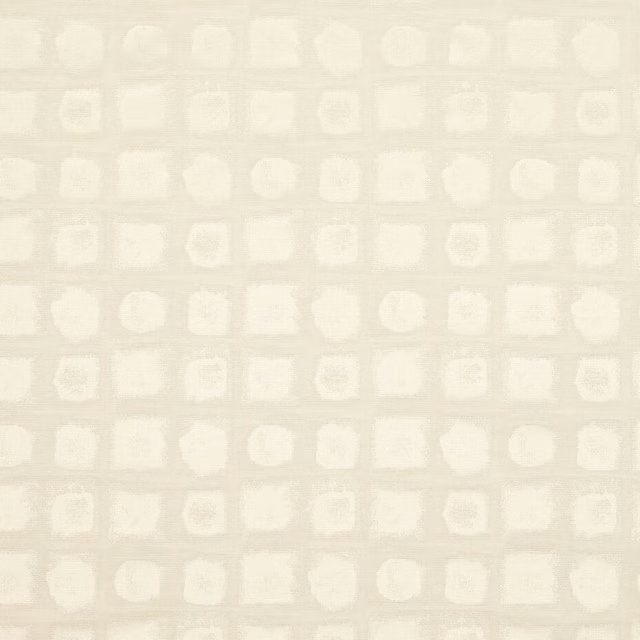
Chelton Ivory
Essential Weaves Vol 1
Marmor Linen
Expressions Performance Wallcoverings
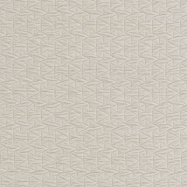
Quarzo Ivory
Metalli
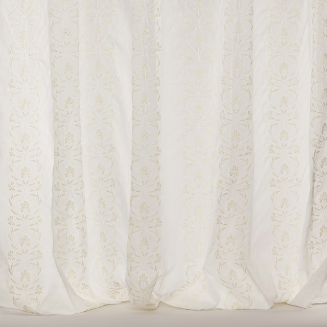
Adella Ivory
Carissa Sheers
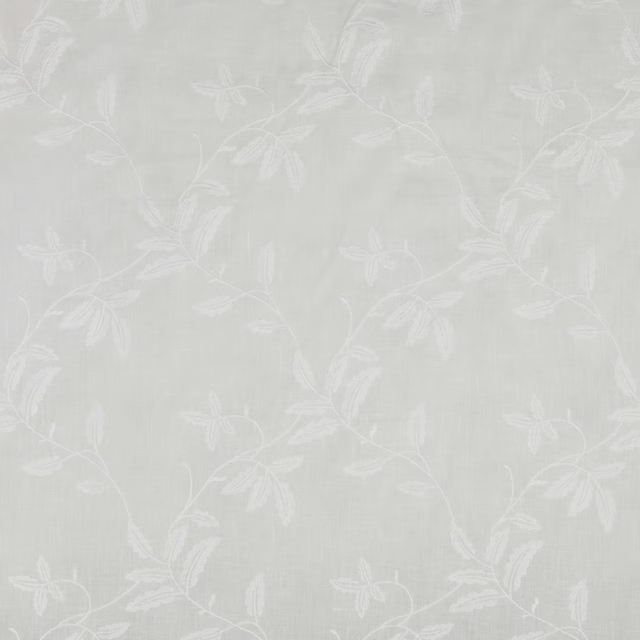
Avery Voile Ivory
Florenza Sheers
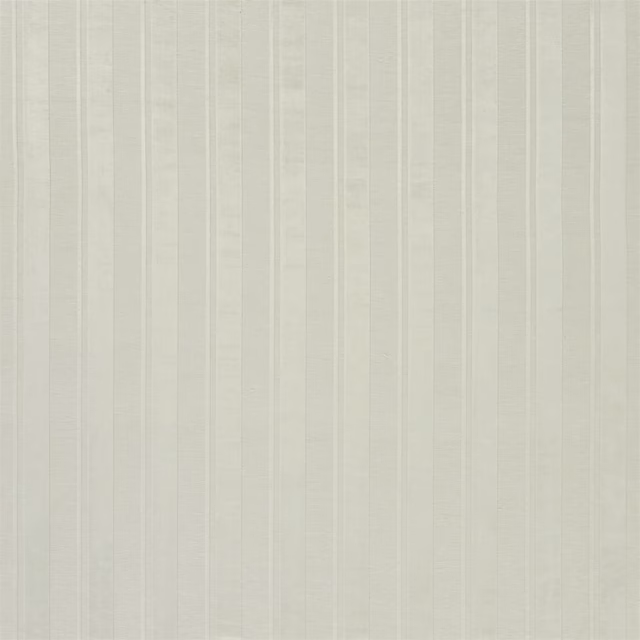
Chaumont Chalk
Greycloth Fabrics
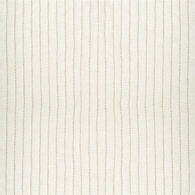
Isere Alabaster
Isère Fabrics
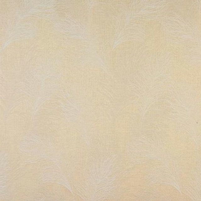
Feather Ivory
Acacia

Belgravia Ivory
Grosvenor
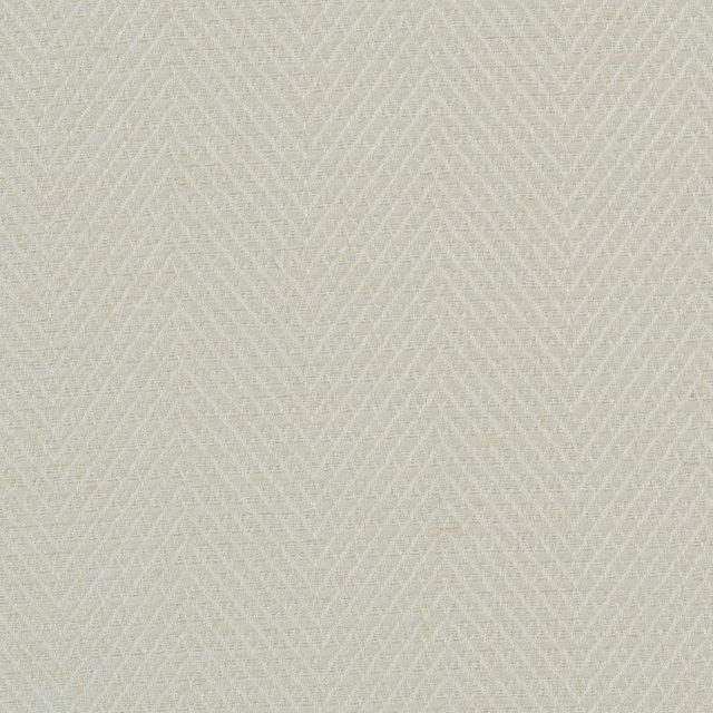
Hampton Mother of Pearl
Hampton
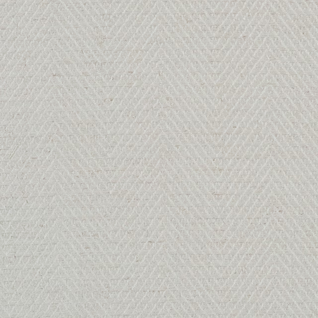
Hampton Oystershell
Hampton
Paint that goes with it
Two ways to take the room. Both colours are from houses we hold, so a pot can come off the same order as the cloth. Screens shift colour, so treat these as a direction and bring the cloth to the shelf before you buy the paint.
To sit quietly behind it
Mushroom
Little Greene · #d3c3ae
To stand against it
Midnight Blue
Sanderson · #5f7990
Other cream fabrics
Across the houses we hold. See all 4,572.