

Tap the swatch to see it full screen. Hover it to magnify the weave. Colours on a screen are a guide, not a match, so come and feel the real cloth.
Scroll up or down to zoom in and out.
Wolseley Primrose
Wolseley Fabric
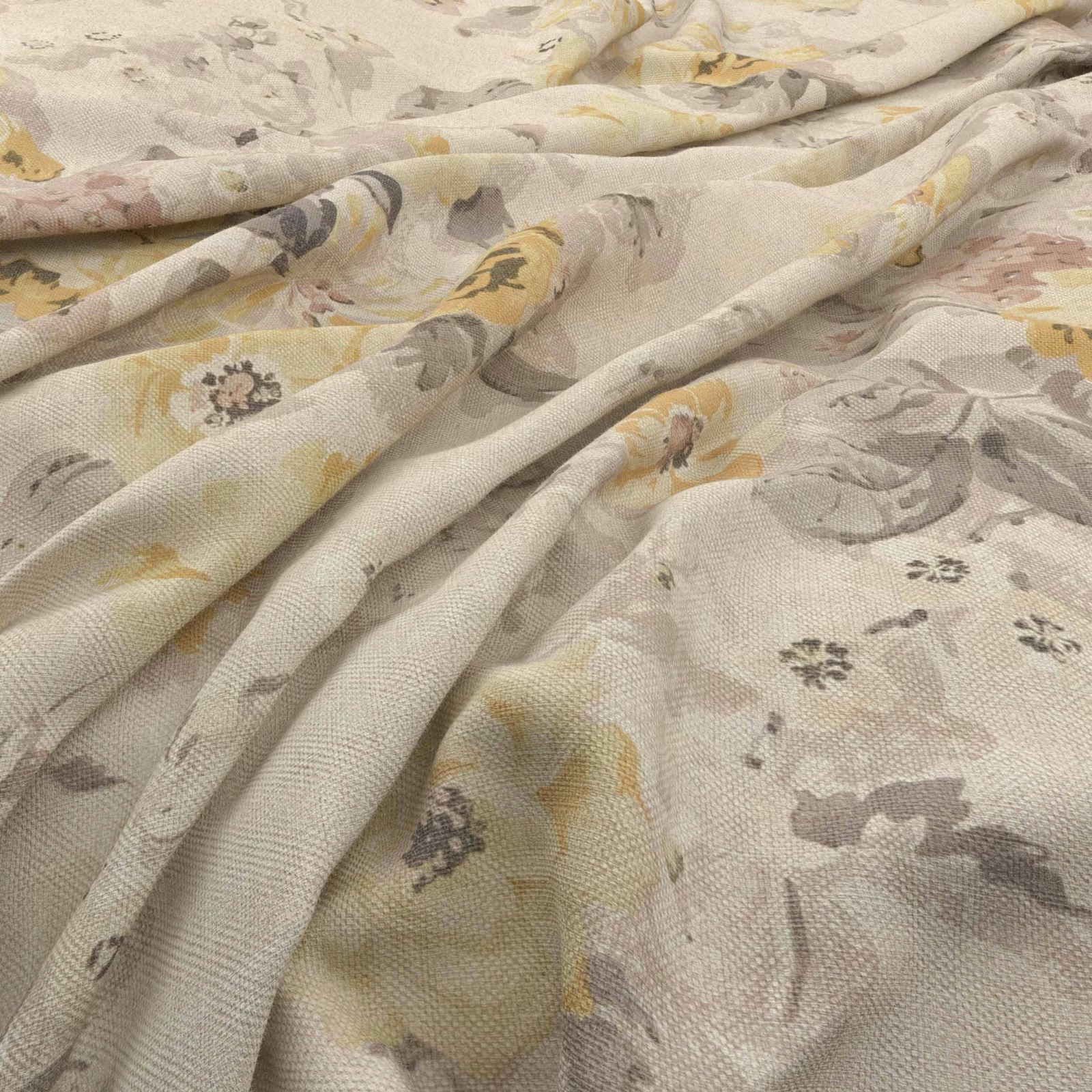
Wolseley Primrose has a warm, softly flecked cream ground, overlaid with loosely painted florals in primrose yellow, dove grey, taupe and gentle blush. Its visible woven texture gives the pale colourway a quiet, tactile depth rather than a flat printed appearance.
You have used your previews for today. Send one to Simon and you can carry on.
Your board
0 fabrics
See this fabric on Warwick's own site, then order it through us.
See Wolseley Primrose in your own room
A photograph of the piece you want re-covered. Straight on is best, and daylight helps. It is used to make your picture and nothing else.
Looking at your room
We found things here Wolseley Primrose could go on. Tap one on the photograph, or choose below.
We could not see anything to re-cover
, s
Wolseley Primrose, on your
Drag to compare. AI impression, colours indicative: ask us for a cutting before you decide.
About this fabric
The design combines larger, indistinct floral forms with scattered small flower heads, creating a layered botanical pattern across the cloth. Primrose yellow brings a mellow warmth, while grey and taupe shapes temper the cream base and keep the overall impression muted. The fabric falls in substantial, softly rounded folds in the image, making it suitable to consider for both upholstery and drapery. No further performance or construction specification is supplied for this fabric.
How to use it
Use Wolseley Primrose to lighten a traditional chair, headboard or curtain scheme, pairing its warm cream and yellow notes with pale timber, oatmeal upholstery or softly weathered painted furniture. The grey and taupe details also make it easy to coordinate with understated neutral trims.
A softly textured cream ground with painterly florals in muted yellow, grey, taupe and blush.
Pairs well with
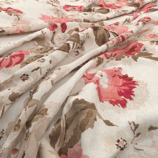
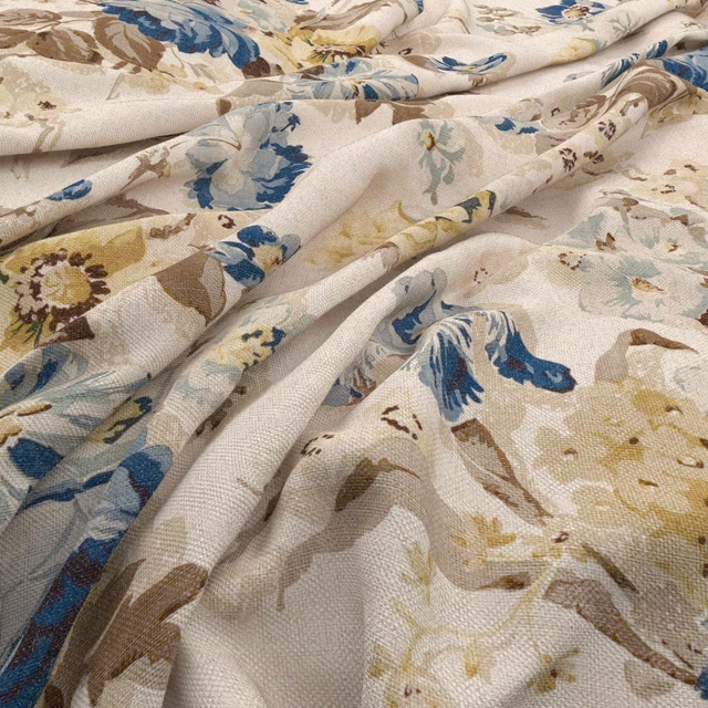
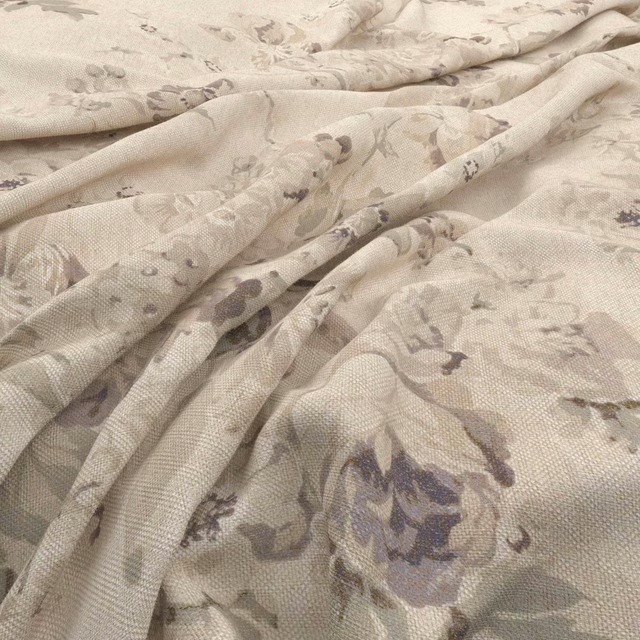
A pattern needs somewhere for the eye to rest, so these are the plains and textures that sit beside Wolseley Primrose without fighting it. Mixed across the houses we hold, which is the part a single supplier's book cannot do.










Paint that goes with it
Two ways to take the room. Both colours are from houses we hold, so a pot can come off the same order as the cloth. Screens shift colour, so treat these as a direction and bring the cloth to the shelf before you buy the paint.
To sit quietly behind it
Debate Club
Coat Paints · #b0a18c
To stand against it
Hicks' Blue
Little Greene · #415968
Other cream fabrics
Across the houses we hold. See all 4,572.
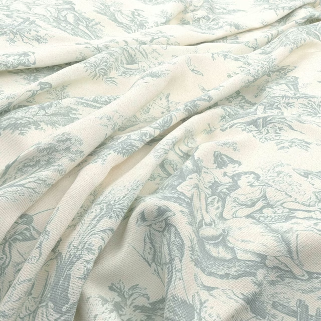
Valencay Toile Bleu
Valencay Toile
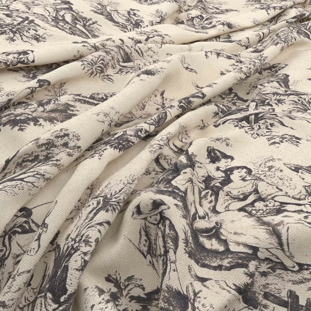
Valencay Toile Charbon
Valencay Toile
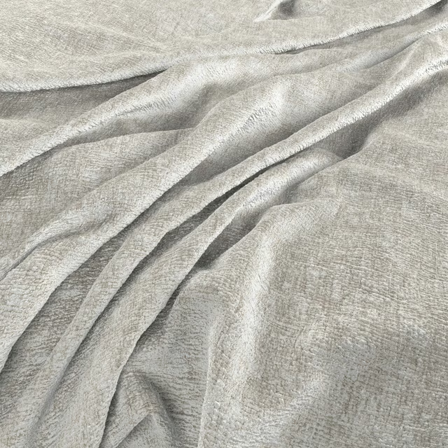
Verbier Alabaster
Verbier
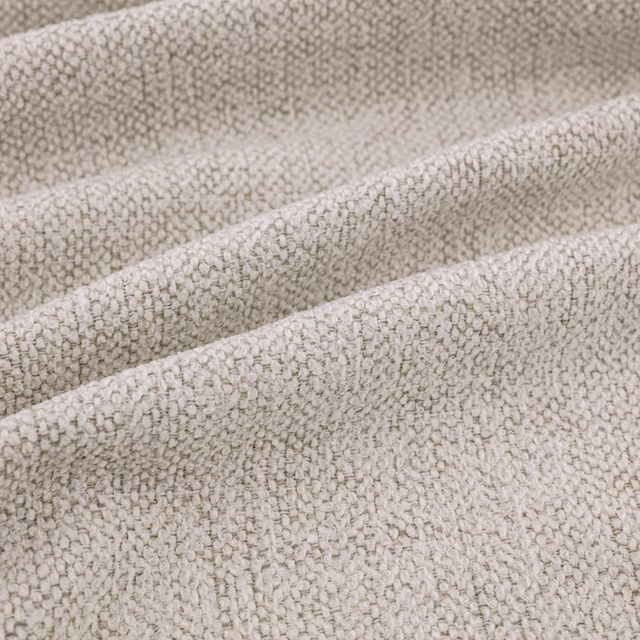
Verona Ecru
Verona
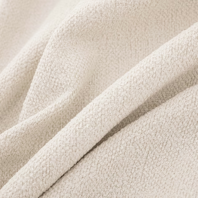
Verona Ivory
Verona
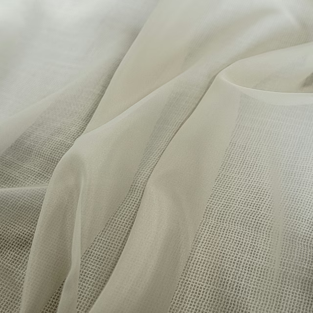
Whisper Natural
Whisper
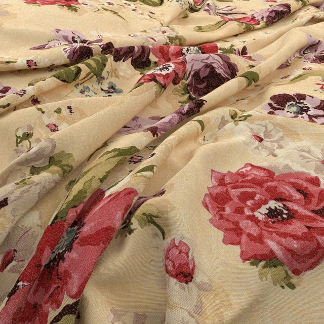
Wildflower Antique
Wildflower
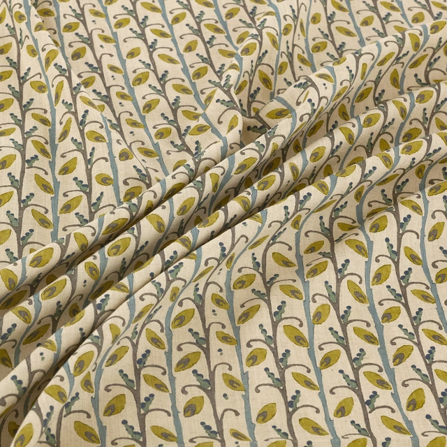
Wildwood Cascade
Wildwood
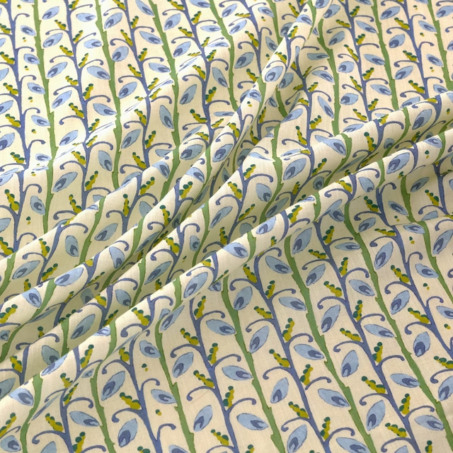
Wildwood Saltwater
Wildwood
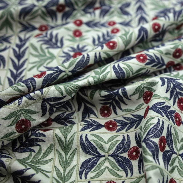
Yasmin Cornsilk
Yasmin

Devon Cream
Inglewood Saxony

Ivory
Inglewood Saxony