
Tap the swatch to see it full screen. Hover it to magnify the weave. Colours on a screen are a guide, not a match, so come and feel the real cloth.
Scroll up or down to zoom in and out.
22 Post Box
Panaro Fabric22
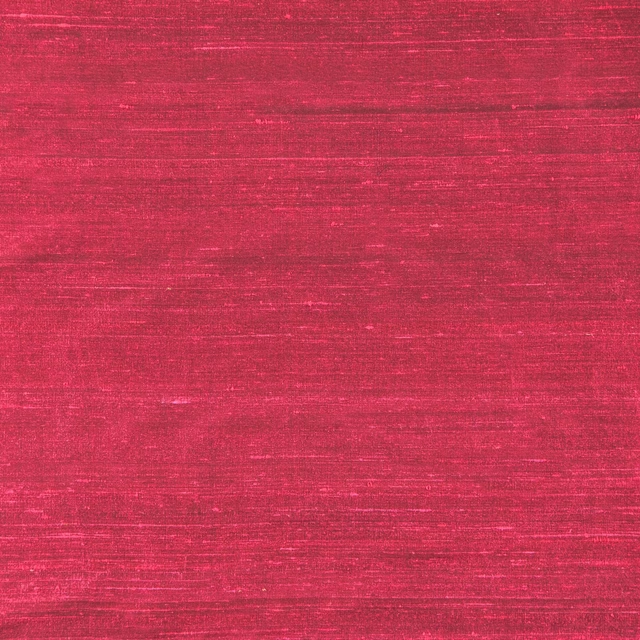
Panaro 22 Post Box is a saturated red textile with a quiet, close-woven surface. The even colour reads as a deep post-box red, with slight tonal variation where the weave catches the light.
You have used your previews for today. Send one to Simon and you can carry on.
Your board
0 fabrics
See this fabric on Wemyss's own site, then order it through us.
See 22 Post Box in your own room
A photograph of the piece you want re-covered. Straight on is best, and daylight helps. It is used to make your picture and nothing else.
Looking at your room
We found things here 22 Post Box could go on. Tap one on the photograph, or choose below.
We could not see anything to re-cover
, s
22 Post Box, on your
Drag to compare. AI impression, colours indicative: ask us for a cutting before you decide.
About this fabric
This plain colourway has a rich red tone that feels warm, concentrated and confident rather than bright or orange. A fine, closely woven texture gives the surface understated depth while keeping the design visually calm. The swatch appears versatile enough for upholstery or drapery, depending on the intended finish and application. No composition, width or rub-test data has been supplied for this colourway.
How to use it
Use 22 Post Box to bring depth to a neutral room through a tailored armchair, headboard or pair of curtains. Its saturated red tone works especially well with warm timber, aged brass and soft creams.
Use this saturated red as a confident accent on upholstery or as a rich, grounding drapery tone.
More from Panaro
The same book, other colourways.

15 Jet
Panaro
16 Mink
Panaro

17 Fawn
Panaro

19 Honey
Panaro

20 Fox
Panaro

21 Paprika
Panaro

23 Strawberry
Panaro

24 Fuchsia
Panaro

26 Aubergine
Panaro

27 Hunter
Panaro

29 Lizard
Panaro

30 Corn
Panaro
Pairs well with
22 Post Box is a quiet cloth, so it carries a pattern beside it: one of these on the curtains and this on the chair. Mixed across the houses we hold, which is the part a single supplier's book cannot do.
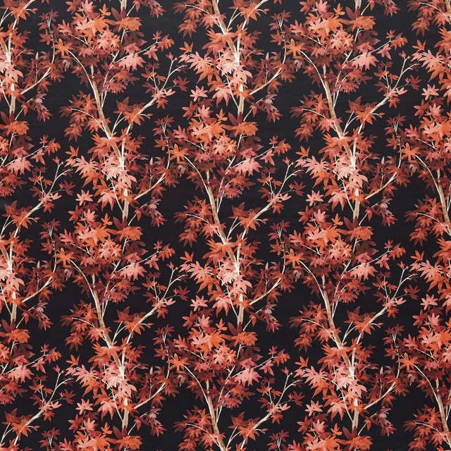
Aspen Scarlet
Tahiti Collection
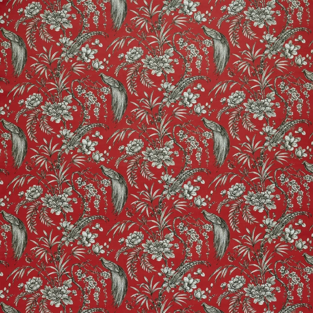
Botanist Crimson
Tahiti Collection
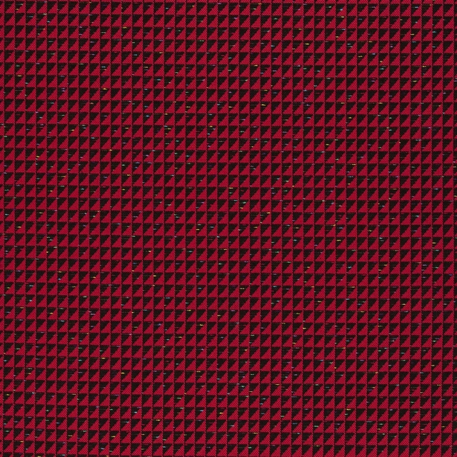
Manta Carmin
Carnets Andalous Fabrics
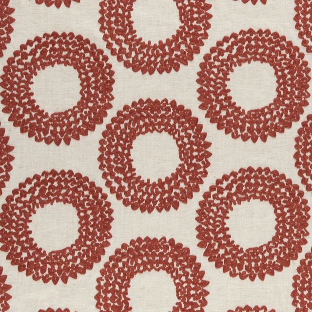
Dashiki Cinnabar
Amara
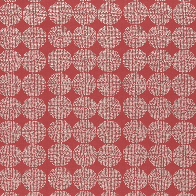
Kiko Red
Amara
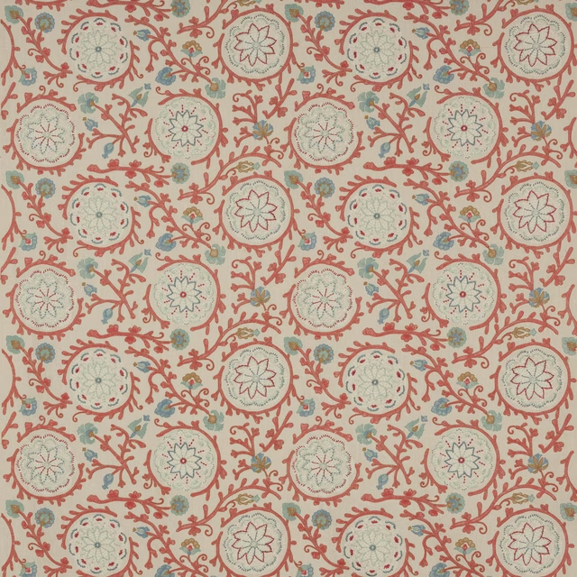
Caspian Tomato
Ashdown
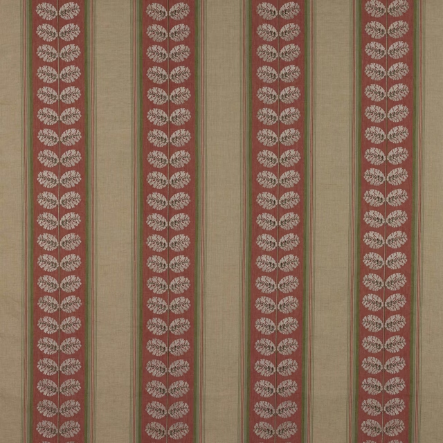
Woodcote Stripe Red/Green
Ashdown
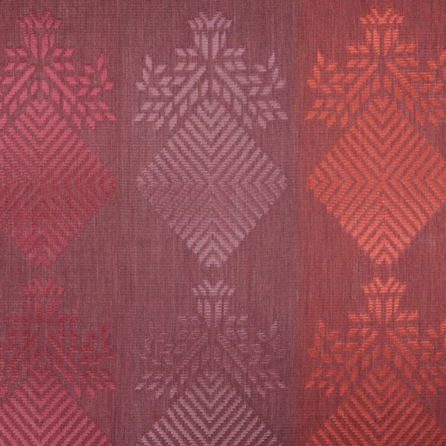
Purachina Scarlet
Amaya Fabrics

Warp Cloth Berry
Tweed FR Fabrics

Kensington Wine
Brodsworth
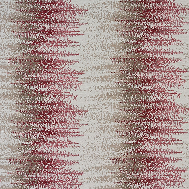
Byron Rosso
Byron
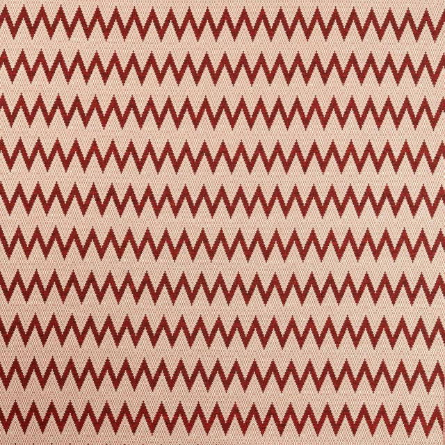
Akari Harrisa/Sunstone
Akari Weaves
Paint that goes with it
Two ways to take the room. Both colours are from houses we hold, so a pot can come off the same order as the cloth. Screens shift colour, so treat these as a direction and bring the cloth to the shelf before you buy the paint.
To sit quietly behind it
Theatre Red
Little Greene · #711324
To stand against it
Light Bronze Green
Little Greene · #5a4620