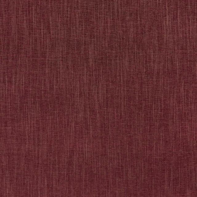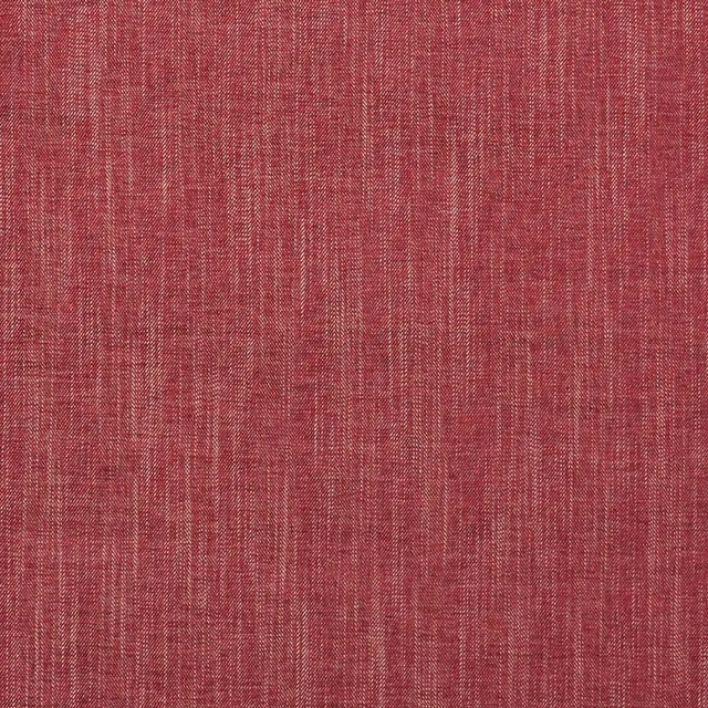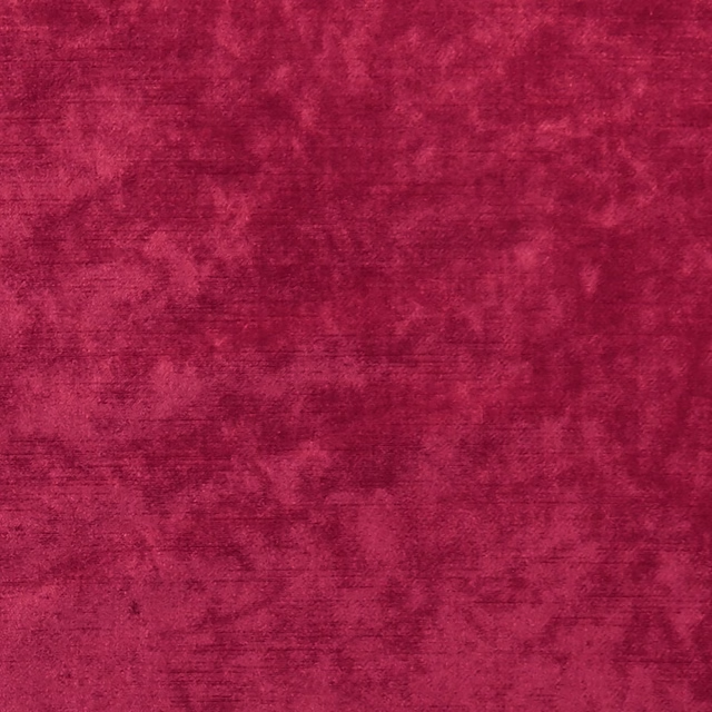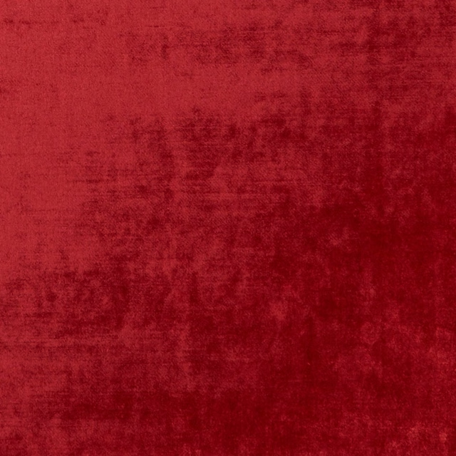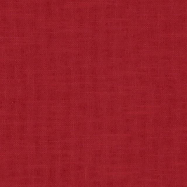


Tap the swatch to see it full screen. Hover it to magnify the weave. Colours on a screen are a guide, not a match, so come and feel the real cloth.
Scroll up or down to zoom in and out.
Dashiki Cinnabar
Amara FabricCCF0149-01
Dashiki Cinnabar brings a warm, brick-red interpretation to the Amara collection, with repeated linked ring motifs woven across an ivory ground. The dense surface gives the pattern a tactile, slightly raised appearance rather than a flat printed finish.
You have used your previews for today. Send one to Simon and you can carry on.
Your board
0 fabrics
Part of the range we hold from Clarke & Clarke.
See Dashiki Cinnabar in your own room
A photograph of the piece you want re-covered. Straight on is best, and daylight helps. It is used to make your picture and nothing else.
Looking at your room
We found things here Dashiki Cinnabar could go on. Tap one on the photograph, or choose below.
We could not see anything to re-cover
, s
Dashiki Cinnabar, on your
Drag to compare. AI impression, colours indicative: ask us for a cutting before you decide.
About this fabric
The design is formed from chunky, interlocking red loops that create rounded medallion-like rings, while the ivory background keeps the overall colourway light enough to read clearly. Cinnabar has a warm, earthy depth: the red appears softly varied across the weave, with darker edges and lighter highlights catching on the textured yarns. At 534gsm, this is a substantial fabric well suited to upholstery, and its 130cm usable width is practical for covering furniture panels. The pattern repeat measures 23.4cm vertically by 32.7cm horizontally, giving the motif a noticeable but not oversized presence on a chair, headboard or sofa.
How to use it
Use Dashiki Cinnabar on a statement armchair, banquette or tailored sofa where its warm red rings can anchor an ivory, putty or natural timber scheme. Repeat the cinnabar tone in a cushion or small accessory, while keeping surrounding surfaces quiet so the woven medallions remain the focus.
The substantial 534gsm weave and warm ivory-and-cinnabar contrast make this a confident choice for upholstered seating and occasional chairs.
More from Amara
The same book, other colourways.

Adisa Natural
Amara
Adisa Taupe
Amara

Adisa Willow
Amara

Amara Cinnamon
Amara
Amara Natural
Amara

Amara Orchid
Amara
Dashiki Cinnamon
Amara

Dashiki Indigo
Amara

Dashiki Plum
Amara

Imani Charcoal/Cinnamon
Amara

Imani Cinnabar/Aqua
Amara

Imani Indigo/Red
Amara
Pairs well with
A pattern needs somewhere for the eye to rest, so these are the plains and textures that sit beside Dashiki Cinnabar without fighting it. Mixed across the houses we hold, which is the part a single supplier's book cannot do.





Paint that goes with it
Two ways to take the room. Both colours are from houses we hold, so a pot can come off the same order as the cloth. Screens shift colour, so treat these as a direction and bring the cloth to the shelf before you buy the paint.
To sit quietly behind it
Blush
Little Greene · #ae8a82
To stand against it
The Record Store
Coat Paints · #404140
Other red fabrics
Across the houses we hold. See all 2,143.