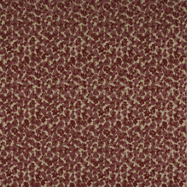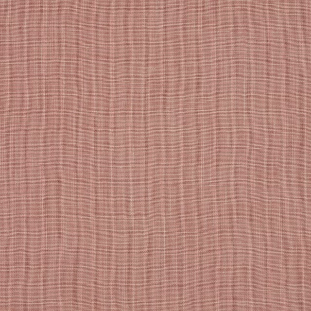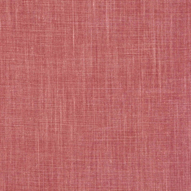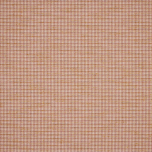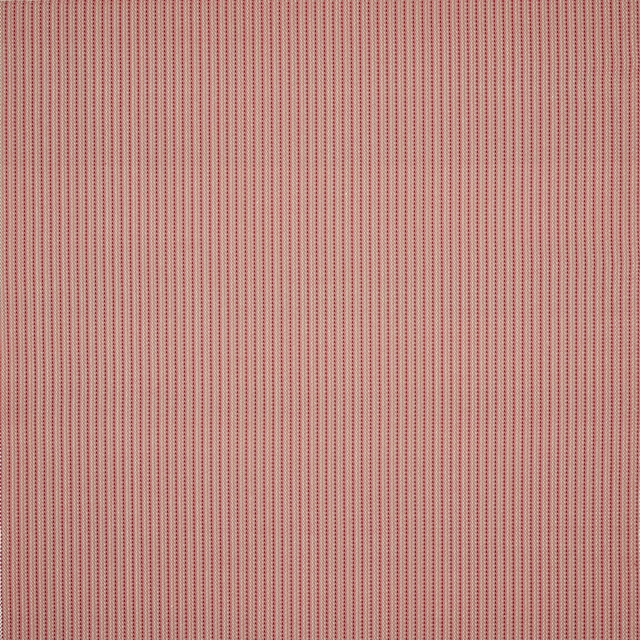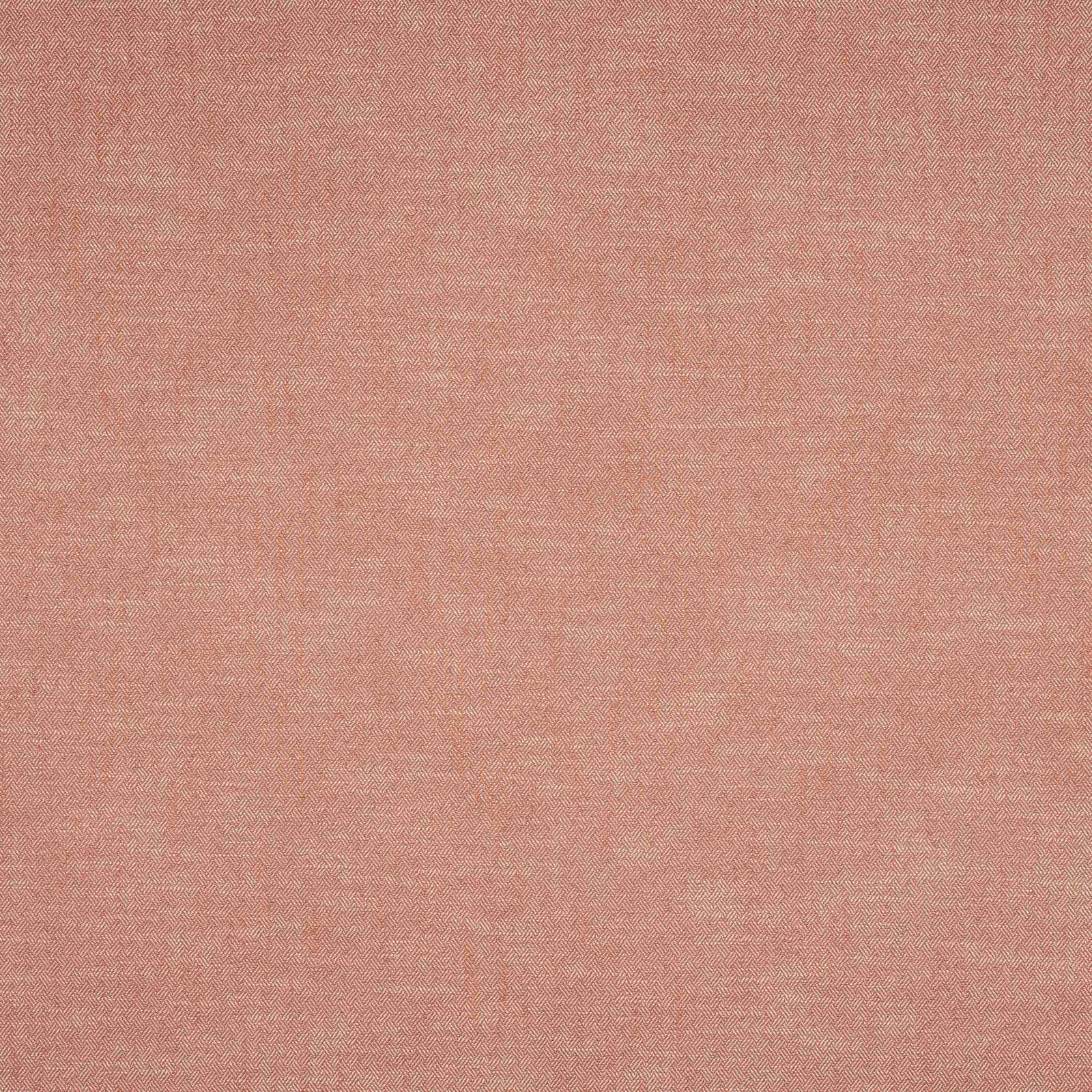

Tap the swatch to see it full screen. Hover it to magnify the weave. Colours on a screen are a guide, not a match, so come and feel the real cloth.
Scroll up or down to zoom in and out.
Monti Corail
Marco FabricM4163-08
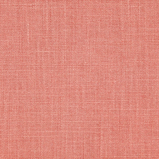
Monti Corail is a softly textured coral-pink fabric with a fine woven check that reads warm and airy on the surface. The small repeat gives the design a gentle rhythm without disturbing the calm, sun-faded look of the colourway.
You have used your previews for today. Send one to Simon and you can carry on.
Your board
0 fabrics
See this fabric on Manuel Canovas's own site, then order it through us.
See Monti Corail in your own room
A photograph of the piece you want re-covered. Straight on is best, and daylight helps. It is used to make your picture and nothing else.
Looking at your room
We found things here Monti Corail could go on. Tap one on the photograph, or choose below.
We could not see anything to re-cover
, s
Monti Corail, on your
Drag to compare. AI impression, colours indicative: ask us for a cutting before you decide.
About this fabric
Woven in 70% viscose and 30% linen, Monti Corail has the tactile, slightly matte character you expect from a linen blend, with a subtle lift from the viscose. The fabric shows a tiny chevron-like check, repeated at approximately V 2cm / H 1cm, which adds quiet structure rather than a bold pattern statement. Its coral tone sits between blush and peach, giving the cloth a warmed, delicate pink appearance that softens the weave’s texture. At approximately 140cm wide, it is a practical furnishing cloth for tailored schemes, and the fire code is √CM. Care code Q 8 + T 3 is supplied for this exact fabric.
How to use it
Use this shade where you want a gentle wash of colour against pale timber, chalky neutrals or warm white paint. It works especially well in rooms that need a little warmth without moving into stronger terracotta or red tones.
A warm coral pink that brings an easy, sunlit freshness to upholstery or curtains.
More from Marco
The same book, other colourways.
Marco Prairie
Marco

Marco Rose Ancien
Marco
Marco Rose The
Marco

Monti Aqua
Marco
Monti Beige
Marco

Monti Ciel
Marco
Monti Curcuma
Marco
Monti Indigo
Marco
Monti Paon
Marco
Monti Prairie
Marco
Monti Rose Ancien
Marco
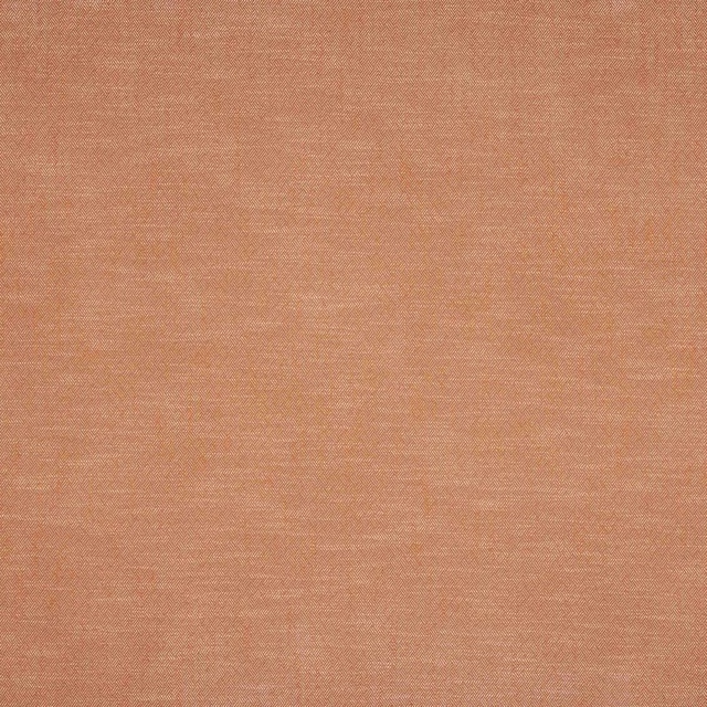
Monti Terre Cuite
Marco
Pairs well with
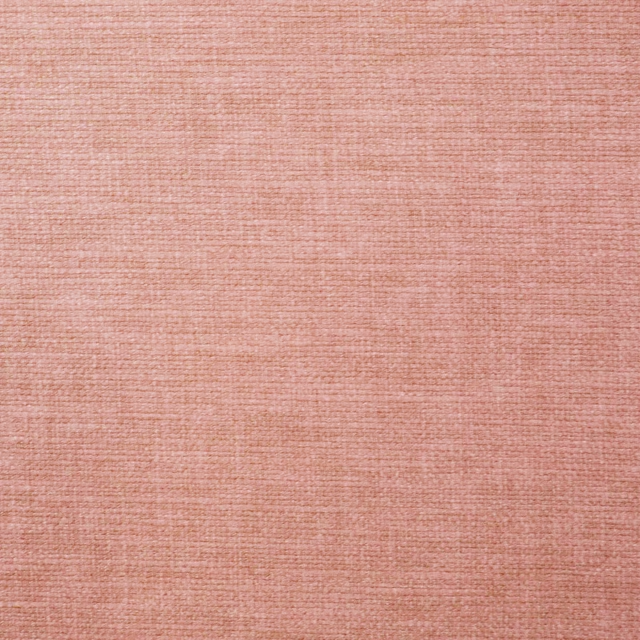
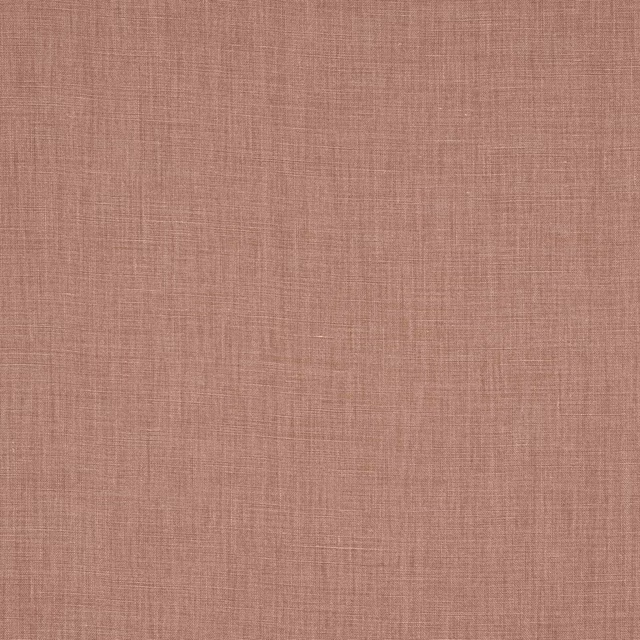
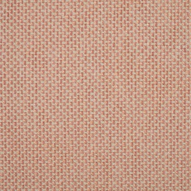
A pattern needs somewhere for the eye to rest, so these are the plains and textures that sit beside Monti Corail without fighting it. Mixed across the houses we hold, which is the part a single supplier's book cannot do.




Paint that goes with it
Two ways to take the room. Both colours are from houses we hold, so a pot can come off the same order as the cloth. Screens shift colour, so treat these as a direction and bring the cloth to the shelf before you buy the paint.
To sit quietly behind it
Chrysanthemum
Morris & Co. · #cb9480
To stand against it
Balmory Blue
Sanderson · #8aadc1