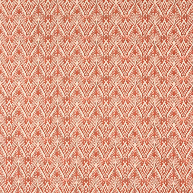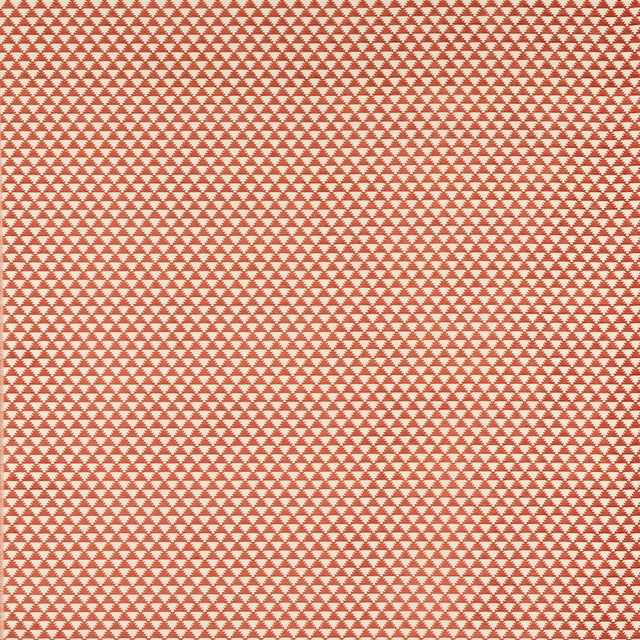

Tap the swatch to see it full screen. Hover it to magnify the weave. Colours on a screen are a guide, not a match, so come and feel the real cloth.
Scroll up or down to zoom in and out.
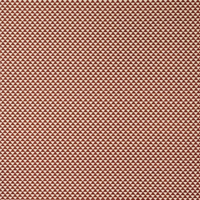
Saona Terre Cuite
Paros FabricM4155-03
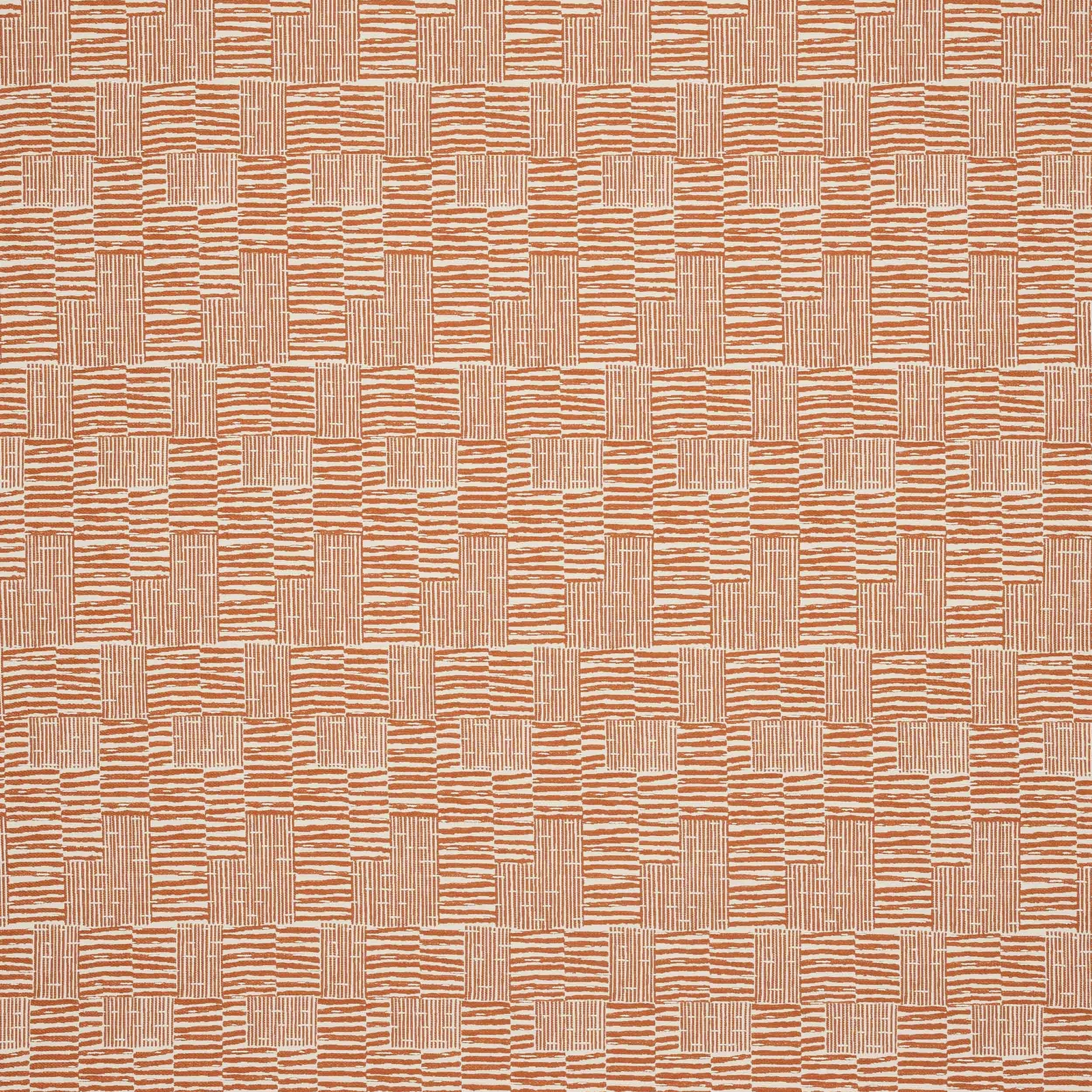
Saona Terre Cuite shows a textured check with a handwoven look, mixing warm terracotta with lighter clay-toned threads. The result is earthy and sun-baked, with a lively woven rhythm that reads clearly across the surface.
You have used your previews for today. Send one to Simon and you can carry on.
Your board
0 fabrics
See this fabric on Manuel Canovas's own site, then order it through us.
See Saona Terre Cuite in your own room
A photograph of the piece you want re-covered. Straight on is best, and daylight helps. It is used to make your picture and nothing else.
Looking at your room
We found things here Saona Terre Cuite could go on. Tap one on the photograph, or choose below.
We could not see anything to re-cover
, s
Saona Terre Cuite, on your
Drag to compare. AI impression, colours indicative: ask us for a cutting before you decide.
About this fabric
Saona Terre Cuite from the Paros collection by Manuel Canovas is a fabric with a distinctive checked layout and an approximate repeat of V 68cm / H 17cm. The image shows a warm terracotta ground lifted by pale peach and sand-toned stripes, giving the design a dry, Mediterranean warmth rather than a heavy red tone. Its 138cm approximate width and 84% polypropylene, 16% polyester composition make it a practical textile, while the C 8 + W 3 care code and fire code K are part of the supplied specification. The woven surface has a crisp, tactile appearance that suits the pattern’s blocky geometry and keeps the colourway feeling fresh and architectural.
How to use it
Use this colourway to warm up pale timber, limestone and plaster interiors, where its terracotta note will feel grounded and inviting. It works especially well on statement chairs, banquettes or cushions when you want pattern without introducing a dark or overpowering shade.
A sun-baked terracotta weave that brings warmth and texture to relaxed seating or soft furnishings.
More from Paros
The same book, other colourways.
Paros Mer
Paros
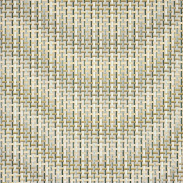
Paros Paon
Paros
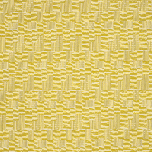
Saona Anis
Paros
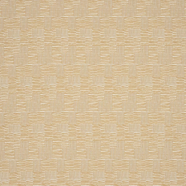
Saona Biscuit
Paros
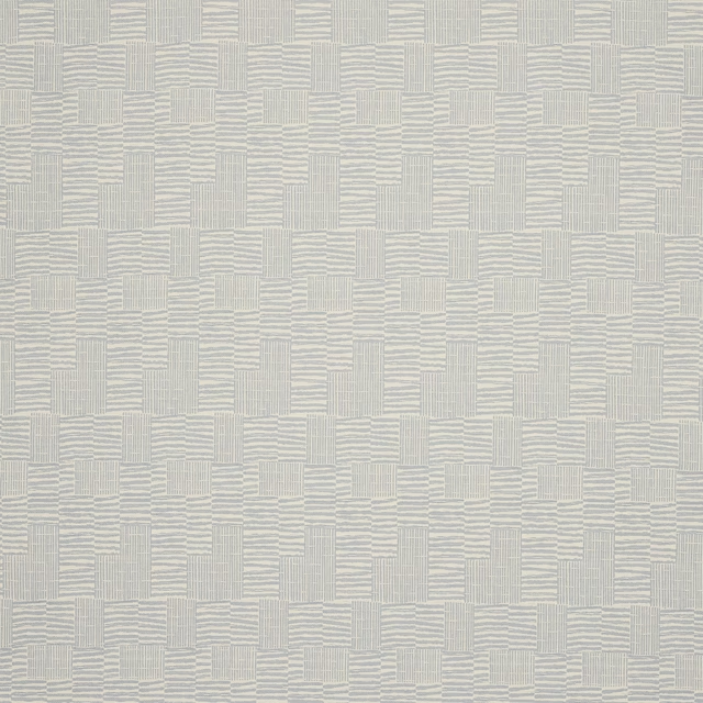
Saona Celeste
Paros
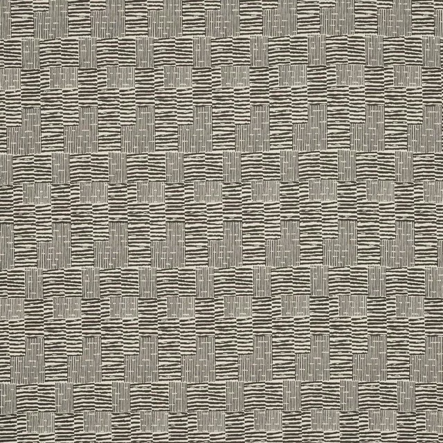
Saona Ebene
Paros

Saona Matcha
Paros
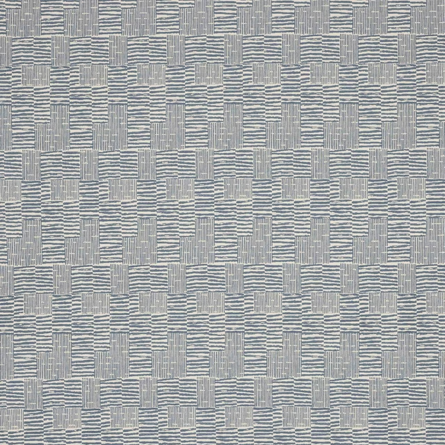
Saona Mer
Paros
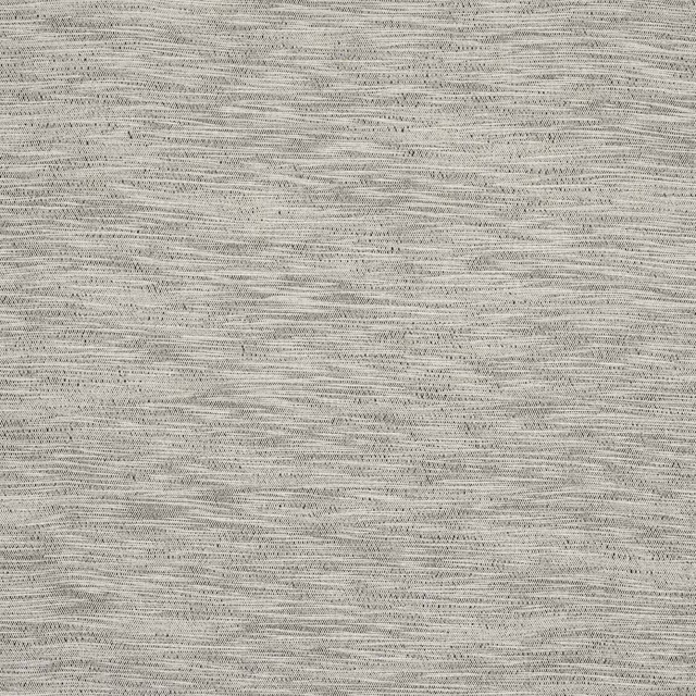
Tahiti Cendre
Paros
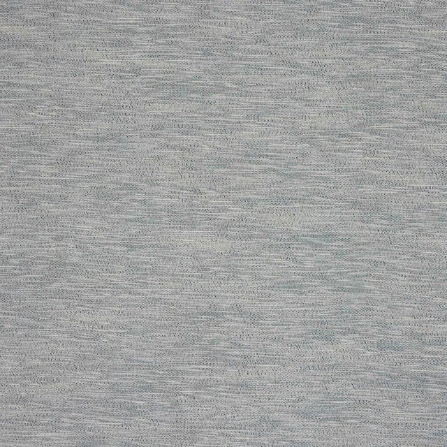
Tahiti Mer
Paros
Tahiti Naturel
Paros
Tahiti Sable
Paros
Pairs well with
A pattern needs somewhere for the eye to rest, so these are the plains and textures that sit beside Saona Terre Cuite without fighting it. Mixed across the houses we hold, which is the part a single supplier's book cannot do.
Loire Terracotta
Verona Collection
Alaska Rust
Alaska Collection
Moray Spice
Albany and Moray
Alvar Sienna
Alvar 2
Brandon Terracotta
Albeck
Marldon Brick Red
Albeck
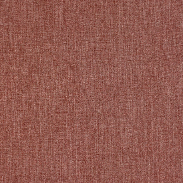
Monza Spice
Arezzo
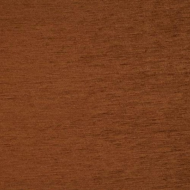
Kensington Spice
Brodsworth
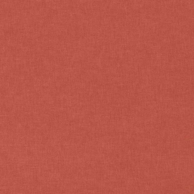
Ario Cameo
Ario
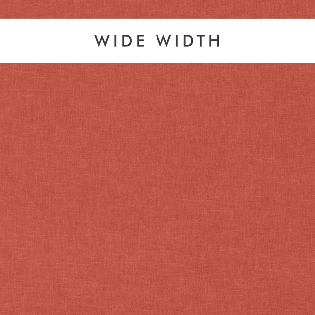
Ario Wide Width Cameo
Ario
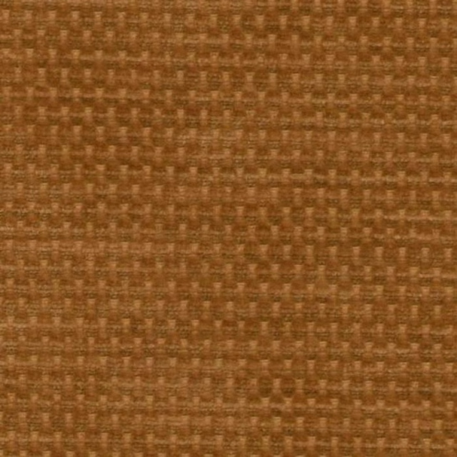
Evergreen Ginger
Evergreen
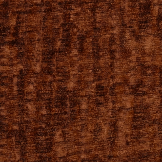
Mimosa Rust
Mimosa
Paint that goes with it
Two ways to take the room. Both colours are from houses we hold, so a pot can come off the same order as the cloth. Screens shift colour, so treat these as a direction and bring the cloth to the shelf before you buy the paint.
To sit quietly behind it
Chrysanthemum
Morris & Co. · #cb9480
To stand against it
Orange Aurora
Little Greene · #e3634b
Other terracotta fabrics
Across the houses we hold. See all 1,701.