
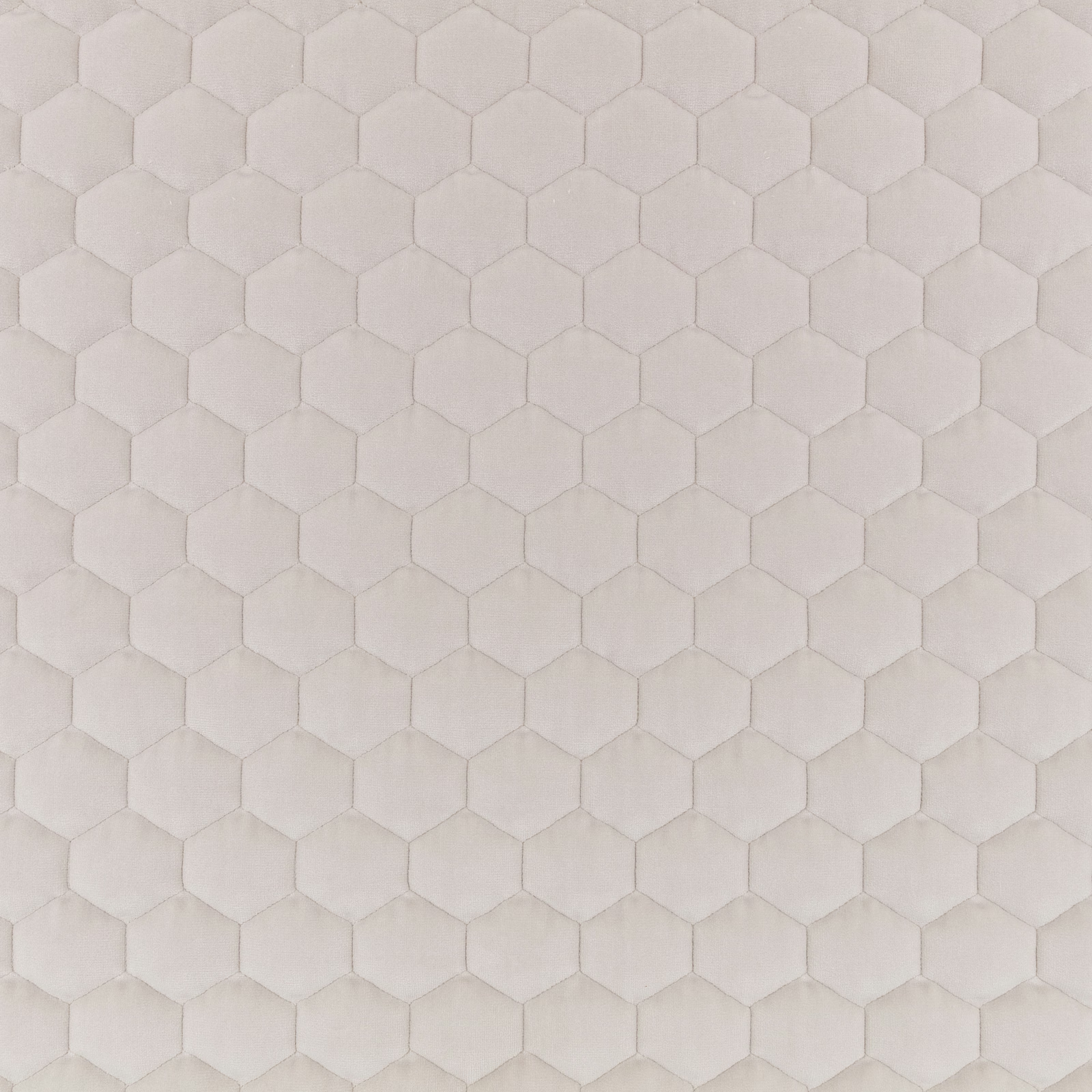

Tap the swatch to see it full screen. Hover it to magnify the weave. Colours on a screen are a guide, not a match, so come and feel the real cloth.
Scroll up or down to zoom in and out.
Cloud Porcini
Cloud Ii Fabric
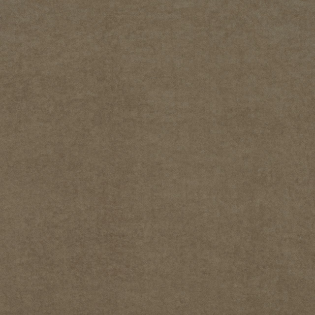
Cloud Porcini presents a pale warm-taupe ground covered in a closely repeated honeycomb of softly raised hexagons. The low-contrast surface gives the colourway a quiet, cushioned appearance while allowing the geometric texture to remain visible.
You have used your previews for today. Send one to Simon and you can carry on.
Your board
0 fabrics
See this fabric on Kirkby Design's own site, then order it through us.
See Cloud Porcini in your own room
A photograph of the piece you want re-covered. Straight on is best, and daylight helps. It is used to make your picture and nothing else.
Looking at your room
We found things here Cloud Porcini could go on. Tap one on the photograph, or choose below.
We could not see anything to re-cover
, s
Cloud Porcini, on your
Drag to compare. AI impression, colours indicative: ask us for a cutting before you decide.
About this fabric
The warm porcini tone sits between pale taupe and soft mushroom, with subtly shaded edges that define each hexagonal cell. Its repeating geometric pattern is clearly embossed or quilted in appearance, creating a tactile surface rather than a flat printed design. Gentle variations in light across the raised shapes add depth without introducing a strong contrast. With no further performance specifications supplied, its visibly structured, upholstery-weight appearance makes it particularly suited to tailored seating and padded furniture.
How to use it
Use Cloud Porcini on a contemporary armchair, sofa or headboard where its pale mushroom tone can soften sharper architectural lines. Pair it with chalky neutrals, warm timber and brushed metal to draw out the fabric’s understated geometric relief.
A softly dimensional taupe textile that brings quiet geometric texture to upholstered seating and headboards.
More from Cloud Ii
The same book, other colourways.
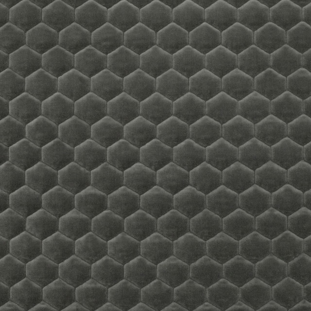
Cloud Anthracite
Cloud Ii
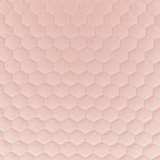
Cloud Blossom
Cloud Ii
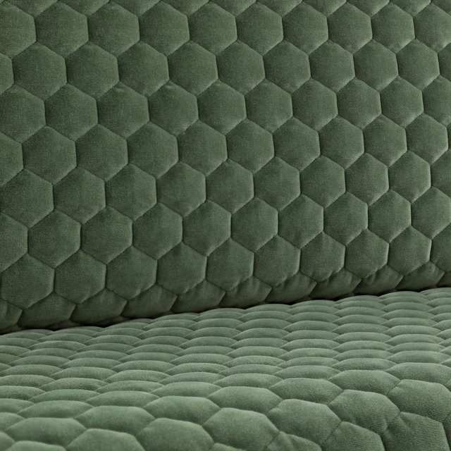
Cloud Eucalyptus
Cloud Ii
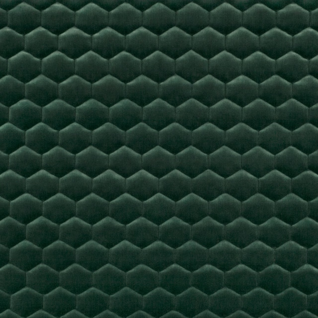
Cloud Evergreen
Cloud Ii
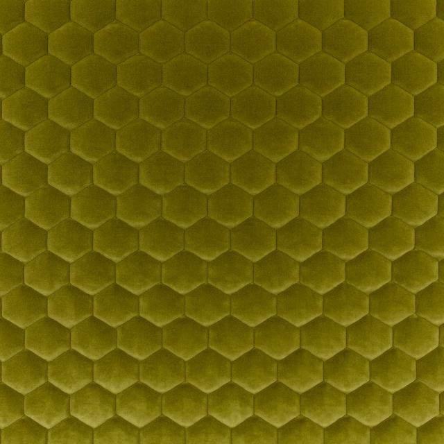
Cloud Fern
Cloud Ii
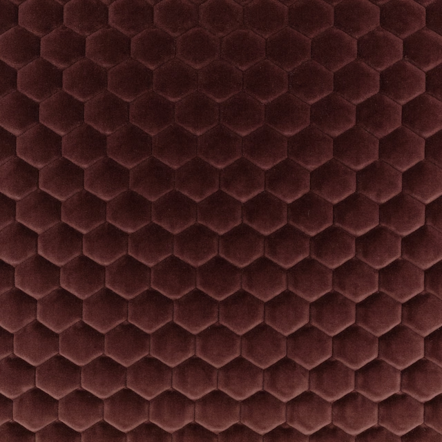
Cloud Fig
Cloud Ii
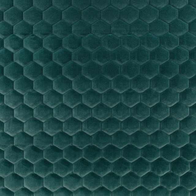
Cloud Gulf
Cloud Ii
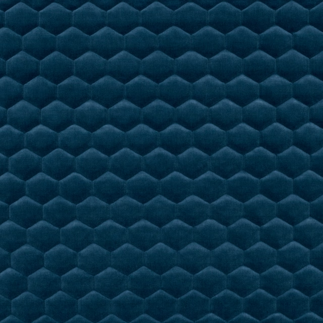
Cloud Kingfisher
Cloud Ii
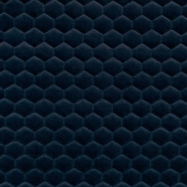
Cloud Marine
Cloud Ii
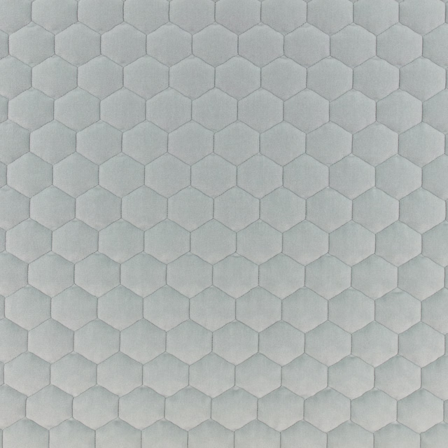
Cloud Quarry
Cloud Ii
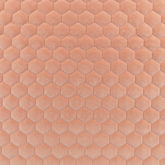
Cloud Rosewater
Cloud Ii
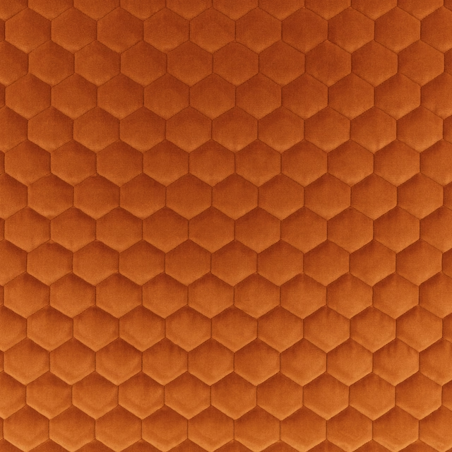
Cloud Tangerine
Cloud Ii
Pairs well with
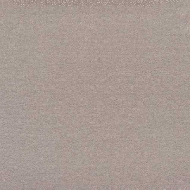
A pattern needs somewhere for the eye to rest, so these are the plains and textures that sit beside Cloud Porcini without fighting it. Mixed across the houses we hold, which is the part a single supplier's book cannot do.




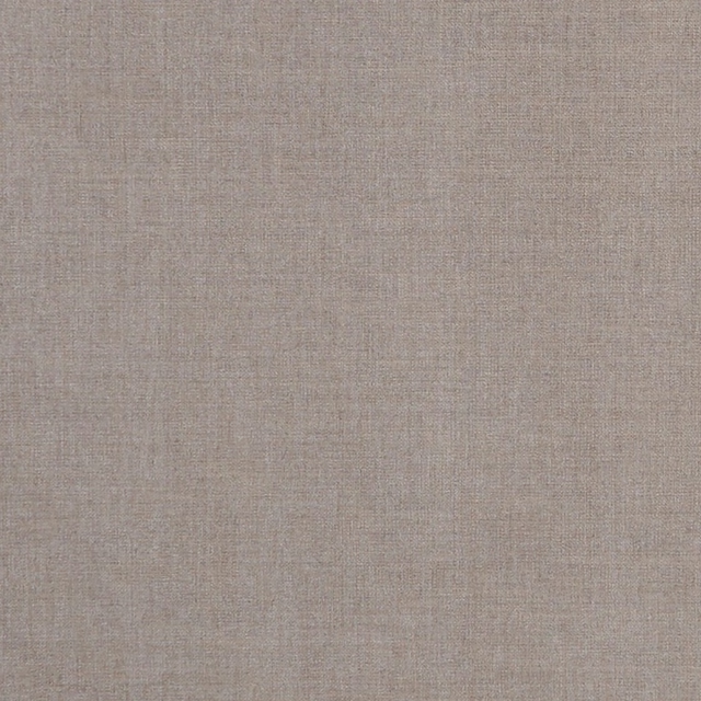
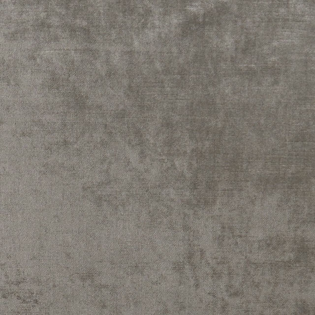
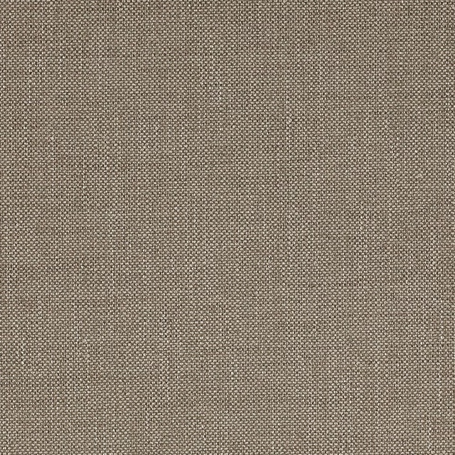
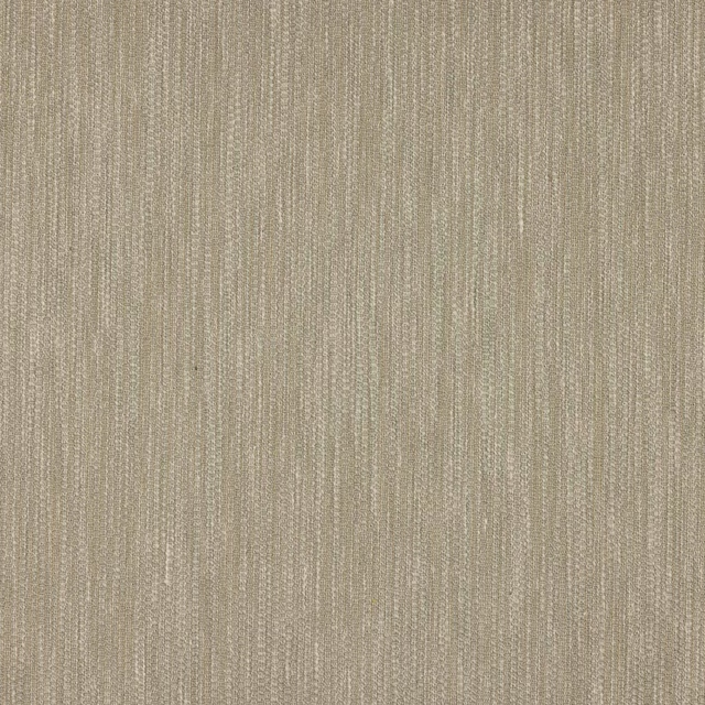
Paint that goes with it
Two ways to take the room. Both colours are from houses we hold, so a pot can come off the same order as the cloth. Screens shift colour, so treat these as a direction and bring the cloth to the shelf before you buy the paint.
To sit quietly behind it
Margot
Coat Paints · #cfc8c1
To stand against it
Affogato
Little Greene · #926a49
Other taupe fabrics
Across the houses we hold. See all 4,148.
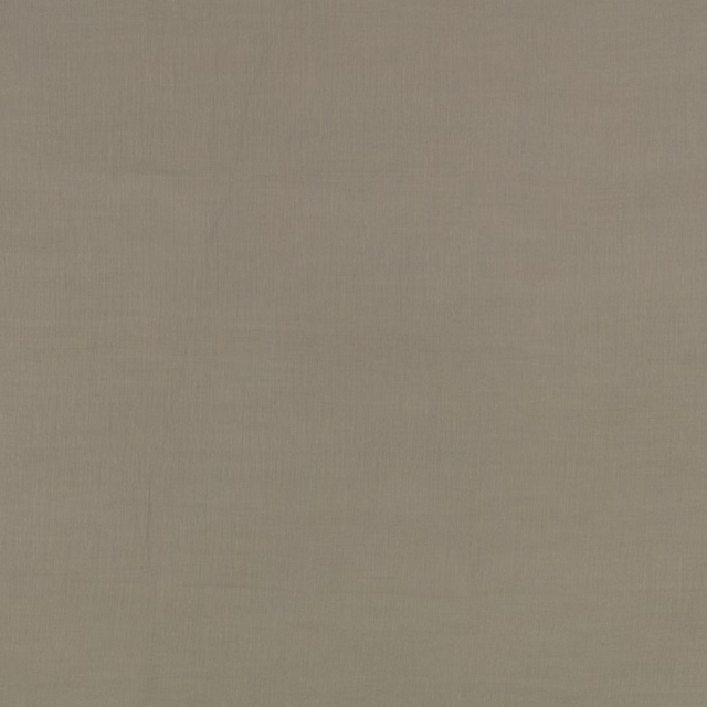
Aloe Gunmetal
Aloe
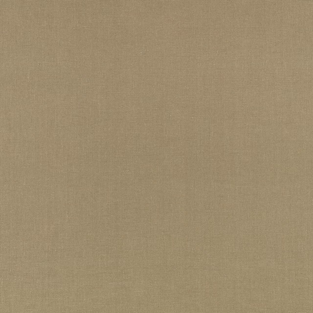
Chelsea Brazil
Chelsea Ii
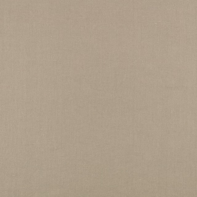
Chelsea Stone
Chelsea Ii
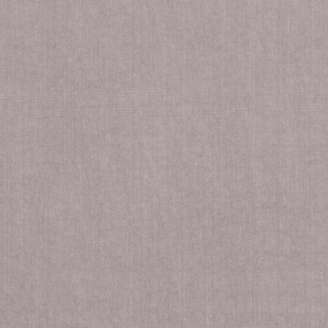
Pure Twilight
Chelsea
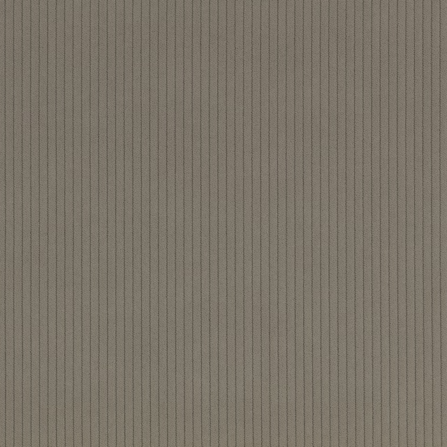
Cord Fr Crib 5 Dolomite
Cordfr
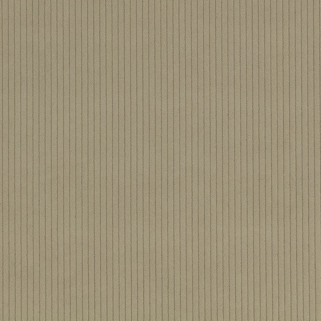
Cord Fr Crib 5 Fennel
Cordfr
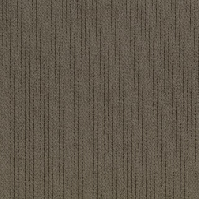
Cord Fr Crib 5 Meteor
Cordfr

Cord Fr Crib 5 Taupe
Cordfr
Crush Ii Hessian
Crush Ii

Crush Ii Ice
Crush Ii

Crush Ii Pumice
Crush Ii

Crush Fr Easyclean Hazelwood
Crush Iii