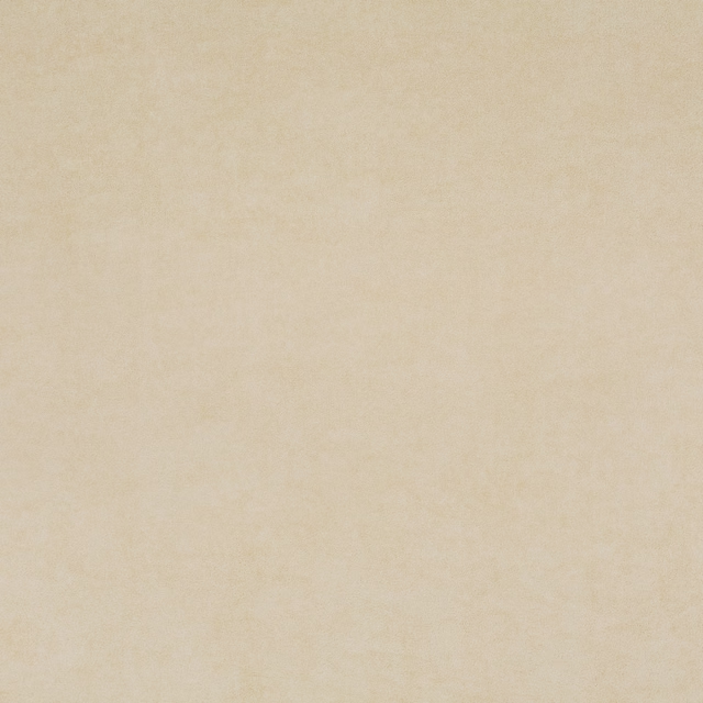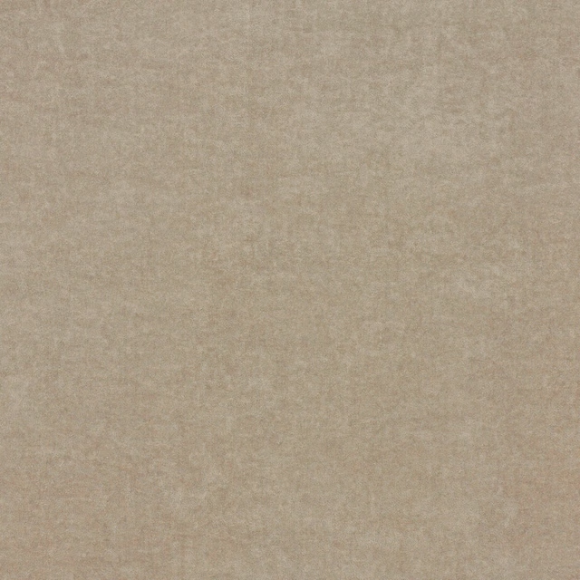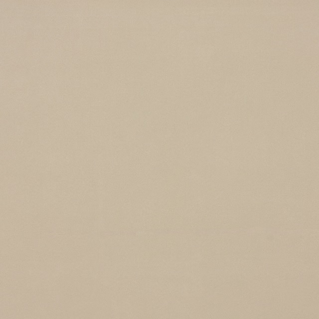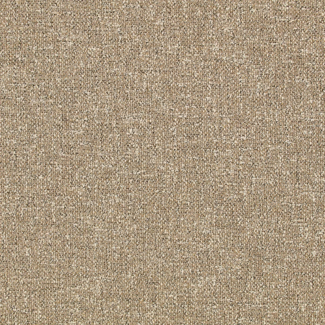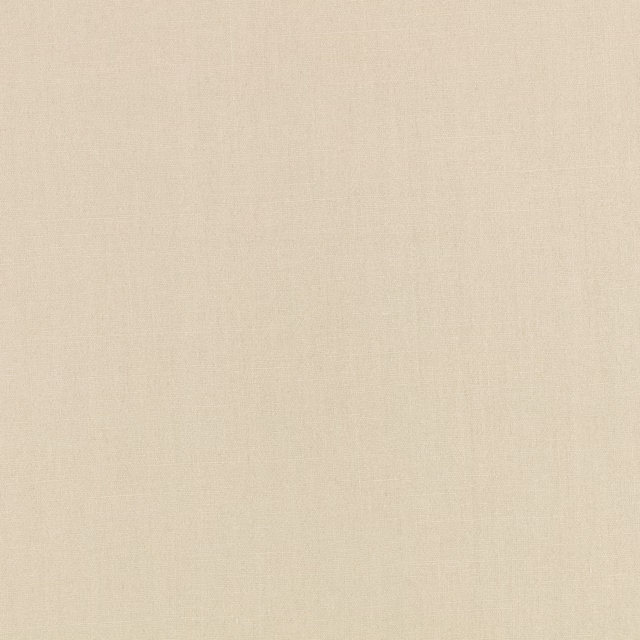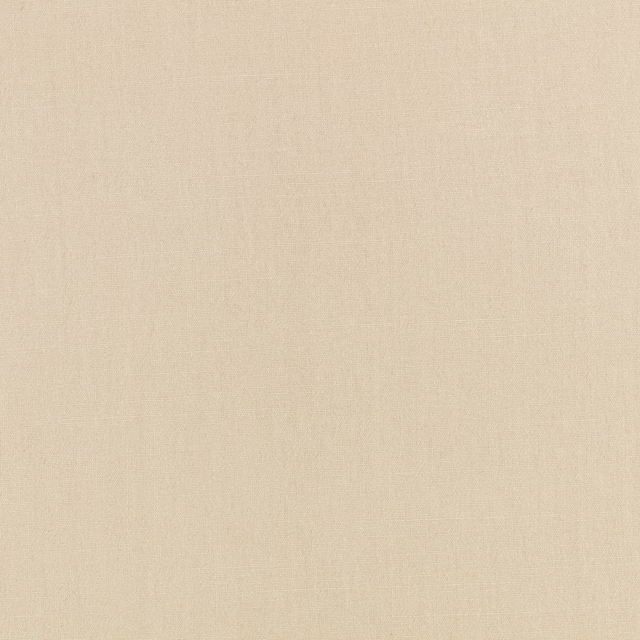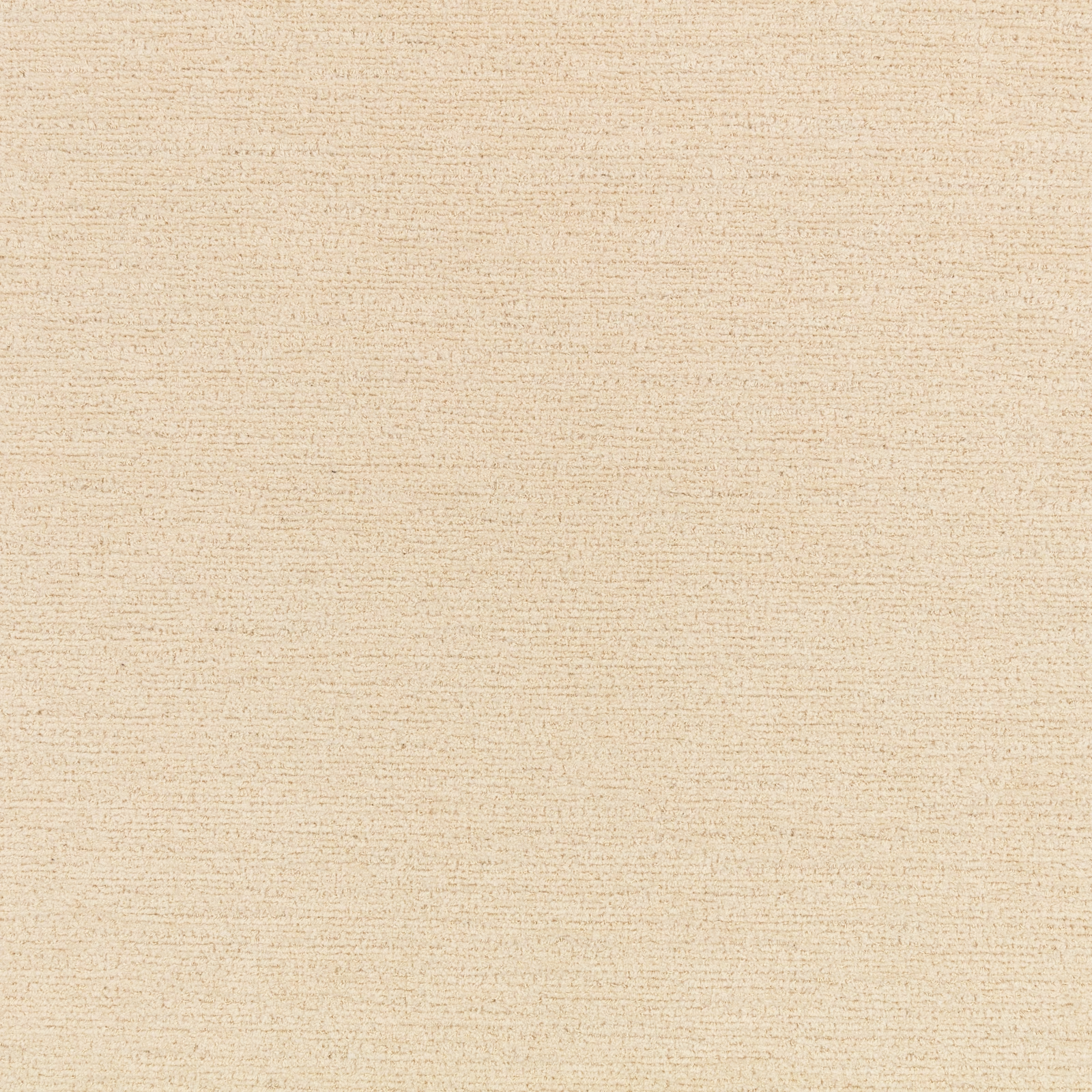

Tap the swatch to see it full screen. Hover it to magnify the weave. Colours on a screen are a guide, not a match, so come and feel the real cloth.
Scroll up or down to zoom in and out.
Element Buff
Element Fabric
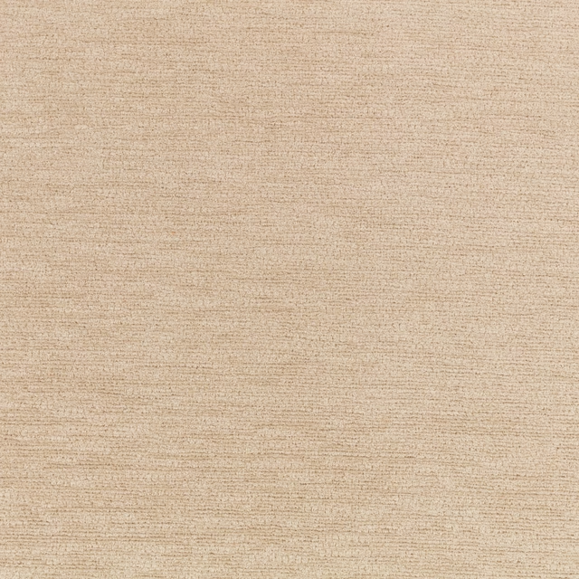
Element Buff has a warm, pale buff-beige appearance with a softly flecked woven surface. Its fine horizontal texture gives the colour a gently broken, natural depth rather than a flat finish.
You have used your previews for today. Send one to Simon and you can carry on.
Your board
0 fabrics
See this fabric on Kirkby Design's own site, then order it through us.
See Element Buff in your own room
A photograph of the piece you want re-covered. Straight on is best, and daylight helps. It is used to make your picture and nothing else.
Looking at your room
We found things here Element Buff could go on. Tap one on the photograph, or choose below.
We could not see anything to re-cover
, s
Element Buff, on your
Drag to compare. AI impression, colours indicative: ask us for a cutting before you decide.
About this fabric
This close-woven fabric is shown in a muted buff tone, sitting between pale beige and warm cream as the light catches its fine surface. Delicate horizontal slubs and tiny tonal flecks create quiet movement across the swatch without forming a pronounced motif. The supplied catalogue identifies it as a fabric, with no additional composition, width or performance specification provided.
How to use it
Pair this warm buff colourway with ivory, oat and light timber for a calm, tonal room, or use it to soften darker brown and charcoal accents. Its restrained horizontal texture can add depth to plain upholstery or understated window treatments.
Use this softly textured buff neutral to bring gentle warmth to upholstery, curtains or layered schemes.
More from Element
The same book, other colourways.
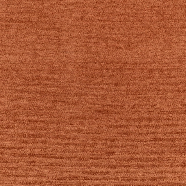
Element Bonfire
Element
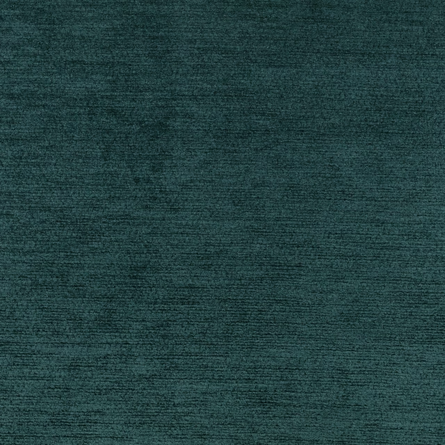
Element Evergreen
Element
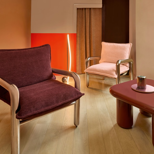
Element Fig
Element
Element Flax
Element
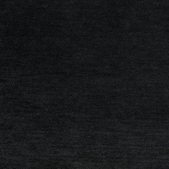
Element Jet Black
Element
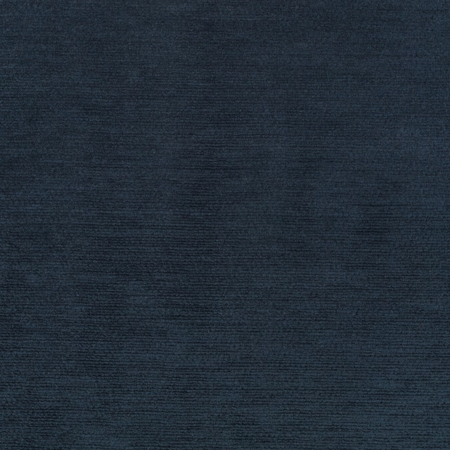
Element Marine
Element
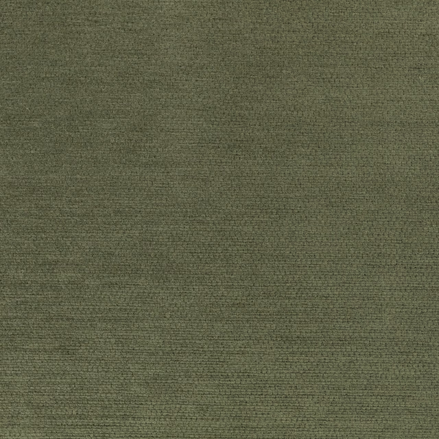
Element Pesto
Element
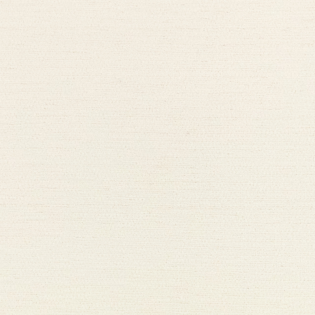
Element White
Element
Pairs well with
Element Buff is a quiet cloth, so it carries a pattern beside it: one of these on the curtains and this on the chair. Mixed across the houses we hold, which is the part a single supplier's book cannot do.
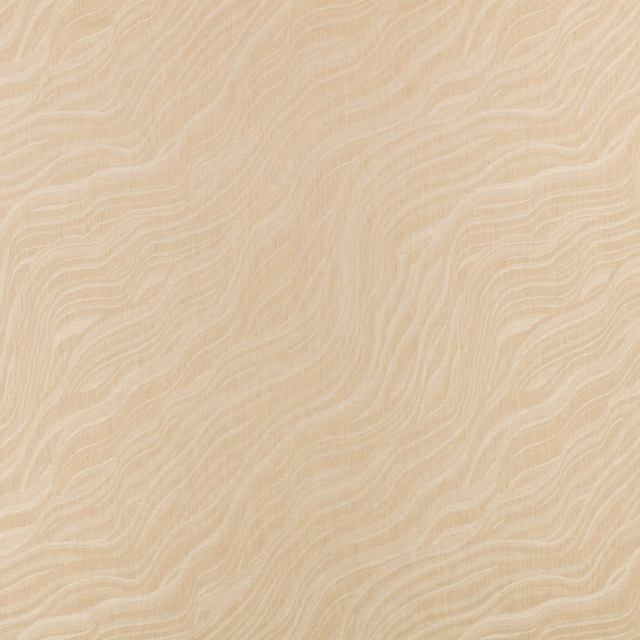
Naoshima Buff
Dvvlinens
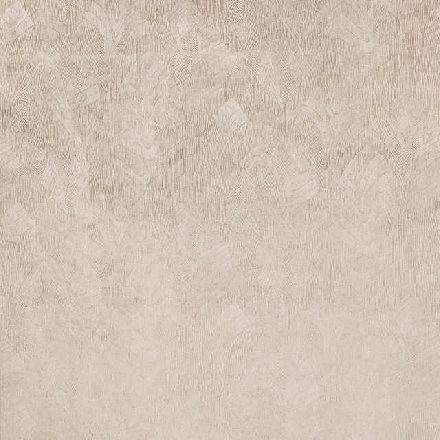
Onuma Buff
Tsauri
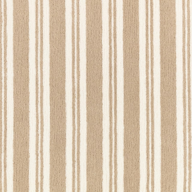
Knight Buff
Heir
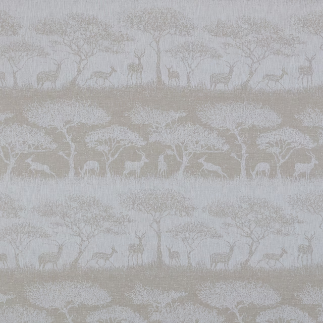
Hastings Fawn
Belvoir Collection
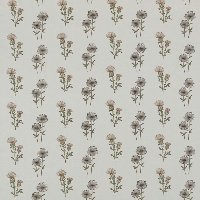
Lismore Caramel
Belvoir Collection
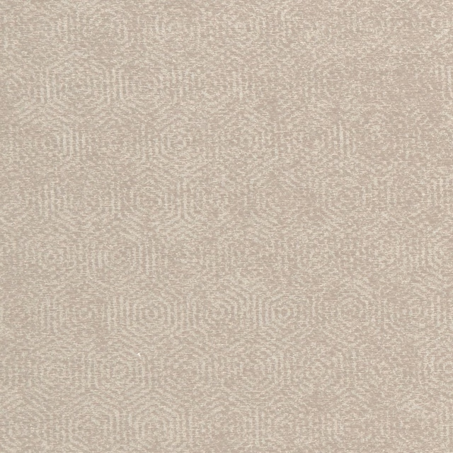
Yoruba Natural
Amara
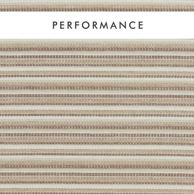
Integer Natural
Aqueous Performance
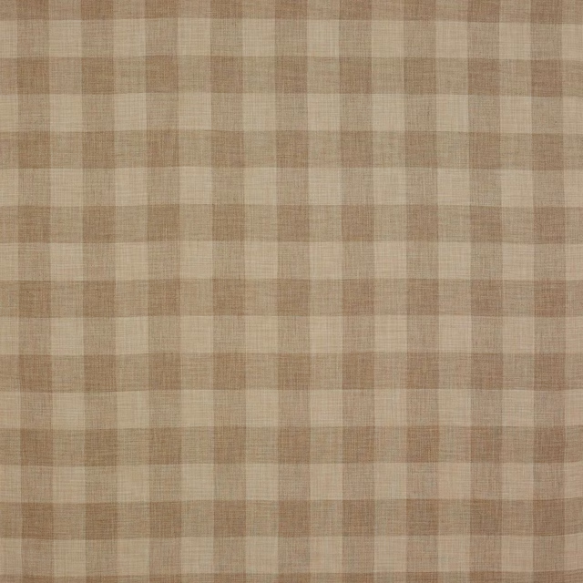
Appledore Check Beige
Appledore
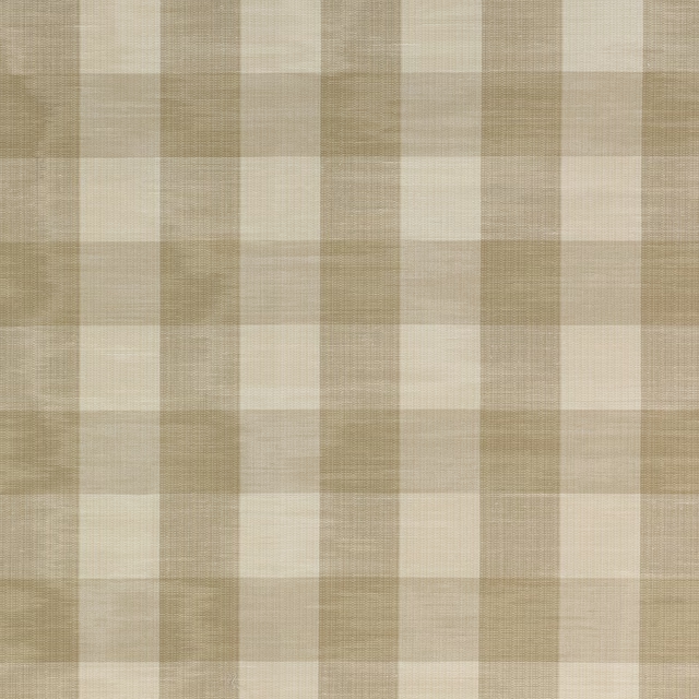
Eaton Check Flax
Eaton Checks and Stripes

Roumier Vanilla
Carlu WALLPAPER
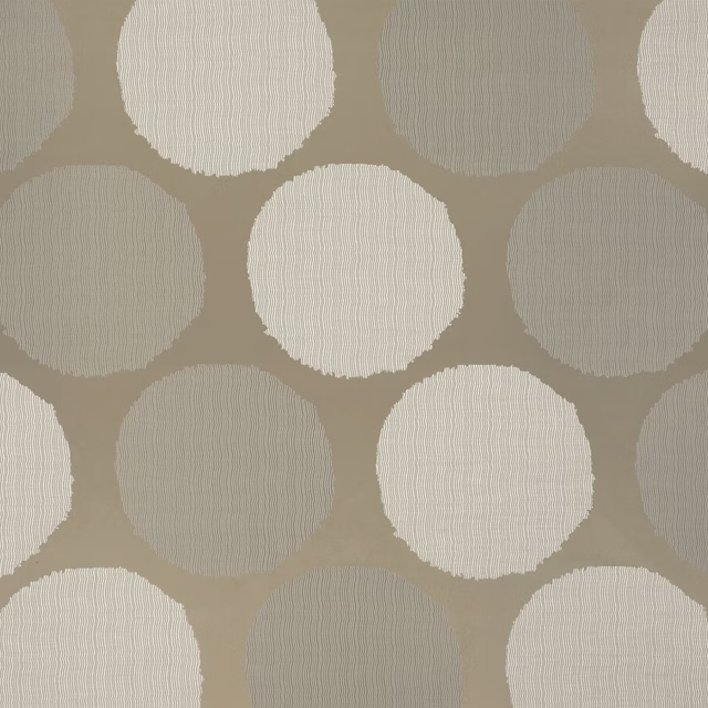
Amalfi Dove
Cecilia Fabrics
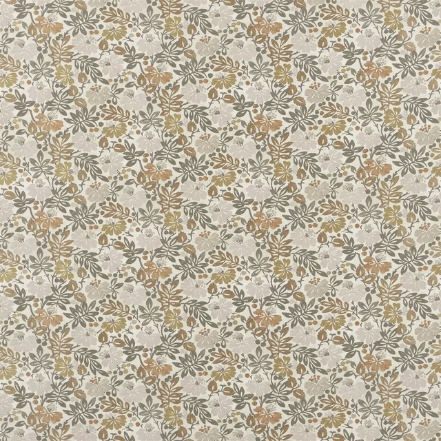
Carlisle Fauna Woodland
Heritage Prints
Paint that goes with it
Two ways to take the room. Both colours are from houses we hold, so a pot can come off the same order as the cloth. Screens shift colour, so treat these as a direction and bring the cloth to the shelf before you buy the paint.
To sit quietly behind it
Travertine
Little Greene · #dfceb2
To stand against it
Love Lane
Coat Paints · #a36962
Other beige fabrics
Across the houses we hold. See all 4,485.