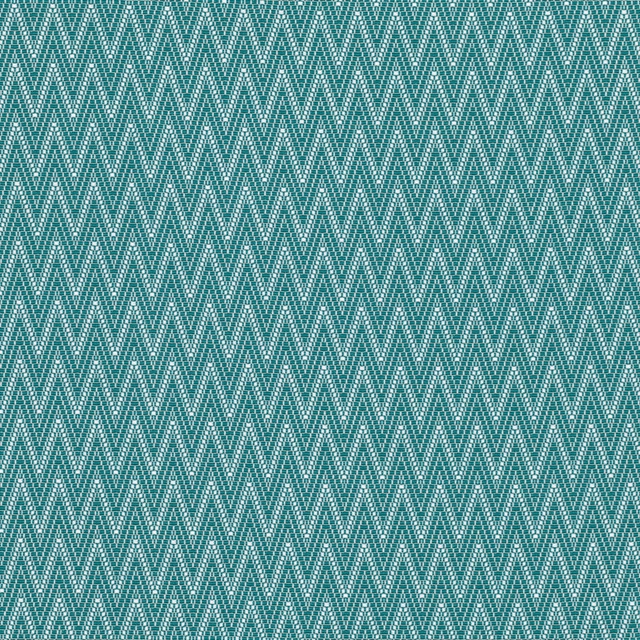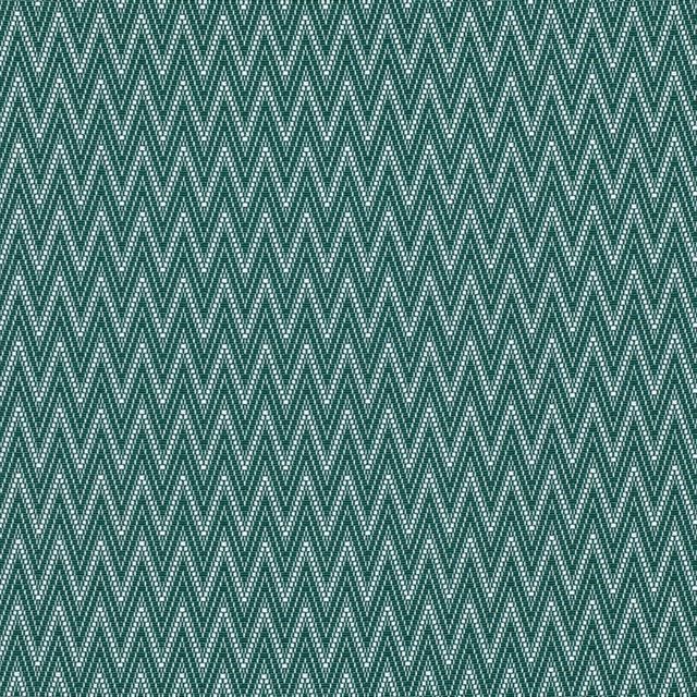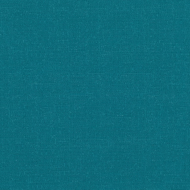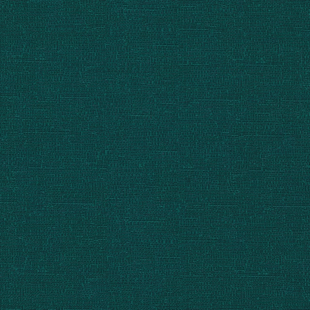

Tap the swatch to see it full screen. Hover it to magnify the weave. Colours on a screen are a guide, not a match, so come and feel the real cloth.
Scroll up or down to zoom in and out.
1796/D24
Misc Fabric
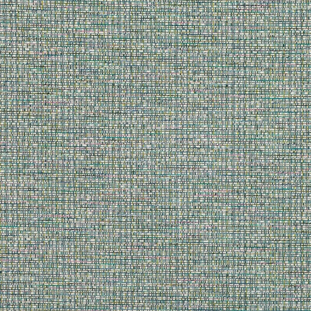
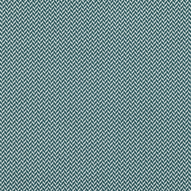
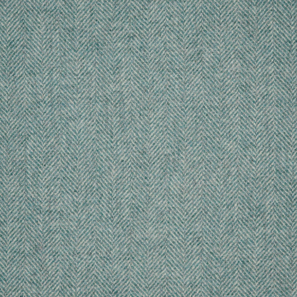
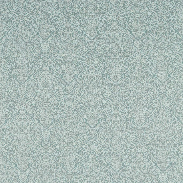
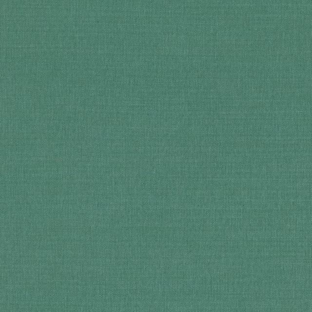
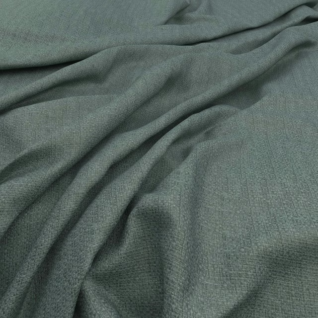
1796/D24 has a cool, muted blue-green ground with a fine, closely woven chevron pattern. The softly mottled surface gives the colour gentle depth rather than a flat teal finish.
You have used your previews for today. Send one to Simon and you can carry on.
Your board
0 fabrics
See this fabric on Moons's own site, then order it through us.
See 1796/D24 in your own room
A photograph of the piece you want re-covered. Straight on is best, and daylight helps. It is used to make your picture and nothing else.
Looking at your room
We found things here 1796/D24 could go on. Tap one on the photograph, or choose below.
We could not see anything to re-cover
, s
1796/D24, on your
Drag to compare. AI impression, colours indicative: ask us for a cutting before you decide.
About this fabric
The small repeating herringbone lines run vertically across the swatch, creating a discreet directional pattern. Pale grey-green threads blend through the blue-teal base, giving the weave a softly weathered, understated appearance. Its close texture and mid-weight-looking handle make it suitable for either upholstery or drapery. No composition, width, rub test or performance rating has been supplied for this fabric, so those details should be confirmed before ordering.
How to use it
Pair this cool blue-green colourway with chalky whites, pale timber and soft grey upholstery for a calm, tailored scheme. The fine chevron adds movement to a chair, bench or curtain without overwhelming a room.
Use this cool blue-green chevron weave to bring quiet pattern and texture to upholstery, cushions or relaxed window treatments.
More from Misc
The same book, other colourways.
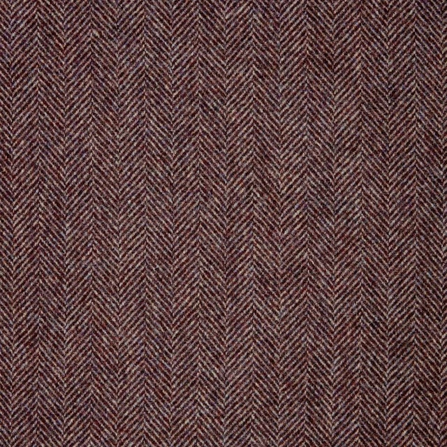
1796/PD65
Misc
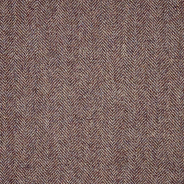
1796/PDW2
Misc
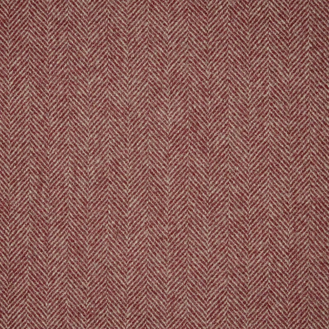
1796/KD61
Misc
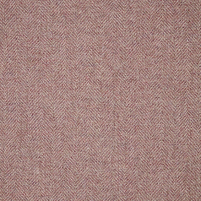
1796/KD53
Misc
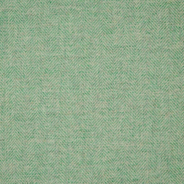
1796/NRR1
Misc
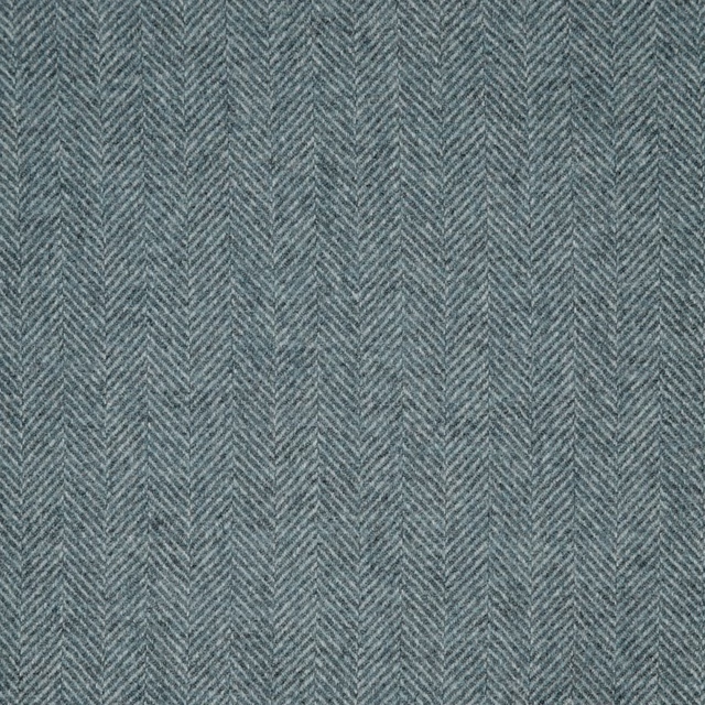
1796/BWT5
Misc
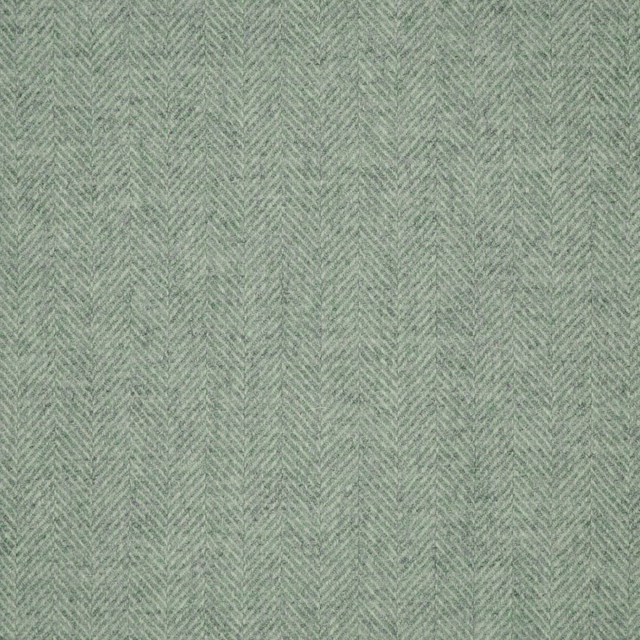
1796/NR80
Misc
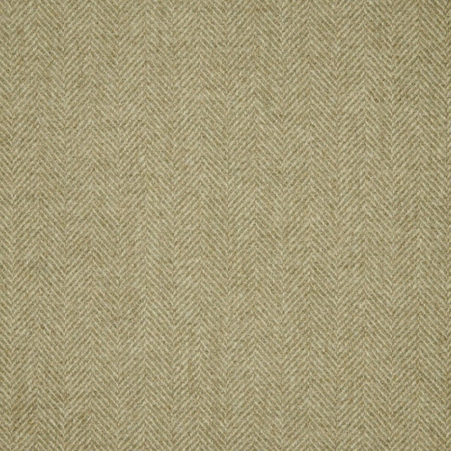
1796/PM12
Misc
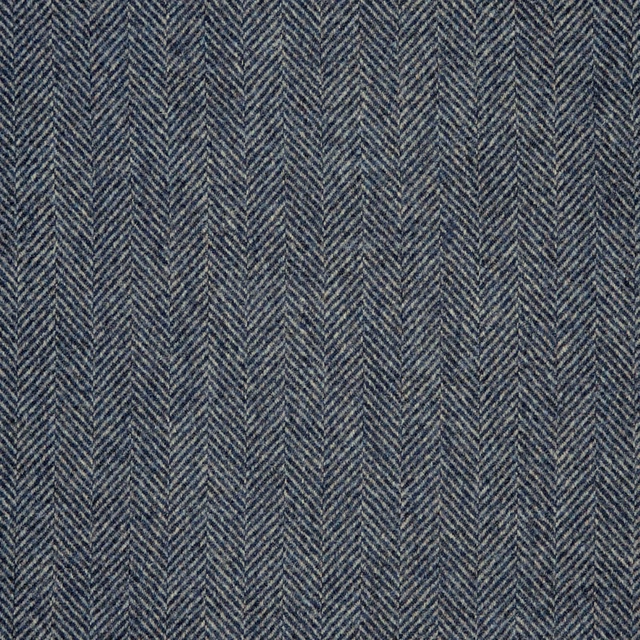
1796/PD49
Misc
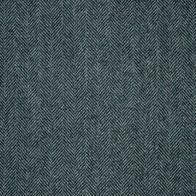
1796/BW14
Misc
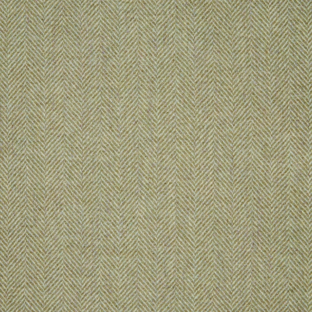
1796/NR12
Misc
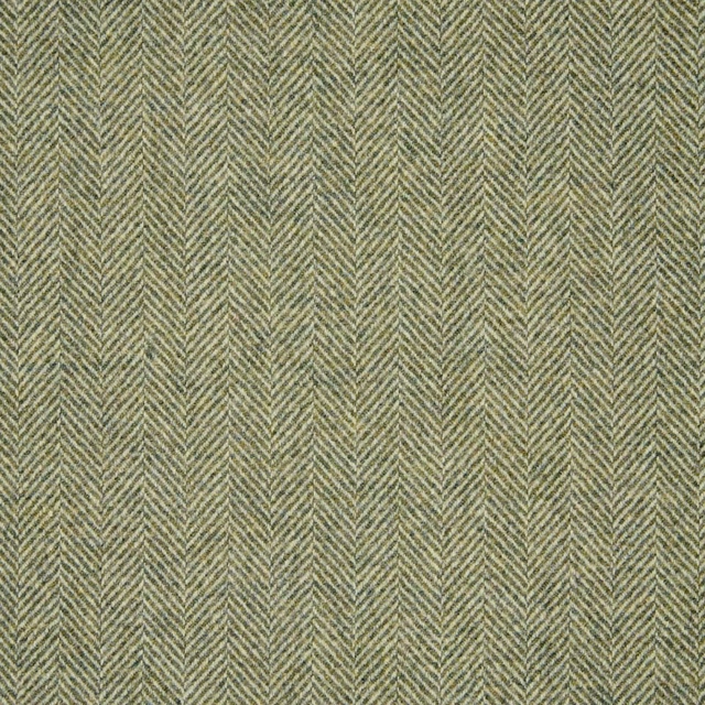
1796/NR44
Misc
Pairs well with
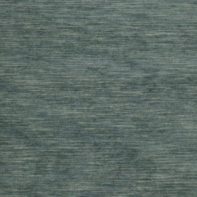
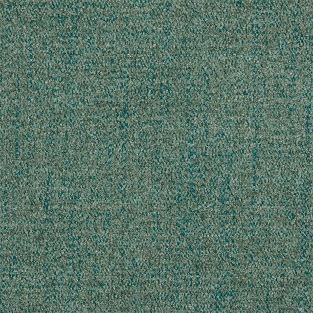
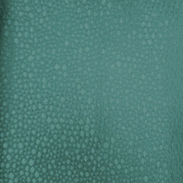
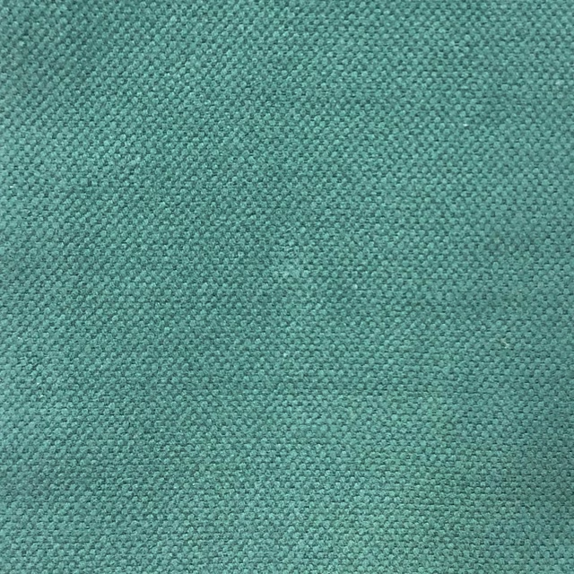
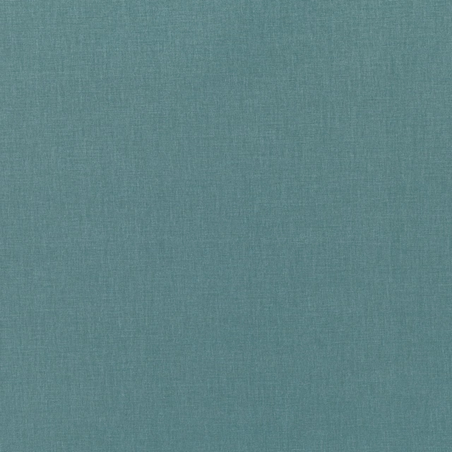
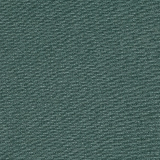
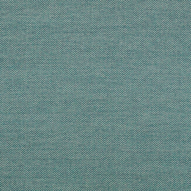
A pattern needs somewhere for the eye to rest, so these are the plains and textures that sit beside 1796/D24 without fighting it. Mixed across the houses we hold, which is the part a single supplier's book cannot do.


Paint that goes with it
Two ways to take the room. Both colours are from houses we hold, so a pot can come off the same order as the cloth. Screens shift colour, so treat these as a direction and bring the cloth to the shelf before you buy the paint.
To sit quietly behind it
River Wandle
Morris & Co. · #7e9195
To stand against it
Silent White - Pale
Little Greene · #fbfdf2
Other teal fabrics
Across the houses we hold. See all 2,990.