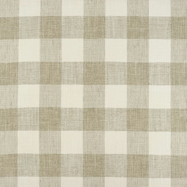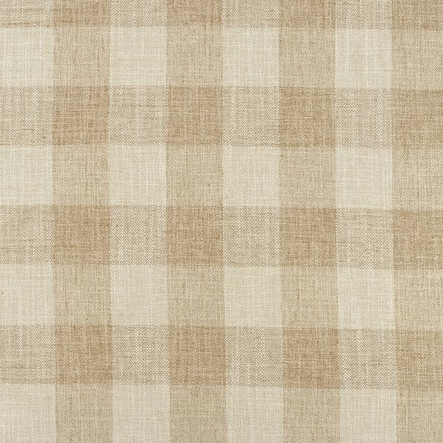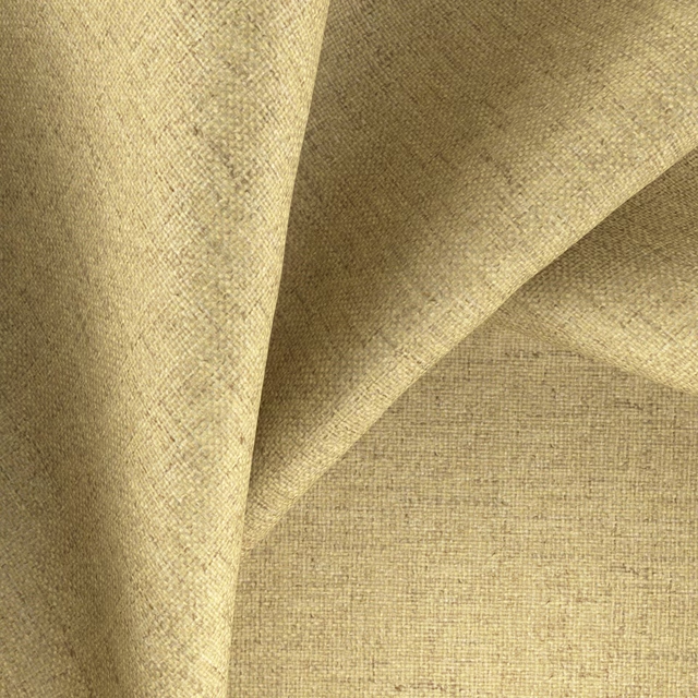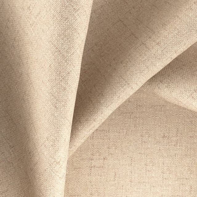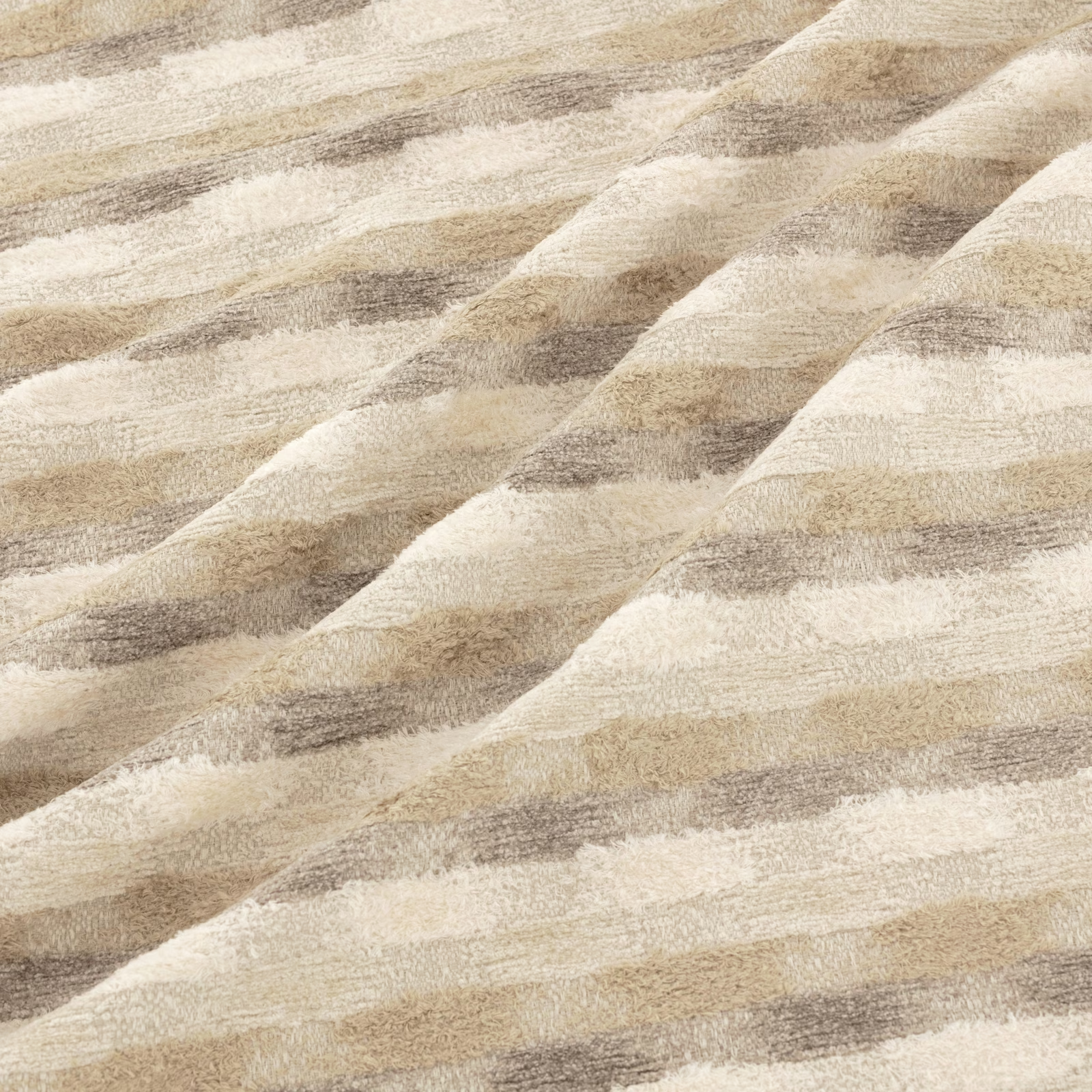

Tap the swatch to see it full screen. Hover it to magnify the weave. Colours on a screen are a guide, not a match, so come and feel the real cloth.
Scroll up or down to zoom in and out.
Nata Dune
Nata Fabric
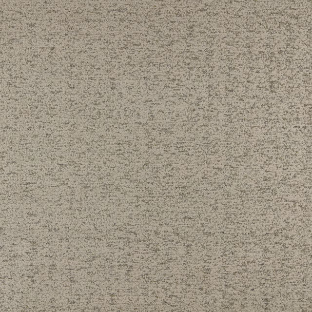
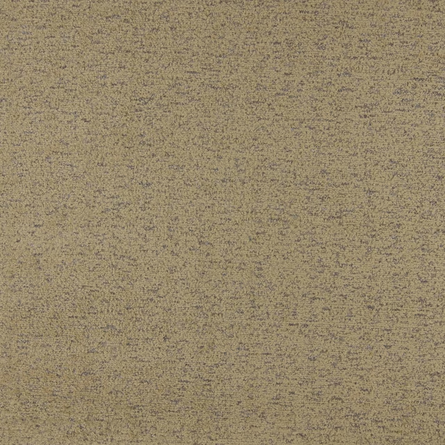
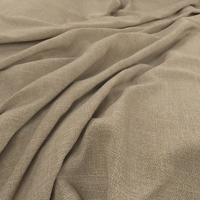
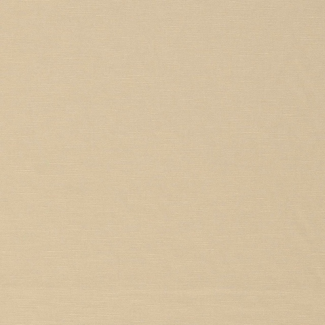
Nata Dune combines a warm cream ground with softly mottled taupe and sand bands. The broad, irregular movement is especially visible where the fabric falls into folds, revealing a tactile raised surface.
You have used your previews for today. Send one to Simon and you can carry on.
Your board
0 fabrics
See this fabric on Warwick's own site, then order it through us.
See Nata Dune in your own room
A photograph of the piece you want re-covered. Straight on is best, and daylight helps. It is used to make your picture and nothing else.
Looking at your room
We found things here Nata Dune could go on. Tap one on the photograph, or choose below.
We could not see anything to re-cover
, s
Nata Dune, on your
Drag to compare. AI impression, colours indicative: ask us for a cutting before you decide.
About this fabric
This Warwick Nata colourway reads as a gentle blend of ivory, oatmeal and muted taupe rather than a sharply striped design. Broad undulating bands travel across the surface, with softly feathered edges that give the pattern an organic, hand-rendered character. The visibly textured weave catches light unevenly, shifting from pale cream highlights to deeper grey-brown shadows in the folds. No further composition, width, rub-test or performance specification has been supplied for this fabric, so its suitability here is assessed from the substantial, flexible textile appearance shown.
How to use it
Use Nata Dune to soften a relaxed sitting room through an upholstered chair, loose cushion or curtains. Its warm cream base and restrained taupe contrast pair naturally with pale timber, linen-look neutrals and weathered finishes.
Its warm, softly contrasting bands bring relaxed texture to upholstered seating, cushions or full-length curtains.
Pairs well with
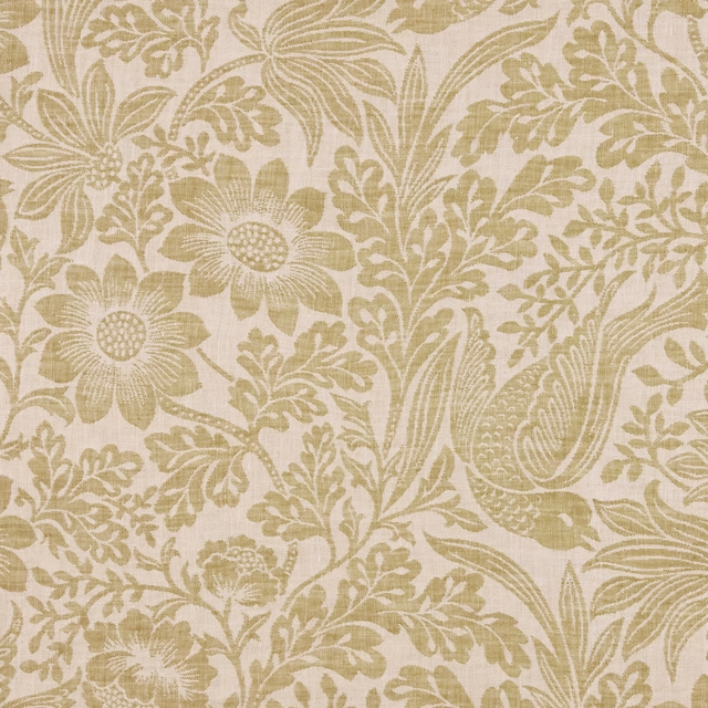
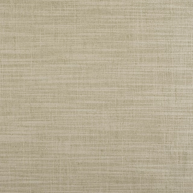
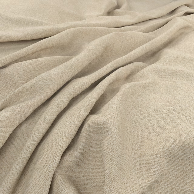
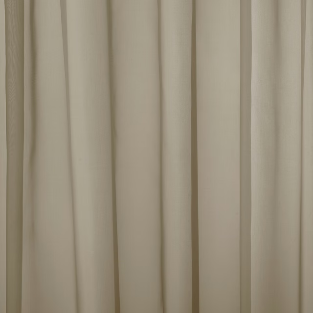
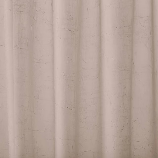
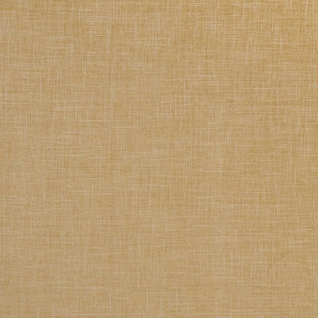
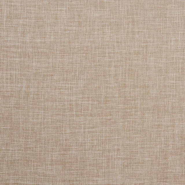
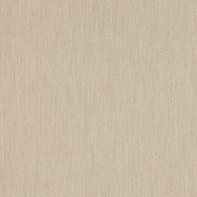
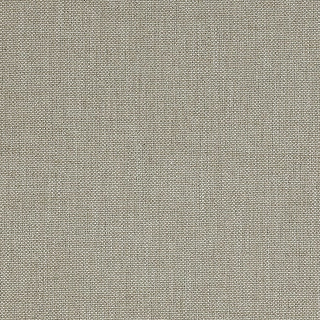
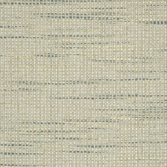
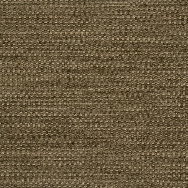
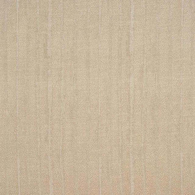
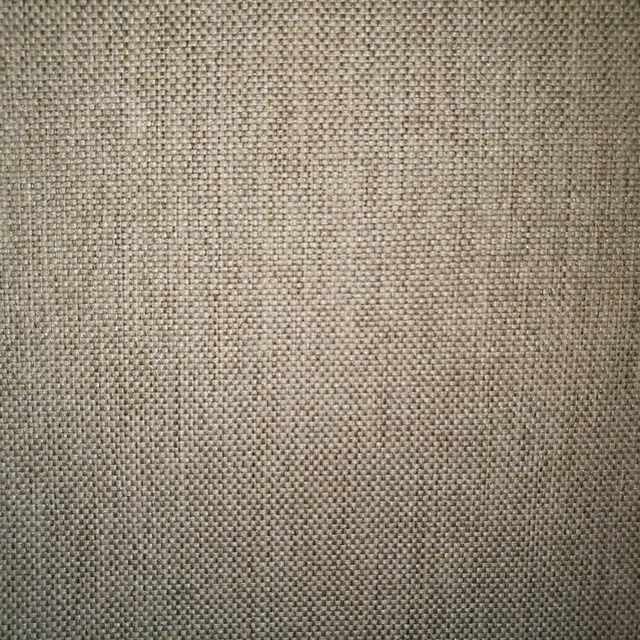
A pattern needs somewhere for the eye to rest, so these are the plains and textures that sit beside Nata Dune without fighting it. Mixed across the houses we hold, which is the part a single supplier's book cannot do.
Paint that goes with it
Two ways to take the room. Both colours are from houses we hold, so a pot can come off the same order as the cloth. Screens shift colour, so treat these as a direction and bring the cloth to the shelf before you buy the paint.
To sit quietly behind it
Wheatfield
Zoffany · #cebea5
To stand against it
Emery Blue
Morris & Co. · #4f696a
Other beige fabrics
Across the houses we hold. See all 4,485.