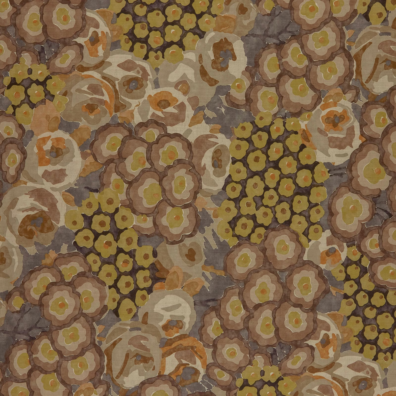

Tap the swatch to see it full screen. Hover it to magnify the weave. Colours on a screen are a guide, not a match, so come and feel the real cloth.
Scroll up or down to zoom in and out.
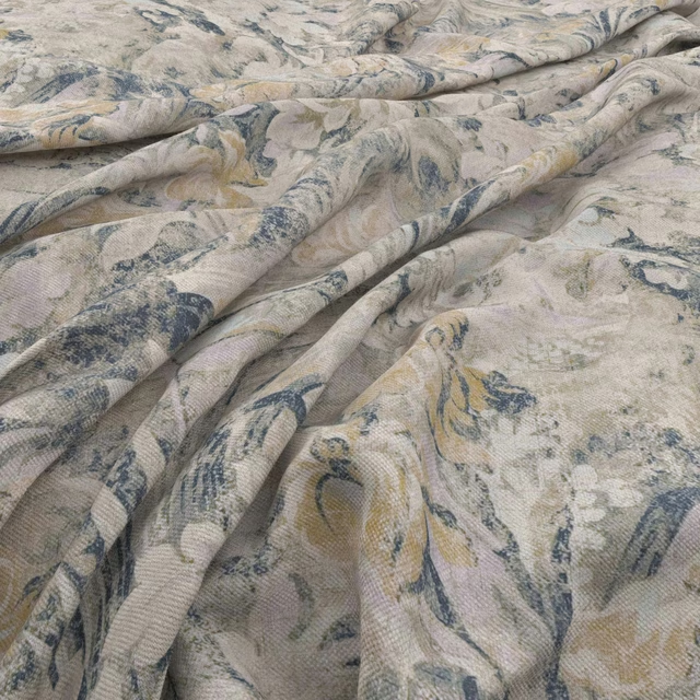
Paloma Burnish
Paloma Fabric
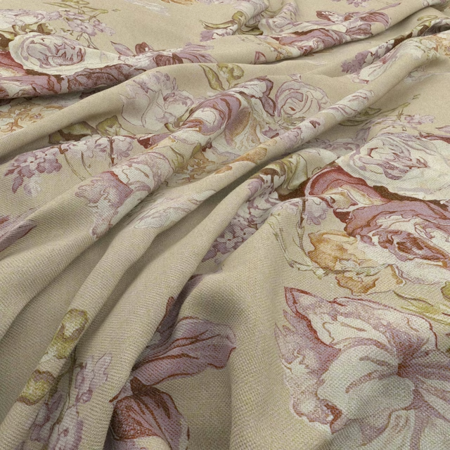
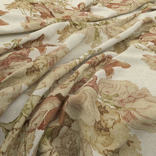
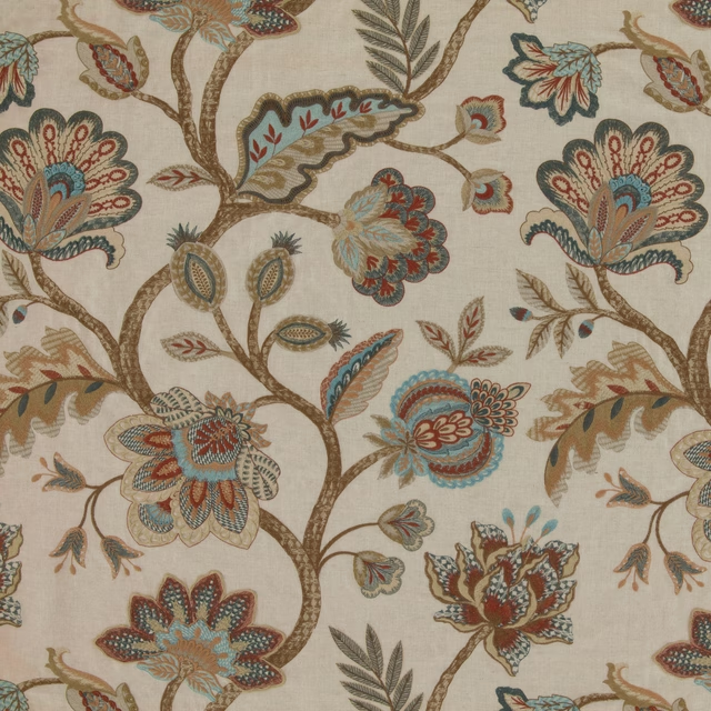
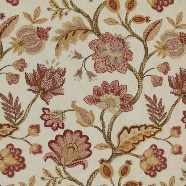
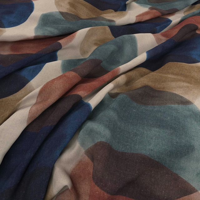
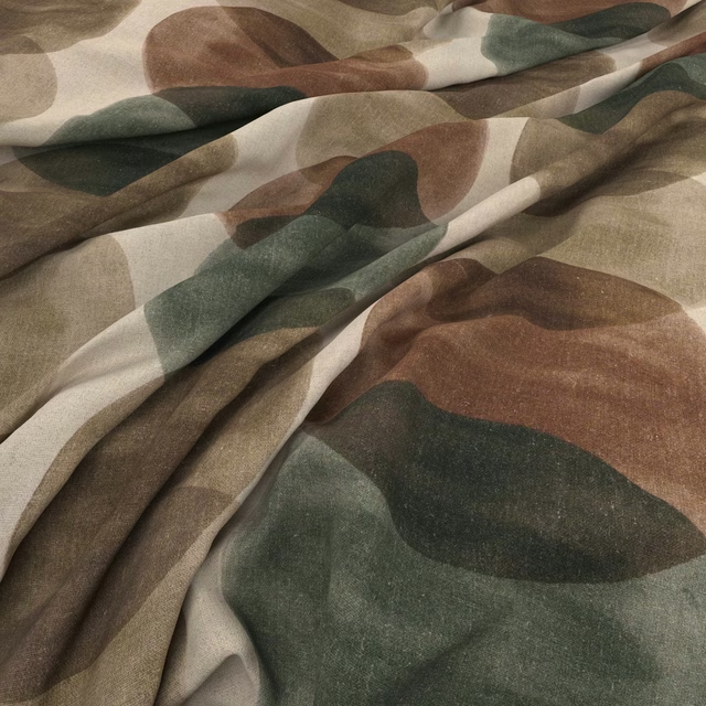
Paloma Burnish brings together densely packed flowers in a softened, earthy palette. Olive, ochre, taupe and brown tones overlap with a painterly, timeworn character.
You have used your previews for today. Send one to Simon and you can carry on.
Your board
0 fabrics
See this fabric on Warwick's own site, then order it through us.
See Paloma Burnish in your own room
A photograph of the piece you want re-covered. Straight on is best, and daylight helps. It is used to make your picture and nothing else.
Looking at your room
We found things here Paloma Burnish could go on. Tap one on the photograph, or choose below.
We could not see anything to re-cover
, s
Paloma Burnish, on your
Drag to compare. AI impression, colours indicative: ask us for a cutting before you decide.
About this fabric
The design combines rounded, layered blooms with smaller dark olive flower clusters and sweeping leaf-like forms. Its background shifts through warm taupe, grey-brown and muted beige, giving the pattern depth without a sharp, high-contrast edge. Ochre and terracotta accents warm the composition, while pale centres catch the light across the floral shapes. The visible surface reads as a softly textured printed textile with an expressive, richly variegated finish.
How to use it
Use this colourway on a feature armchair, bench or full-length curtains where its olive and burnished brown tones can sit alongside walnut, antique brass and warm neutral walls. Keep neighbouring textiles relatively plain so the layered floral pattern remains the focal point.
Layer this richly patinated floral with warm taupes, aged timber and restrained natural textures.
Pairs well with
A pattern needs somewhere for the eye to rest, so these are the plains and textures that sit beside Paloma Burnish without fighting it. Mixed across the houses we hold, which is the part a single supplier's book cannot do.
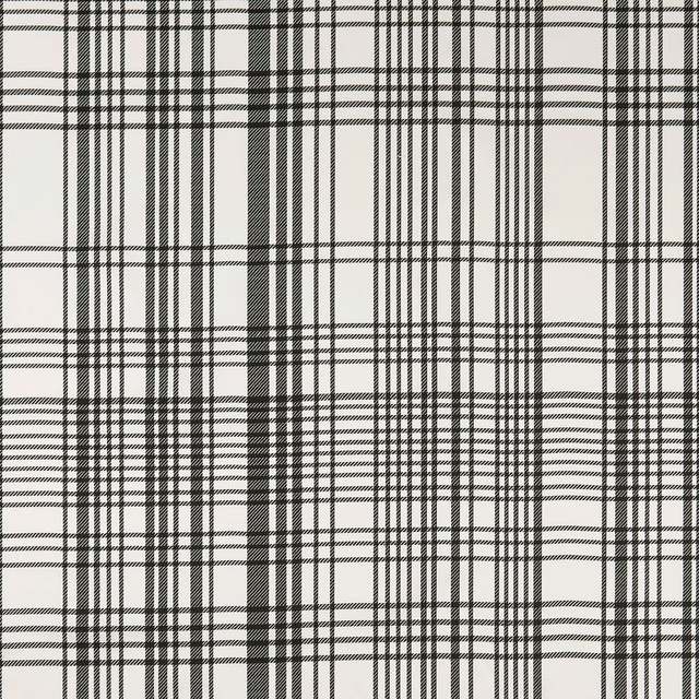
BW1006 Black/White
Black and White

Malindi Mineral/Blush
Breegan Jane x Clarke and Clarke Wallpaper
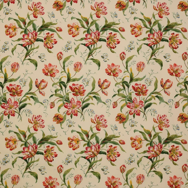
Delft Tulips Pink/Green
C&F Classic Prints
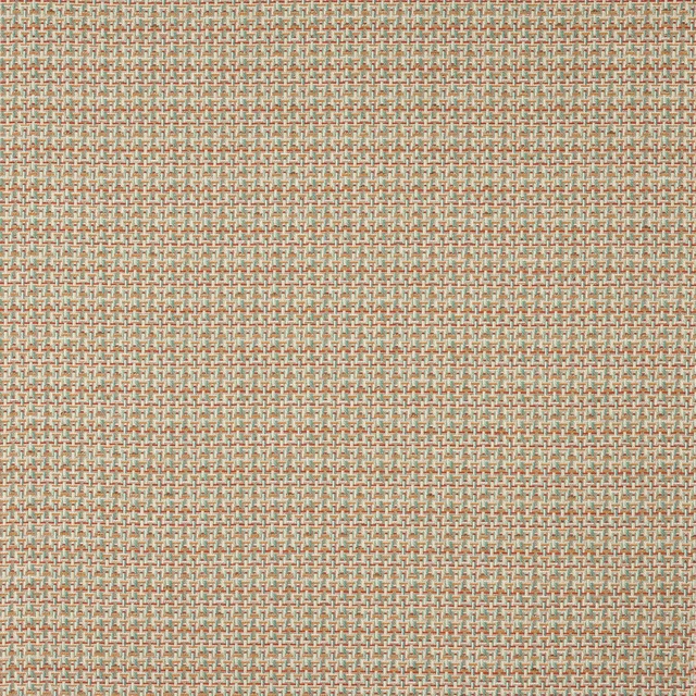
Beal Multi
Pelham

Limosa Loganberry / Papaya / Lagoon
Amazilia Wallpapers
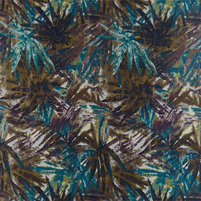
Celadon Marine/Plum/Zest
Atelier Fabrics
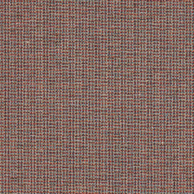
Romey Multi/Indigo
Almora Wvs
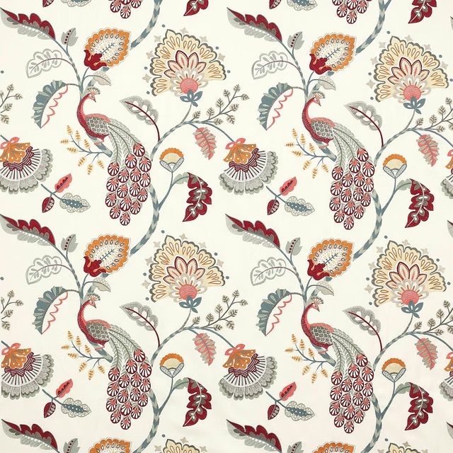
Jaipur Peacock Slate/Red
Azara
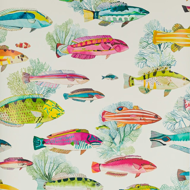
Fidji Wallpaper Corail
Papierspeints Vol 8
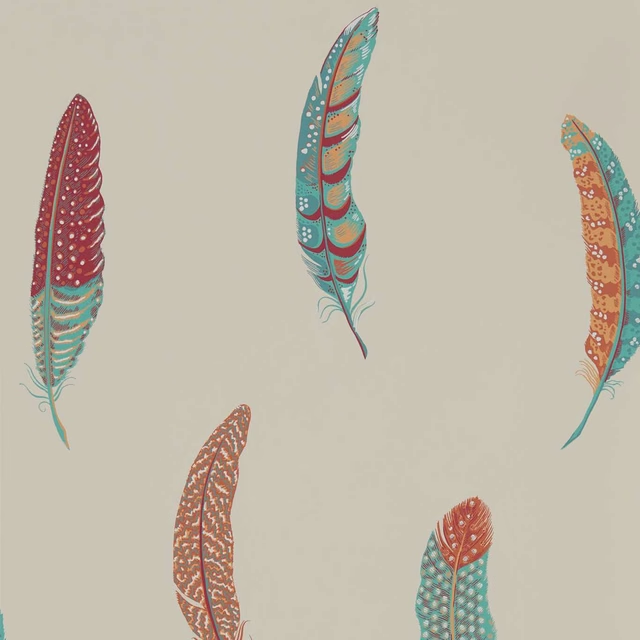
Lismore Russet
Elysian Wallpapers
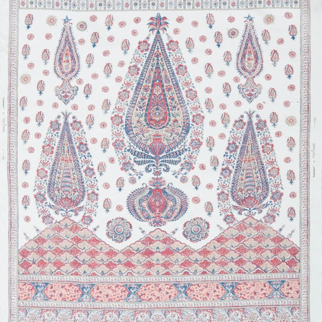
Kalamkari Panel Indigo and Madder
Limited Stock
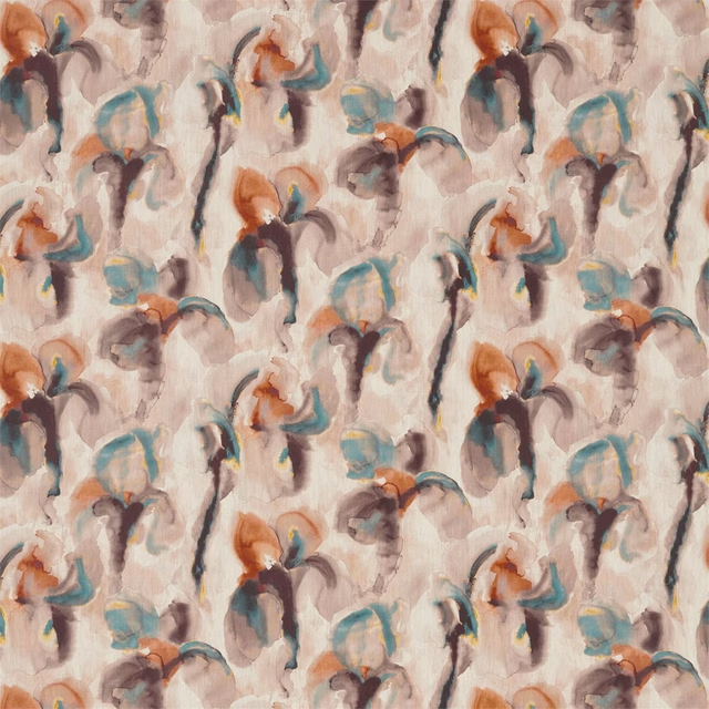
WAter Iris Peacock/Copper
Kensington Walk Fabrics
Paint that goes with it
Two ways to take the room. Both colours are from houses we hold, so a pot can come off the same order as the cloth. Screens shift colour, so treat these as a direction and bring the cloth to the shelf before you buy the paint.
To sit quietly behind it
Affogato
Little Greene · #926a49
To stand against it
Weld Yellow
Morris & Co. · #dfc781
Other multi fabrics
Across the houses we hold. See all 4,069.