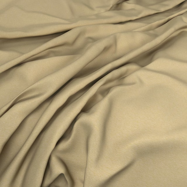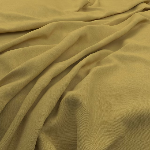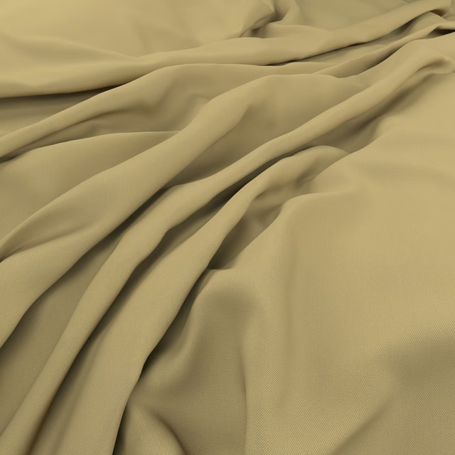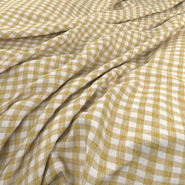

Tap the swatch to see it full screen. Hover it to magnify the weave. Colours on a screen are a guide, not a match, so come and feel the real cloth.
Scroll up or down to zoom in and out.
Serena Primrose
Serena Fabric
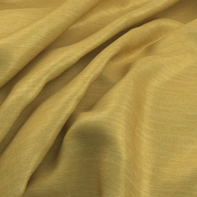
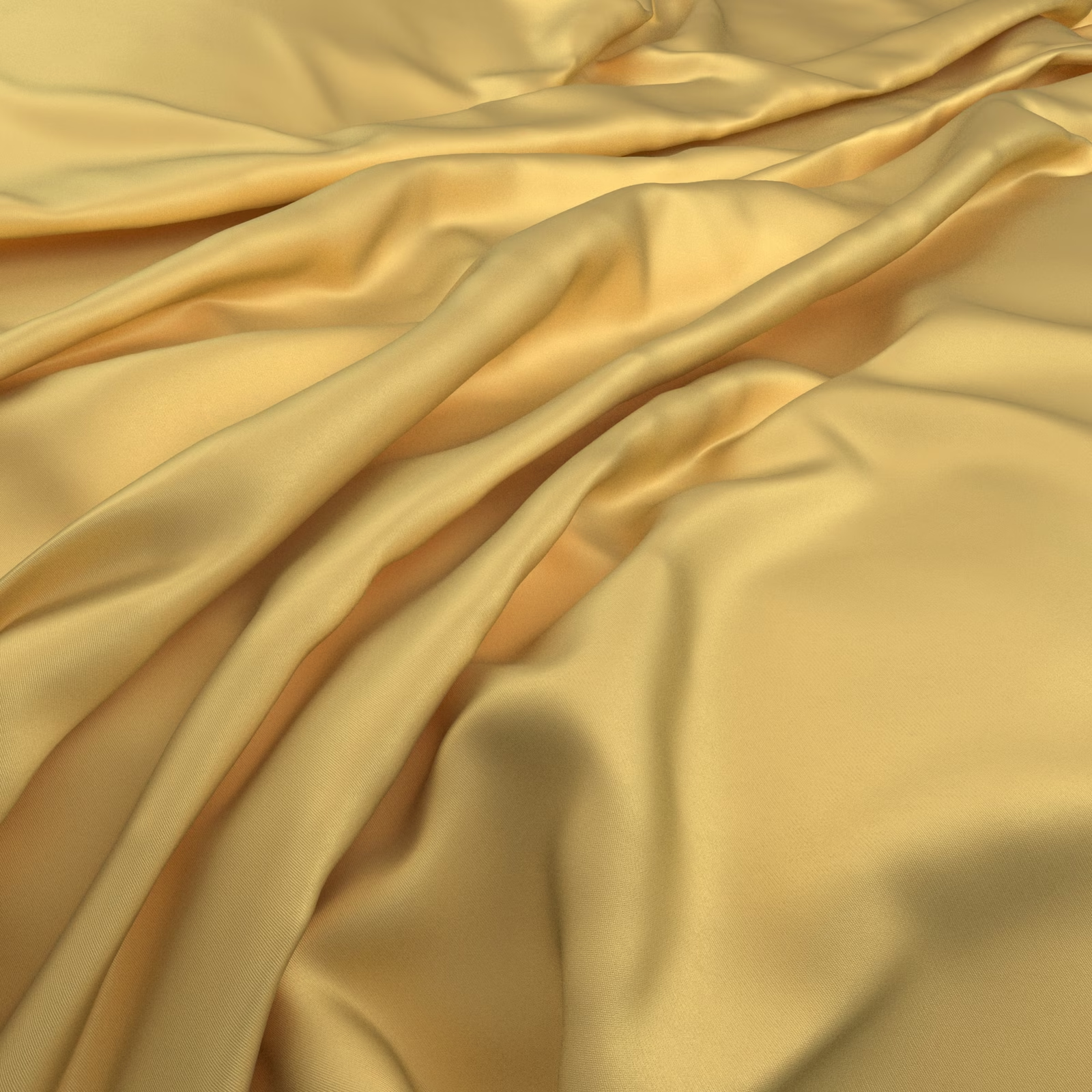
Serena Primrose is shown in a warm primrose yellow that shifts between soft lemon and golden honey as the cloth folds. Its smooth surface catches the light in broad, liquid highlights.
You have used your previews for today. Send one to Simon and you can carry on.
Your board
0 fabrics
See this fabric on Warwick's own site, then order it through us.
See Serena Primrose in your own room
A photograph of the piece you want re-covered. Straight on is best, and daylight helps. It is used to make your picture and nothing else.
Looking at your room
We found things here Serena Primrose could go on. Tap one on the photograph, or choose below.
We could not see anything to re-cover
, s
Serena Primrose, on your
Drag to compare. AI impression, colours indicative: ask us for a cutting before you decide.
About this fabric
Catalogued as a fabric, Serena Primrose has a fluid, satin-like appearance in this swatch image rather than a visibly textured or patterned surface. The warm yellow tone is softly muted, with deeper amber-gold shading where the cloth gathers and overlaps. Long, relaxed folds create a sense of movement, while the flatter areas reveal an even, polished colour.
How to use it
Use this warm golden-yellow colourway for full-length curtains or softly gathered blinds, where its fluid folds can reflect natural light and add a gentle luxe note.
Its warm golden tone and fluid sheen suit elegant curtains, blinds and softly gathered window treatments.
More from Serena
The same book, other colourways.
Serena Honey
Serena
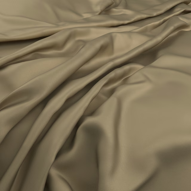
Serena Burnish
Serena
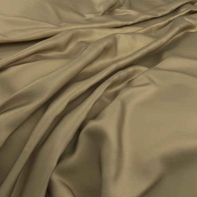
Serena Brass
Serena
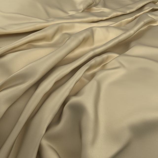
Serena Snitch
Serena
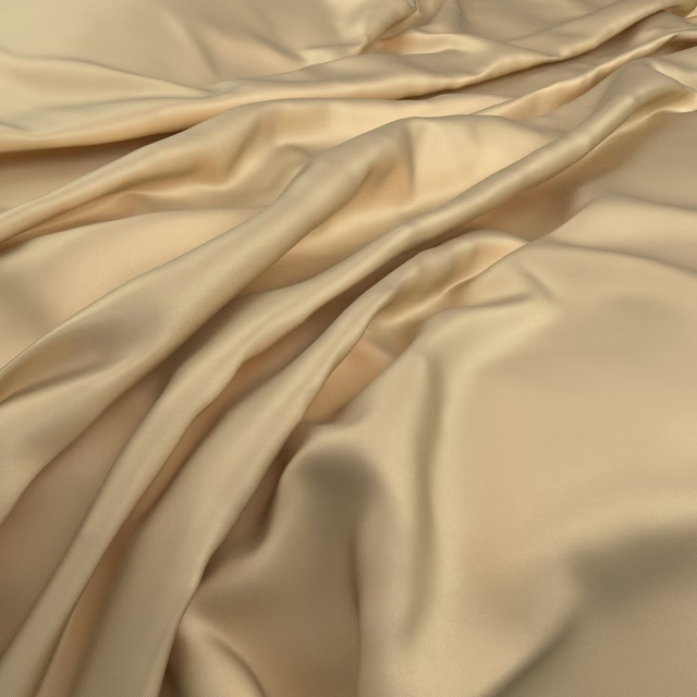
Serena Syrup
Serena
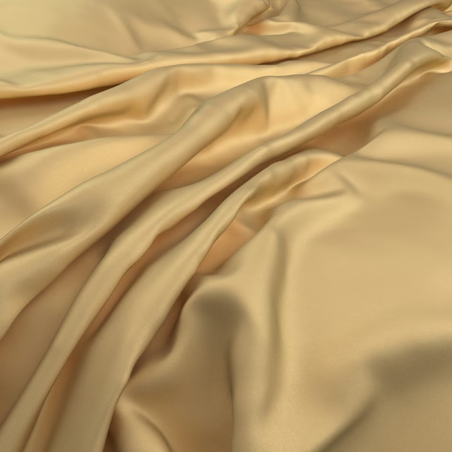
Serena Marigold
Serena
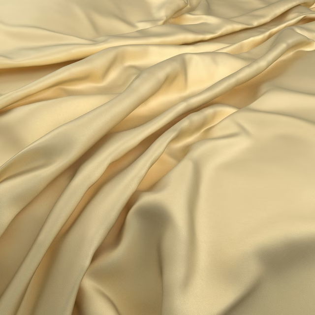
Serena Butter
Serena
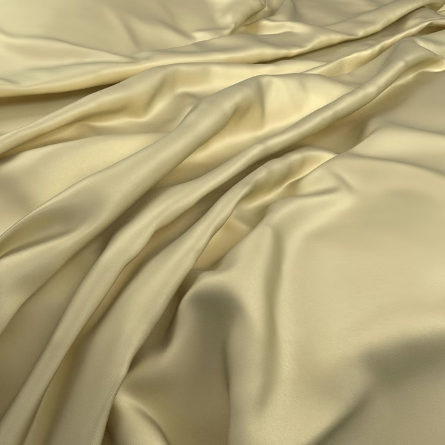
Serena Pistachio
Serena
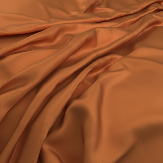
Serena Tangerine
Serena
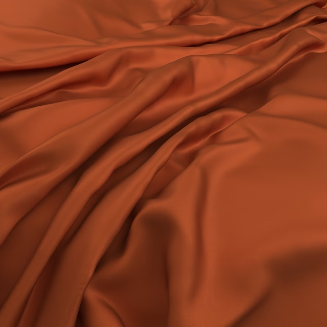
Serena Tiger
Serena
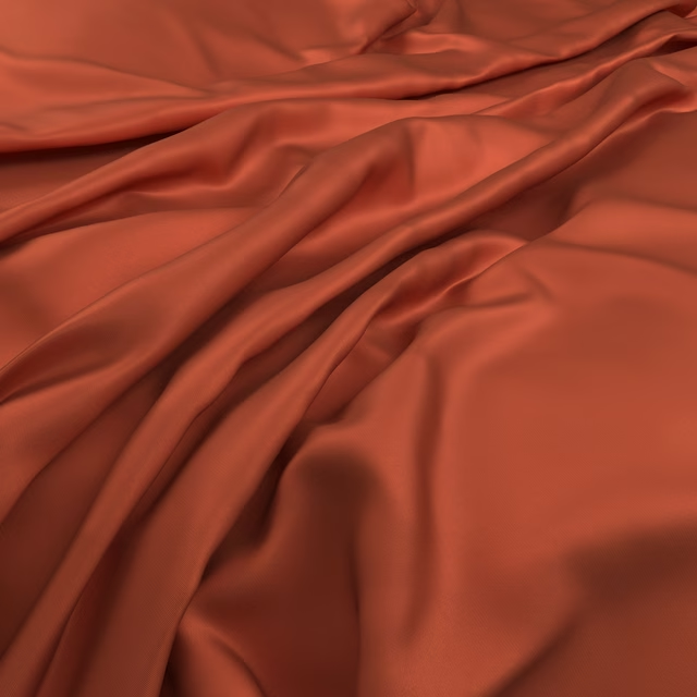
Serena Tandoori
Serena
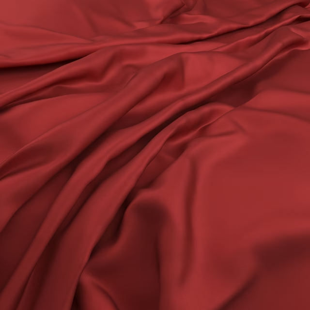
Serena Lust
Serena
Pairs well with
Serena Primrose is a quiet cloth, so it carries a pattern beside it: one of these on the curtains and this on the chair. Mixed across the houses we hold, which is the part a single supplier's book cannot do.
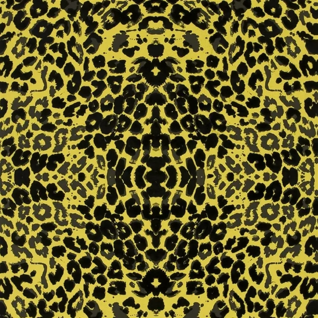
Santo Sospir Citrus Wallpaper
Belles Rives WALLPAPER
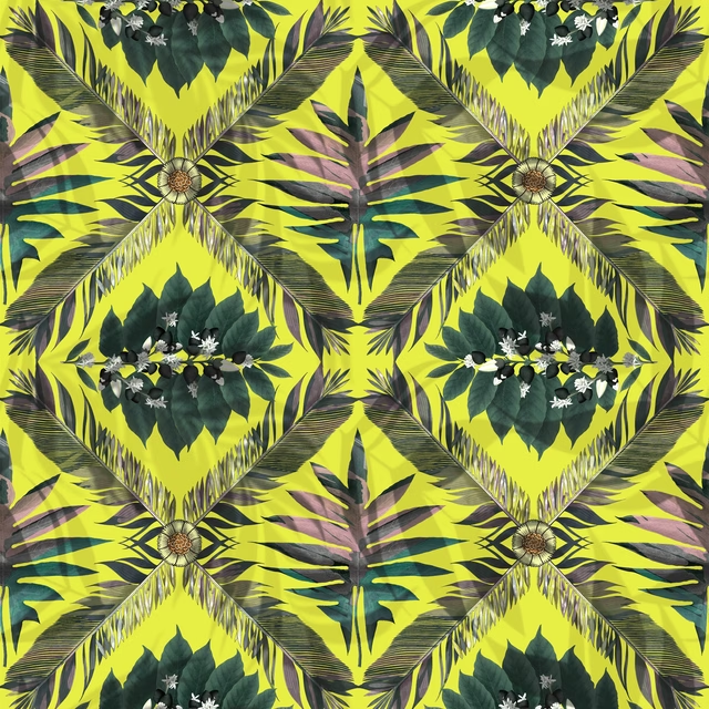
Feather Park Soft Iris
Utopia Fabric & Wallpaper
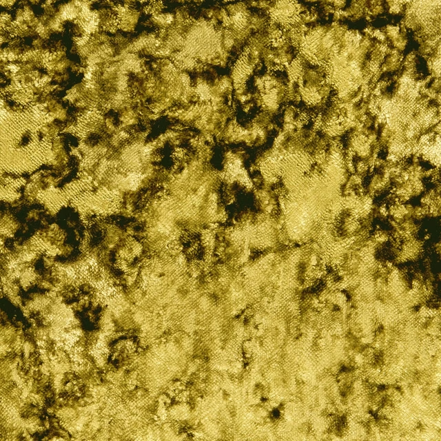
Crush Citrus
Crush
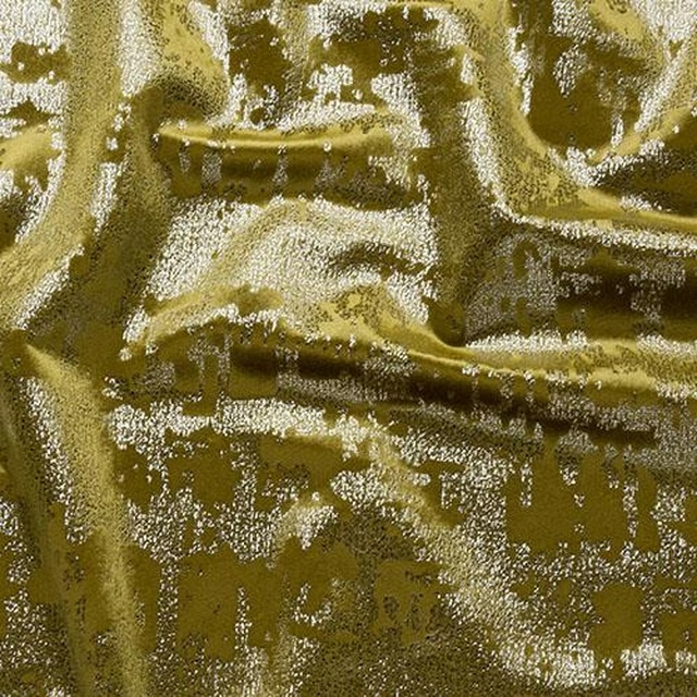
Mercury Ochre
Glamour
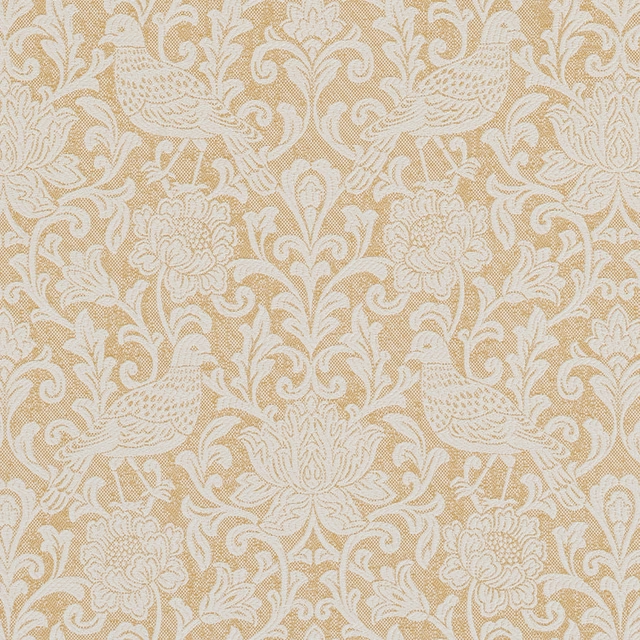
Auvergne Ochre
Provence
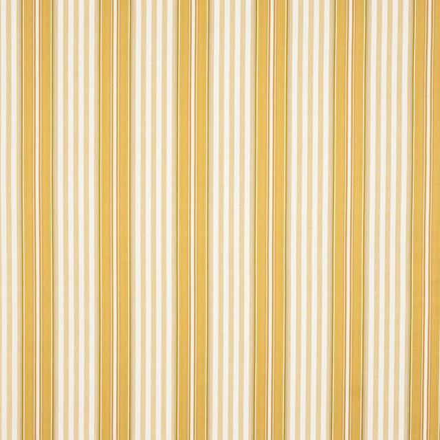
Deacon Stripe Yellow
Camber Stripes
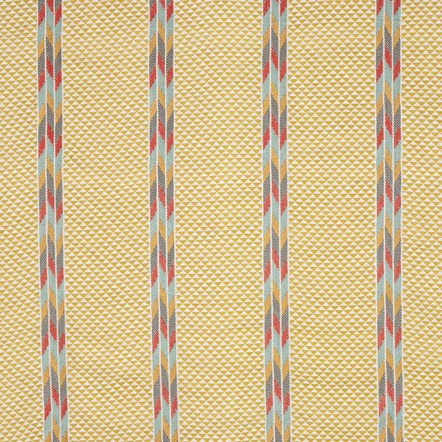
Bodhi Yellow/Multi
Gloriana
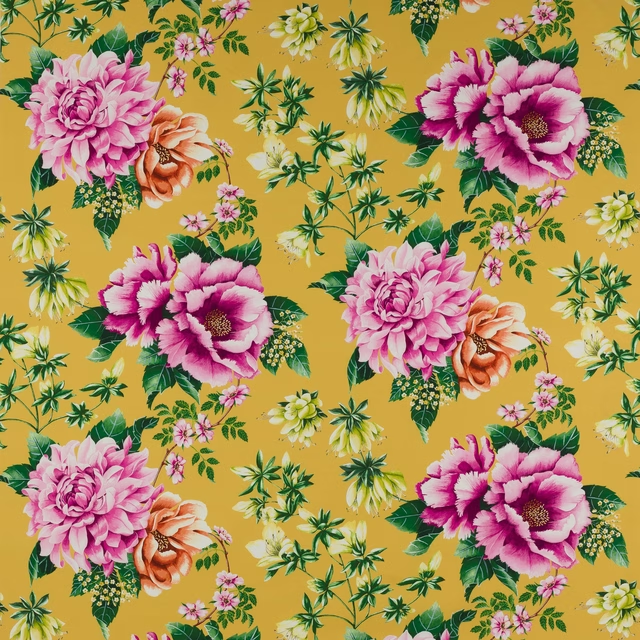
Alba Jonquille
Alba
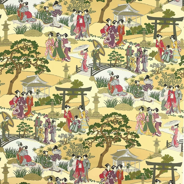
Geishas Epice
Beaumont
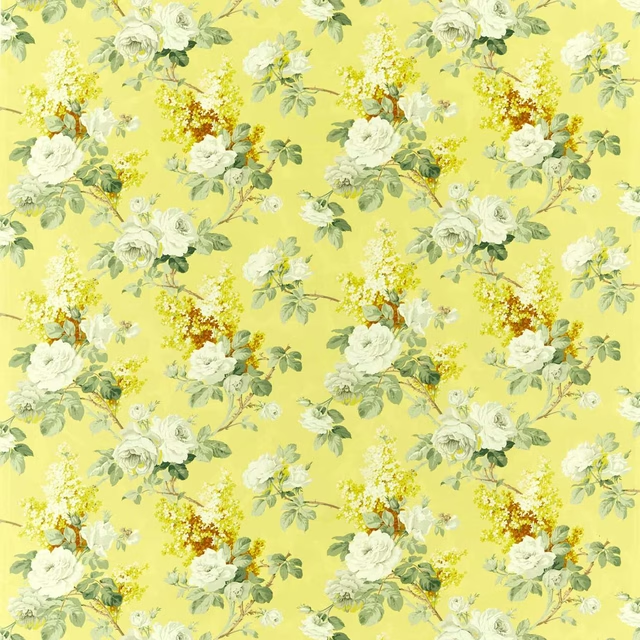
Sorilla Mimosa
Sanderson One Sixty Fabrics
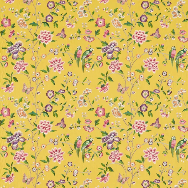
Chinoiserie Hall Papavera
Water Garden Fabrics
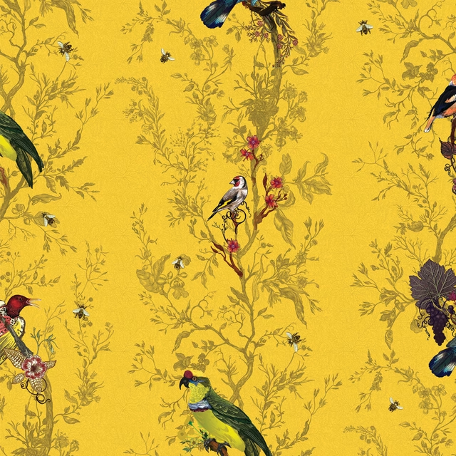
Birds N Bees Wallpaper Cadmium
Birds N Bees
Paint that goes with it
Two ways to take the room. Both colours are from houses we hold, so a pot can come off the same order as the cloth. Screens shift colour, so treat these as a direction and bring the cloth to the shelf before you buy the paint.
To sit quietly behind it
Bassoon
Little Greene · #c09f66
To stand against it
Silent White - Mid
Little Greene · #f2ecd7
Other yellow fabrics
Across the houses we hold. See all 1,033.