

Tap the swatch to see it full screen. Hover it to magnify the weave. Colours on a screen are a guide, not a match, so come and feel the real cloth.
Scroll up or down to zoom in and out.
Persis Coral
Theodore FabricF4667-01
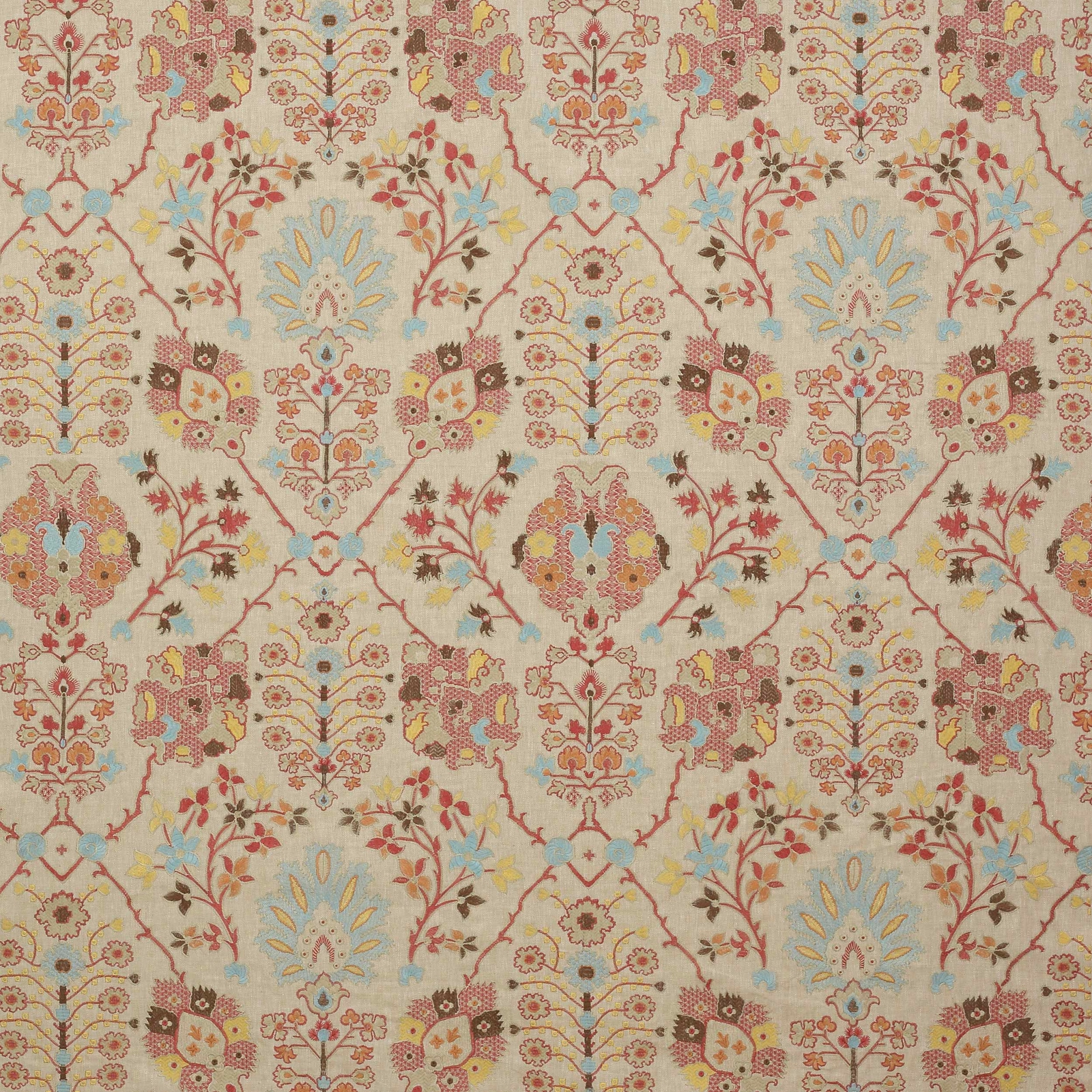
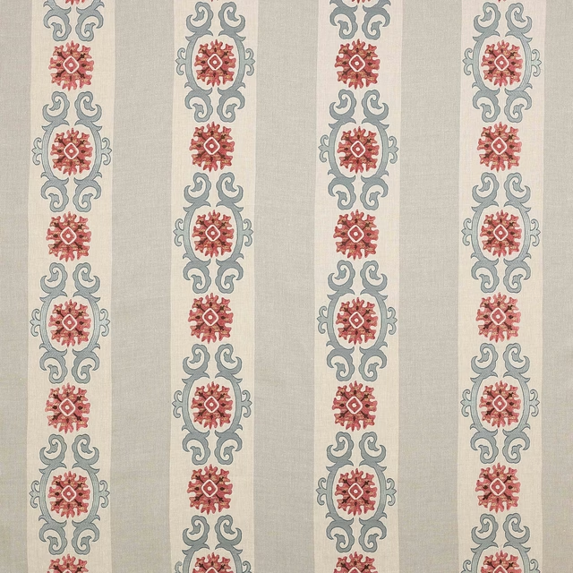
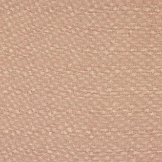
Persis Coral shows a richly worked damask pattern in a soft coral pink ground, lifted by pale aqua, butter yellow and warm brown details. The design reads decorative and welcoming, with enough contrast to give the motifs clear definition.
You have used your previews for today. Send one to Simon and you can carry on.
Your board
0 fabrics
See this fabric on Colefax and Fowler's own site, then order it through us.
See Persis Coral in your own room
A photograph of the piece you want re-covered. Straight on is best, and daylight helps. It is used to make your picture and nothing else.
Looking at your room
We found things here Persis Coral could go on. Tap one on the photograph, or choose below.
We could not see anything to re-cover
, s
Persis Coral, on your
Drag to compare. AI impression, colours indicative: ask us for a cutting before you decide.
About this fabric
Woven in 64% linen and 36% viscose, this fabric has the poised look of a decorative cloth with a natural, slightly textured handle. The repeat is generous at approximately V 78cm / H 63cm, and the 126cm width gives good scope for larger-scale pattern placement. In this colourway, the coral tone is tempered rather than bright, with a warm blush cast that sits comfortably beside the pale blue and muted gold accents. The overall effect is detailed and romantic, while the √BM fire code and Q 8 + T 3 care coding are practical specification points for made-up interiors.
How to use it
Use Persis Coral on a statement chair, curtain panels or a feature ottoman where the coral ground can warm up a neutral room. It pairs especially well with weathered timber, soft stone shades and the pale aqua notes already present in the pattern.
A lively coral-tinged damask that brings warmth and pattern without feeling too heavy.
More from Theodore
The same book, other colourways.
Lombard Blue
Theodore
Paisley Leaf Old Blue
Theodore
Paisley Leaf Red
Theodore
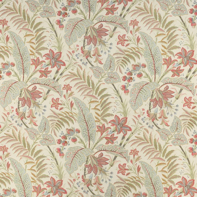
Paisley Leaf Tomato/Aqua
Theodore
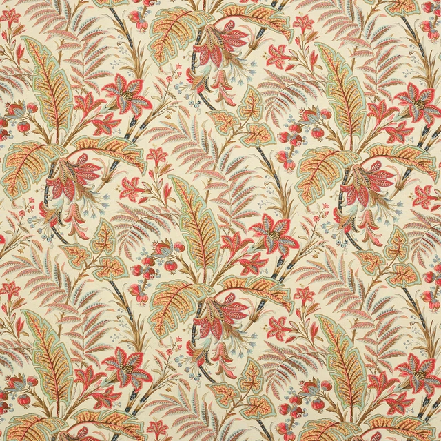
Paisley Leaf Tomato/Sienna
Theodore
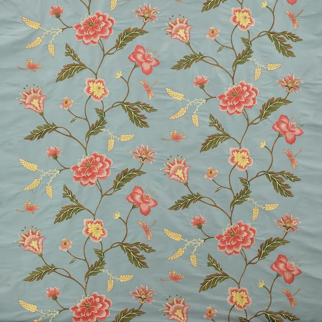
Passerine Blue
Theodore
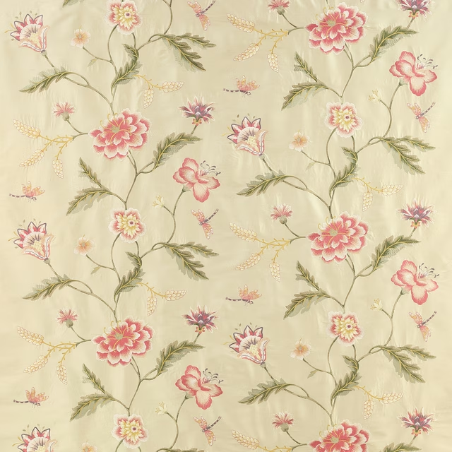
Passerine Pink/Green
Theodore
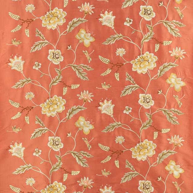
Passerine Red
Theodore
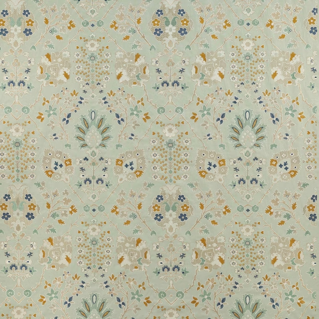
Persis Aqua
Theodore
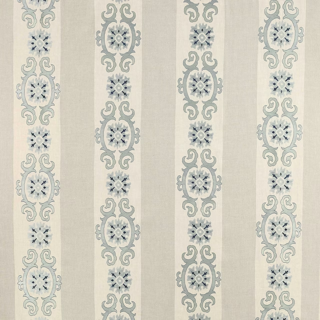
Theodore Old Blue
Theodore
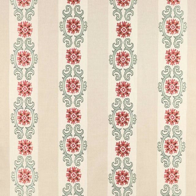
Theodore Red/Forest
Theodore
Theodore Tomato/Blue
Theodore
Pairs well with
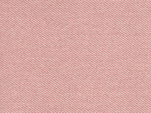
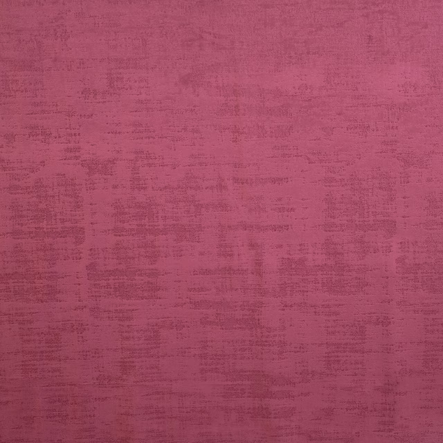
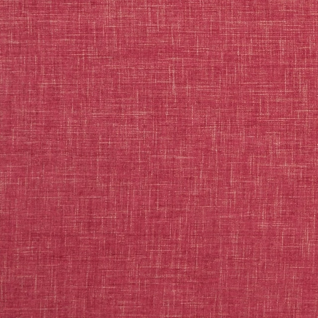
A pattern needs somewhere for the eye to rest, so these are the plains and textures that sit beside Persis Coral without fighting it. Mixed across the houses we hold, which is the part a single supplier's book cannot do.

Prati Corail
Marco
CER3190
Porto Cervo
Dakota Berry
Dakota Collection

Galaxy Blush
Galaxy Collection
Albany Raspberry
Albany and Moray
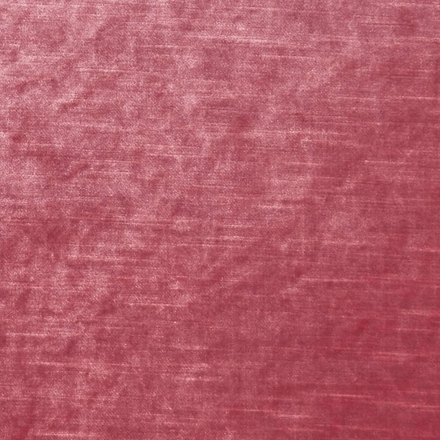
Allure Candy
Allure
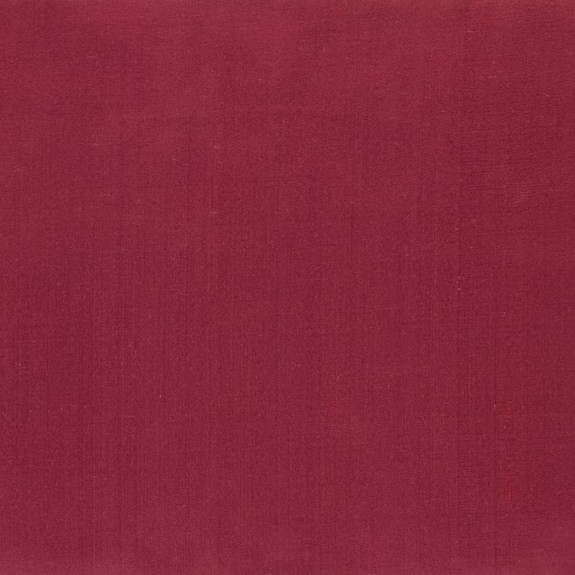
Amboise Crhysantemum
Amboise
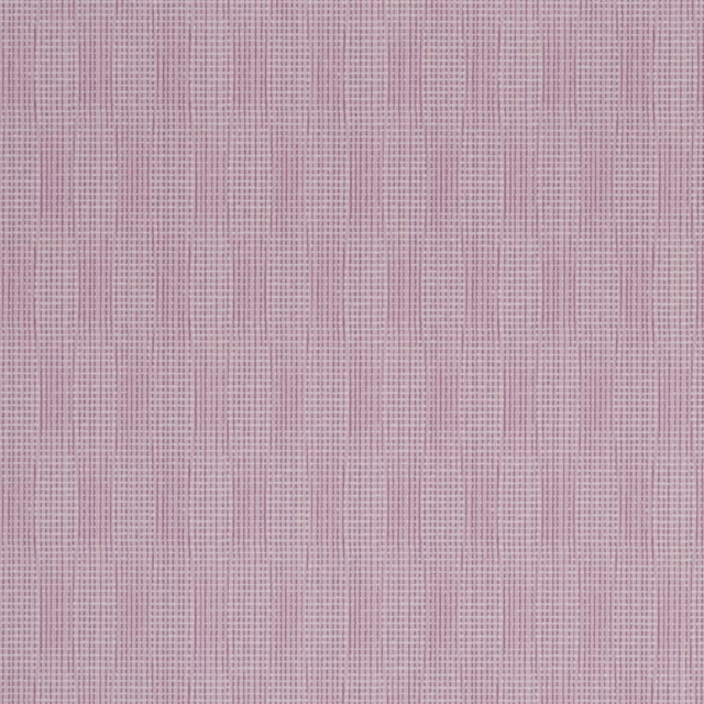
Reverdy Magenta
Carlu WALLPAPER
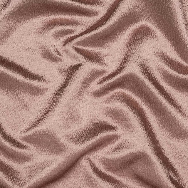
Alchemy Dusky Pink
Alchemy
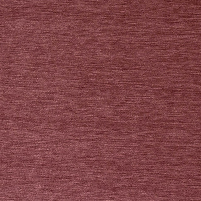
Kensington Antique Rose
Brodsworth
Allegra Peony
Allegra

Allegra Postiano
Allegra
Paint that goes with it
Two ways to take the room. Both colours are from houses we hold, so a pot can come off the same order as the cloth. Screens shift colour, so treat these as a direction and bring the cloth to the shelf before you buy the paint.
To sit quietly behind it
Sybil
Coat Paints · #c1a18c
To stand against it
Juniper Ash
Little Greene · #525969
Other pink fabrics
Across the houses we hold. See all 2,519.
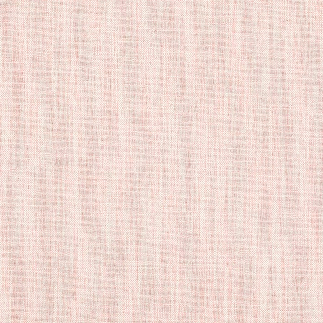
Carnforth Old Pink
Tarn
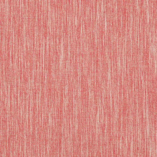
Carnforth Red
Tarn
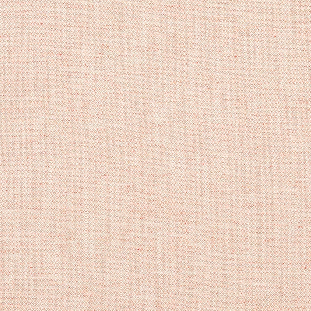
Iver Coral
Tarn
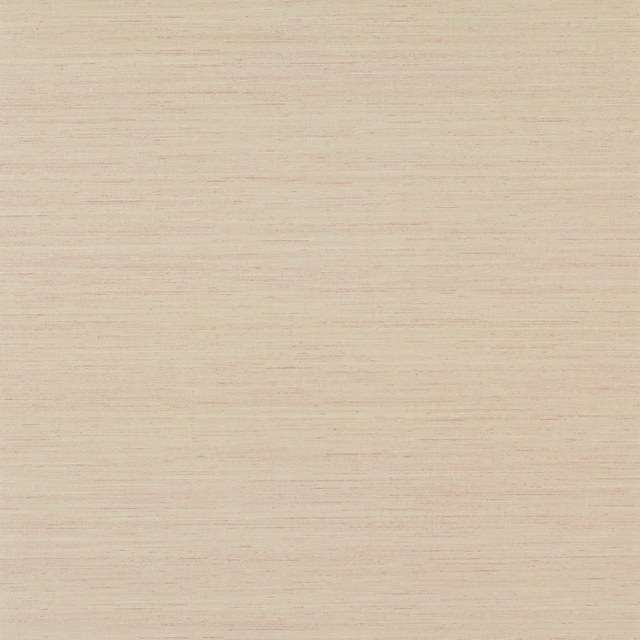
Sandrine Wallpaper Pink
Textured Wallpapers
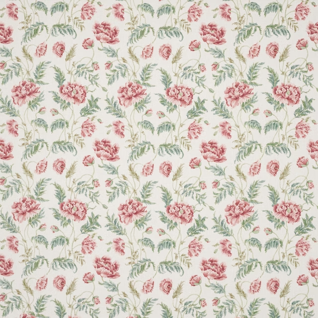
Eleanora Pink/Green
Tilbury
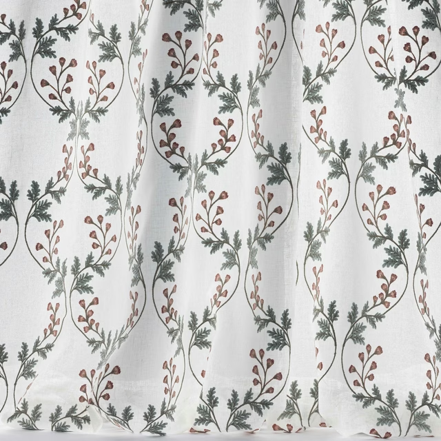
Georgia Sheer Pink/Old Blue
Tilbury
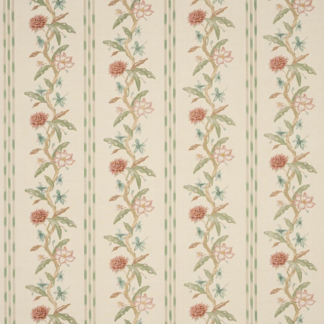
Harewood Pink/Green
Tilbury
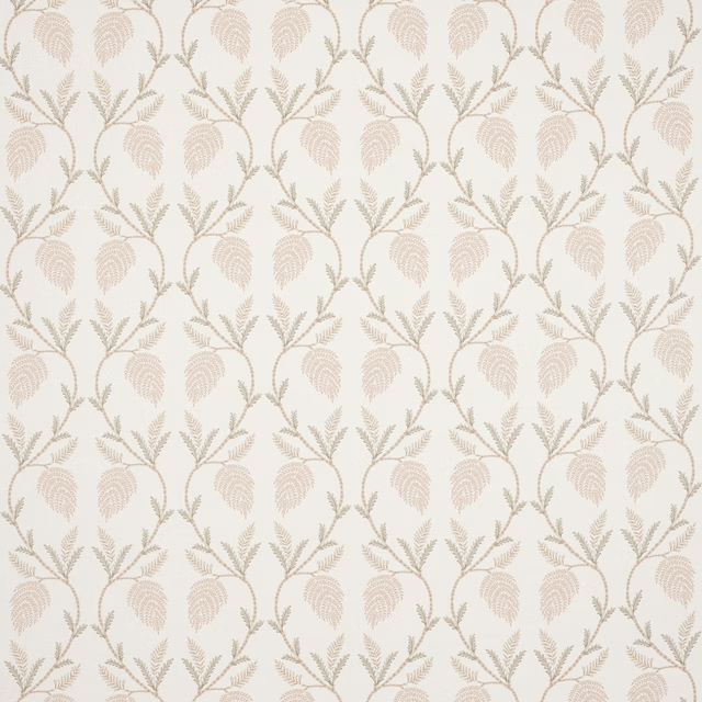
Theta Old Pink
Tilbury
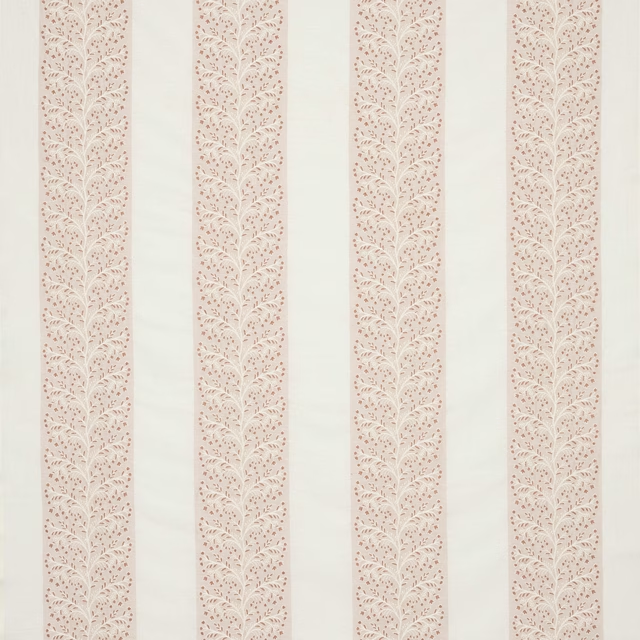
Wren Stripe Old Pink
Tilbury
Tyndall Old Pink
Tyndall Linen

Tyndall Pale Pink
Tyndall Linen
Tyndall Pink
Tyndall Linen