
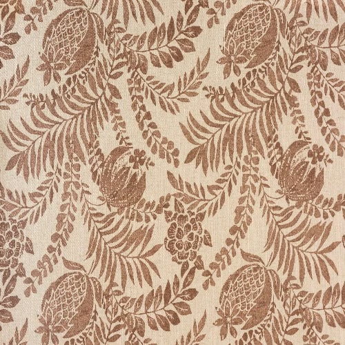
Tap the swatch to see it full screen. Hover it to magnify the weave. Colours on a screen are a guide, not a match, so come and feel the real cloth.
Scroll up or down to zoom in and out.
Clarendon Blush
Digital Prints Fabric
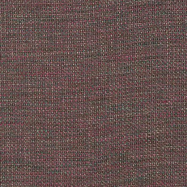
Clarendon Blush pairs a soft blush ground with an all-over botanical print in deeper rosy taupe. The design feels airy and decorative, with the motif sitting clearly on the surface rather than sinking into the background.
You have used your previews for today. Send one to Simon and you can carry on.
Your board
0 fabrics
See this fabric on Porter & Stone's own site, then order it through us.
See Clarendon Blush in your own room
A photograph of the piece you want re-covered. Straight on is best, and daylight helps. It is used to make your picture and nothing else.
Looking at your room
We found things here Clarendon Blush could go on. Tap one on the photograph, or choose below.
We could not see anything to re-cover
, s
Clarendon Blush, on your
Drag to compare. AI impression, colours indicative: ask us for a cutting before you decide.
About this fabric
This Porter & Stone fabric is from the Digital Prints collection and has no performance features noted. The visible ground is a pale blush pink with a warm, slightly faded look that softens the contrast of the print. Leaf trails, fronds and rounded floral forms are picked out in a deeper dusty rose-brown, giving the pattern a large, flowing repeat. The overall effect is light, natural and gently vintage, with enough definition in the print to read clearly without feeling harsh.
How to use it
Use Clarendon Blush where you want a botanical fabric that feels warm rather than sugary; it would suit relaxed curtains, a statement armchair or a bedroom headboard. The muted pink ground works especially well with aged brass, cane, oak and other soft neutrals.
The warm blush ground keeps the leafy print gentle and easy to live with.
More from Digital Prints
The same book, other colourways.
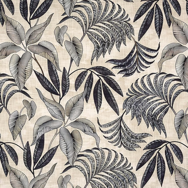
Bryony Charcoal
Digital Prints
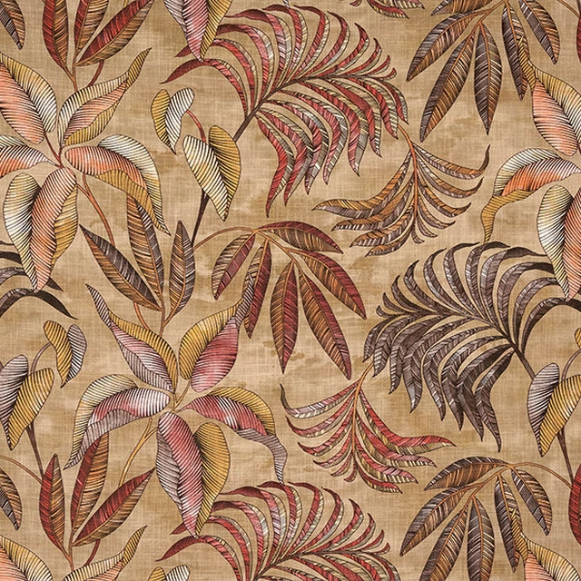
Bryony Earth
Digital Prints
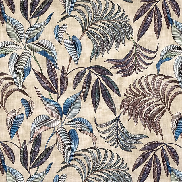
Bryony Indigo
Digital Prints
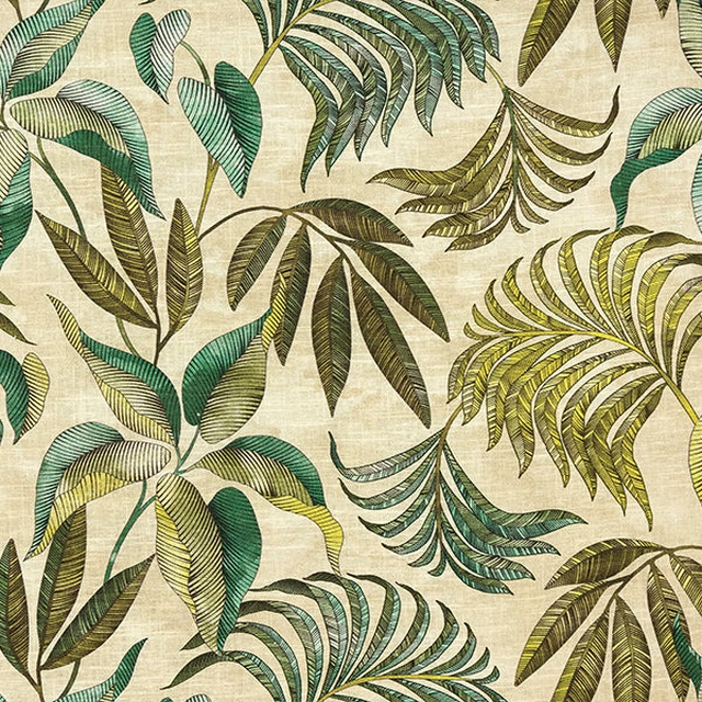
Bryony Jade
Digital Prints
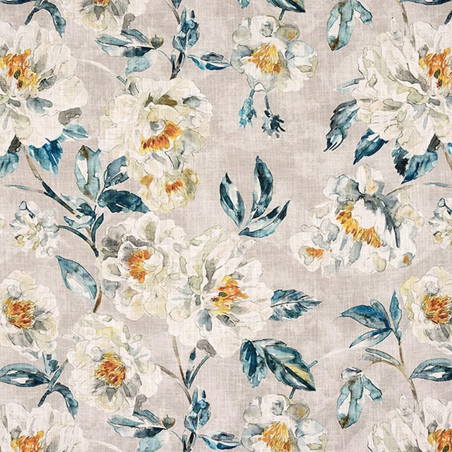
Cassia Teal
Digital Prints
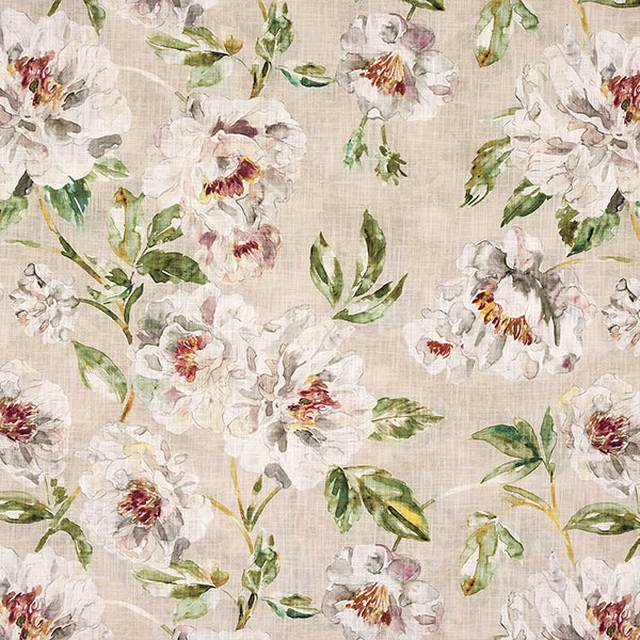
Cassia chintz
Digital Prints
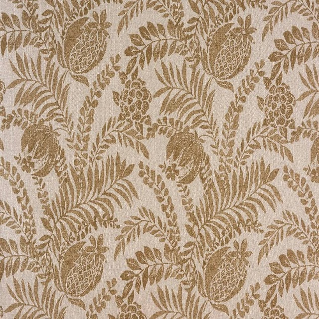
Clarendon Linen
Digital Prints
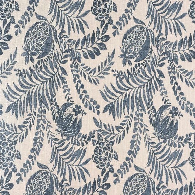
Clarendon Navy
Digital Prints
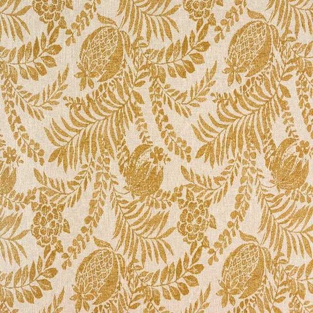
Clarendon Ochre
Digital Prints
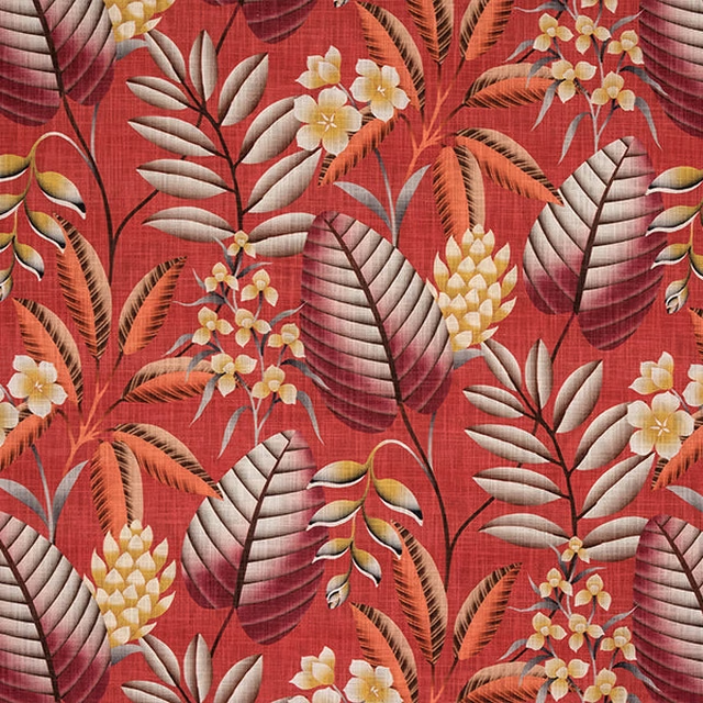
Dahlia Burnt Orange
Digital Prints
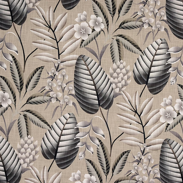
Dahlia Charcoal
Digital Prints
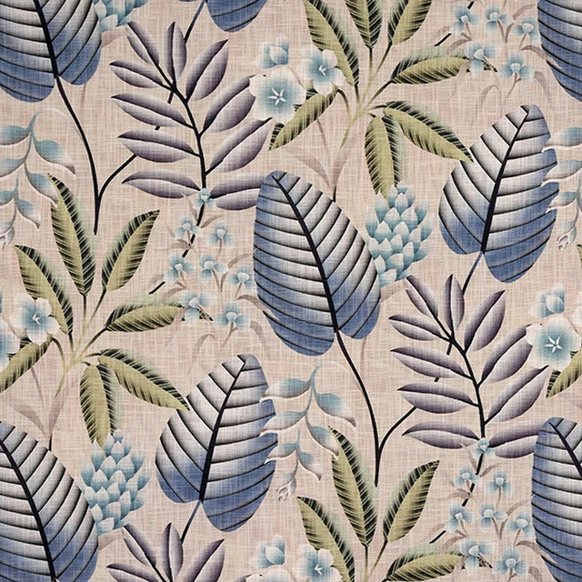
Dahlia Cobalt
Digital Prints
Pairs well with
A pattern needs somewhere for the eye to rest, so these are the plains and textures that sit beside Clarendon Blush without fighting it. Mixed across the houses we hold, which is the part a single supplier's book cannot do.
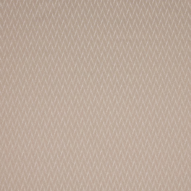
Eldon Blush
Essential Weaves Vol 2
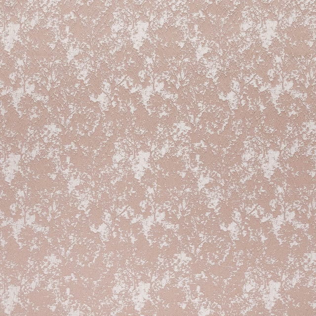
Poplar Blush
Essential Weaves Vol 2
Alvar Petal
Alvar 2
Avani Blush
Eco
Eaton Plain Pink
Eaton Checks and Stripes

Foss Pink
Foss Linen II

Naples FR Blush
Alderney
Monza Blush
Arezzo
Ario Wide Width Blush
Ario
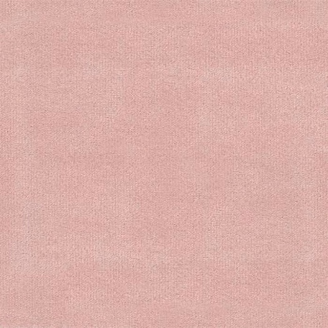
Amalfi Blush
Amalfi
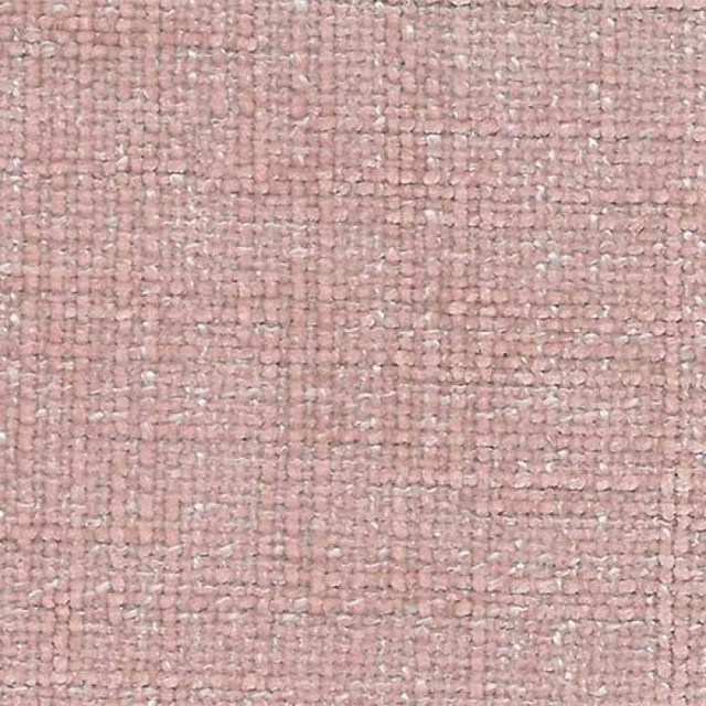
Bohemian Blush
Bohemian

Astor Cherry Blossom
Astor
Paint that goes with it
Two ways to take the room. Both colours are from houses we hold, so a pot can come off the same order as the cloth. Screens shift colour, so treat these as a direction and bring the cloth to the shelf before you buy the paint.
To sit quietly behind it
Sybil
Coat Paints · #c1a18c
To stand against it
Air Force Blue
Little Greene · #558799
Other pink fabrics
Across the houses we hold. See all 2,519.
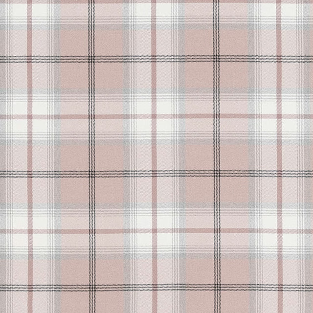
Balmoral FR Blush
Balmoral FR
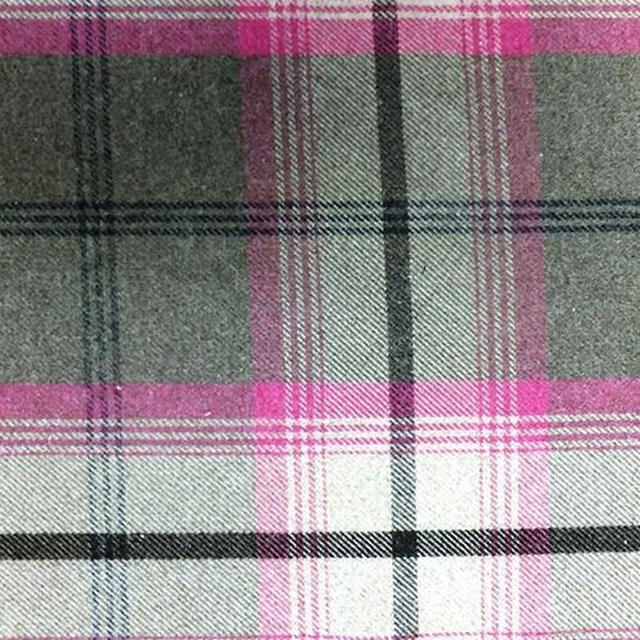
Balmoral FR Fushsia
Balmoral FR
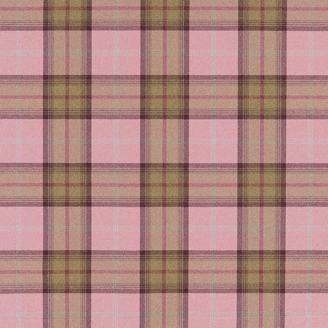
Balmoral FR Watermelon
Balmoral FR
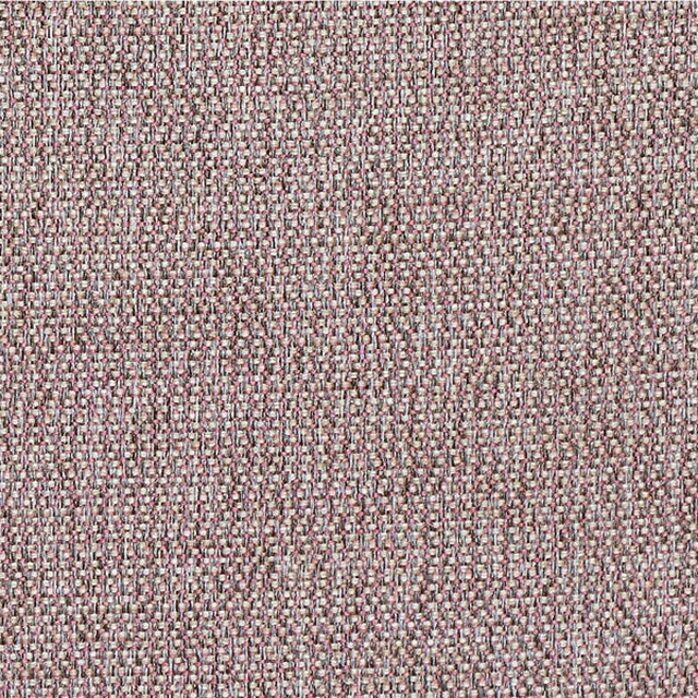
Baltic FR Blush
Baltic FR
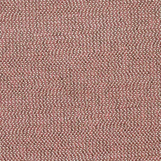
Baltic FR Coral
Baltic FR
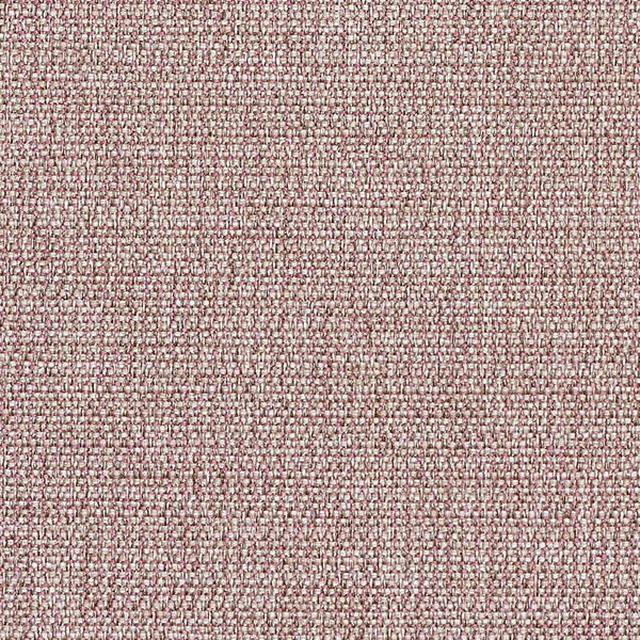
Baltic FR Dusky Pink
Baltic FR
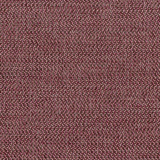
Baltic FR Heather
Baltic FR

Dreamy FR Rose
Dreamy FR
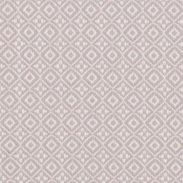
Komodo Blush
Flavia FR
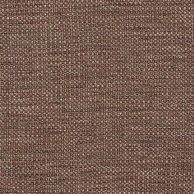
Sparta FR Blush
Flavia FR
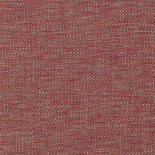
Sparta FR Fuschia
Flavia FR
Sparta FR Heather
Flavia FR