
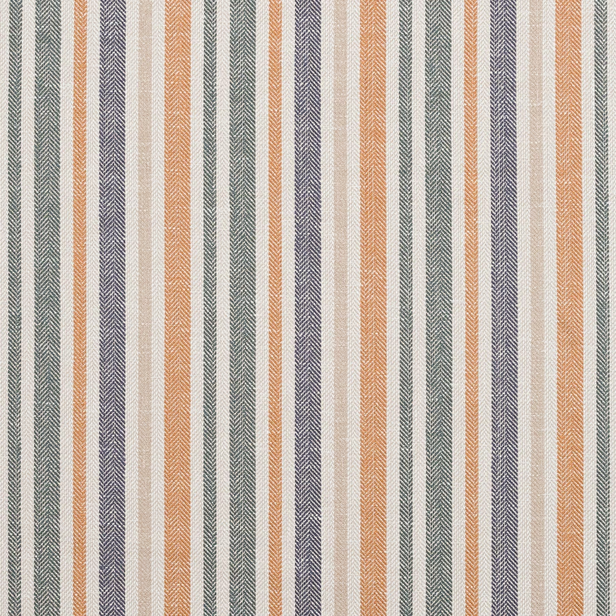

Tap the swatch to see it full screen. Hover it to magnify the weave. Colours on a screen are a guide, not a match, so come and feel the real cloth.
Scroll up or down to zoom in and out.
Tiverton Stripe Burnt Orange
Other Fabrics & Weaves Fabric
Tiverton Stripe Burnt Orange has a crisp woven stripe look, with warm burnt orange bands set against soft neutral ground tones and cooler accent stripes. The herringbone-like texture gives the pattern a dry, tailored feel rather than a glossy finish.
You have used your previews for today. Send one to Simon and you can carry on.
Your board
0 fabrics
See this fabric on Fryett's Fabrics's own site, then order it through us.
See Tiverton Stripe Burnt Orange in your own room
A photograph of the piece you want re-covered. Straight on is best, and daylight helps. It is used to make your picture and nothing else.
Looking at your room
We found things here Tiverton Stripe Burnt Orange could go on. Tap one on the photograph, or choose below.
We could not see anything to re-cover
, s
Tiverton Stripe Burnt Orange, on your
Drag to compare. AI impression, colours indicative: ask us for a cutting before you decide.
About this fabric
This fabric is 137cm wide and composed of 36% cotton and 64% recycled polyester, giving the surface a practical woven handle with a slightly structured look. The stripe repeats every 15.5cm across the width, while the vertical repeat is 0cm, so the design reads as a clean, uninterrupted stripe. In this colourway, the burnt orange stripes feel earthy and sun-baked, softened by cream, sage-green and muted plum notes that keep the overall effect grounded. The visible weave has a subtle chevron texture that adds depth and helps the warmer orange stand out without looking harsh. No performance features are noted, and care is NQT1.
How to use it
Use it on an accent chair, ottoman or tailored curtains where the burnt orange stripe can bring warmth to timber, cane and natural linen. It works especially well in rooms that need colour but still call for a restrained, heritage-inspired finish.
Pair with warm neutrals and textured woods to let the stripe’s earthy colour feel tailored, not loud.
More from Other Fabrics & Weaves
The same book, other colourways.
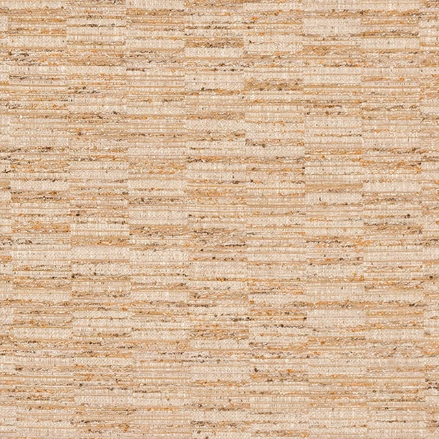
Stavanger Natural
Other Fabrics & Weaves
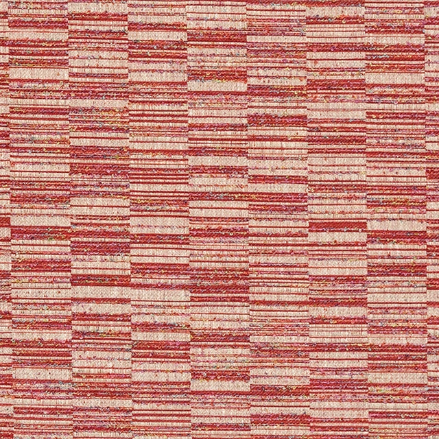
Stavanger Rosso
Other Fabrics & Weaves
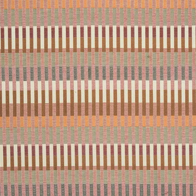
Tangier Burnt Orange
Other Fabrics & Weaves
Tangier Dove
Other Fabrics & Weaves
Tangier Indigo
Other Fabrics & Weaves
Tangier Pampas
Other Fabrics & Weaves
Tiverton Stripe Harlequin
Other Fabrics & Weaves
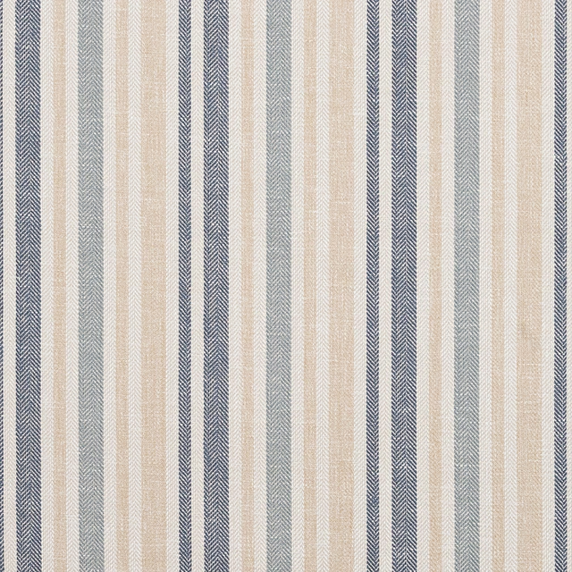
Tiverton Stripe Indigo
Other Fabrics & Weaves

Tiverton Stripe Natural
Other Fabrics & Weaves
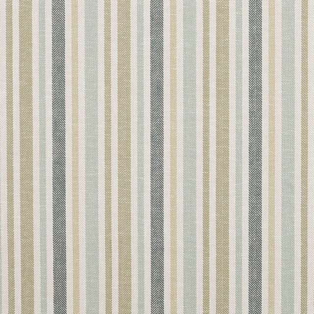
Tiverton Stripe Pampas
Other Fabrics & Weaves
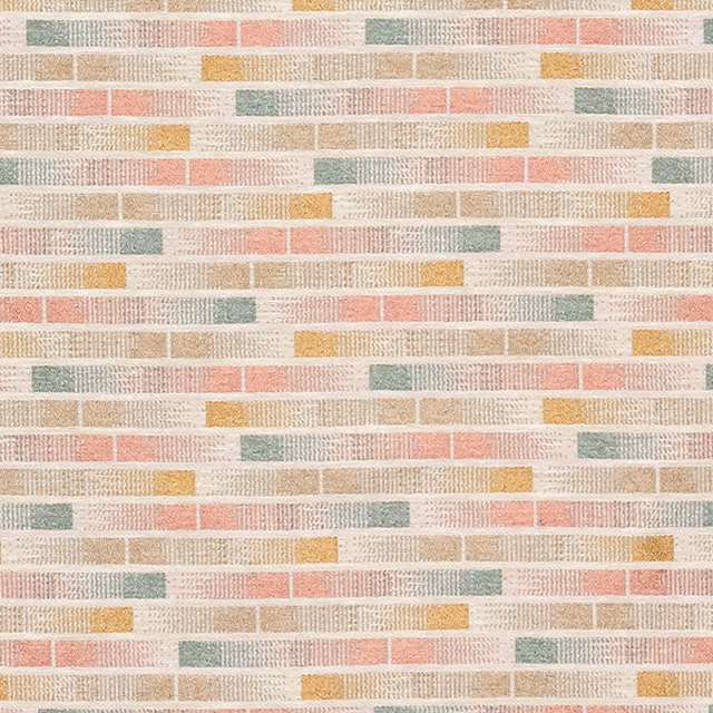
Uppsala Blush
Other Fabrics & Weaves
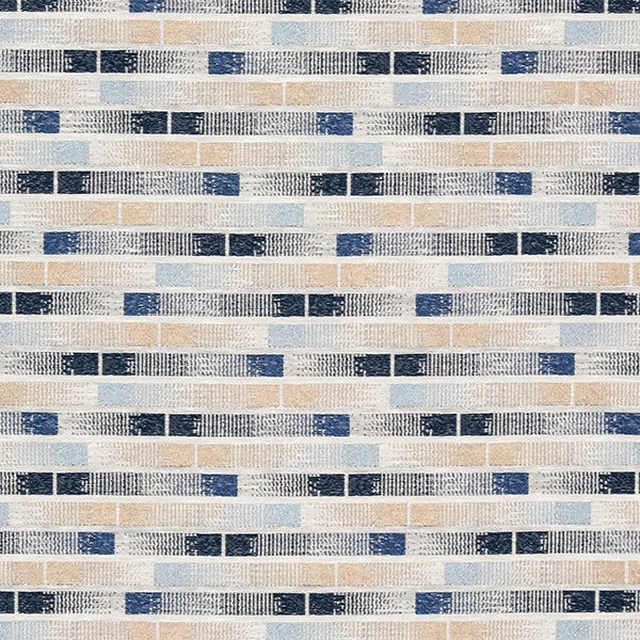
Uppsala Indigo
Other Fabrics & Weaves
Pairs well with
A pattern needs somewhere for the eye to rest, so these are the plains and textures that sit beside Tiverton Stripe Burnt Orange without fighting it. Mixed across the houses we hold, which is the part a single supplier's book cannot do.
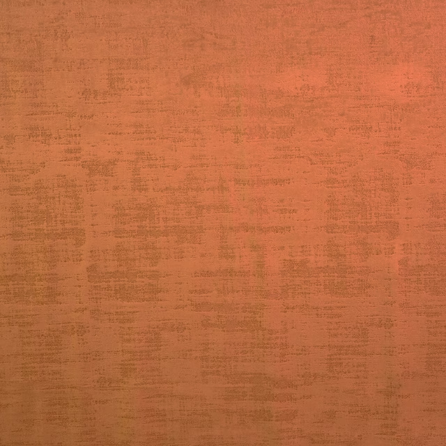
Dakota Saffron
Dakota Collection
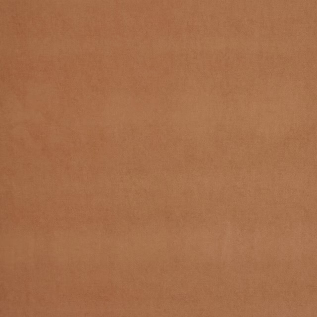
Arezzo Papaya
Portofino Collection
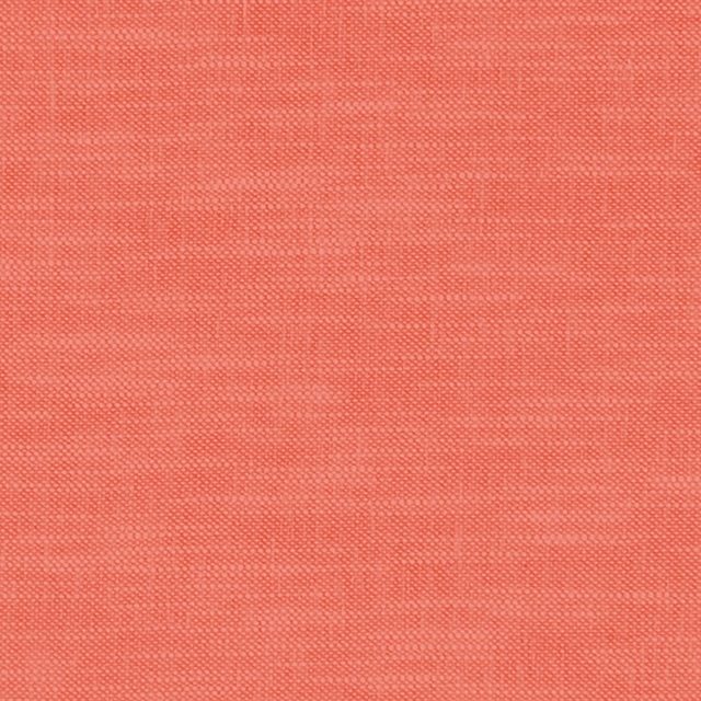
Amalfi Coral
Amalfi
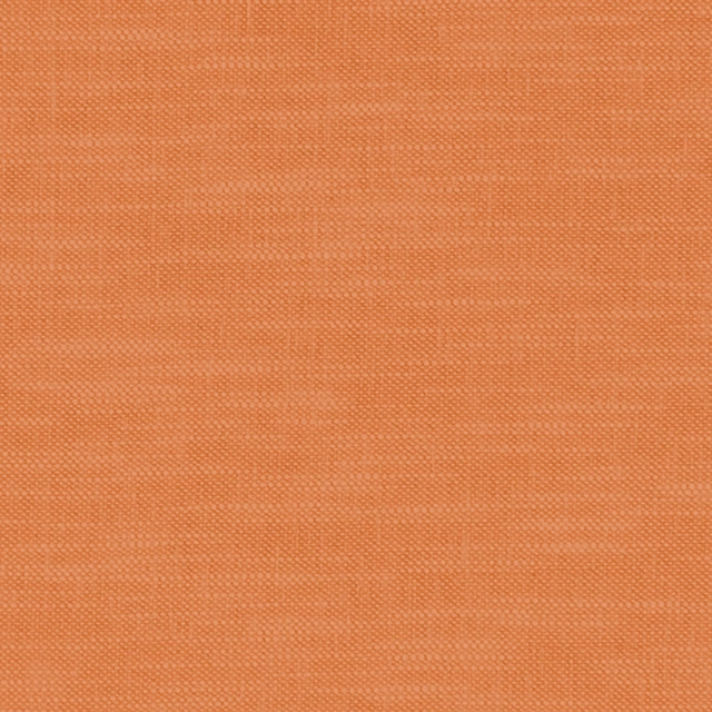
Amalfi Pumpkin
Amalfi
Carnforth Copper
Tarn
Kellen Sienna
Tarn
Dai Clementine/Ivory
Indoor Outdoor Weaves
Bohemian Pumpkin
Bohemian
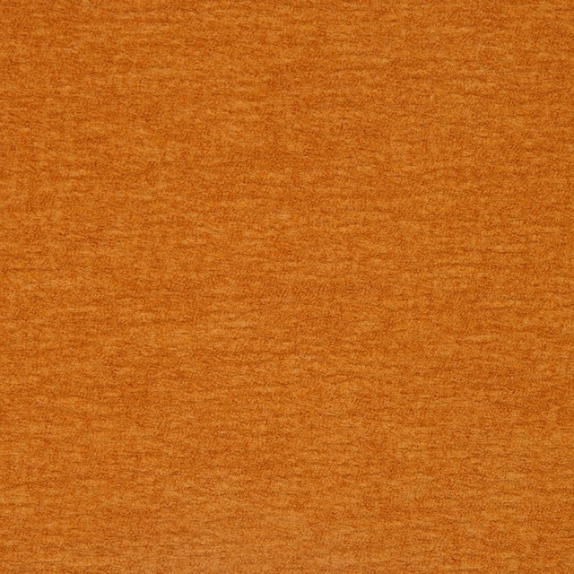
Camden Pumpkin
Camden
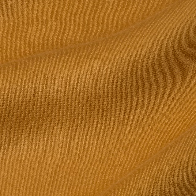
Iona Squash
Iona

Orissa Silk Satsuma
Orissa Silk
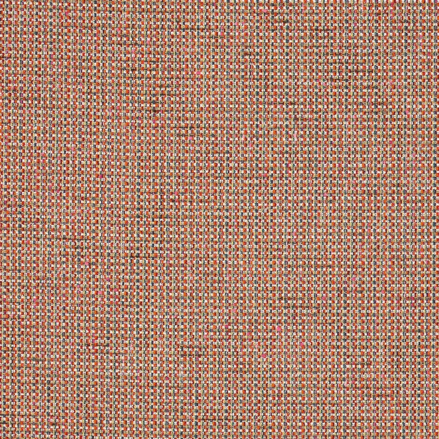
Romey Multi
Almora Wvs
Paint that goes with it
Two ways to take the room. Both colours are from houses we hold, so a pot can come off the same order as the cloth. Screens shift colour, so treat these as a direction and bring the cloth to the shelf before you buy the paint.
To sit quietly behind it
Mondo
Zoffany · #c1b7ad
To stand against it
Green Verditer
Little Greene · #6ac59c
Other orange fabrics
Across the houses we hold. See all 784.
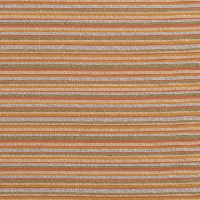
Modena FR Copper
Modena FR
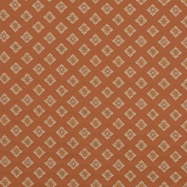
Pisa FR Copper
Modena FR
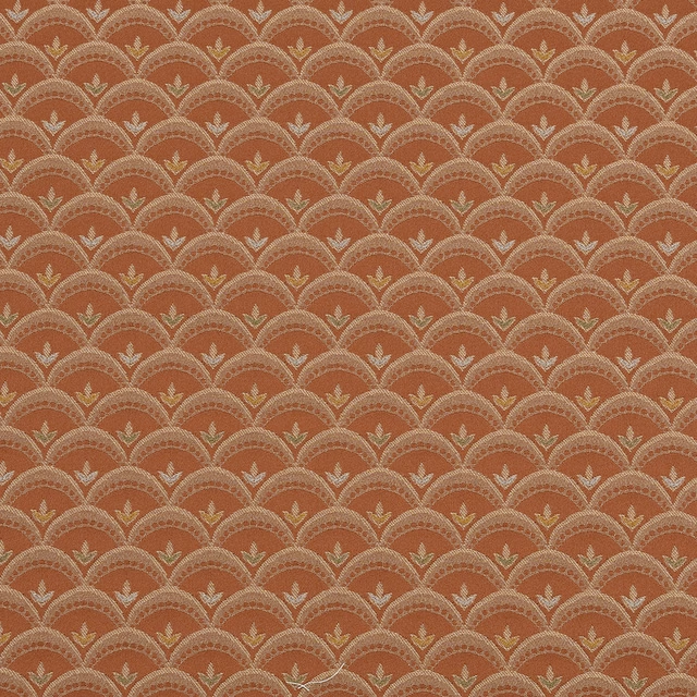
Viareggio FR Copper
Modena FR
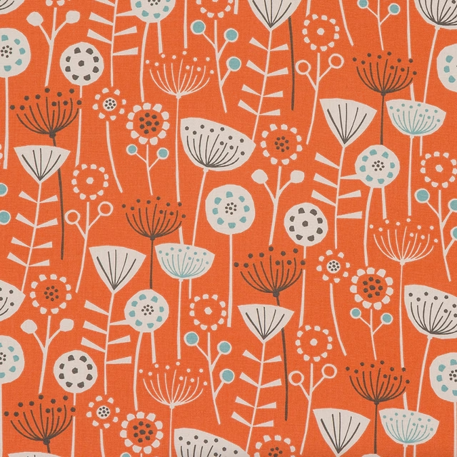
Bergen PVC Burnt Orange
PVC Table covers
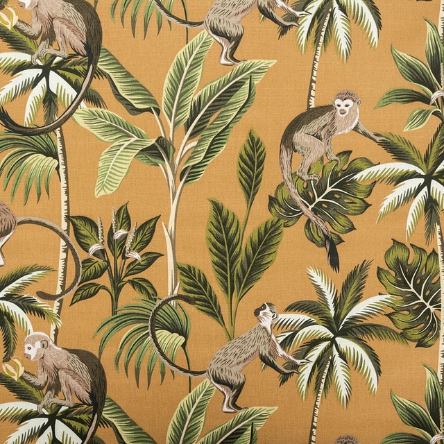
Monkey PVC Ochre
PVC Table covers
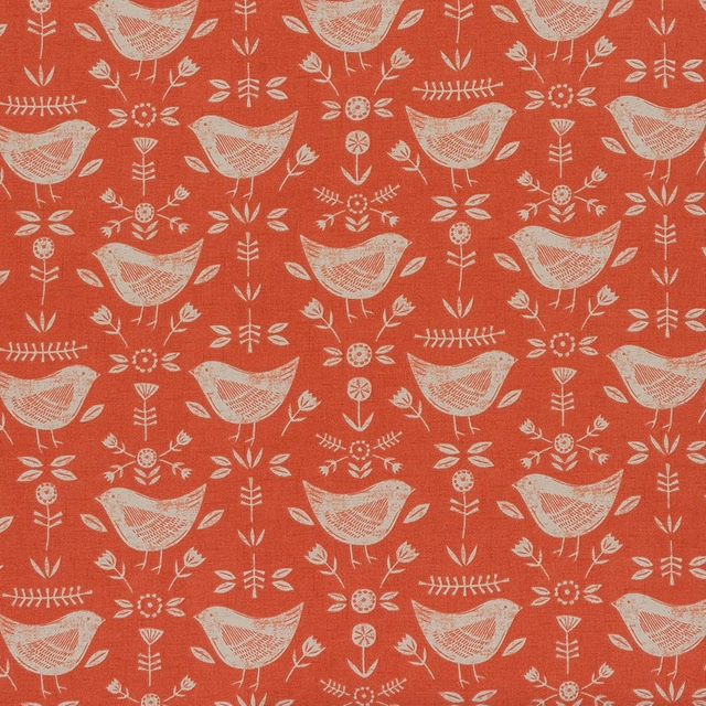
Narvik PVC Burnt Orange
PVC Table covers
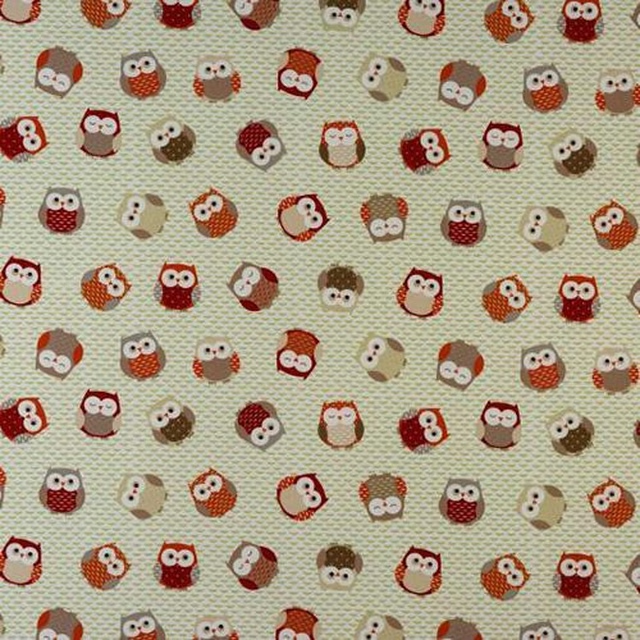
Owls PVC Orange
PVC Table covers
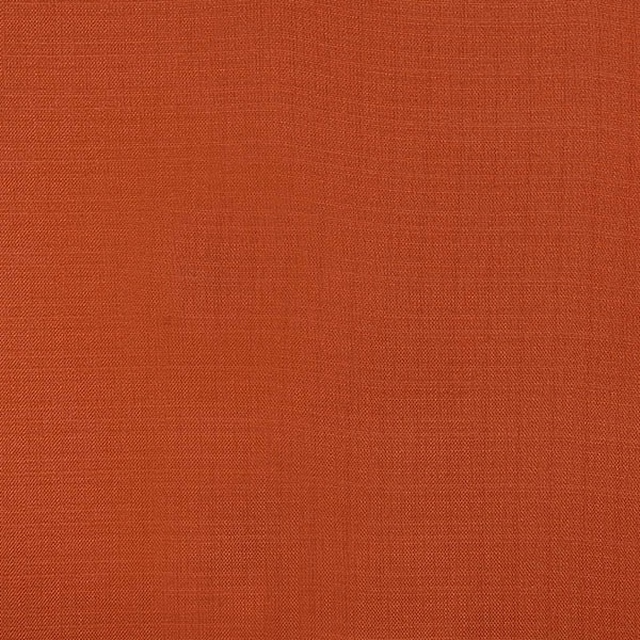
Capri burnt orange
Patagonia
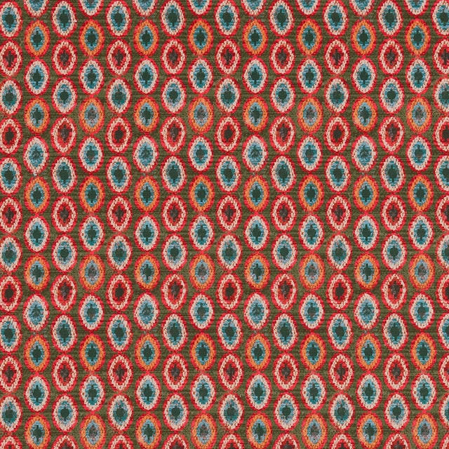
Shiraz Burnt Orange
Persia
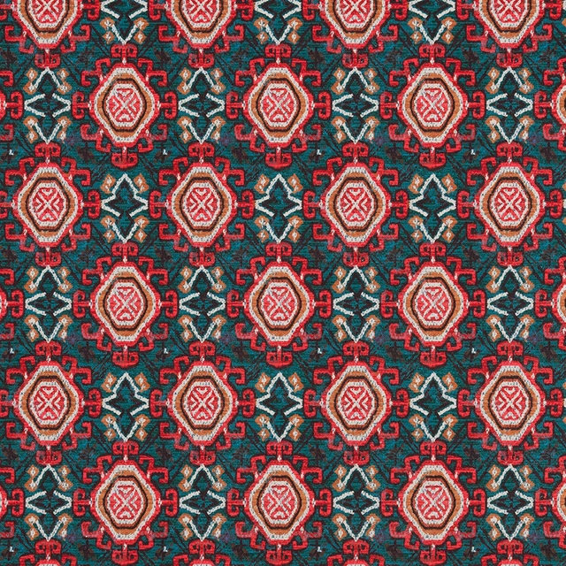
Tabriz Burnt Orange
Persia
Aria Burnt Orange
Plains & Semi Plains
Corsica Burnt Sienna
Plains & Semi Plains