
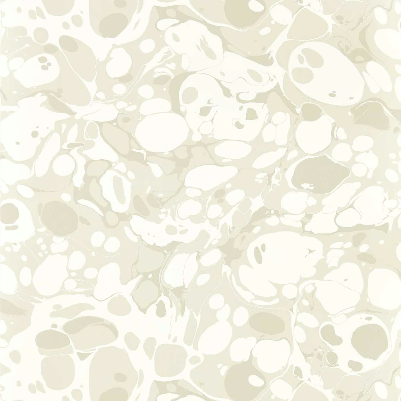

Tap the swatch to see it full screen. Hover it to magnify the weave. Colours on a screen are a guide, not a match, so come and feel the real cloth.
Scroll up or down to zoom in and out.
Marble Wide Width Awakening/Oyster/Champagne
Colour 2 Wallpapers WallpaperHAW0233-03
Marble Wide Width in Awakening/Oyster/Champagne presents a pale, warm-neutral interpretation of Harlequin’s organic marbled design. Chalky white shapes drift through oyster and champagne-beige forms, creating a softly luminous wallcovering.
You have used your previews for today. Send one to Simon and you can carry on.
Your board
0 fabrics
See this wallpaper on Harlequin's own site, then order it through us.
See Marble Wide Width Awakening/Oyster/Champagne in your own room
A photograph of the piece you want re-covered. Straight on is best, and daylight helps. It is used to make your picture and nothing else.
Looking at your room
We found things here Marble Wide Width Awakening/Oyster/Champagne could go on. Tap one on the photograph, or choose below.
We could not see anything to re-cover
, s
Marble Wide Width Awakening/Oyster/Champagne, on your
Drag to compare. AI impression, colours indicative: ask us for a cutting before you decide.
About this wallpaper
The colourway combines creamy white, muted oyster and delicate champagne tones in a fluid pattern of rounded cells, flecks and irregular pools. Its medium-scale marbling shifts between broad pale forms and finer marks, giving the surface visible movement without a hard-edged motif. The supplied specification lists a 68.6 cm usable width, 10.05 m standard length, 64 cm vertical repeat and 146 gsm weight. The horizontal repeat is listed as 0 cm, while the light tonal contrast keeps this colourway airy and understated.
How to use it
Use Awakening/Oyster/Champagne where a room needs warmth without saturated colour, particularly alongside ivory, pale timber and soft beige furnishings. Its champagne undertone can add gentle depth to otherwise white walls while the oyster areas keep the overall effect calm.
Use this pale oyster and champagne design to bring softly layered marbling to walls without a strong colour contrast.
More from Colour 2 Wallpapers
The same book, other colourways.
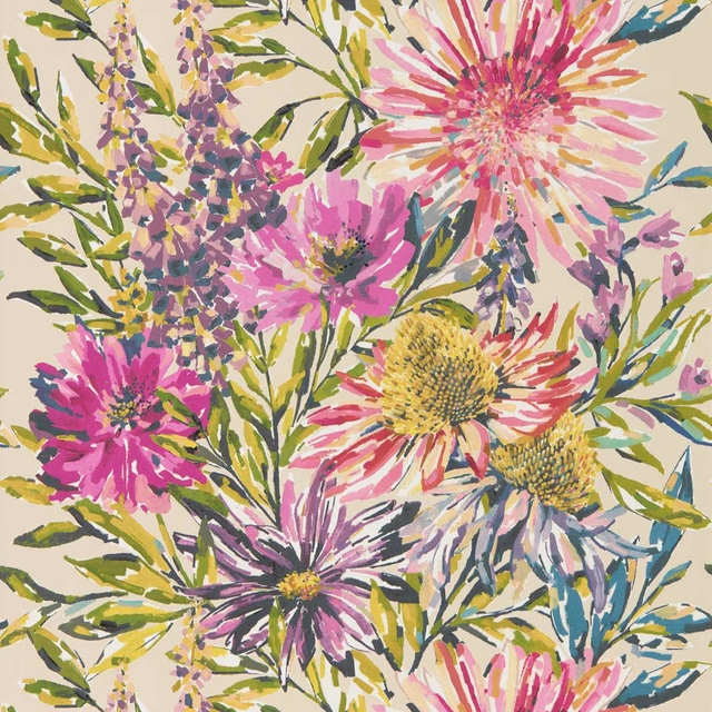
Floreale Wide Width Tangerine/Fuchsia
Colour 2 Wallpapers
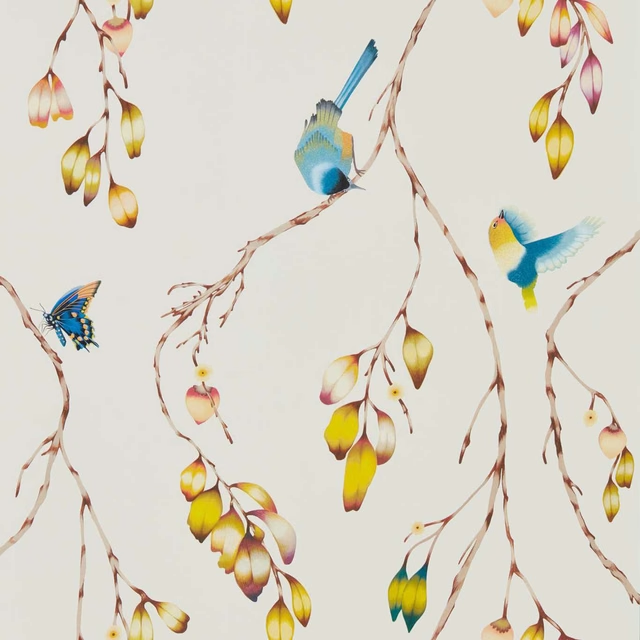
Iyanu Wide Width Papaya/Kiwi
Colour 2 Wallpapers
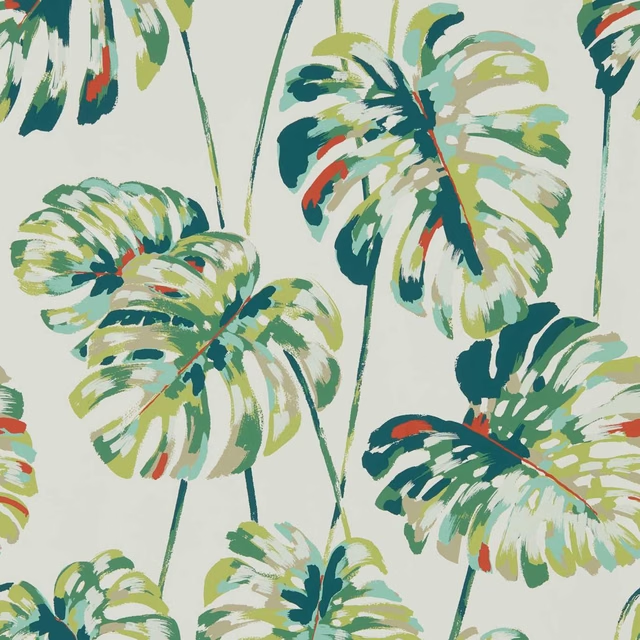
Kelapa Wide Width Emerald/Zest
Colour 2 Wallpapers
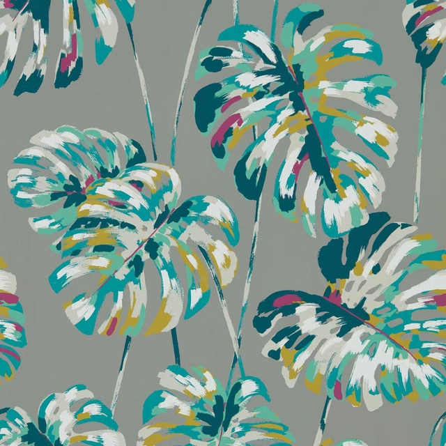
Kelapa Wide Width Lagoon/Cerise
Colour 2 Wallpapers

Koto Wide Width Steel
Colour 2 Wallpapers
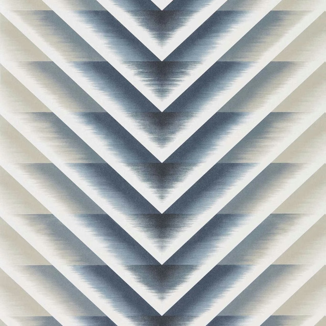
Makalu Wide Width Moonlight
Colour 2 Wallpapers
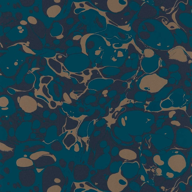
Marble Wide Width Azurite/ Copper/Japanese Ink
Colour 2 Wallpapers
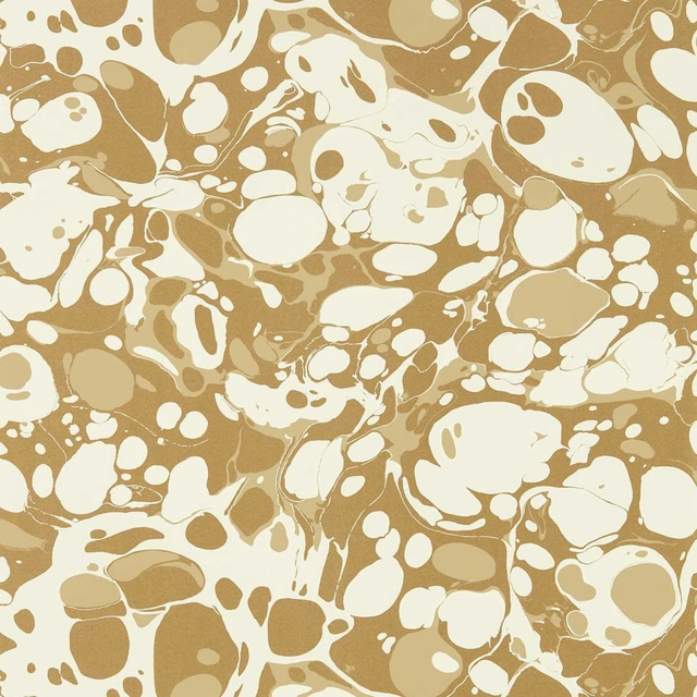
Marble Wide Width Incense/Soft Focus/Gold
Colour 2 Wallpapers

Melodic Wide Width Gold/Black Earth
Colour 2 Wallpapers
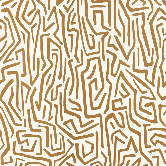
Melodic Wide Width Gold/Paper Lantern
Colour 2 Wallpapers
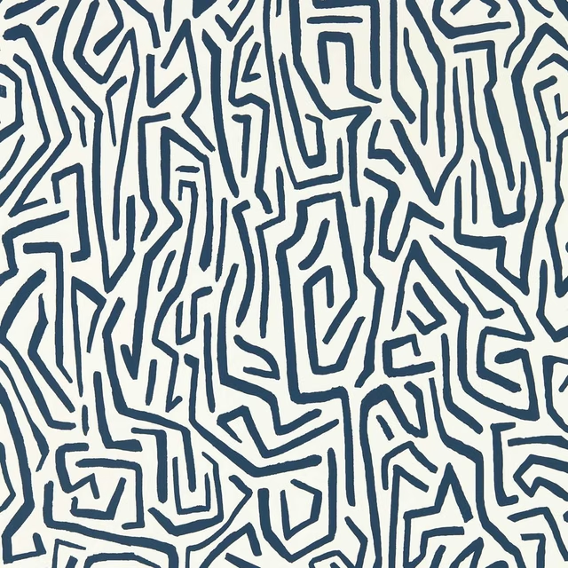
Melodic Wide Width Japanese Ink/Origami
Colour 2 Wallpapers
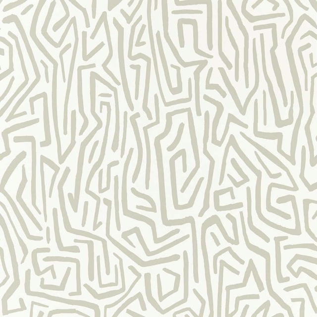
Melodic Wide Width Stone/Awakening
Colour 2 Wallpapers
Pairs well with
A pattern needs somewhere for the eye to rest, so these are the plains and textures that sit beside Marble Wide Width Awakening/Oyster/Champagne without fighting it. Mixed across the houses we hold, which is the part a single supplier's book cannot do.

Alaska Oyster
Alaska Collection
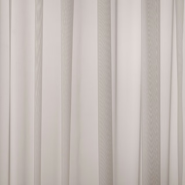
Baltic Shell
Atlantic Collection
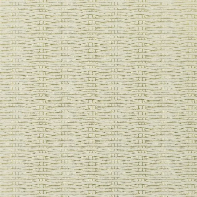
Barbade Or Wallpaper
Nouveaux Mondes WALLPAPER

Albany Ivory
Albany and Moray

Moray Ivory
Albany and Moray

Brandon Sand
Albeck
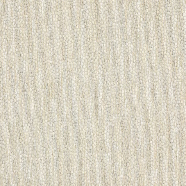
Lyncombe Moonstone
Albeck
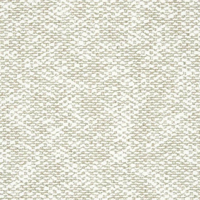
Genval Gesso
AALTER FABRICS
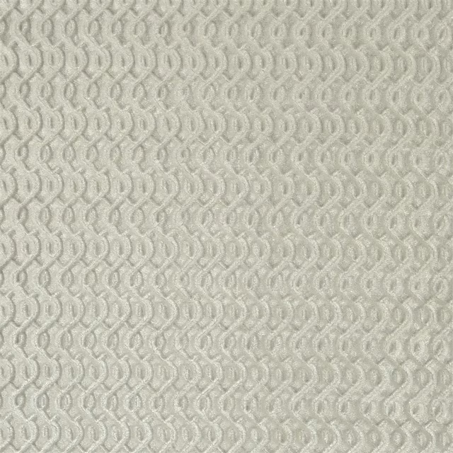
Stanmer Mist
Cassan Fabrics

Bordeaux Plain Natural
Eco -Friendly Ranges
Forte FR Cream
Forte FR

Amalfi Dove
Amalfi
Paint that goes with it
Two ways to take the room. Both colours are from houses we hold, so a pot can come off the same order as the cloth. Screens shift colour, so treat these as a direction and bring the cloth to the shelf before you buy the paint.
To sit quietly behind it
Whitening
Little Greene · #f4f2e5
To stand against it
Pegwell Bay
Coat Paints · #b58772
Other cream fabrics
Across the houses we hold. See all 4,572.
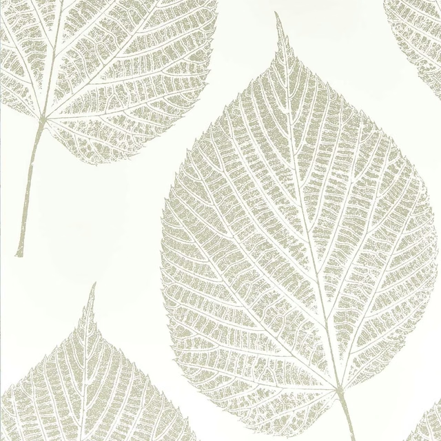
Leaf Chalk/Silver
Colour 1 Wallpapers
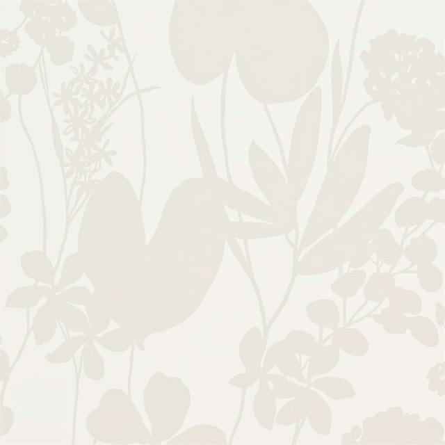
Nalina Pearl
Colour 1 Wallpapers
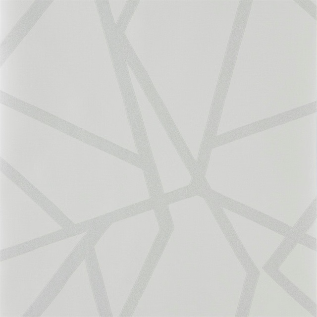
Sumi Shimmer Wide Width Porcelain/Linen
Colour 1 Wallpapers
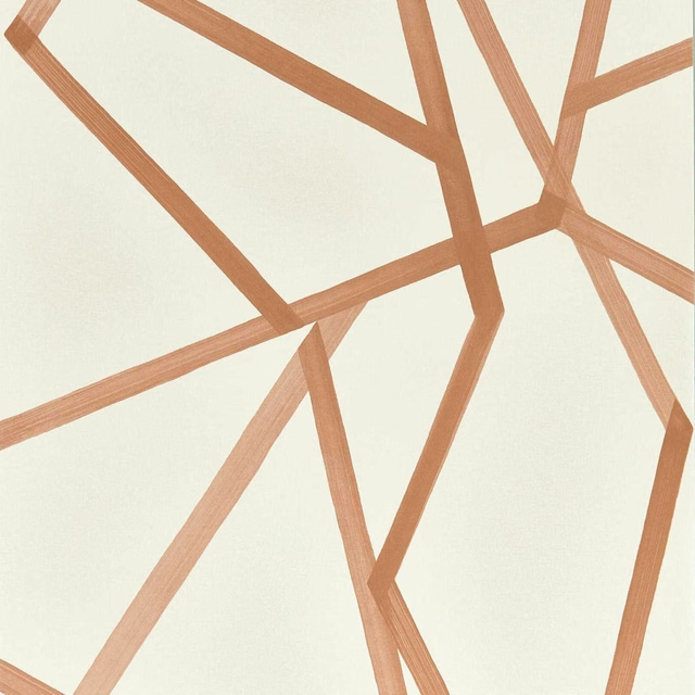
Sumi Wide Width Linen/Copper
Colour 1 Wallpapers
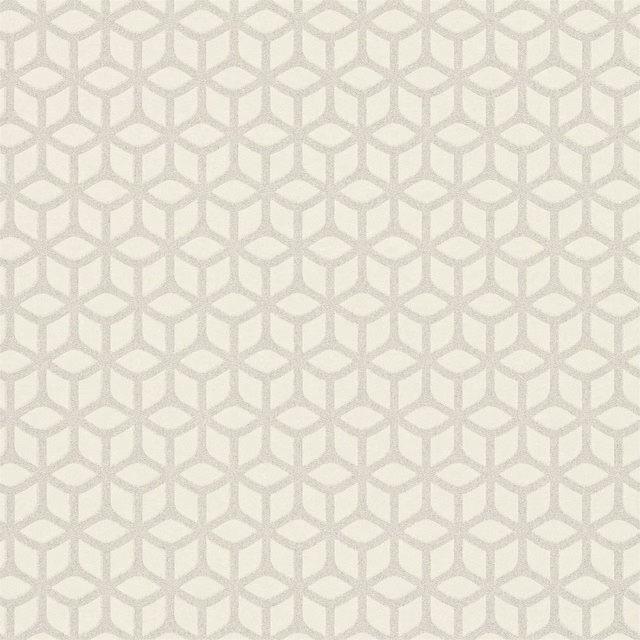
Trellis Pearl
Colour 1 Wallpapers
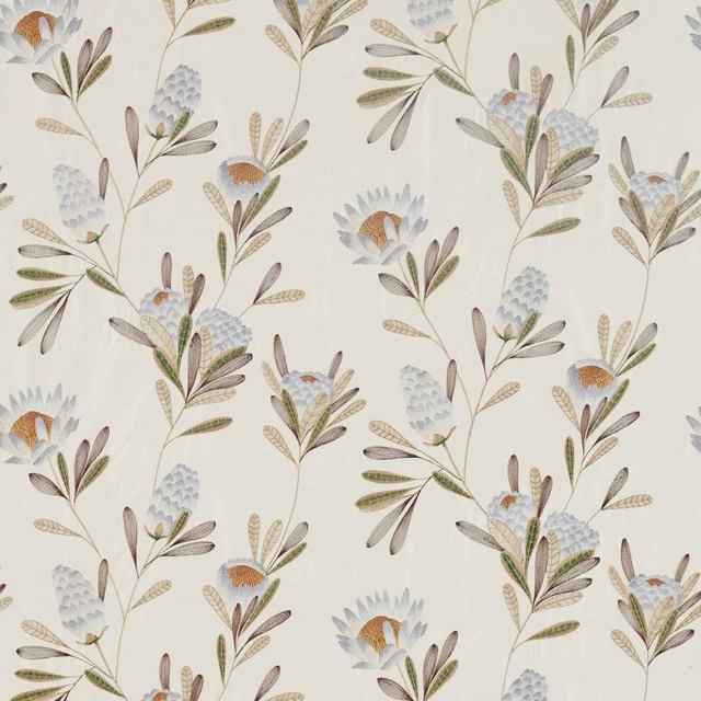
Cayo Mist/Linen
Colour 2 Fabrics
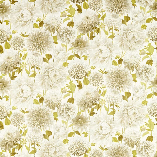
Dahlia Fig Blossom/Nectar/Awakening
Colour 2 Fabrics
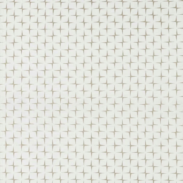
Issoria Pearl
Colour 2 Fabrics
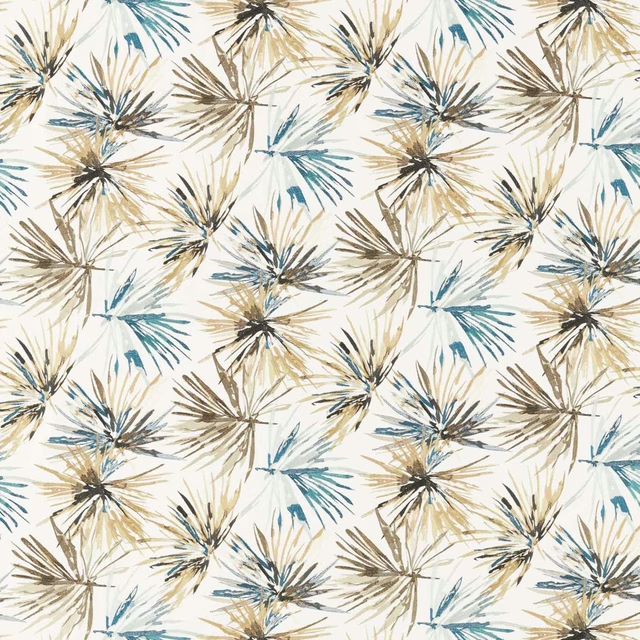
Aucuba Embroidery Ink/Gold
Colour 3 Fabrics

Khorol Almond/Diffused Light
Colour 3 Fabrics
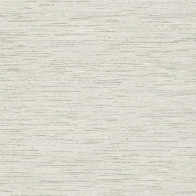
Seri Wide Width Parchment
Colour 3 Wallpapers
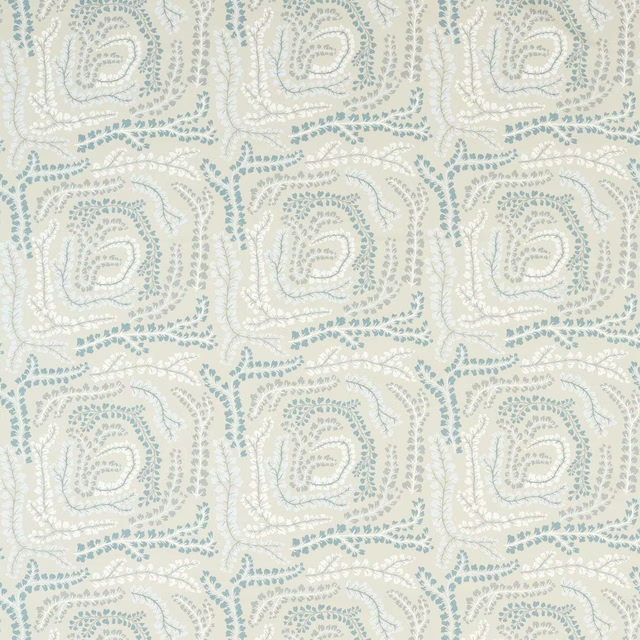
Fayola Tranquility/Exhale/Celestial
Colour 4 Fabrics