
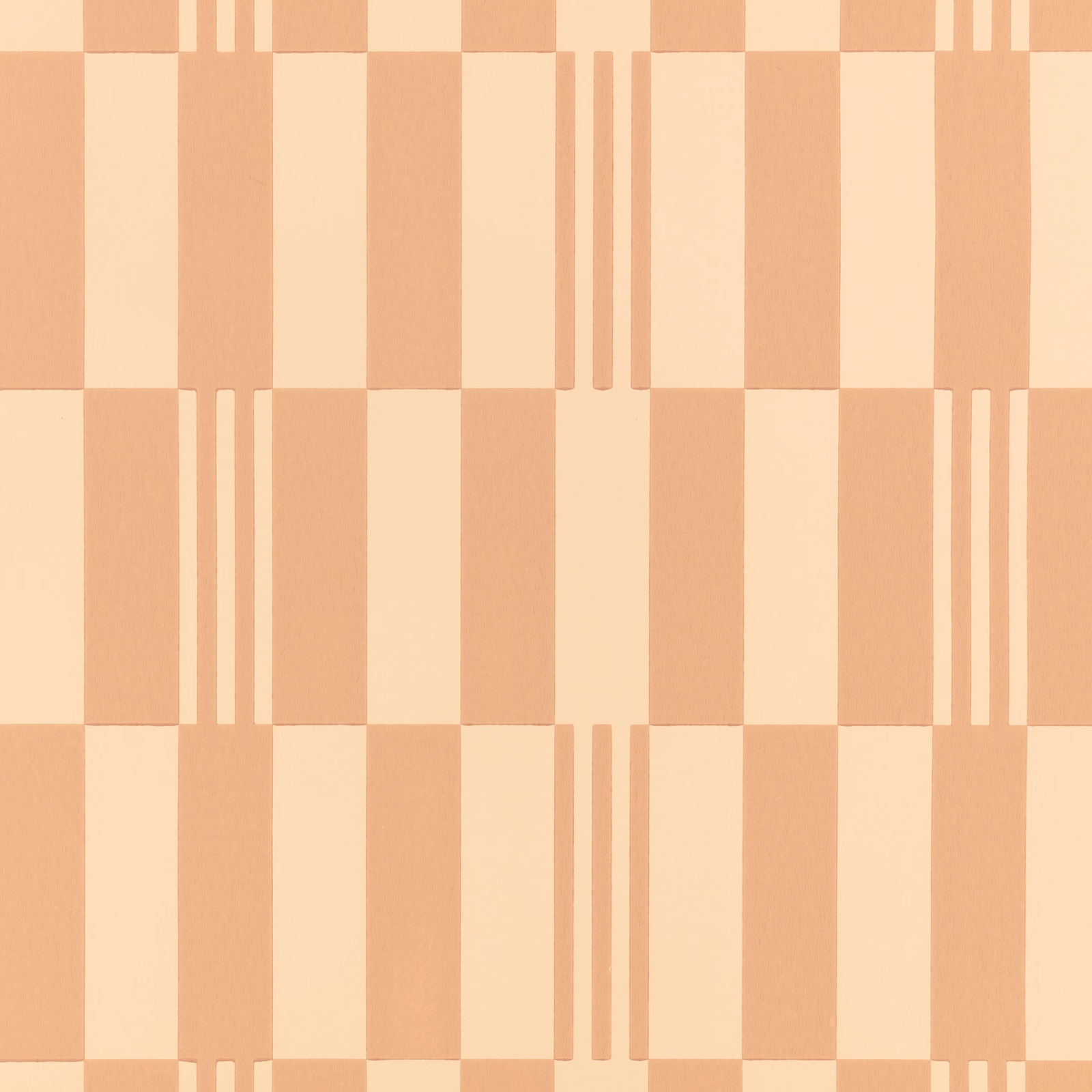

Tap the swatch to see it full screen. Hover it to magnify the weave. Colours on a screen are a guide, not a match, so come and feel the real cloth.
Scroll up or down to zoom in and out.
Checkerboard Wallcovering Pink Apricot
Wallcoverings Vol 2 Wallpaper
Checkerboard Wallcovering Pink Apricot combines warm pink-apricot and creamy ivory blocks in a precise geometric layout. Narrow triple-stripe details interrupt the checks, adding a distinctive linear accent to the pattern.
You have used your previews for today. Send one to Simon and you can carry on.
Your board
0 fabrics
See this wallpaper on Kirkby Design's own site, then order it through us.
See Checkerboard Wallcovering Pink Apricot in your own room
A photograph of the piece you want re-covered. Straight on is best, and daylight helps. It is used to make your picture and nothing else.
Looking at your room
We found things here Checkerboard Wallcovering Pink Apricot could go on. Tap one on the photograph, or choose below.
We could not see anything to re-cover
, s
Checkerboard Wallcovering Pink Apricot, on your
Drag to compare. AI impression, colours indicative: ask us for a cutting before you decide.
About this wallpaper
Large rectangular checks alternate between soft pink-apricot and pale cream, giving this colourway a warm, gently sunlit character rather than a strong or saturated contrast. At selected joins, groups of three slim vertical lines break up the blocks and sharpen the architectural rhythm. The surface visible in the swatch has a subtle, low-sheen texture that keeps the apricot tones feeling softly tactile. Catalogued as wallpaper, it offers a graphic wall treatment with a measured, tailored quality.
How to use it
Use the warm pink-apricot tone in a bedroom, dressing room or welcoming sitting room where its creamy contrast can feel light and softly retro. Pair it with natural timber, ivory upholstery and muted terracotta accents to echo the wallpaper’s warmth without competing with its geometry.
Use this warm apricot-and-cream graphic to bring a softly retro, tailored rhythm to walls.
More from Wallcoverings Vol 2
The same book, other colourways.
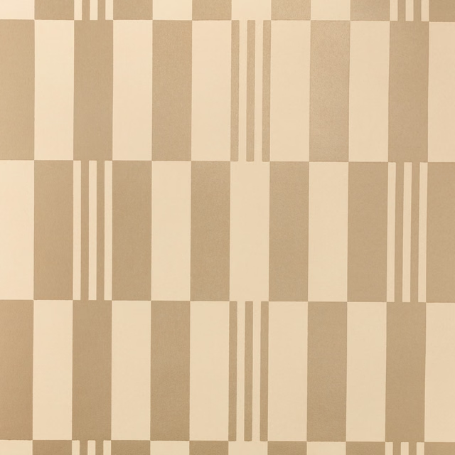
Checkerboard Metallic Wallcovering Champagne
Wallcoverings Vol 2
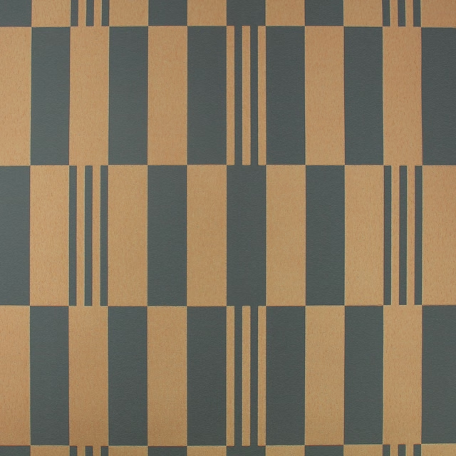
Checkerboard Metallic Wallcovering Panther
Wallcoverings Vol 2
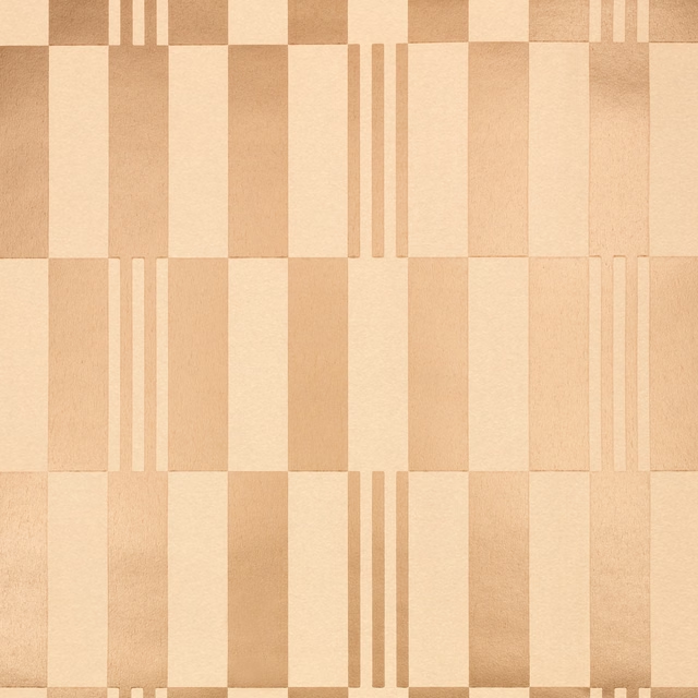
Checkerboard Metallic Wallcovering Rose Gold
Wallcoverings Vol 2
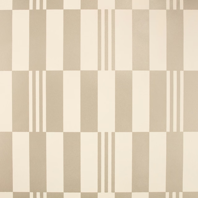
Checkerboard Metallic Wallcovering Silver Grey
Wallcoverings Vol 2
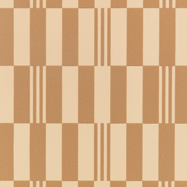
Checkerboard Wallcovering Chai
Wallcoverings Vol 2

Checkerboard Wallcovering Chalk
Wallcoverings Vol 2
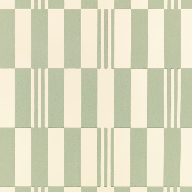
Checkerboard Wallcovering Pistachio
Wallcoverings Vol 2
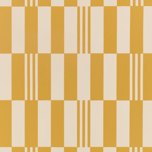
Checkerboard Wallcovering Sunshine
Wallcoverings Vol 2
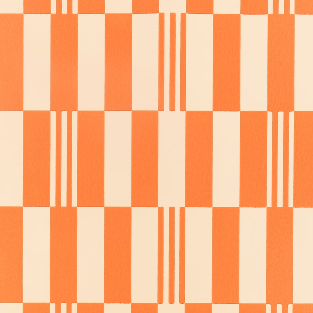
Checkerboard Wallcovering Tangelo
Wallcoverings Vol 2
Fragment Wallcovering Chai
Wallcoverings Vol 2
Fragment Wallcovering Chalk
Wallcoverings Vol 2
Fragment Wallcovering Monochrome
Wallcoverings Vol 2
Pairs well with
A pattern needs somewhere for the eye to rest, so these are the plains and textures that sit beside Checkerboard Wallcovering Pink Apricot without fighting it. Mixed across the houses we hold, which is the part a single supplier's book cannot do.

Bronte Saffron
Darwin Collection

Omari Nectarine
Omari Collection

Amalfi Flame
Amalfi

Rowland Turmeric
Burlington

Cosima Coral
Cosima Velvet II

Dante Burnt Orange
Dante Velvet

Bordeaux Plain Burnt Orange
Eco -Friendly Ranges
Carnaby Bronze
Magma
Florio Amber
Florio Plains

Camden Ochre
Camden
Hampton Plain Rust
Hampton

Astor Pumpkin
Astor
Paint that goes with it
Two ways to take the room. Both colours are from houses we hold, so a pot can come off the same order as the cloth. Screens shift colour, so treat these as a direction and bring the cloth to the shelf before you buy the paint.
To sit quietly behind it
Stone-Pale-Warm
Little Greene · #f3d5af
To stand against it
Indian Yellow
Little Greene · #ede068
Other orange fabrics
Across the houses we hold. See all 784.

Sculpt Burnt Orange
Sculpt

Soda Fr Pumpkin
Soda
Spritz Fr Tangerine
Spritz Fr
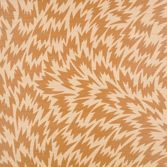
Flash Wallcovering Burnt Orange
Kirkby Design X Eley Kishimoto Edition Ii Wallcovering
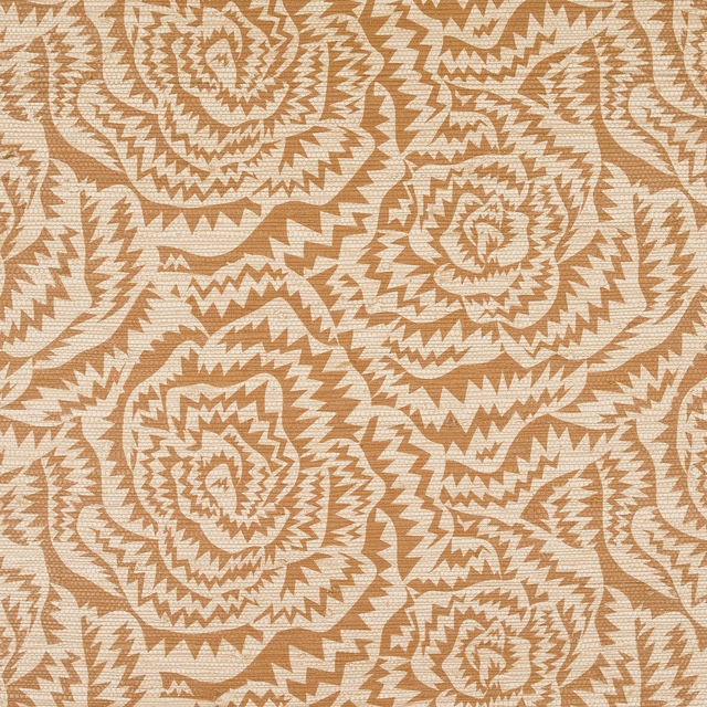
Jagged Roses Wallcovering Burnt Orange
Kirkby Design X Eley Kishimoto Edition Ii Wallcovering
Solid Wallcovering Burnt Orange
Kirkby Design X Eley Kishimoto Edition Ii Wallcovering

Roden Mango
Alston

Celino Copper
Celino

Celino Koi
Celino

Celino Pumpkin
Celino

Dune Pumpkin
Dune

Emin Cinnabar
Emin