


Tap the swatch to see it full screen. Hover it to magnify the weave. Colours on a screen are a guide, not a match, so come and feel the real cloth.
Scroll up or down to zoom in and out.
Scribble Wallcovering Chalk
Wallcoverings Vol 2 Wallpaper
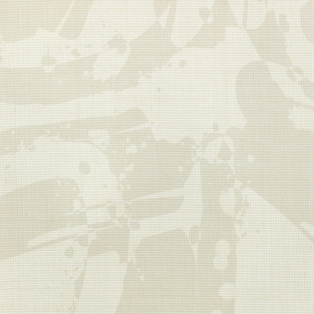
Scribble Wallcovering Chalk pairs a pale chalky ivory ground with loosely scattered, hand-drawn-looking marks in a soft grey-beige tone. The low-contrast design feels light and airy, with enough irregular linework to keep the surface visually engaging.
You have used your previews for today. Send one to Simon and you can carry on.
Your board
0 fabrics
See this wallpaper on Kirkby Design's own site, then order it through us.
See Scribble Wallcovering Chalk in your own room
A photograph of the piece you want re-covered. Straight on is best, and daylight helps. It is used to make your picture and nothing else.
Looking at your room
We found things here Scribble Wallcovering Chalk could go on. Tap one on the photograph, or choose below.
We could not see anything to re-cover
, s
Scribble Wallcovering Chalk, on your
Drag to compare. AI impression, colours indicative: ask us for a cutting before you decide.
About this wallpaper
The design is made up of fine, broken scribble lines and small isolated strokes, dispersed across the pale ground rather than arranged in a regular repeat. Its chalk tone reads as a warm, softened ivory, while the muted grey marks add gentle definition without becoming a strong graphic contrast. The supplied catalogue identifies this item as wallpaper from Kirkby Design’s Wallcoverings Vol 2 collection, with no performance features or further specification data noted. Viewed as a whole, the colourway has a quiet, relaxed character suited to interiors where texture and subtle movement matter more than bold pattern.
How to use it
Use the chalky ivory background as a soft alternative to plain white, pairing it with warm oak, pale upholstery and muted stone accents. The faint grey scribble marks also sit comfortably alongside brushed metal, natural linen and restrained monochrome details.
Use this soft chalk-and-grey colourway to bring quiet, low-contrast movement to bedrooms, hallways or calm living spaces.
More from Wallcoverings Vol 2
The same book, other colourways.
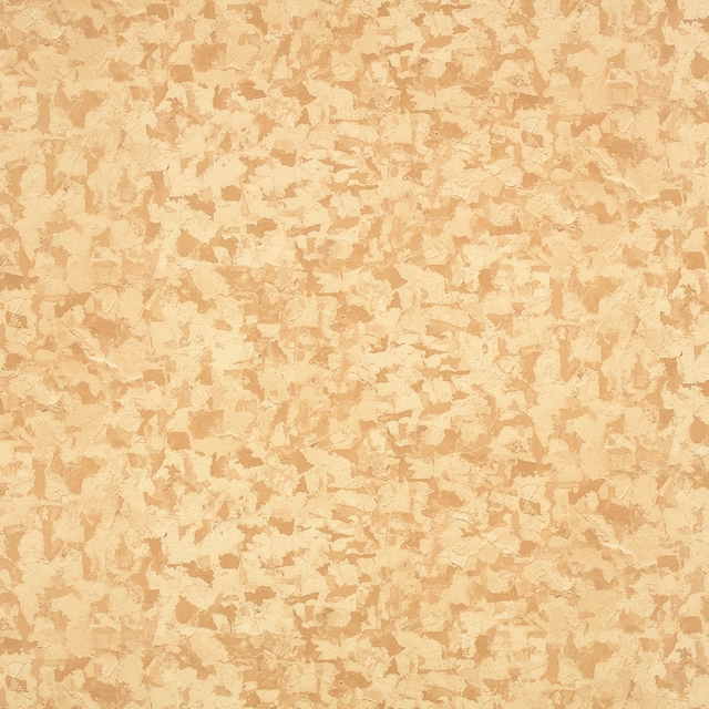
Fragment Wallcovering Chai
Wallcoverings Vol 2
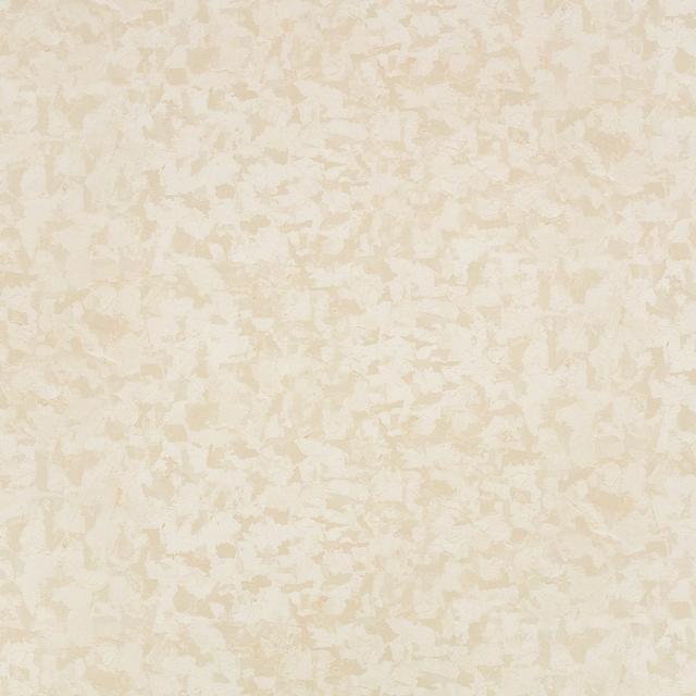
Fragment Wallcovering Chalk
Wallcoverings Vol 2
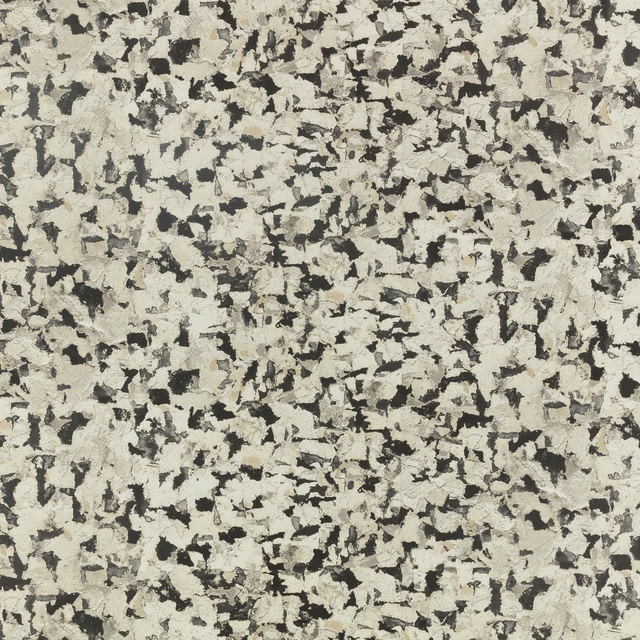
Fragment Wallcovering Monochrome
Wallcoverings Vol 2
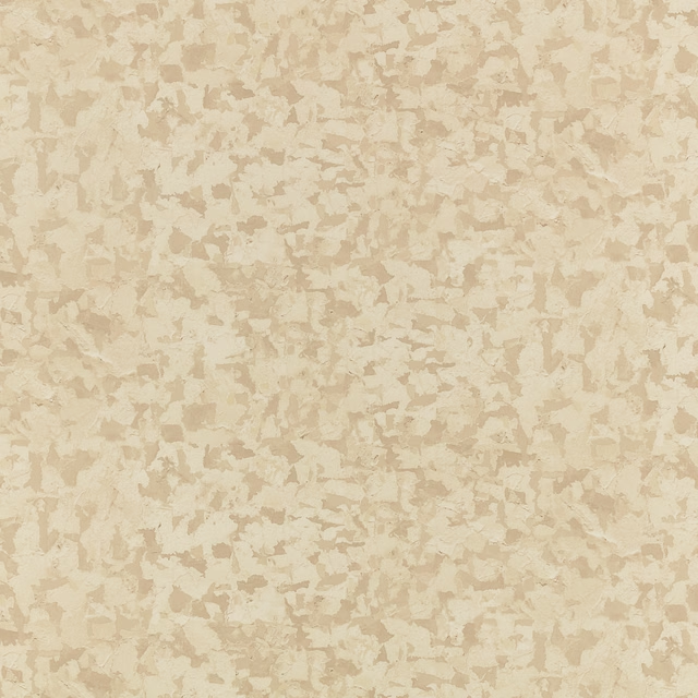
Fragment Wallcovering Natural
Wallcoverings Vol 2
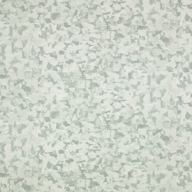
Fragment Wallcovering Silver Grey
Wallcoverings Vol 2
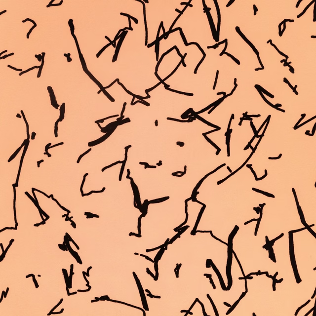
Scribble Wallcovering Amber
Wallcoverings Vol 2
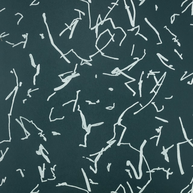
Scribble Wallcovering Noir
Wallcoverings Vol 2
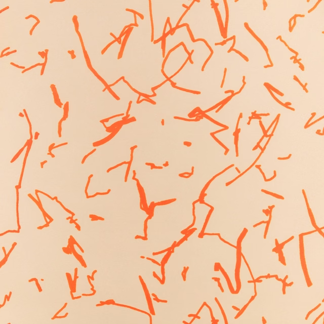
Scribble Wallcovering Tangelo
Wallcoverings Vol 2
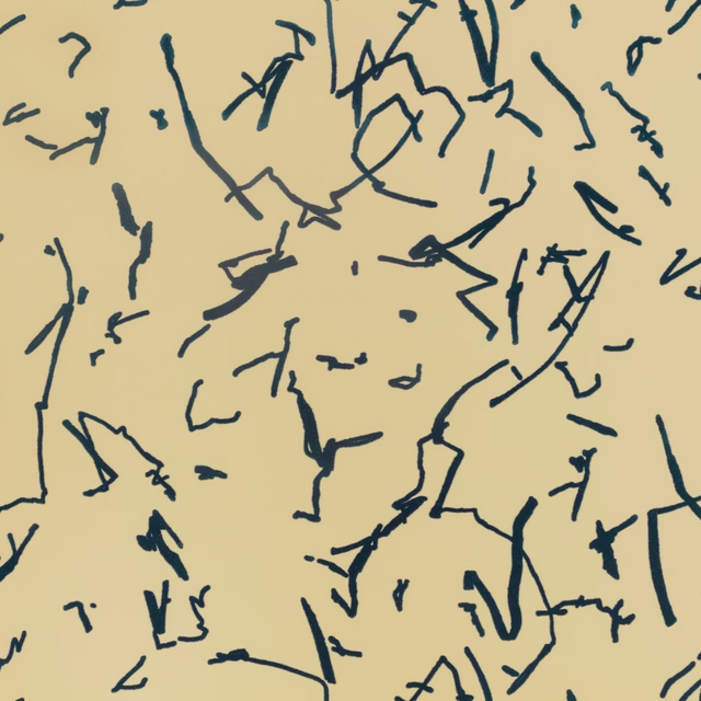
Scribble Wallcovering Zest
Wallcoverings Vol 2
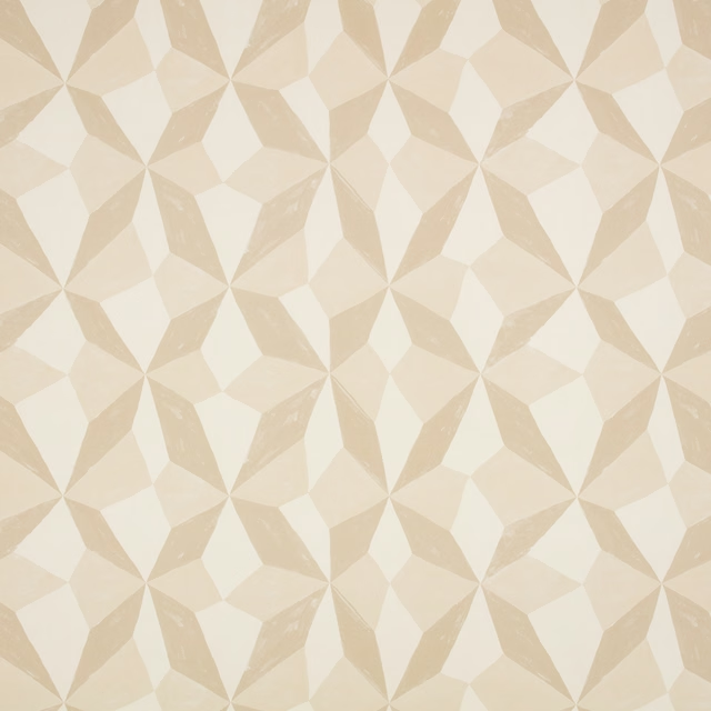
Stars Wallcovering Natural
Wallcoverings Vol 2
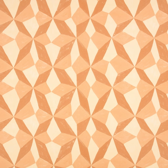
Stars Wallcovering Pink Apricot
Wallcoverings Vol 2
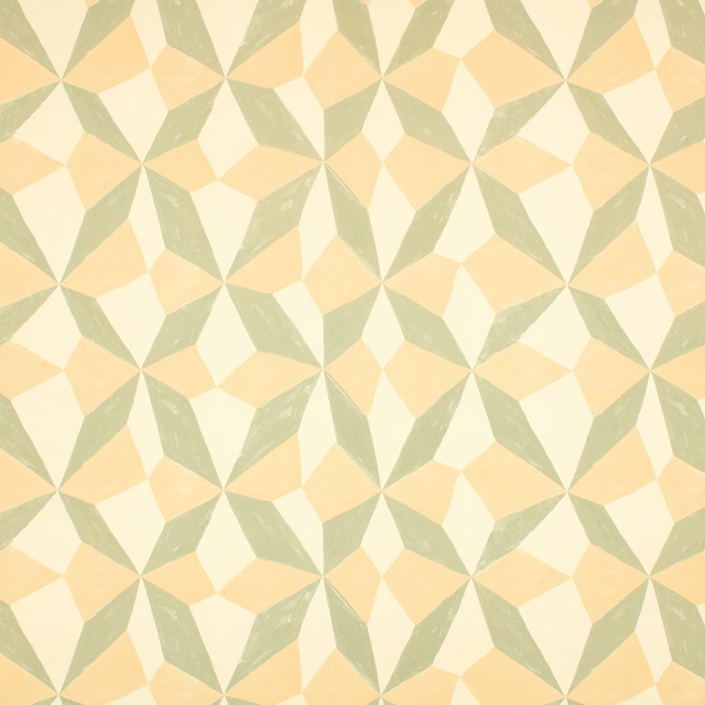
Stars Wallcovering Pistachio
Wallcoverings Vol 2
Pairs well with
A pattern needs somewhere for the eye to rest, so these are the plains and textures that sit beside Scribble Wallcovering Chalk without fighting it. Mixed across the houses we hold, which is the part a single supplier's book cannot do.
Paint that goes with it
Two ways to take the room. Both colours are from houses we hold, so a pot can come off the same order as the cloth. Screens shift colour, so treat these as a direction and bring the cloth to the shelf before you buy the paint.
To sit quietly behind it
Canvas
Zoffany · #ebe3d0
To stand against it
Pan
Coat Paints · #857d5b
Other cream fabrics
Across the houses we hold. See all 4,572.
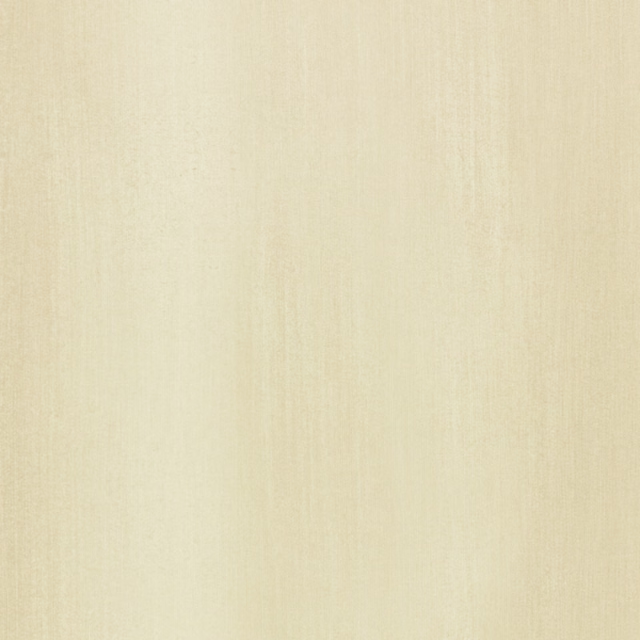
Blend Wallcovering Flax
Wallcoverings Vol 1
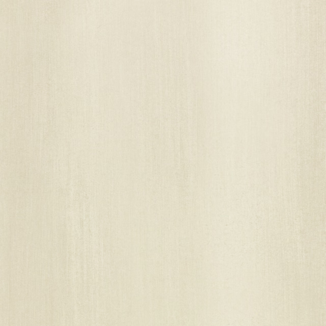
Blend Wallcovering Jute
Wallcoverings Vol 1
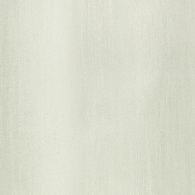
Blend Wallcovering Shell
Wallcoverings Vol 1
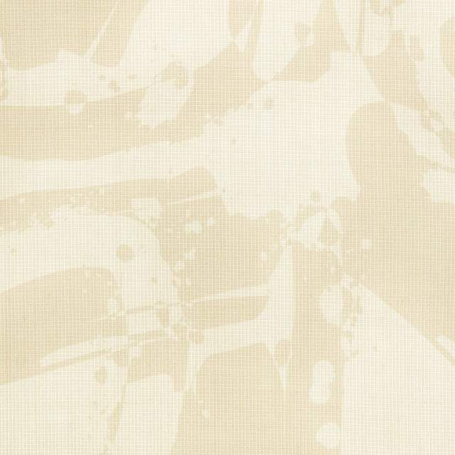
Glade Wallcovering Chalk
Wallcoverings Vol 1
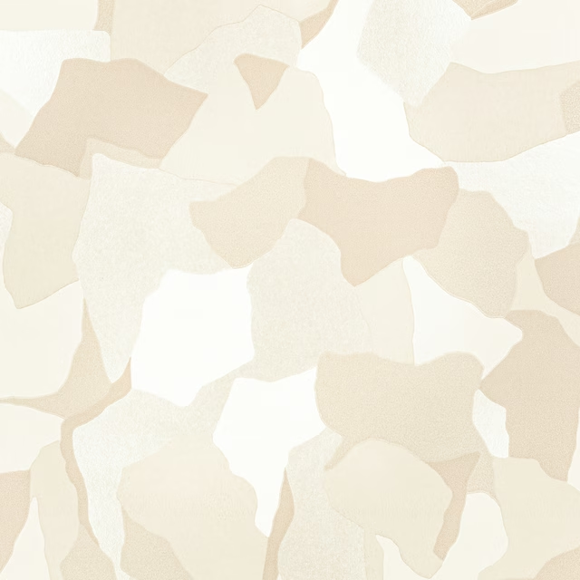
Hidden Wallcovering Chalk
Wallcoverings Vol 1
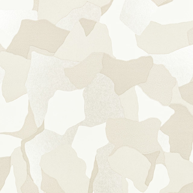
Hidden Wallcovering Shell
Wallcoverings Vol 1

Mist Wallcovering Jute
Wallcoverings Vol 1
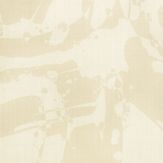
Reclaim Wall Mural Chalk
Wallcoverings Vol 1
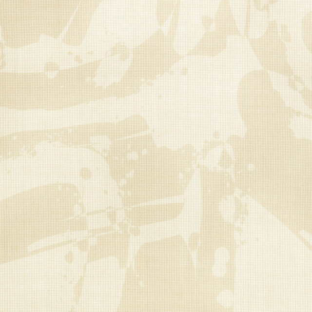
Studio Wall Mural Chalk
Wallcoverings Vol 1
Vandal Wall Mural Shell
Wallcoverings Vol 1
Asuri Coconut
Asuri

Asuri Oyster
Asuri