

Tap the swatch to see it full screen. Hover it to magnify the weave. Colours on a screen are a guide, not a match, so come and feel the real cloth.
Scroll up or down to zoom in and out.
Portland Stone
Neutrals Paint
Portland Stone is a quiet Little Greene neutral with the feel of aged stone and softened beige. It sits comfortably between warmth and restraint, making it an easy colour to live with on walls or woodwork.
You have used your previews for today. Send one to Simon and you can carry on.
Your board
0 fabrics
See this colour on Little Greene's own site, then order it through us.
See Portland Stone in your own room
A photograph of the piece you want re-covered. Straight on is best, and daylight helps. It is used to make your picture and nothing else.
Looking at your room
We found things here Portland Stone could go on. Tap one on the photograph, or choose below.
We could not see anything to re-cover
, s
Portland Stone, on your
Drag to compare. AI impression, colours indicative: ask us for a cutting before you decide.
About this colour
This shade reads as a muted warm neutral with a gentle green-grey undertone, so it never feels stark or sugary. Its #C9C5A8 value gives it enough depth to hold a room together while still lifting the light more than a deeper taupe would. In a north-facing room it can look cooler and slightly more stone-like, with the green-grey note becoming clearer; in south-facing light it warms up and shows more of its beige side. It works well beside natural oak, walnut and painted joinery, and it gives a calm backdrop to linen, wool and patterned upholstery in earthy or chalky tones.
How to use it
It suits sitting rooms, hallways and bedrooms where you want a settled neutral that will not fight with furniture. Use it with painted skirtings, window frames or built-in joinery, and pair it with muted greens, tobacco browns, navy or off-white upholstery.
A grounded neutral like this makes a room feel calm without going flat.
More from Neutrals
The same book, other colourways.

Rolling Fog - Pale
Neutrals

Slaked Lime - Mid
Neutrals

French Grey - Mid
Neutrals

Portland Stone - Light
Neutrals

Rolling Fog - Light
Neutrals

French Grey
Neutrals

Slaked Lime - Deep
Neutrals

Slaked Lime - Dark
Neutrals

French Grey - Dark
Neutrals

Portland Stone - Dark
Neutrals

Rolling Fog - Dark
Neutrals

Silt
Neutrals
Pairs well with
Portland Stone is a wall colour, so these are the cloths that sit against it: one of them on the curtains, the paint behind. Mixed across the houses we hold, which is the part a single supplier's book cannot do.
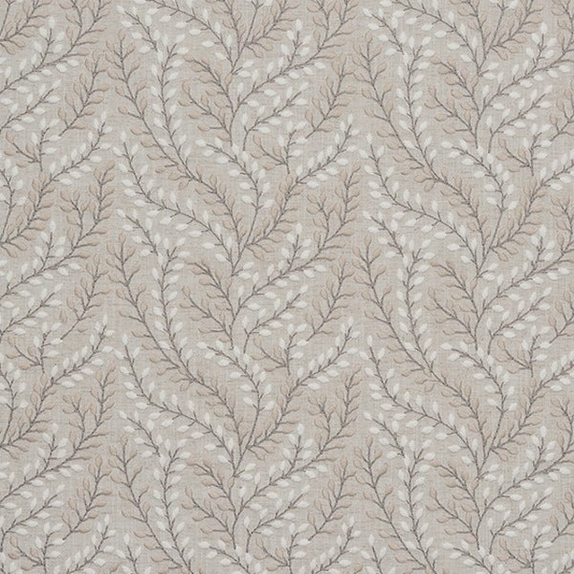
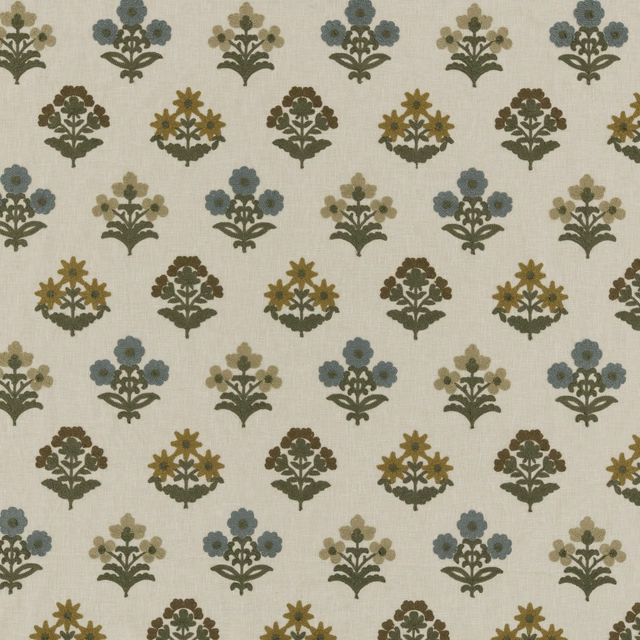
Shimla Natural
What's New
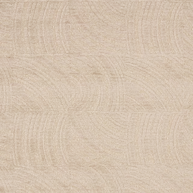
Moulin Natural
Moulin

Jenson Beige
Jenson Linen

Oliver Wallcovering Beige
Naturals IV

Roumier Vanilla
Carlu WALLPAPER
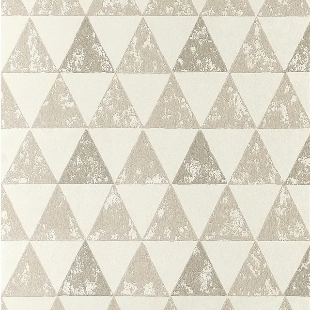
Dorsoduro Ivory
Foscari Fresco Wallpaper
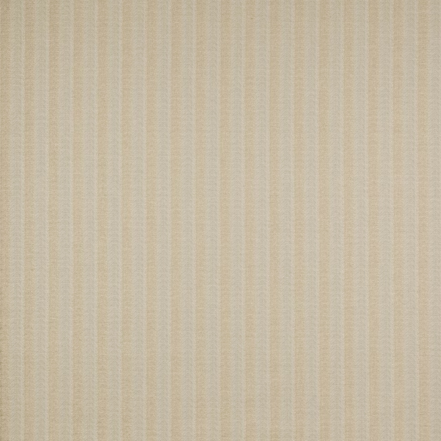
Holt Beige
Boscombe
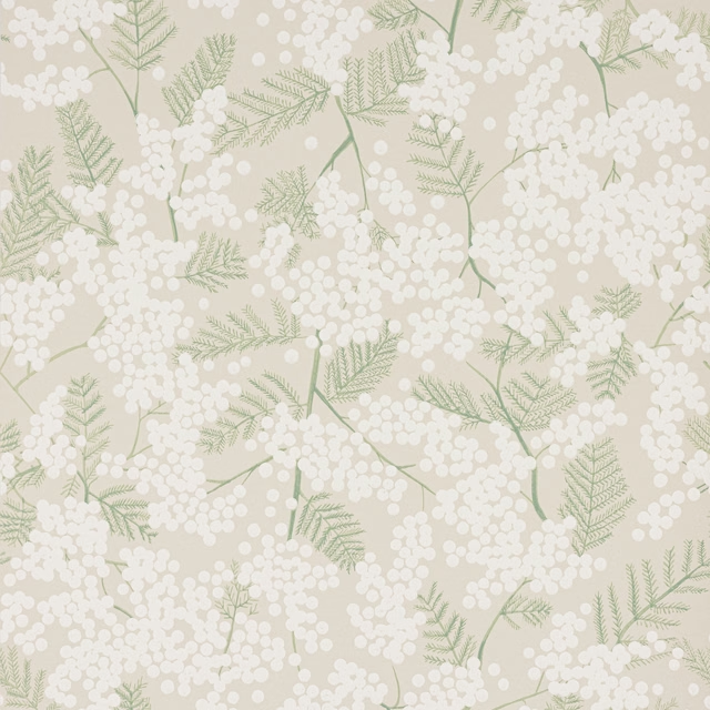
Mimosa Wallpaper Beige
Camber Wallpapers
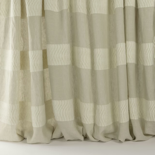
Meadow Linen
Longwood
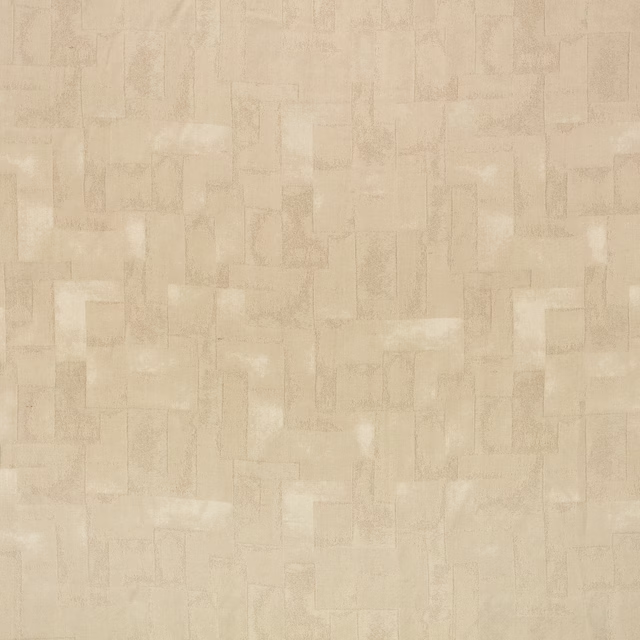
Portland Spacedust
Holland Park

Boa Kudu
Muoto
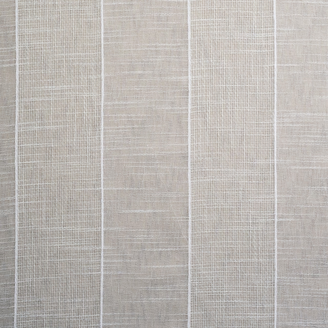
Arklepe
Sheers Vol 2 Collection
Other neutral fabrics
Across the houses we hold. See all 911.
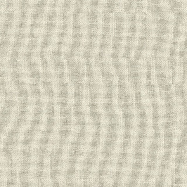
01 Rabbit
Tenby
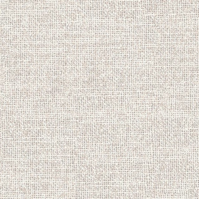
21 Dusk
Bromley

Fescue
Greys

Rubine Ashes
Greys

Mono
Pastels
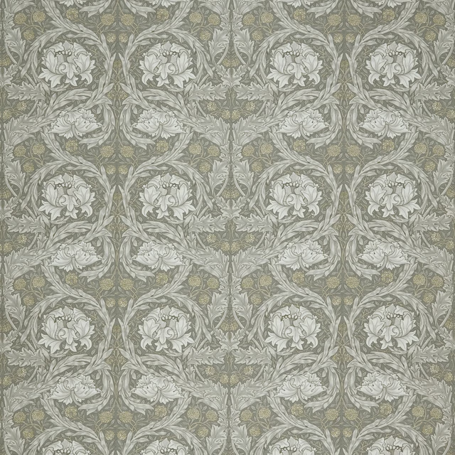
African Marigold Limestone
Kelmscott Gardens Vol II
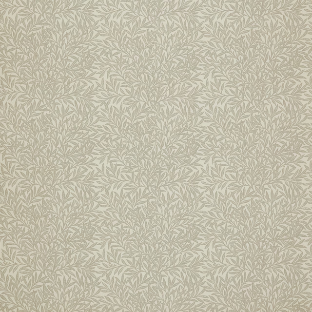
Willow Jute
Kelmscott Gardens Vol II
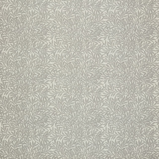
Willow Limestone
Kelmscott Gardens Vol II
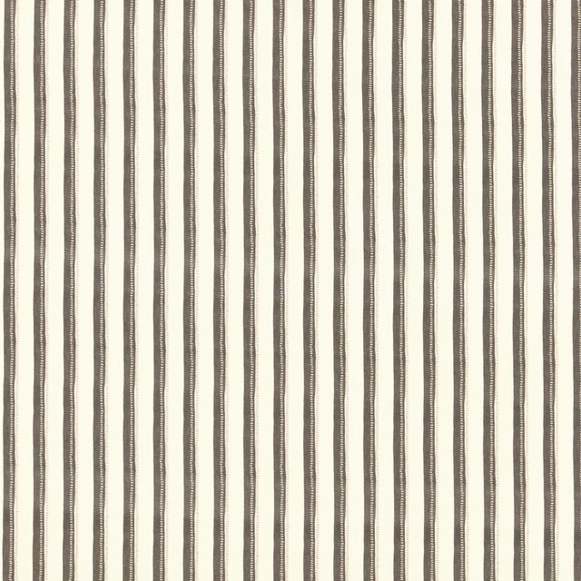
Mallory Charcoal
Paloma Collection
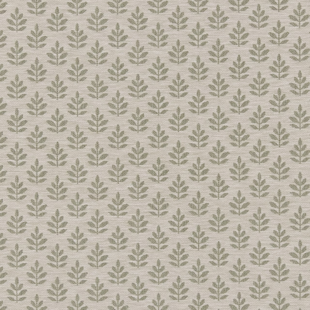
Winniesa
Lina Weaves Vol 1 Collection
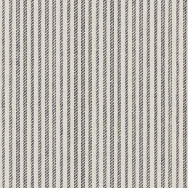
Cassiein
Lina Weaves Vol 1 Collection
Connie Maize
Eliza Collection