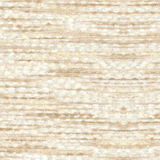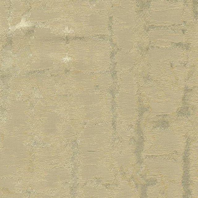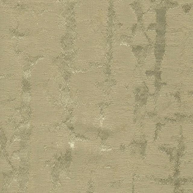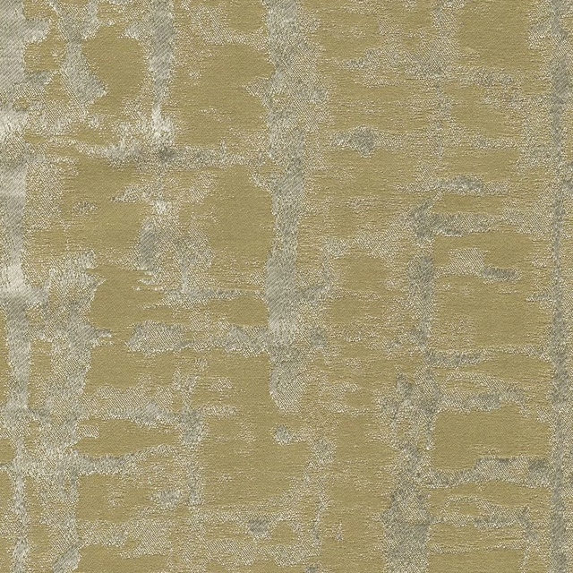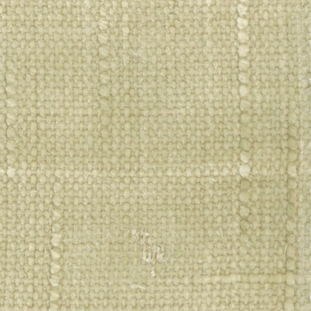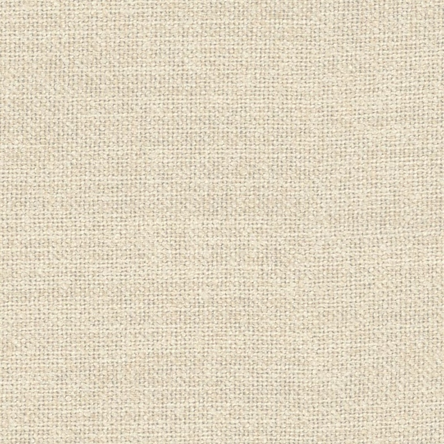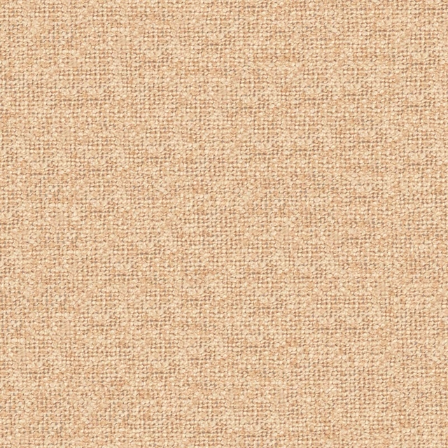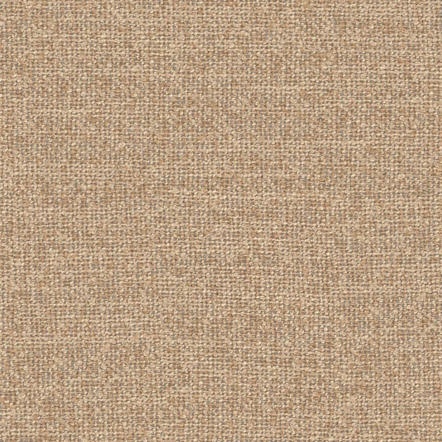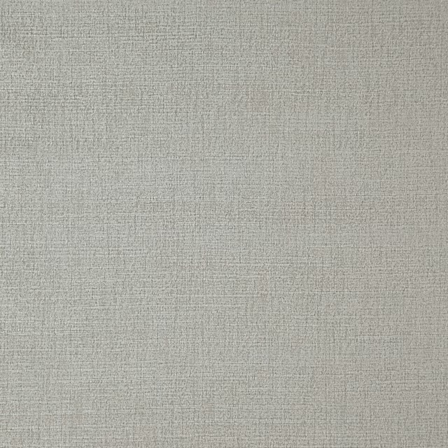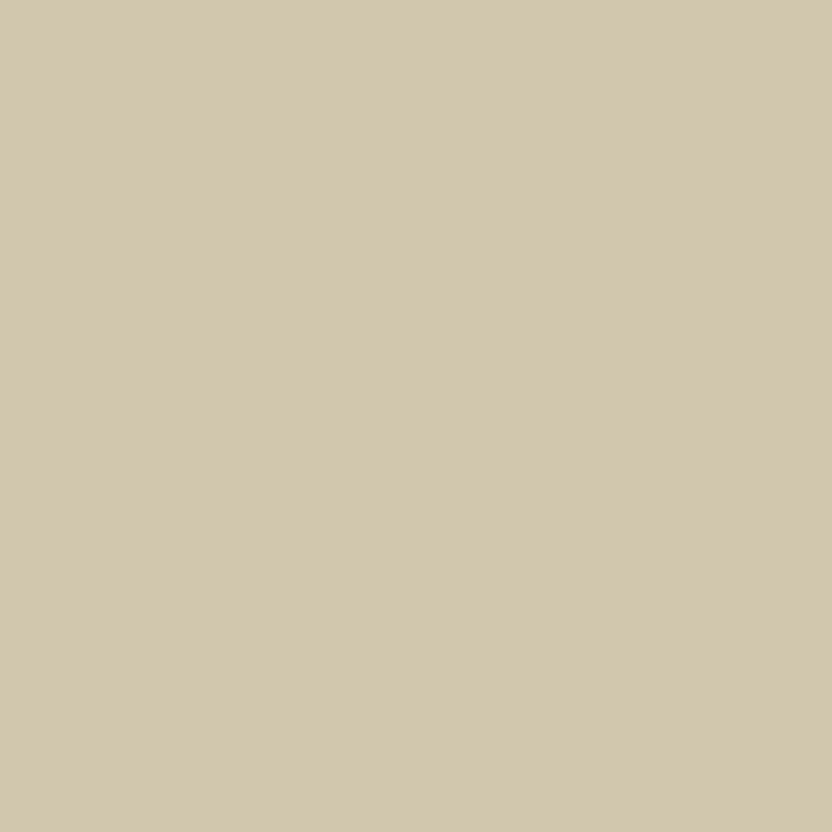
Tap the swatch to see it full screen. Hover it to magnify the weave. Colours on a screen are a guide, not a match, so come and feel the real cloth.
Scroll up or down to zoom in and out.
Slaked Lime - Deep
Neutrals Paint
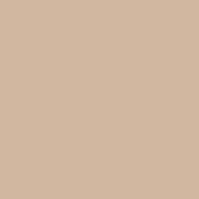
Slaked Lime - Deep is a quietly earthy neutral with a softened, chalky beige-grey presence. It sits in Little Greene’s Neutrals range and feels settled rather than stark.
You have used your previews for today. Send one to Simon and you can carry on.
Your board
0 fabrics
See this colour on Little Greene's own site, then order it through us.
See Slaked Lime - Deep in your own room
A photograph of the piece you want re-covered. Straight on is best, and daylight helps. It is used to make your picture and nothing else.
Looking at your room
We found things here Slaked Lime - Deep could go on. Tap one on the photograph, or choose below.
We could not see anything to re-cover
, s
Slaked Lime - Deep, on your
Drag to compare. AI impression, colours indicative: ask us for a cutting before you decide.
About this colour
In #D2C7AE, this colour reads as a warm, muted stone tone with enough beige in it to feel welcoming and enough grey to keep it restrained. On a wall it absorbs more light than a pale off-white, so it gives a room a gentler, more grounded atmosphere without looking heavy. In north-facing light it can lean slightly cooler and more taupe, while in south-facing rooms the warmer beige notes come forward and the colour feels softer and more sunlit. It works well beside natural oak, dark walnut and painted joinery, and it gives a calm backdrop to linen, wool and patterned upholstery in muted greens, browns and clay tones.
How to use it
Use it in sitting rooms, bedrooms or hallways where you want a neutral with more depth than cream. It suits timber panelling, skirtings and doors, and sits especially well with oatmeal, moss and brown upholstery.
A warm neutral on the wall that feels calm and settled.
More from Neutrals
The same book, other colourways.
Slaked Lime - Mid
Neutrals

French Grey - Mid
Neutrals

Portland Stone - Light
Neutrals

Rolling Fog - Light
Neutrals

French Grey
Neutrals

Portland Stone
Neutrals

Slaked Lime - Dark
Neutrals
French Grey - Dark
Neutrals
Portland Stone - Dark
Neutrals
Rolling Fog - Dark
Neutrals
Silt
Neutrals

Pearl Colour - Pale
Neutrals
Pairs well with
Slaked Lime - Deep is a wall colour, so these are the cloths that sit against it: one of them on the curtains, the paint behind. Mixed across the houses we hold, which is the part a single supplier's book cannot do.
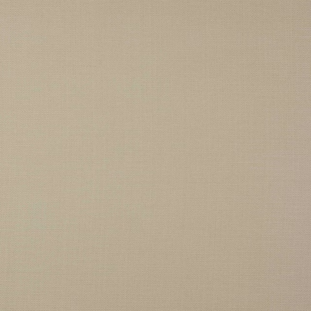
Jenson Beige
Jenson Linen
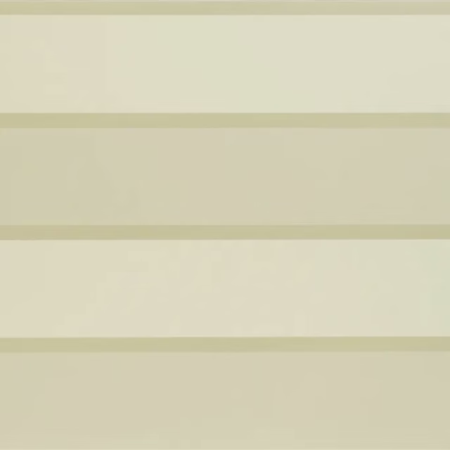
Roumier Vanilla
Carlu WALLPAPER
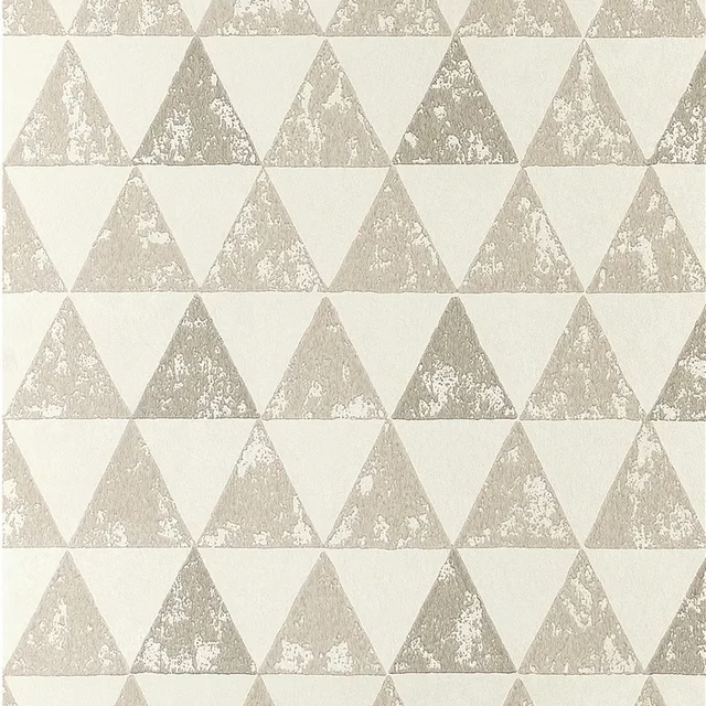
Dorsoduro Ivory
Foscari Fresco Wallpaper
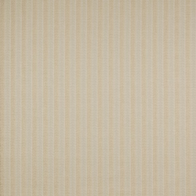
Holt Beige
Boscombe
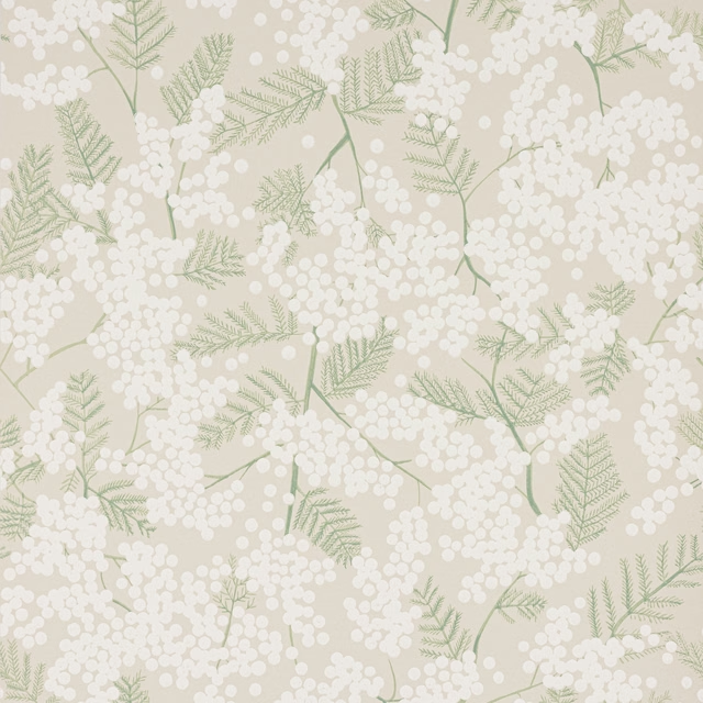
Mimosa Wallpaper Beige
Camber Wallpapers
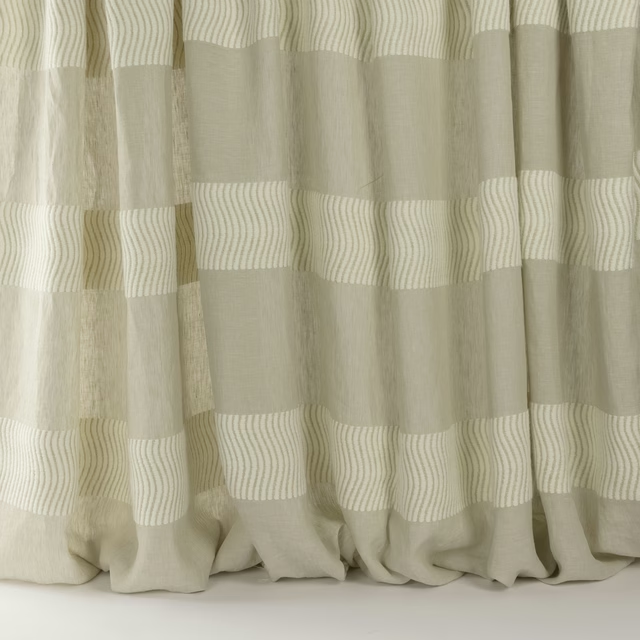
Meadow Linen
Longwood
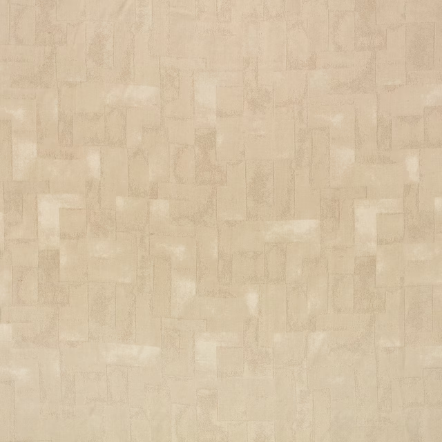
Portland Spacedust
Holland Park
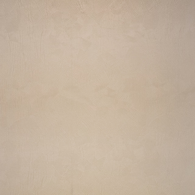
Boa Kudu
Muoto
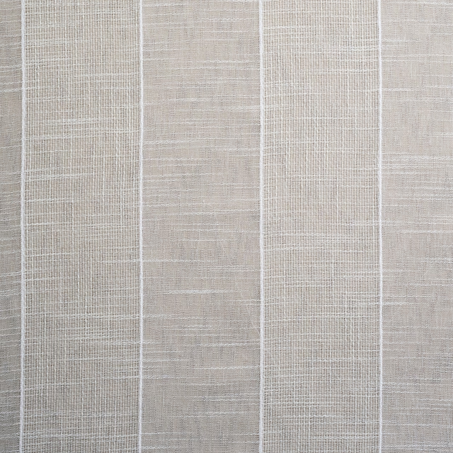
Arklepe
Sheers Vol 2 Collection
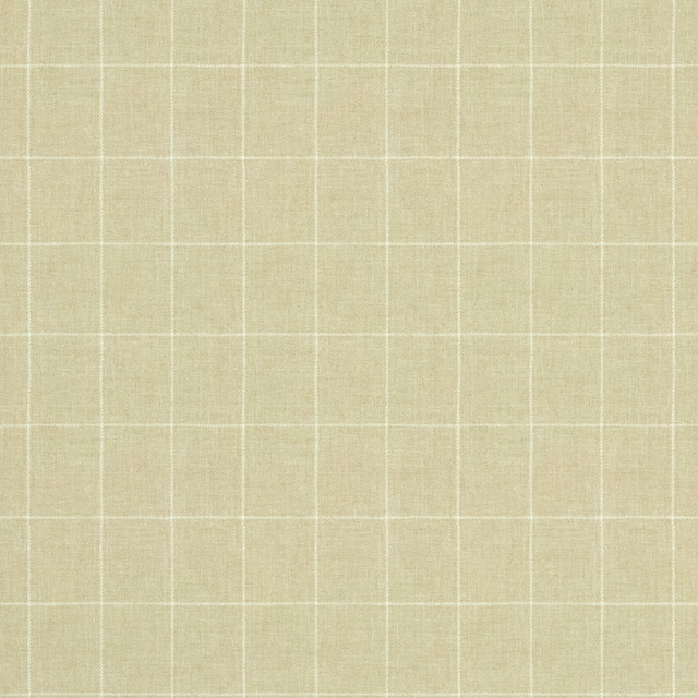
Belmont Beaumaris
Belmont
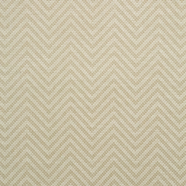
Zeus Candleglow
Zeus
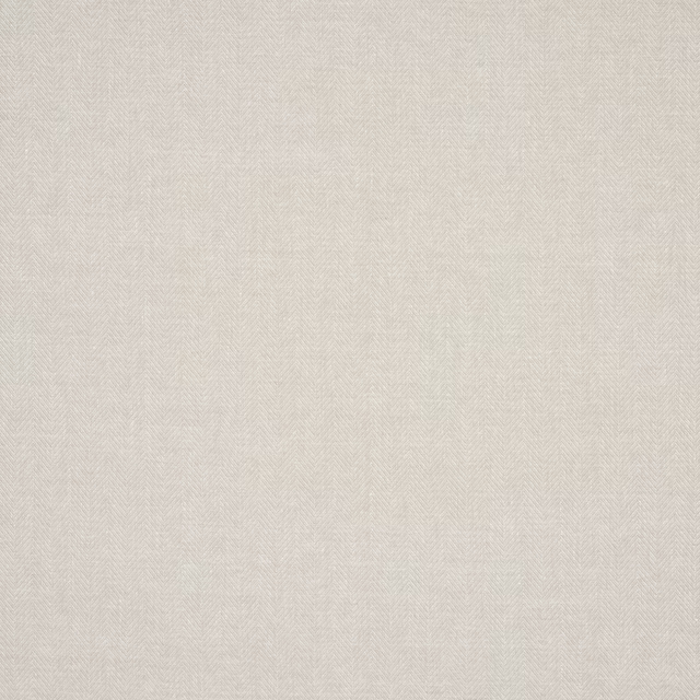
Oliver Wallcovering Beige
Naturals IV
Other beige fabrics
Across the houses we hold. See all 4,485.