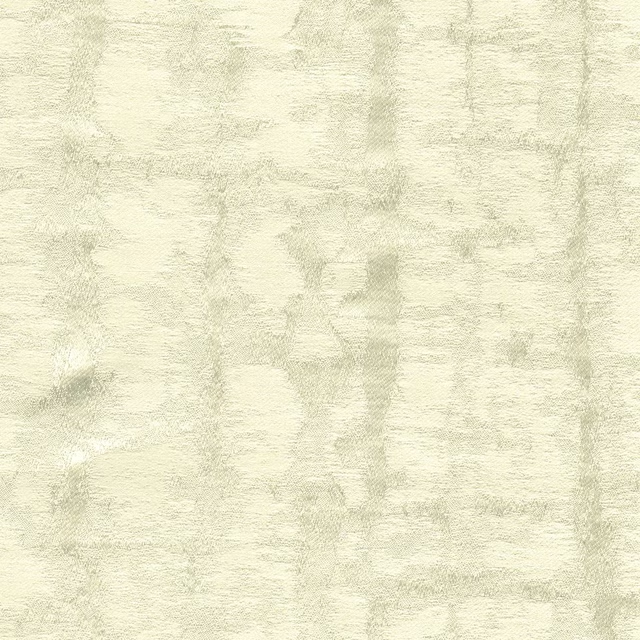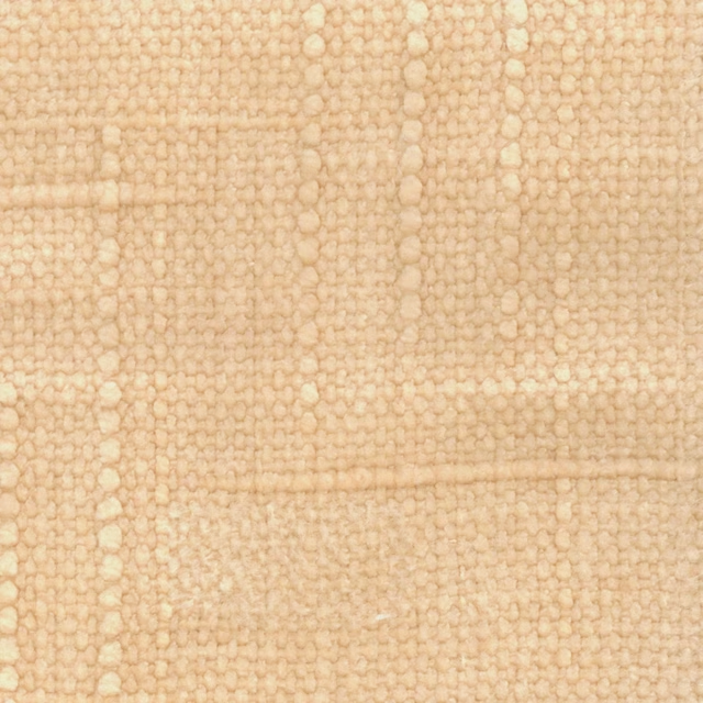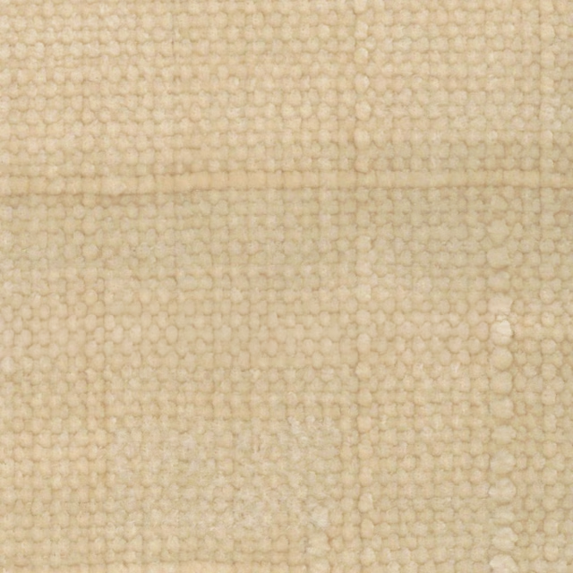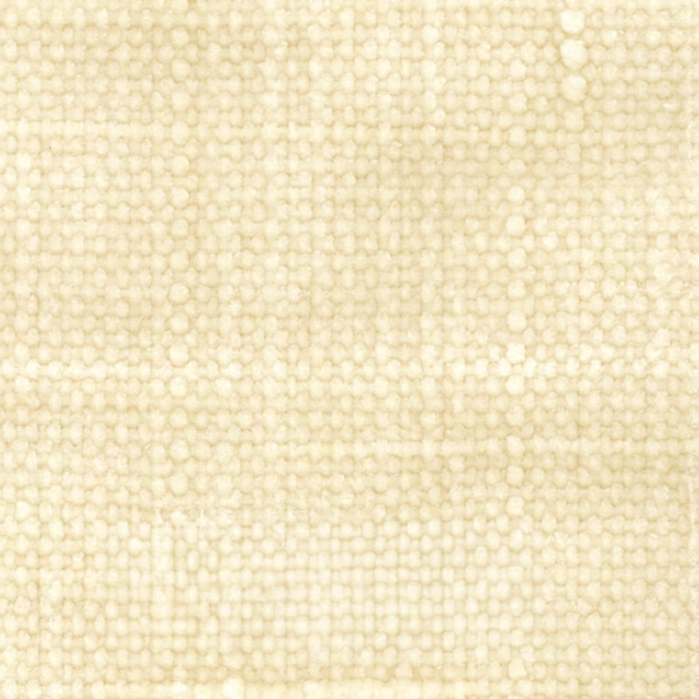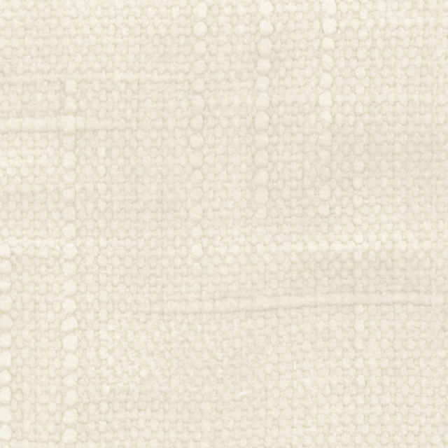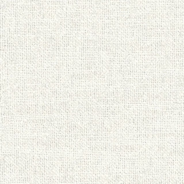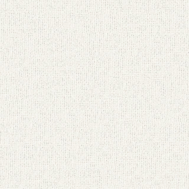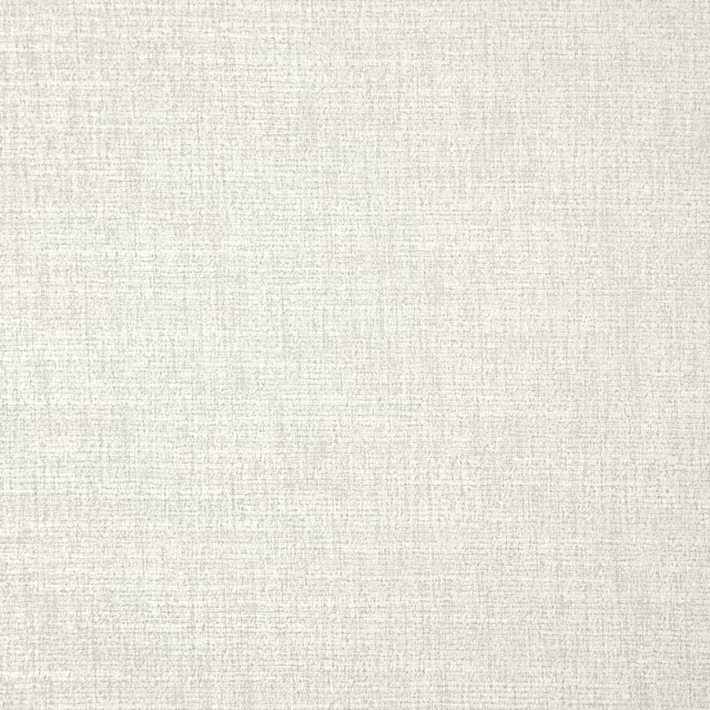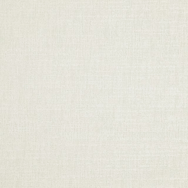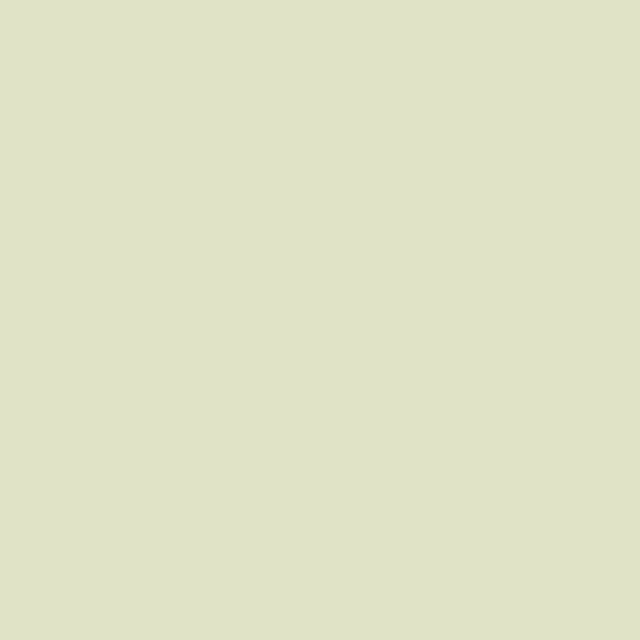
Tap the swatch to see it full screen. Hover it to magnify the weave. Colours on a screen are a guide, not a match, so come and feel the real cloth.
Scroll up or down to zoom in and out.
Pearl Colour - Pale
Neutrals Paint
Pearl Colour - Pale is a quiet Little Greene neutral with a soft green-grey cast. At #E6EBE1 it sits very lightly on the wall, reading fresh rather than stark.
You have used your previews for today. Send one to Simon and you can carry on.
Your board
0 fabrics
See this colour on Little Greene's own site, then order it through us.
See Pearl Colour - Pale in your own room
A photograph of the piece you want re-covered. Straight on is best, and daylight helps. It is used to make your picture and nothing else.
Looking at your room
We found things here Pearl Colour - Pale could go on. Tap one on the photograph, or choose below.
We could not see anything to re-cover
, s
Pearl Colour - Pale, on your
Drag to compare. AI impression, colours indicative: ask us for a cutting before you decide.
About this colour
This shade has a cool-leaning softness, with enough warmth in the green-grey mix to keep it from feeling clinical. It reflects light well and helps a room feel open, though the pale tone still gives a little more presence than a plain off-white. In north-facing rooms it can look cooler and more silvery, while south-facing light brings out its gentle green warmth. It works neatly beside natural oak, painted joinery, and linen-toned upholstery, and it gives darker woods a cleaner, calmer setting.
How to use it
Use it in living rooms, bedrooms, or hallways where you want a light neutral that is not flat white. It pairs well with pale timber, chalky whites on woodwork, and upholstery in stone, sage, or muted blue-grey shades.
A pale neutral like this brings a room up in light without losing softness.
More from Neutrals
The same book, other colourways.
Slaked Lime - Deep
Neutrals

Slaked Lime - Dark
Neutrals
French Grey - Dark
Neutrals
Portland Stone - Dark
Neutrals
Rolling Fog - Dark
Neutrals
Silt
Neutrals
Green Stone - Pale
Neutrals

Pearl Colour - Mid
Neutrals

Pearl Colour
Neutrals
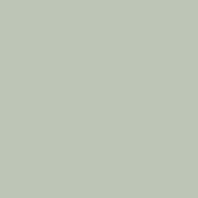
Pearl Colour - Dark
Neutrals

Green Stone - Light
Neutrals
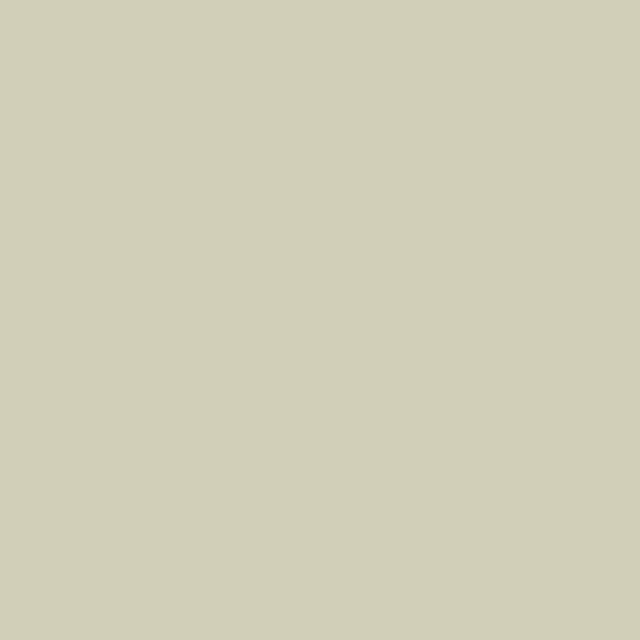
Green Stone
Neutrals
Pairs well with
Pearl Colour - Pale is a wall colour, so these are the cloths that sit against it: one of them on the curtains, the paint behind. Mixed across the houses we hold, which is the part a single supplier's book cannot do.
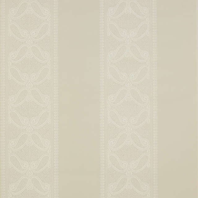
Verney Stripe Wallpaper Ivory
Mallory Stripes
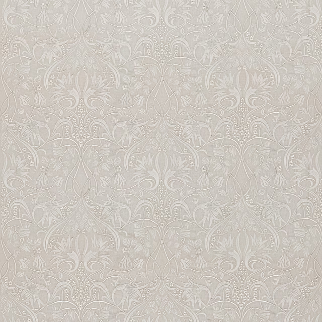
Fritillerie Embroidery Ivory
Original Brantwood Fabric
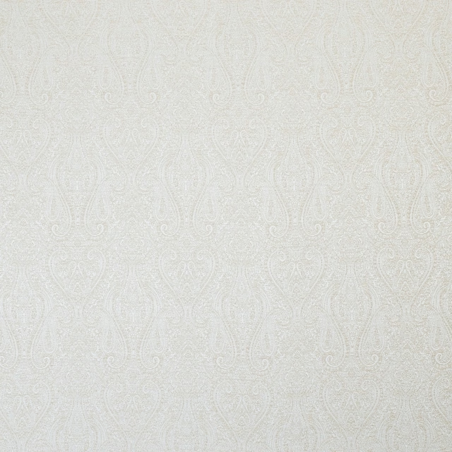
Keeley Champagne
Essential Weaves Vol 3
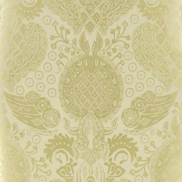
Marseille Dore Wallpaper
Air de Paris WALLPAPER
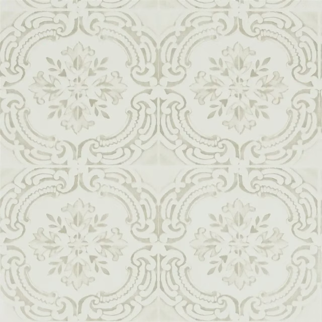
Azulejos Ivoire Wallpaper
BUTTERFLY PARADE WALLPAPER
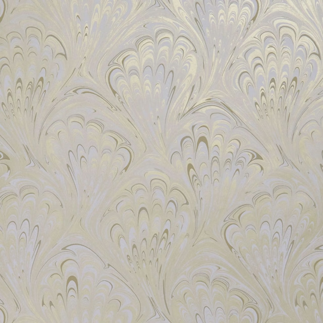
Pavone Ivory/Gold
Botanica Wallpaper
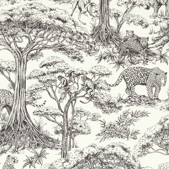
Kisumu Noir
Breegan Jane x Clarke and Clarke Wallpaper
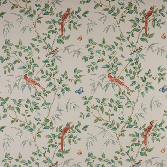
Ashdown Cream
Ashdown
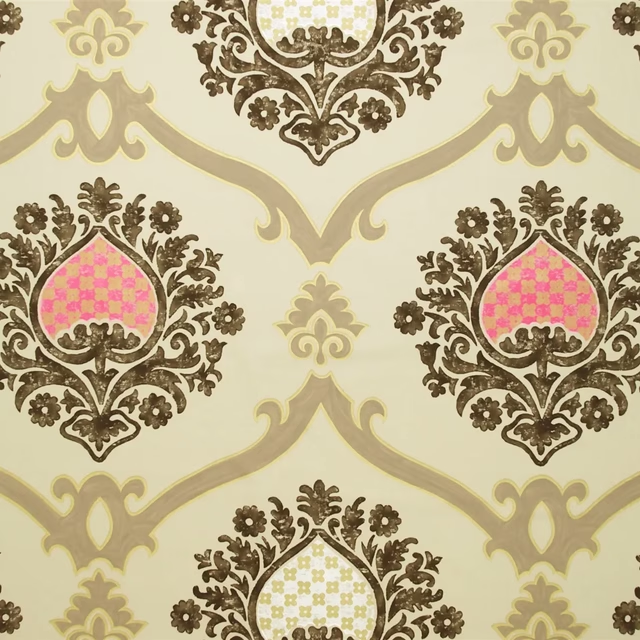
Rocaille Linen
Amalienborg Fabrics
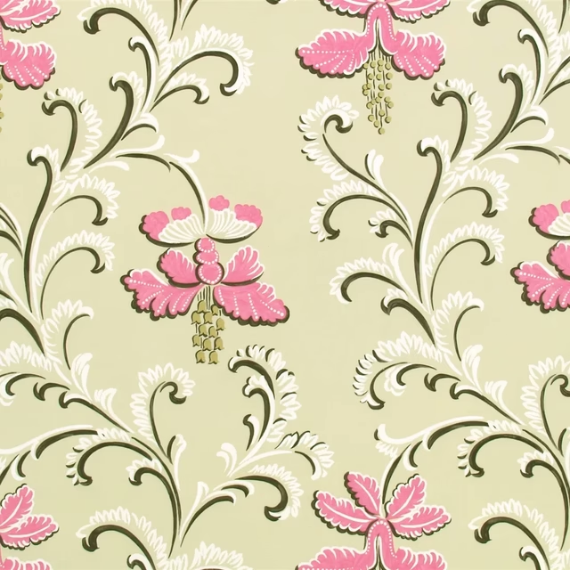
Fidelio Peony
Arabella Fabrics
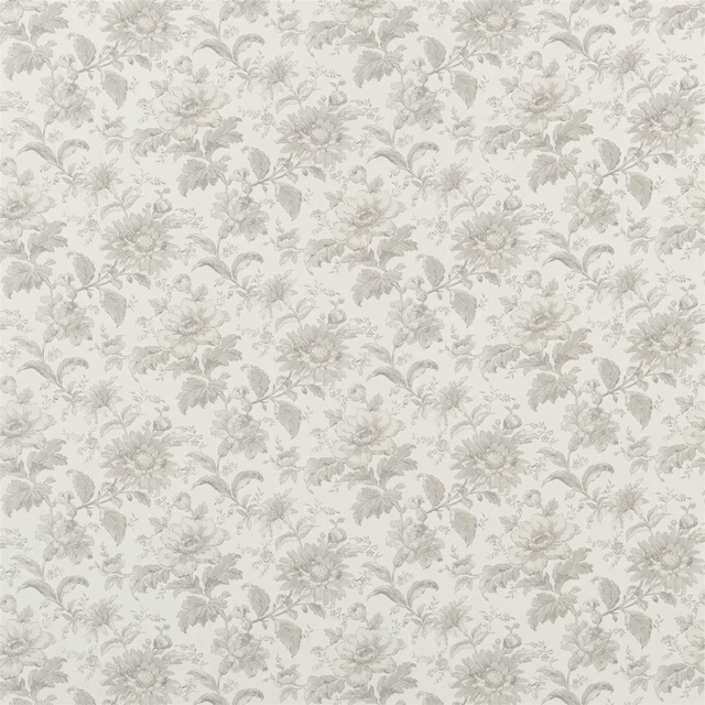
English Garden Floral Birch
Heritage Prints
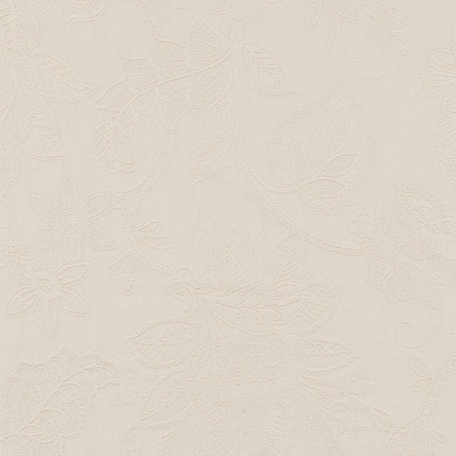
Classique Chalk
Eco -Friendly Ranges
Other cream fabrics
Across the houses we hold. See all 4,572.