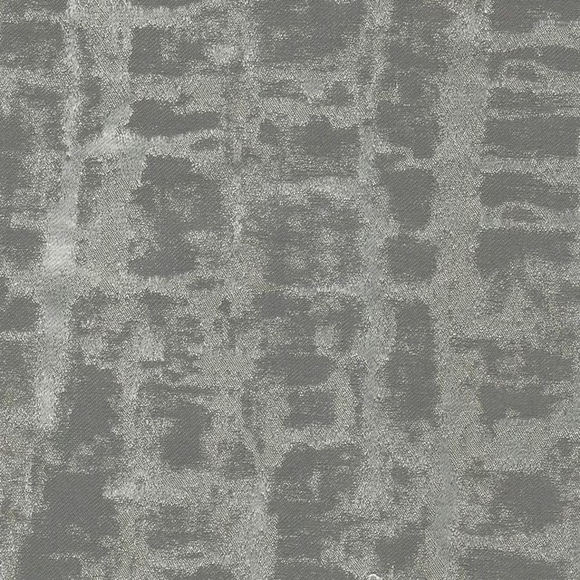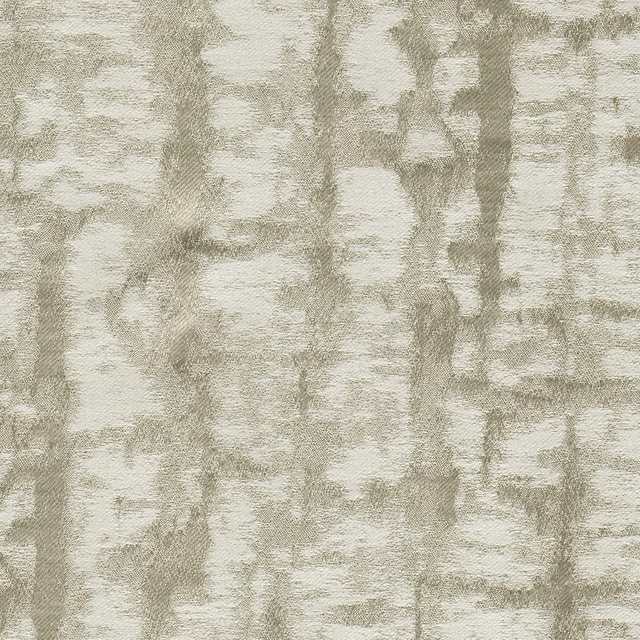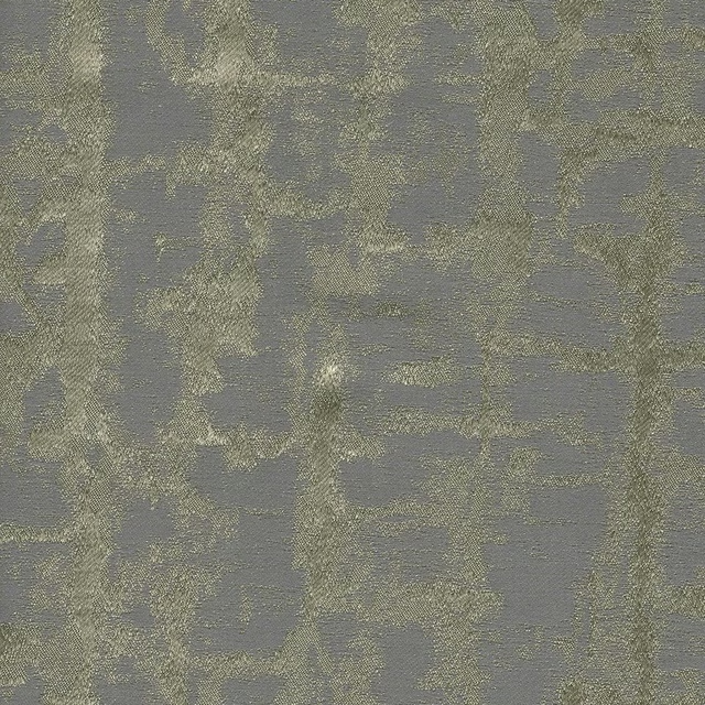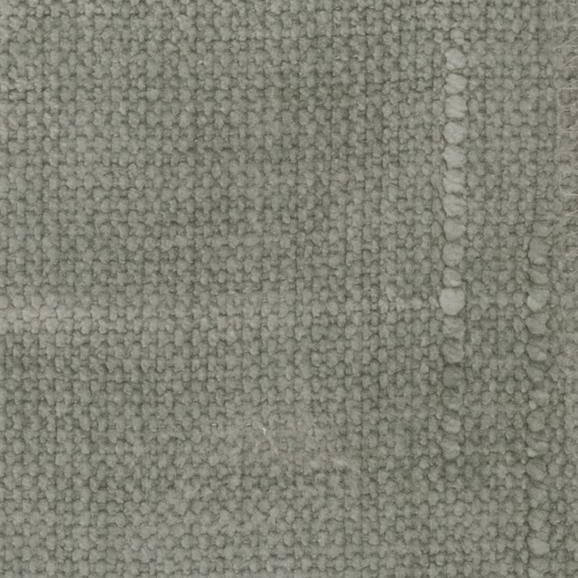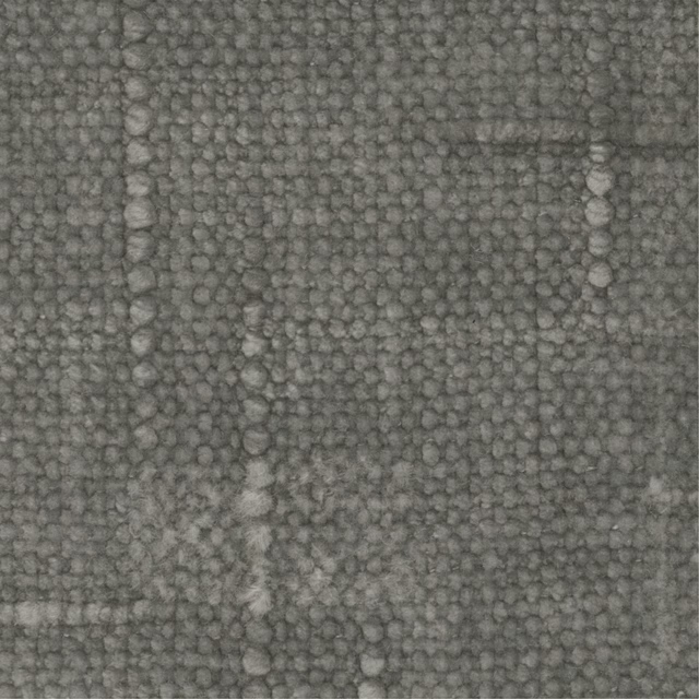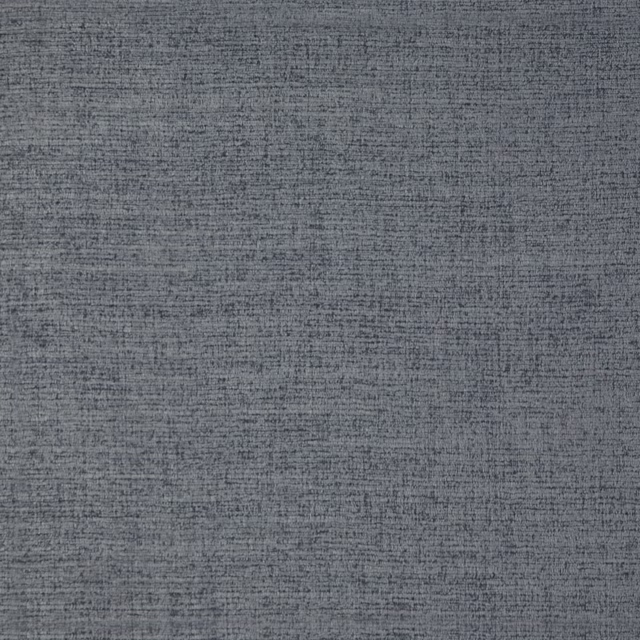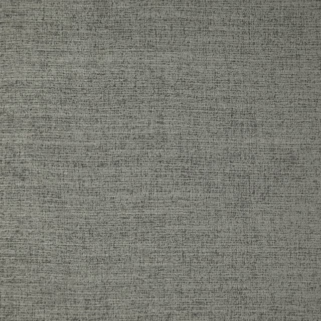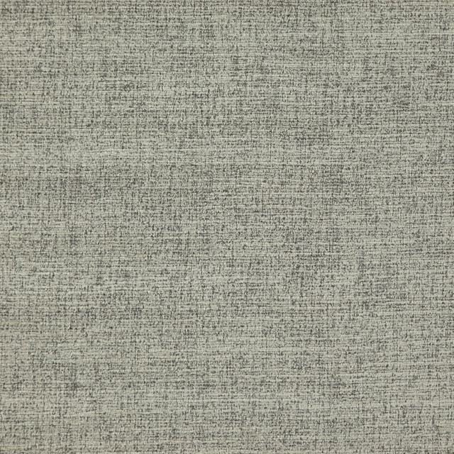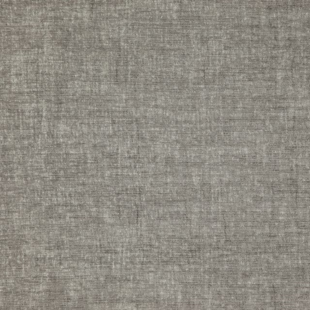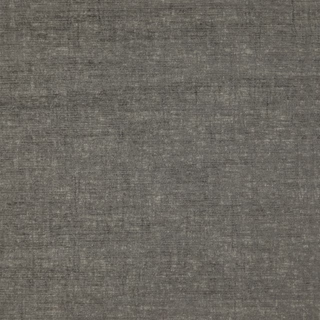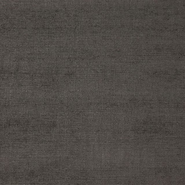
Tap the swatch to see it full screen. Hover it to magnify the weave. Colours on a screen are a guide, not a match, so come and feel the real cloth.
Scroll up or down to zoom in and out.
Pearl Colour - Dark
Neutrals Paint
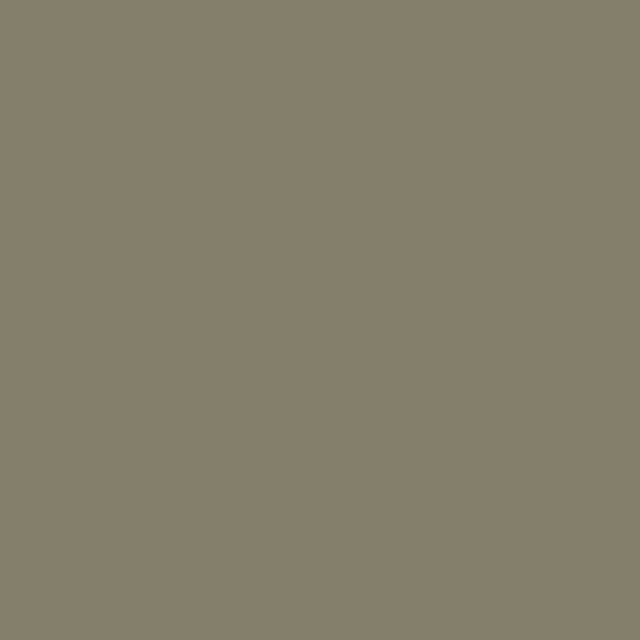
Pearl Colour - Dark is a subdued neutral with a soft green-grey cast. It sits quietly in a room, giving colour without pushing too far into either green or grey.
You have used your previews for today. Send one to Simon and you can carry on.
Your board
0 fabrics
See this colour on Little Greene's own site, then order it through us.
See Pearl Colour - Dark in your own room
A photograph of the piece you want re-covered. Straight on is best, and daylight helps. It is used to make your picture and nothing else.
Looking at your room
We found things here Pearl Colour - Dark could go on. Tap one on the photograph, or choose below.
We could not see anything to re-cover
, s
Pearl Colour - Dark, on your
Drag to compare. AI impression, colours indicative: ask us for a cutting before you decide.
About this colour
This shade reads as a cool-leaning neutral, with enough green in it to stop it feeling flat and enough grey to keep it restrained. On a wall it takes the edge off strong light and can look slightly deeper and moodier in a north-facing room, where the cooler light brings out the grey. In south-facing light it softens and the green note becomes more apparent, so the colour feels calmer and a little warmer. It pairs well with natural oak, dark stained timber, linen tones and muted upholstery colours, especially where a gentle backdrop is needed. On woodwork it gives a quieter finish than a pure white, helping trims and joinery sit more naturally with the rest of the room.
How to use it
Use it in sitting rooms, bedrooms or hallways where you want a grounded neutral that still has character. It works neatly with pale woodwork, walnut, and upholstery in stone, sage, charcoal or woven natural shades.
A calm green-grey neutral that stays soft and settled on the wall.
More from Neutrals
The same book, other colourways.
Rolling Fog - Dark
Neutrals
Silt
Neutrals

Pearl Colour - Pale
Neutrals

Green Stone - Pale
Neutrals

Pearl Colour - Mid
Neutrals

Pearl Colour
Neutrals

Green Stone - Light
Neutrals

Green Stone
Neutrals

Tracery II
Neutrals

Book Room Green
Neutrals

Normandy Grey
Neutrals

Ferdinand
Neutrals
Pairs well with
Pearl Colour - Dark is a wall colour, so these are the cloths that sit against it: one of them on the curtains, the paint behind. Mixed across the houses we hold, which is the part a single supplier's book cannot do.
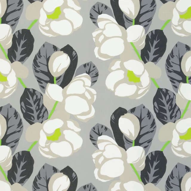
Flamingo Park Natural
Miami Fabrics
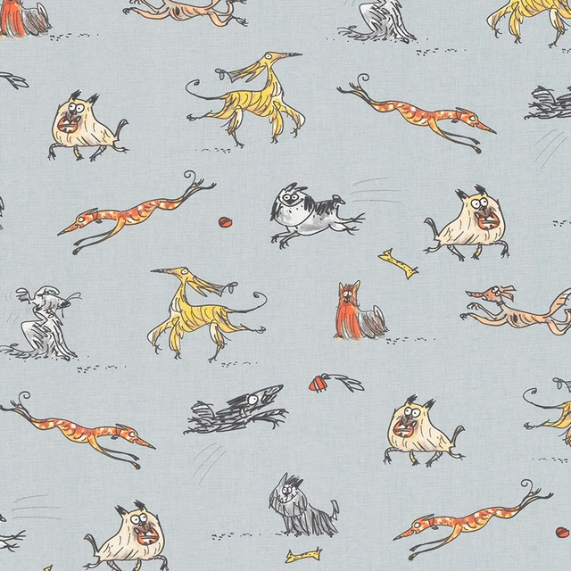
Happy Hounds PVC PVC Happy Hounds Multi
PVC Table covers
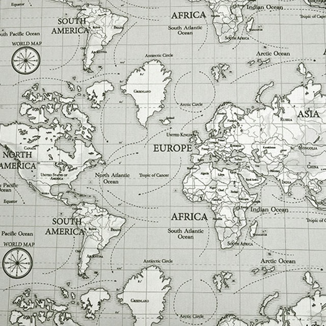
Maps PVC Grey
PVC Table covers
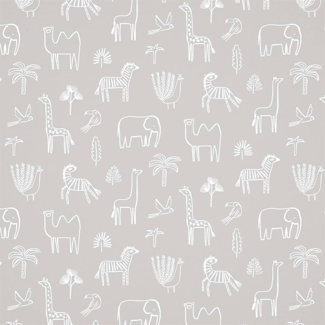
Funky Jungle Stone
Book of Little Treasures Wallpapers
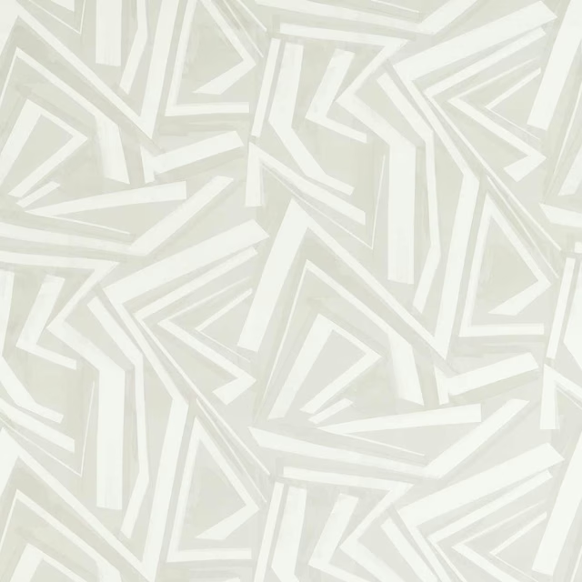
Transverse Marble
Momentum 14 Fabrics
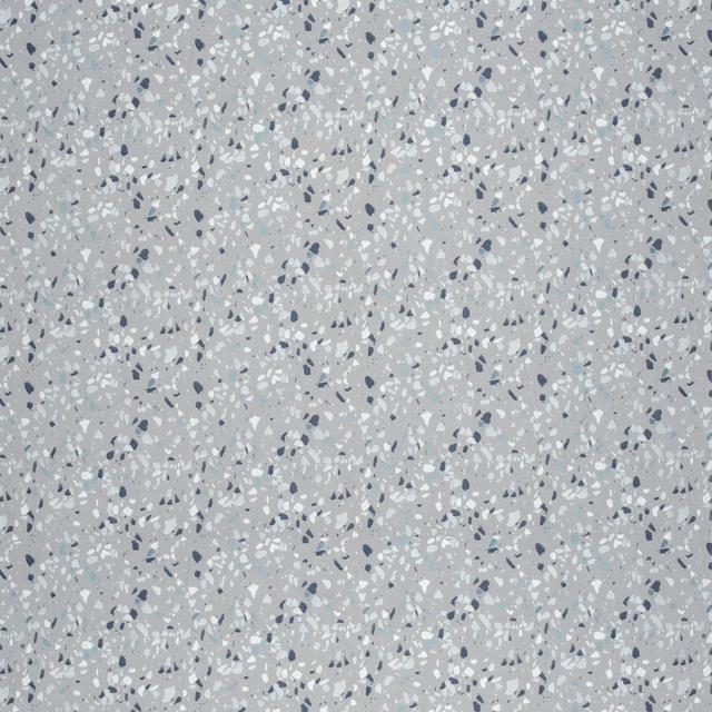
Terrazzo Silver
Hatton
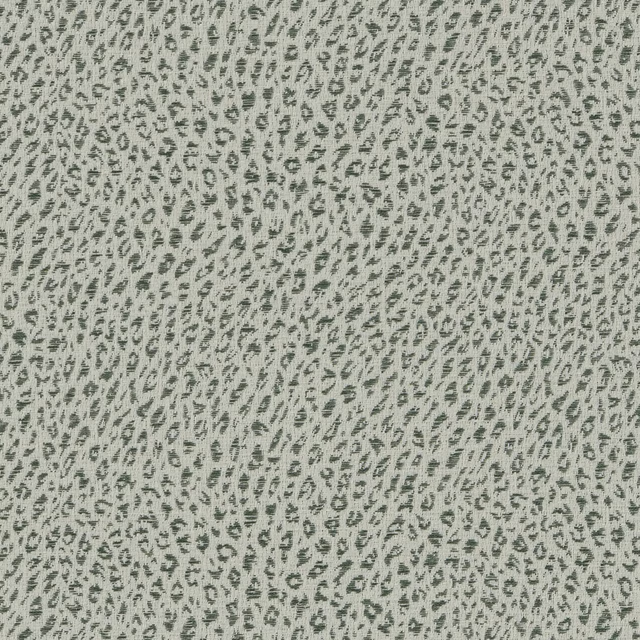
Leopard Viridian
Leopard

Fine Linen Check Chambray
Meadow Lane Fabrics
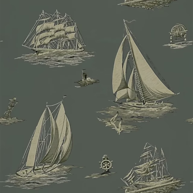
Down Easter Boats Fog
Signature Islesboro Wallpaper
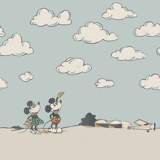
Mickey In the Clouds Sea Salt
Disney Home X Sanderson Wallpapers
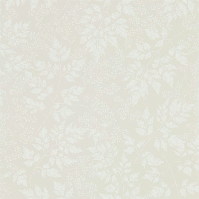
Spring Leaves Flint
Sanderson Home Wallpapers

Epsilon Shadow
Esala
Other grey fabrics
Across the houses we hold. See all 7,198.