Tap the swatch to see it full screen. Hover it to magnify the weave. Colours on a screen are a guide, not a match, so come and feel the real cloth.
Scroll up or down to zoom in and out.
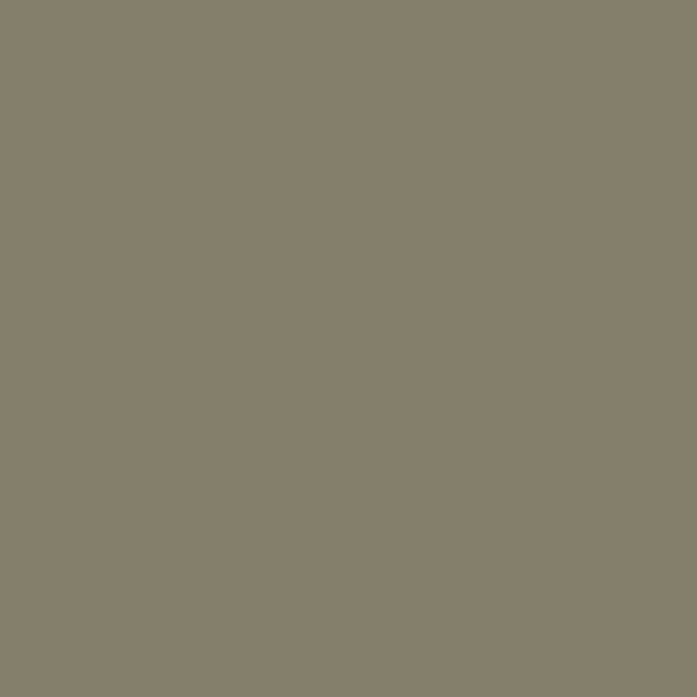
Portland Stone - Dark
Neutrals Paint
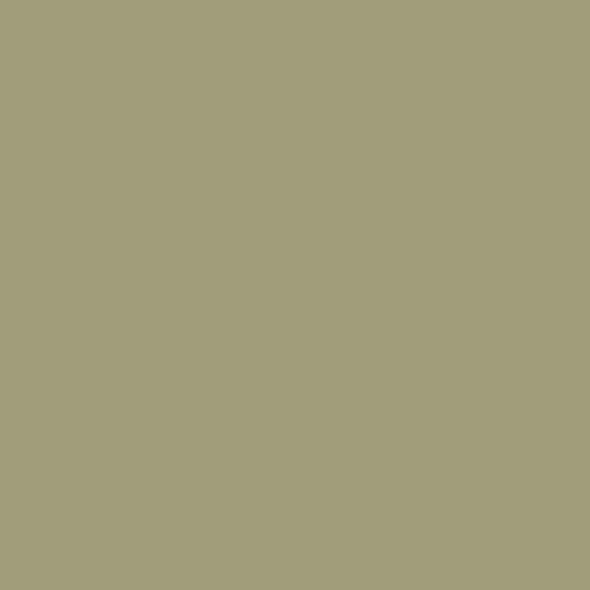
Portland Stone - Dark is Little Greene’s deeper take on a classic neutral, with a grounded khaki-stone character. It brings a settled, earthy note that feels calm rather than stark.
You have used your previews for today. Send one to Simon and you can carry on.
Your board
0 fabrics
See this colour on Little Greene's own site, then order it through us.
See Portland Stone - Dark in your own room
A photograph of the piece you want re-covered. Straight on is best, and daylight helps. It is used to make your picture and nothing else.
Looking at your room
We found things here Portland Stone - Dark could go on. Tap one on the photograph, or choose below.
We could not see anything to re-cover
, s
Portland Stone - Dark, on your
Drag to compare. AI impression, colours indicative: ask us for a cutting before you decide.
About this colour
At #A29C7C, this colour reads as a warm neutral with olive and stone undertones, so it feels more natural than beige and less yellow than tan. On a wall it absorbs more light than a pale neutral, giving rooms a cocooned, composed feel without going dark. In north-facing light it can lean cooler and a little greyer, showing its understated stone side, while in south-facing rooms the warmth comes forward and the colour feels softer and more sunlit. It sits well beside oak, walnut and painted woodwork in off-white, putty or deeper green-browns, and it gives a strong, calm base for patterned upholstery and woven curtains.
How to use it
It suits sitting rooms, studies and hallways where you want a quiet backdrop with more depth than cream. Pair it with natural timber, aged brass, and upholstery in oatmeal, moss, tobacco or charcoal tones.
A steady, warm neutral that gives walls more depth without feeling heavy.
More from Neutrals
The same book, other colourways.

Rolling Fog - Light
Neutrals

French Grey
Neutrals

Portland Stone
Neutrals

Slaked Lime - Deep
Neutrals

Slaked Lime - Dark
Neutrals

French Grey - Dark
Neutrals
Rolling Fog - Dark
Neutrals
Silt
Neutrals

Pearl Colour - Pale
Neutrals

Green Stone - Pale
Neutrals

Pearl Colour - Mid
Neutrals

Pearl Colour
Neutrals
Pairs well with
Portland Stone - Dark is a wall colour, so these are the cloths that sit against it: one of them on the curtains, the paint behind. Mixed across the houses we hold, which is the part a single supplier's book cannot do.
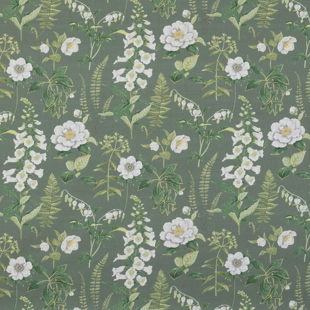
Floren Linen - Khaki
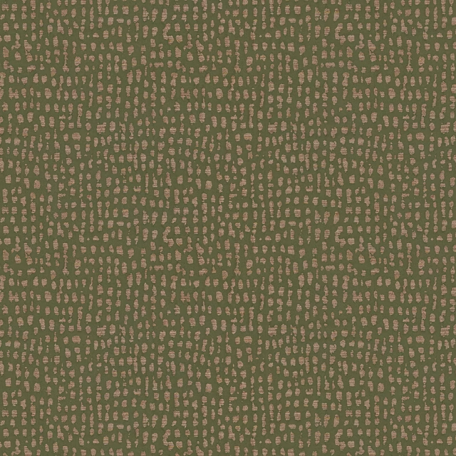
Estrada Olive
Eden Collection
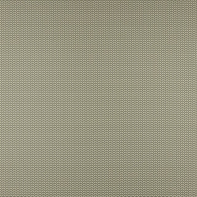
Galatzo Olive
Palma Collection
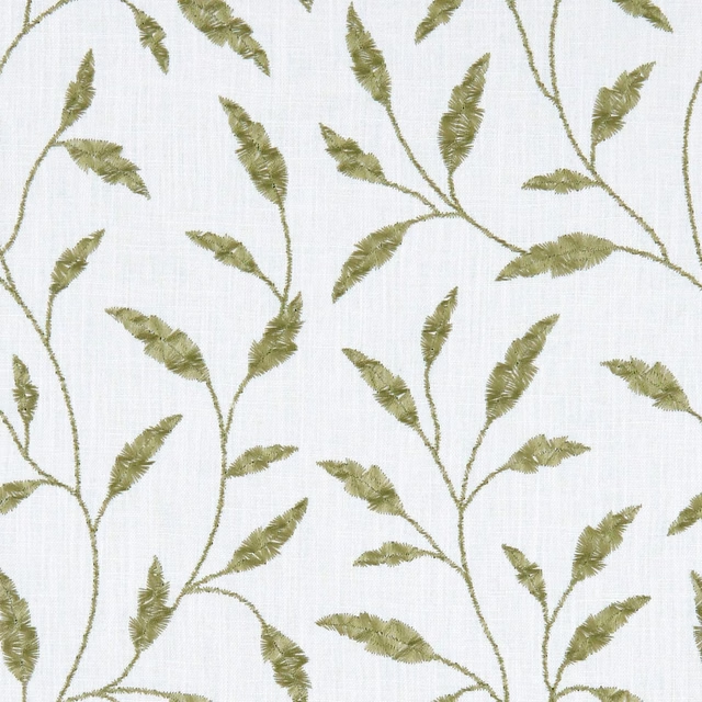
Fairford Olive
Avebury
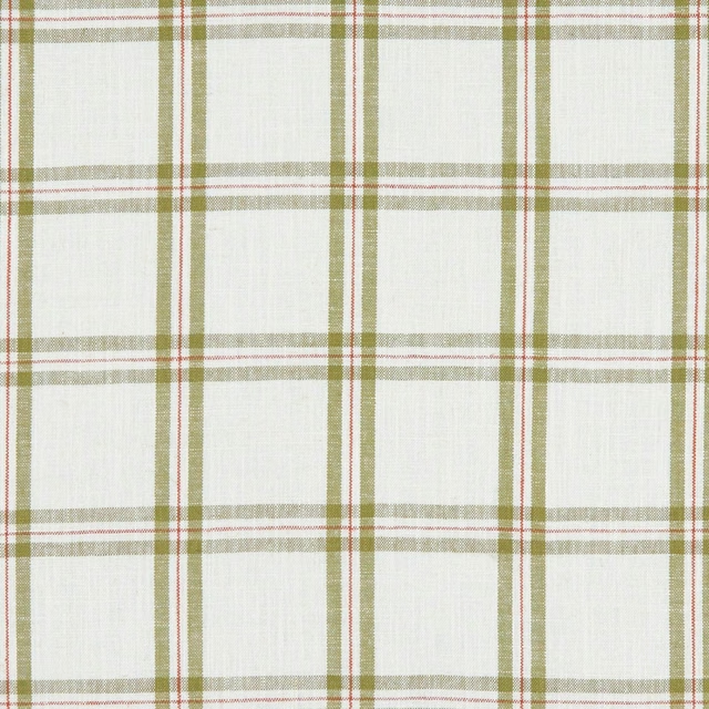
Kelmscott Olive
Avebury
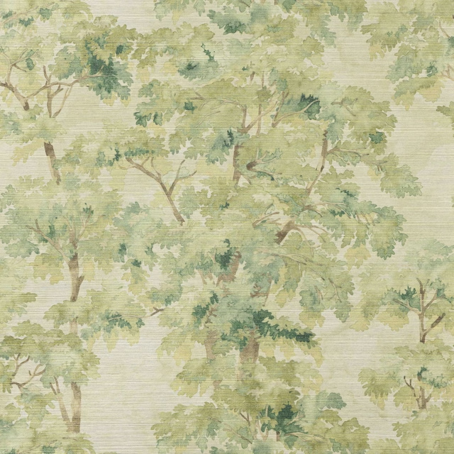
Arbour Sisal Wallpaper Olive Green
Belmont Wallcoverings
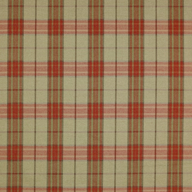
Dunmore Check Tomato/Sage
Magnus Checks
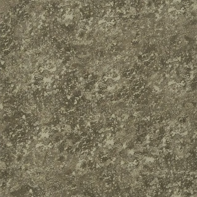
Chiazza Cocoa
Boratti WALLPAPER
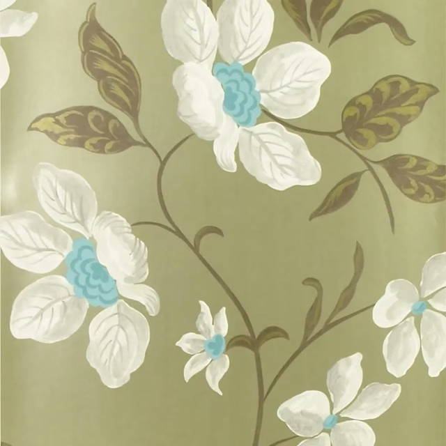
Angelique Zinc
Florimund WALLPAPER
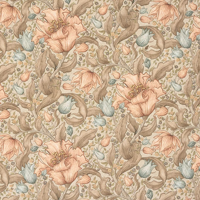
Helmshore Olive
Digital Prints
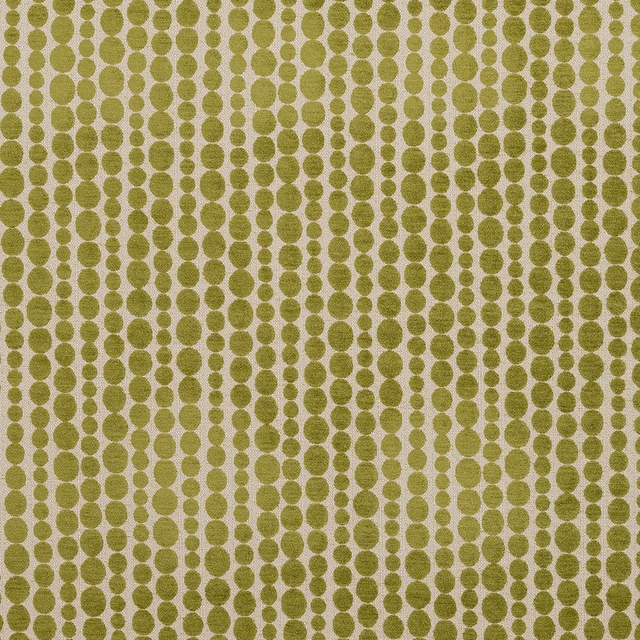
Metronome Pampas
Eco -Friendly Ranges
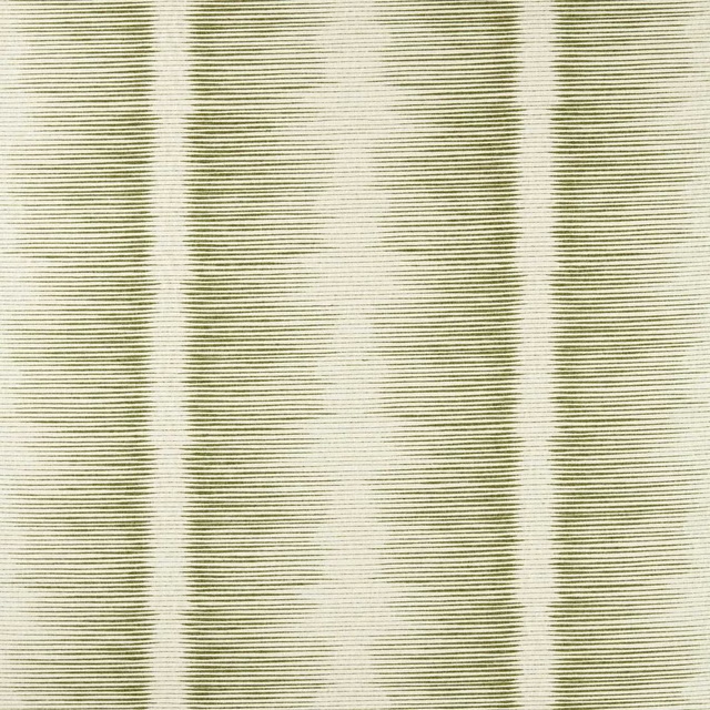
Chaco Moss
Defined Momentum Fabrics
Other olive fabrics
Across the houses we hold. See all 1,903.