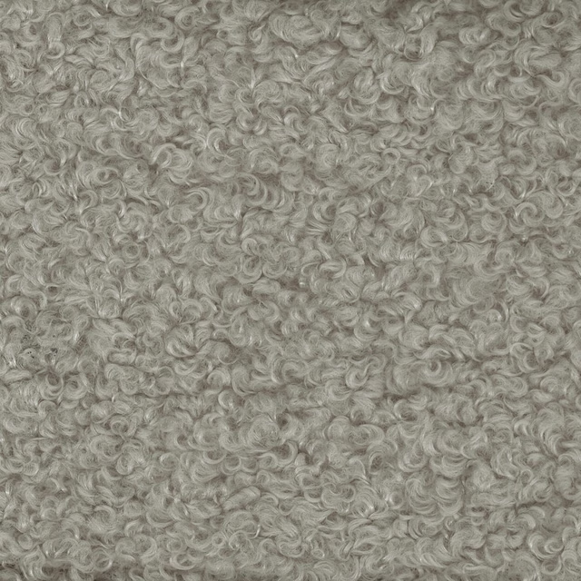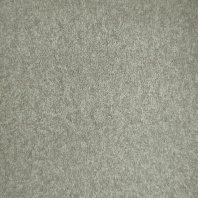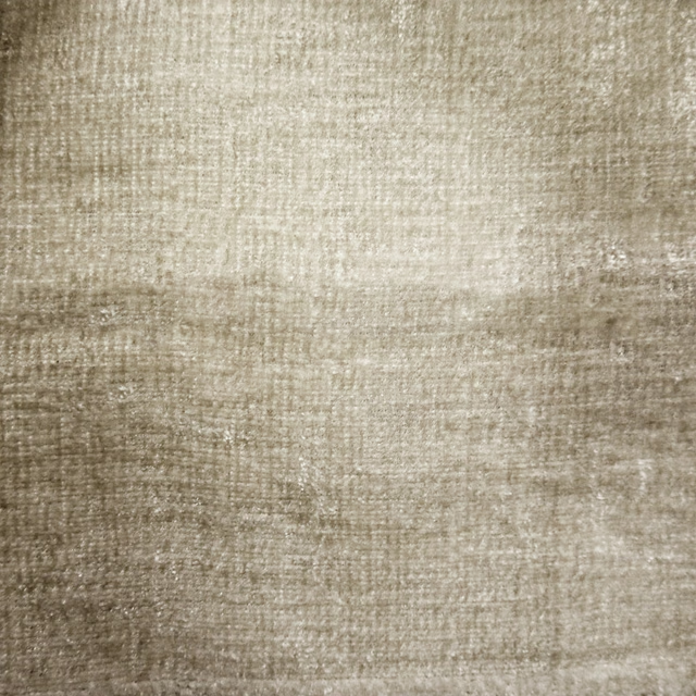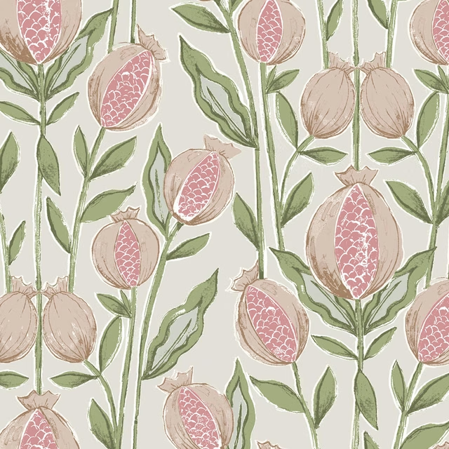

Tap the swatch to see it full screen. Hover it to magnify the weave. Colours on a screen are a guide, not a match, so come and feel the real cloth.
Scroll up or down to zoom in and out.
Tempus Sepia
Naturalhistory Fabrictempus/fa1/sep
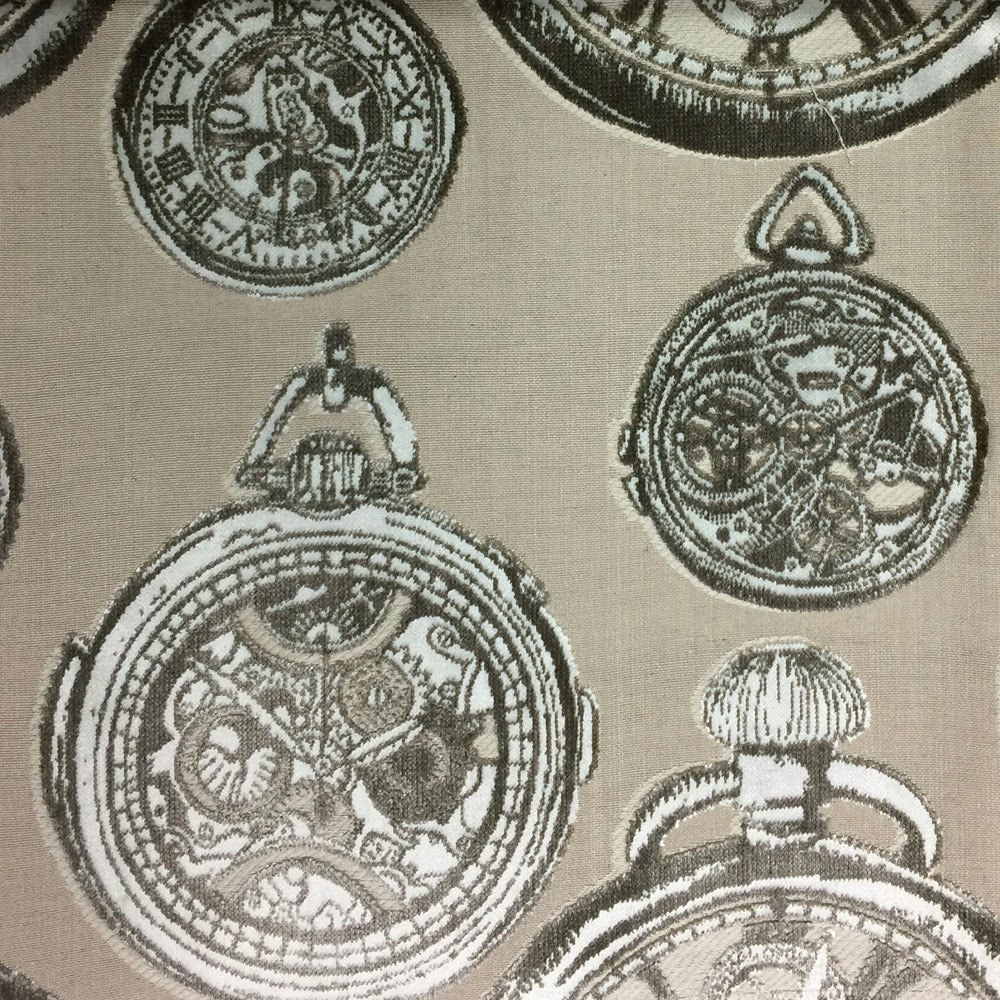
Tempus Sepia pairs a soft stone-toned ground with an intricate circular motif in layered olive-brown and pale chalky outlines. The effect is detailed and antique-inspired, with the pattern sitting clearly against the muted beige background.
You have used your previews for today. Send one to Simon and you can carry on.
Your board
0 fabrics
Part of the range we hold from Voyage Maison.
See Tempus Sepia in your own room
A photograph of the piece you want re-covered. Straight on is best, and daylight helps. It is used to make your picture and nothing else.
Looking at your room
We found things here Tempus Sepia could go on. Tap one on the photograph, or choose below.
We could not see anything to re-cover
, s
Tempus Sepia, on your
Drag to compare. AI impression, colours indicative: ask us for a cutting before you decide.
About this fabric
This Tempus colourway from Voyage Maison's Naturalhistory collection is a substantial 495gsm fabric, suitable for curtains, blinds and upholstery. The 140cm width and 35cm x 50.5cm pattern repeat make it well suited to larger drops where the motif can be shown to full effect. Visually, the beige ground reads as warm and understated, while the printed circular forms bring a darker, heritage feel with crisp pale edging that lifts the design. The cloth has enough body for upholstery use, but the soft mix of polyester, cotton, viscose and linen keeps the surface looking relaxed rather than rigid. Dry clean only and do not iron.
How to use it
Use Tempus Sepia where you want pattern without heavy contrast: it works especially well on relaxed upholstery, roman blinds or full-length curtains in rooms with natural wood, taupe or putty finishes. The muted beige base keeps the design calm, while the antique-style motif adds character to otherwise quiet interiors.
A warm beige ground softens the intricate circular motif, making it an elegant choice for tailored curtains or statement upholstery.
More from Naturalhistory
The same book, other colourways.
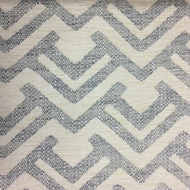
Lucius Natural
Naturalhistory
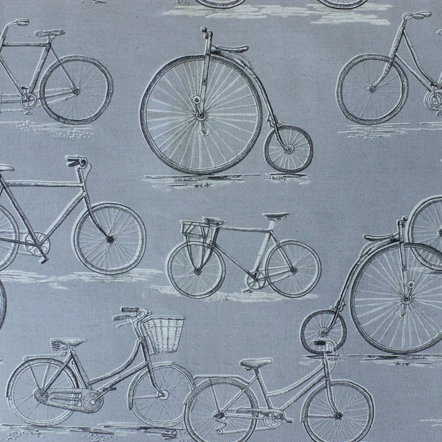
Pennyfarthing Antique
Naturalhistory
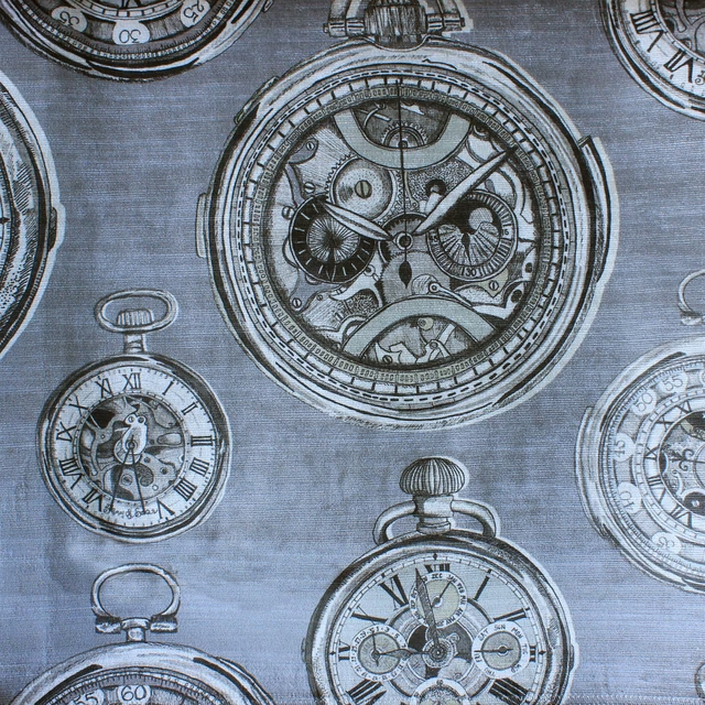
Pocketwatch Charcoal
Naturalhistory
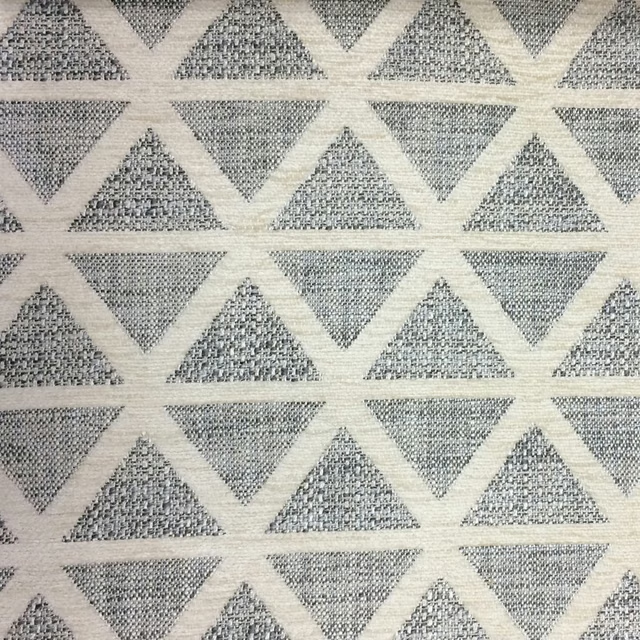
Priscus Natural
Naturalhistory
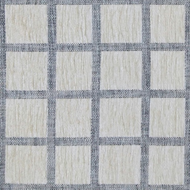
Salvian Natural
Naturalhistory
Pairs well with
A pattern needs somewhere for the eye to rest, so these are the plains and textures that sit beside Tempus Sepia without fighting it. Mixed across the houses we hold, which is the part a single supplier's book cannot do.

Lanux Stone
Visage Collection
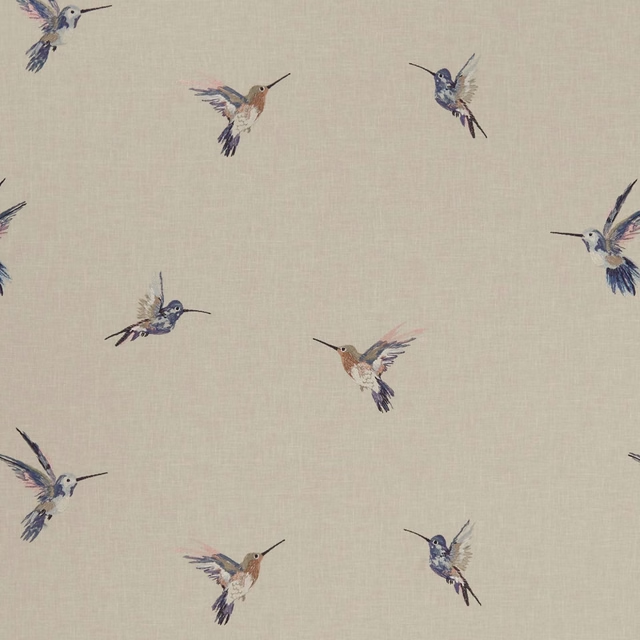
Woodstar Pastel
Exotica
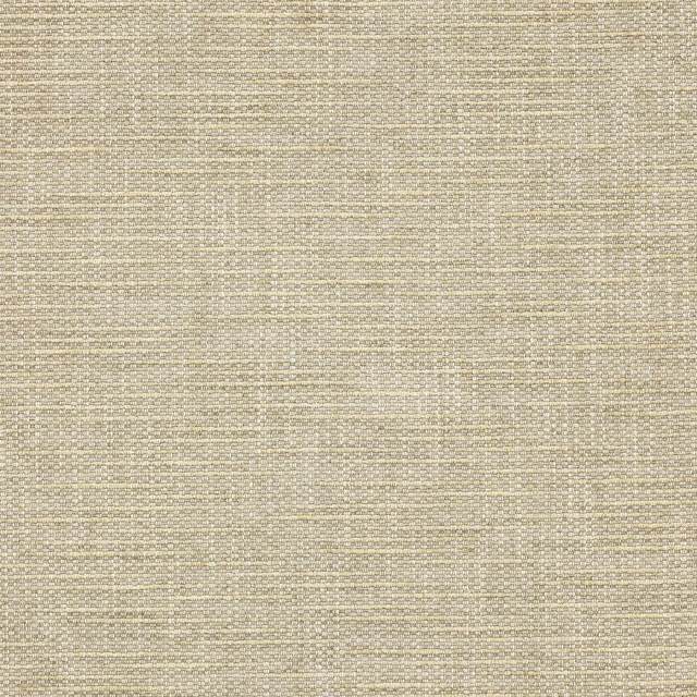
Brandon Stone
Albeck
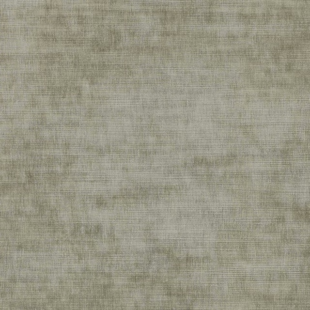
Cosima Beige
Cosima Velvet II
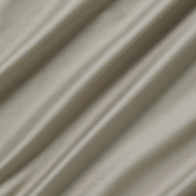
Astor Reindeer
Astor
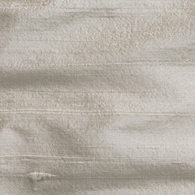
Orissa Silk Quinoa
Orissa Silk
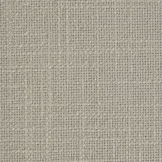
Tuscany II Wren Feather
Tuscany II Weaves
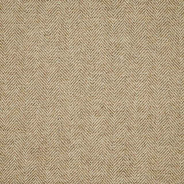
1796/A34
Misc

Nova Fr Tuffet
Nova Fr

Elio Stone
Elio
08 Stone
Presley
Olenka Shingle
Olenka Collection
Paint that goes with it
Two ways to take the room. Both colours are from houses we hold, so a pot can come off the same order as the cloth. Screens shift colour, so treat these as a direction and bring the cloth to the shelf before you buy the paint.
To sit quietly behind it
Lead Colour
Little Greene · #969183
To stand against it
Screenshot
Coat Paints · #ffffff
Other beige fabrics
Across the houses we hold. See all 4,485.