
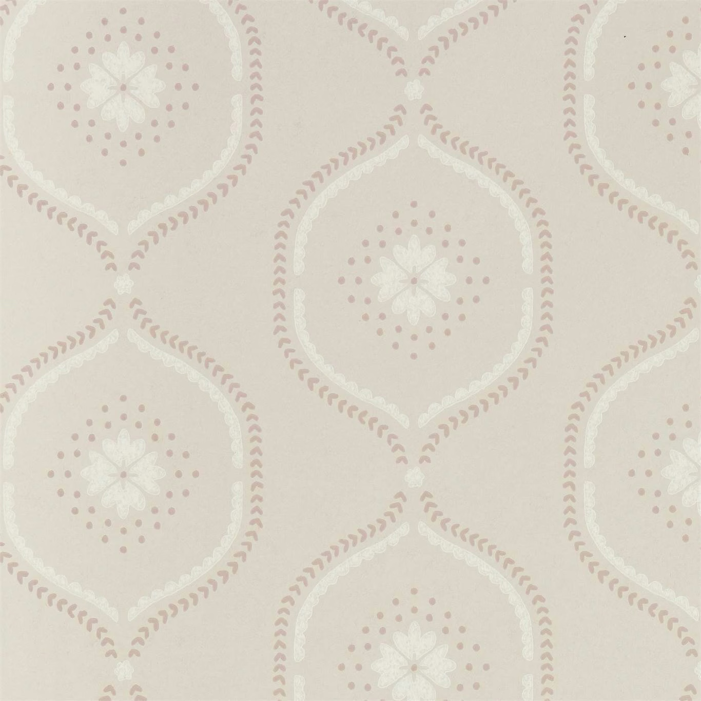

Tap the swatch to see it full screen. Hover it to magnify the weave. Colours on a screen are a guide, not a match, so come and feel the real cloth.
Scroll up or down to zoom in and out.
Milcombe Powder Pink
Littlemore Wallpapers WallpaperSAW0151-03
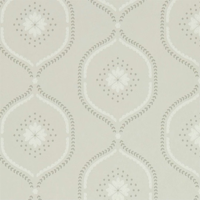
Milcombe Powder Pink pairs a pale stone-pink ground with delicate powder pink and ivory motifs. The repeating design combines rounded diamond outlines, dotted details and small floral centres in a softly washed palette.
You have used your previews for today. Send one to Simon and you can carry on.
Your board
0 fabrics
See this wallpaper on Sanderson's own site, then order it through us.
See Milcombe Powder Pink in your own room
A photograph of the piece you want re-covered. Straight on is best, and daylight helps. It is used to make your picture and nothing else.
Looking at your room
We found things here Milcombe Powder Pink could go on. Tap one on the photograph, or choose below.
We could not see anything to re-cover
, s
Milcombe Powder Pink, on your
Drag to compare. AI impression, colours indicative: ask us for a cutting before you decide.
About this wallpaper
The wallpaper is supplied at a 52 cm useable width and a standard length of 10.05 m, with a 17.3 cm vertical pattern repeat and no horizontal repeat specified. In this colourway, muted pink scalloped outlines and dotted halos sit against a warm, pale stone ground, while the ivory flower centres provide a lighter focal point. The 210 gsm weight gives the paper a visually substantial presence without taking attention away from its finely spaced pattern. Its low-contrast tonal arrangement keeps the geometric medallions gentle rather than bold.
How to use it
Use Milcombe Powder Pink on a bedroom, dressing room or quiet sitting-room wall alongside warm ivory paint, pale timber and blush or stone textiles. The cool, softened pink accents work especially well where a decorative pattern is wanted without a saturated colour statement.
Use this softly muted powder pink with warm ivory, pale stone and natural timber for a calm, gently patterned room.
More from Littlemore Wallpapers
The same book, other colourways.
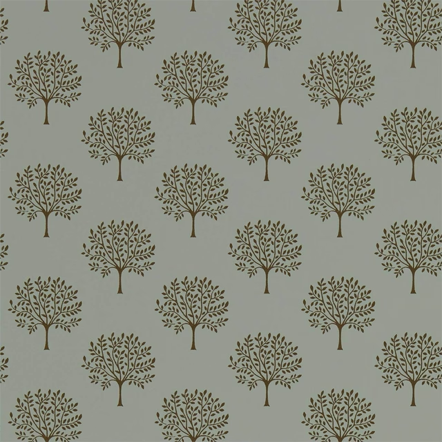
Marcham Tree Copper Grey
Littlemore Wallpapers
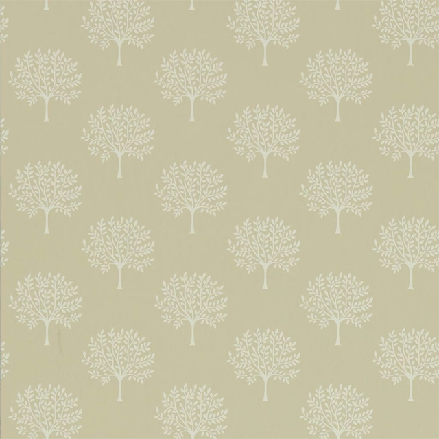
Marcham Tree Country Linen
Littlemore Wallpapers
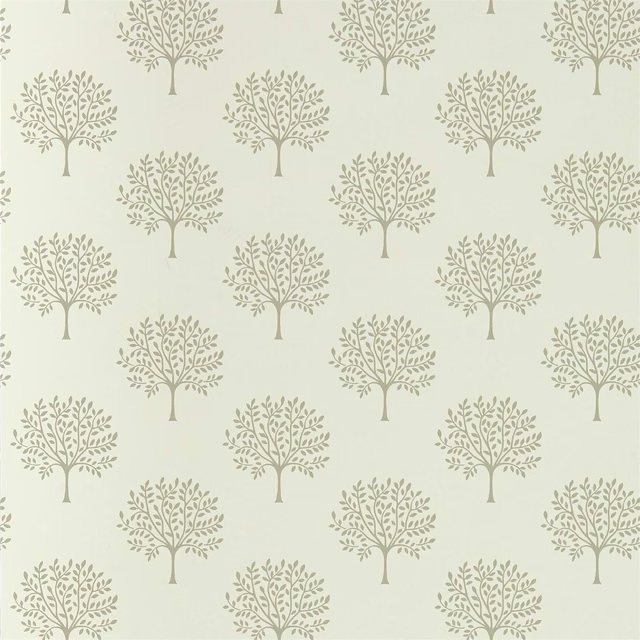
Marcham Tree Cream
Littlemore Wallpapers
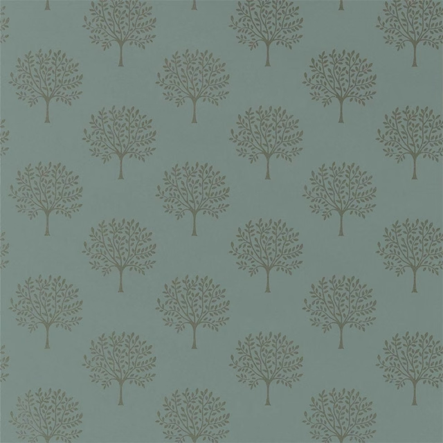
Marcham Tree English Grey
Littlemore Wallpapers
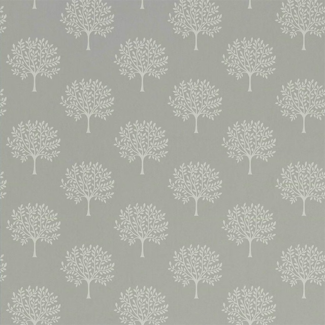
Marcham Tree Grey Birch
Littlemore Wallpapers
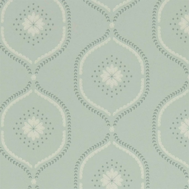
Milcombe Mist Blue
Littlemore Wallpapers
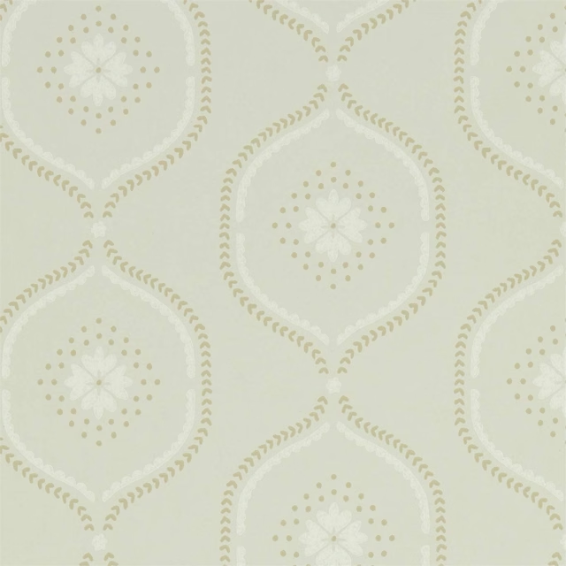
Milcombe Putty
Littlemore Wallpapers
Milcombe Silver
Littlemore Wallpapers

Osney Cream
Littlemore Wallpapers

Osney Grey
Littlemore Wallpapers

Osney Leaf Green
Littlemore Wallpapers

Osney Linen
Littlemore Wallpapers
Pairs well with
A pattern needs somewhere for the eye to rest, so these are the plains and textures that sit beside Milcombe Powder Pink without fighting it. Mixed across the houses we hold, which is the part a single supplier's book cannot do.

Speck Powder
Volume

Smooth Powder
Smooth Iii

Alaska Heather
Alaska Collection

Alaska Shell
Alaska Collection
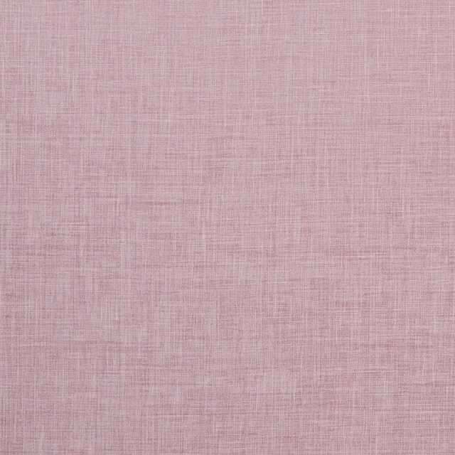
Albany Blush
Albany and Moray
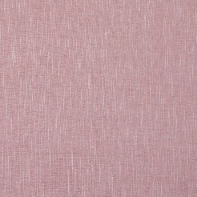
Moray Blush
Albany and Moray
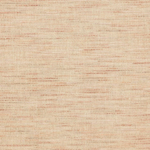
Brandon Old Pink
Albeck

Morton Old Pink
Bampton

Spinelli Alta Dewberry
Contract Essentials II Fabrics

Naples FR Blush
Alderney
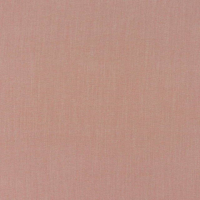
Monza Blush
Arezzo

Allegra Heather
Allegra
Paint that goes with it
Two ways to take the room. Both colours are from houses we hold, so a pot can come off the same order as the cloth. Screens shift colour, so treat these as a direction and bring the cloth to the shelf before you buy the paint.
To sit quietly behind it
Grey Birch Light
Sanderson · #dcd8cc
To stand against it
Dark Lead Colour
Little Greene · #6d6a65
Other pink fabrics
Across the houses we hold. See all 2,519.
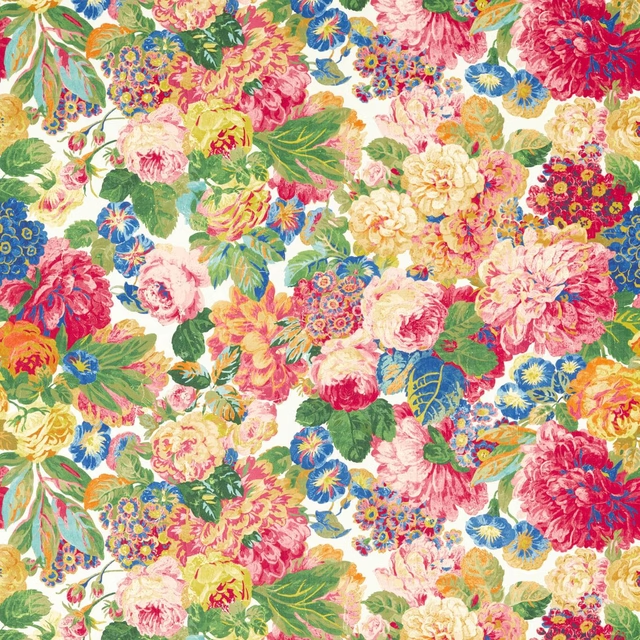
Rose & Peony Cerise
Indoor Outdoor Prints
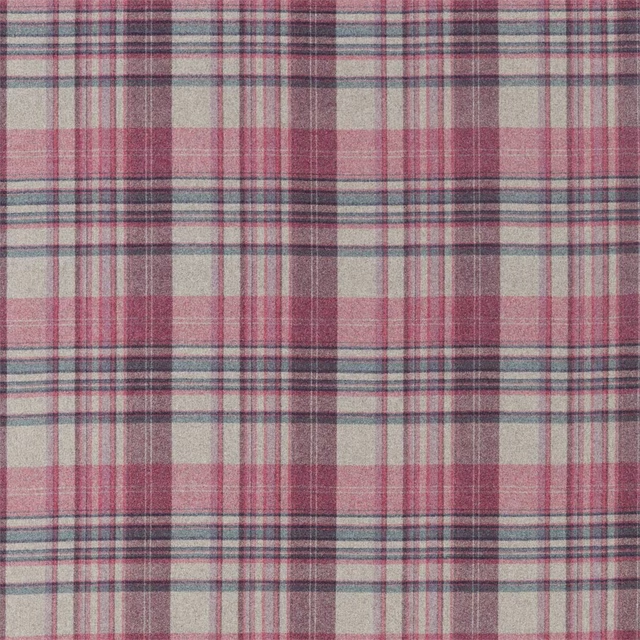
Bryndle Check Mulberry/Fig
Islay Wools
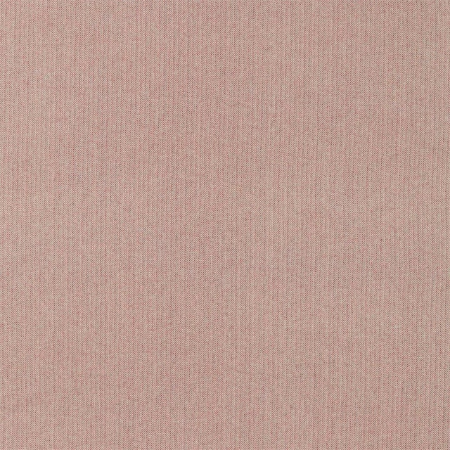
Hector Heather
Islay Wools

Botanic Trellis Rhodera
Linnean Weaves
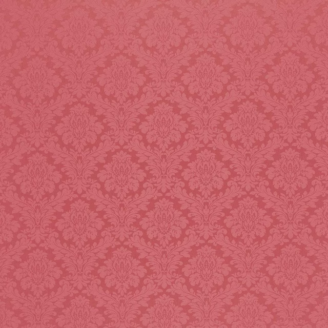
Lymington Damask Rose
Lymington Damasks and Stripes
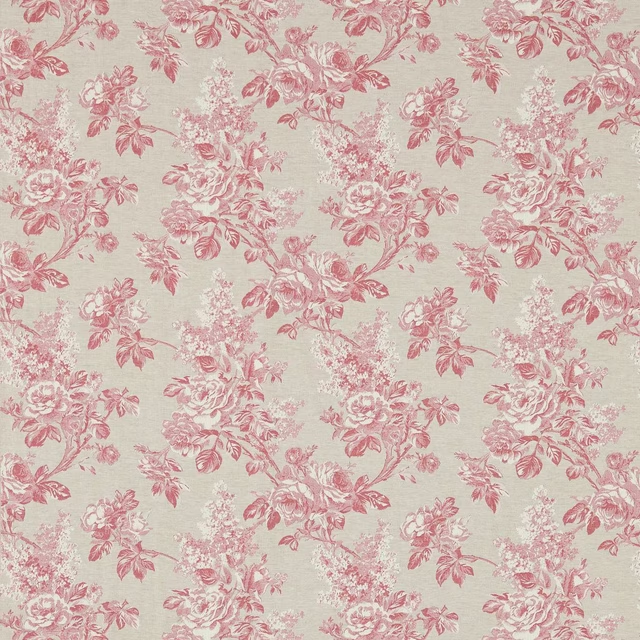
Sorilla Damask Rose/Linen
Lymington Damasks and Stripes
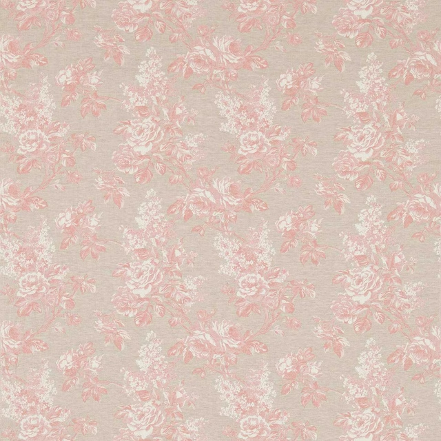
Sorilla Damask Shell Pink/Linen
Lymington Damasks and Stripes

Sorilla Stripe Rose Linen
Lymington Damasks and Stripes

Sorilla Stripe Shell Pink Linen
Lymington Damasks and Stripes

Melford Coral
Melford Weaves

Melford Rose
Melford Weaves

Melford Rowan Berry
Melford Weaves